In defense of capacitive buttons
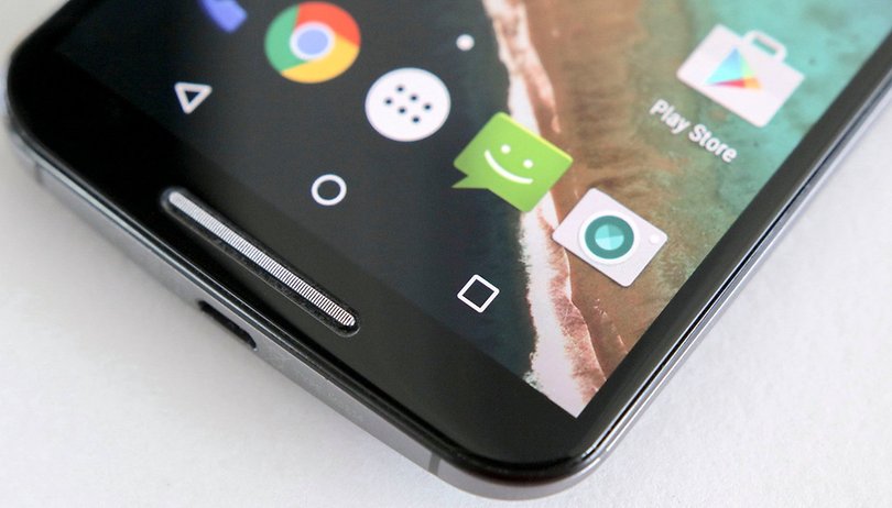

There are three ways to navigate through an Android phone. You either use a physical home button, capacitive buttons or on-screen buttons. Each phone does these buttons in a slightly different way. With multiple ways to interact with Android, I'd argue that one way is better than the rest: capacitive buttons.
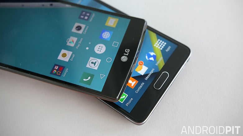
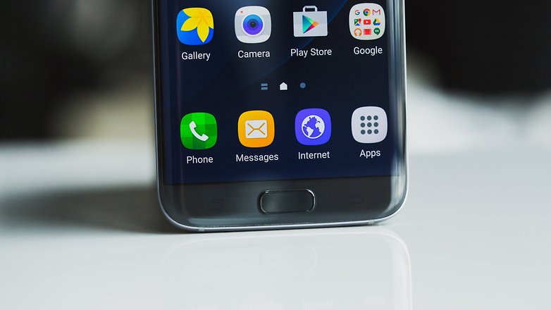
The first setup is a combination of home button and capacitive buttons, as seen on the Galaxy S7. The second is on-screen buttons like we see on the Huawei P9. The third is capacitive buttons. Now, after having used all three, I’m going to argue that capacitive buttons are the most minimal, elegant way to interact with your smartphone.
Who cares about buttons?
Without buttons, your phone has no idea what you’re doing. If there were no buttons, all it could register would be taps, swipes and pinches. A mess of directionless gestures you used to smudge your way through apps and webpages.
With buttons, you introduce order into the Android experience. You can tell Chrome you’d like to go back to the previous webpage, or hold down the back button to switch to the last-used app. You can bring up the app switcher to browse recently-used apps. You can tell Android to return to the home screen, or switch on Google Now on Tap for the few of us who are running Marshmallow.
Buttons introduce order into the Android experience
Whether physical or capacitive, buttons are important and help turn a mess of gestures into a structured set of actions. It’s like a car needs pedals for acceleration, braking and gear changes.
Home button mythology
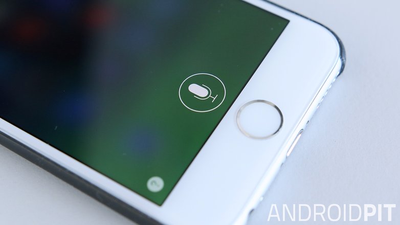
The first widely-used configuration for smartphone buttons came with the iPhone. Aside from its volume controls, all iPhones have one physical home button placed under the display. It allows users to exit apps and return to the springboard, or to access apps such as iTunes with a double-tap, or a long-hold to launch Siri.
The physical home button, as also used in Samsung’s Galaxy S and Note lines, is an interesting design choice. The iPhone introduced a touchscreen with gesture controls and a virtual keyboard to the masses. It removed the need for physical hardware – a mouse and keyboard – to interact with a GUI. But adding a round, tactile button retains a small but poignant link between person and machine. It also enforces simplicity in iOS. To me at least, Apple’s home button is a sort of poetic design choice.
Apple’s home button is a sort of poetic design choice
But is a physical button any better than a capacitive one? I think not. The fact that Samsung has gone a step further than Apple and placed capacitive buttons beside its physical home button – when an all-capacitive setup would do exactly the same job – makes you wonder what Samsung’s design reasoning was.
Defending capacitive buttons
I’ve been using the OnePlus X for several months now. It uses capacitive buttons for navigation, with the choice to use on-screen buttons as well. I’ve also spent quite a bit of time with the Galaxy S6 and its physical/capacitive mix. But I’ve spent the most time with Android’s classic on-screen capacitive buttons, primarily with the Galaxy Nexus.
I have to say, on-screen buttons aren’t so good. At times they even suck. They chew up part of the display and it leaves me wondering – is this necessary? Practically all phones have a lower bezel that could be used for buttons.
Off-screen buttons don’t take up any space on the display. They’re invisible, discreet and don’t lose their ‘clickiness’ after a few months. For me, the only drawback of adjusting to capacitive buttons was that they’re virtual – my fingers want feedback when I press them, just as users of the MacBook enjoy the manmade ‘clicks’ of the touchpad, even though it doesn't actually click. It feels a little strange at first. But this was easily solved by switching on Vibrate on touch in the settings.
With the reliability, minimal design and there-when-you-need-it qualities of capacitive buttons, I'd argue that you should give them a try. You might even realize that it's the best way to engage with a mobile OS.
What's you're preferred Android button setup? Do you like using capacitive buttons? Let me know in the comments.








Your problem begins with the eerie desire for "mininalism" right out of the gate. Everything has to be neat, uncluttered. It's for obsessive women who can't stand any kind of a messy look. The problem is that tech devices SHOULD BE cluttered to an extent, albeit with varying colors and shapes among the buttons.
An intricate interface (unlike the entirely stupid Google Chrome browser design) allows a user to visually negotiate the exact movement before clicking the desired button. Hiding them behind a 3-line menu button WASTES my time. And for what? To look BORING. End of story.
I hate minimalism. And your type has been making it easy for manufacturers to save money while depriving buyers of classy features. Worse, your poll certainly indicates that my take is in the minority. Pity. That's why every laptop for sale during the last 7 years has been a clone of every other one, a keyboard on a blank piece of plastic.
I've steered clear of the last gen phones because of the lack of capacitive buttons. I'm happy to see them make a return on some phones. Also, I like the idea of the physical home button ... BUT, my daughter has shown me the folly! She is always clicking the home button on my wife's phone which turns it on and allows her to access all the basic "emergency" functions. Including making calls to emergency contacts (Samsung S3). I like my HTC with capacitive buttons and dang near impossible to press power button. It's child proof!
I was never a fan of the Home Button on the iPhone, on Samsung (or on any smartphone which copy this scheme).
I like the combination of capacitive / on screen. I preferred the Button Design from KitKat vs everything since Lollipop (triangle circle square - whoop dee doo - doesn't do it for me).
I <3 the idea of being able to personalize and change the look of these Buttons (just as one can change their Smartphone icons, wallpaper, menu, widget, font, launcher, etc). Customize and personalize :-)
Not wanting to sound extreme but i simply hate on-screen buttons, makes the phone look like a cheap video game, hate the geometrical forms.
On-screen buttons are a clever idea but I think in practice they look a bit tacky.
I use Back Button (No Root) by ogapps. It gives me up to four virtual buttons that I can move anywhere,. I can specify a default location for portrait and landscape, specify how transparent they are, resize, them respace them, and more.
Many times I hold my phone upside down so the charging port faces the other way and I forget which end has capacitive buttons are in the dark.
I've stopped using my home button on my excellent Samsung Galaxy S5, I use a app called floating Toucher. This puts a floating button similar to Samsung Toolbox button but with loads more options and customisations. More essentially it has a dedicated home button so I don't need to use the physical home button.
Only time I use it is when Google voice doesn't work and I need to pull up Google now.
I'd prefer touch response captive buttons.
Peace ✌
So you've found another way! Sounds similar to on-screen buttons, but with extra functionality. Thanks for sharing, Mark!
I prefer capacitative buttons as they are not part of screen, placed below the screen. By the way all 3 are interesting & has their own functionality. Actually this article has elaborated these 3 concepts very well.
Apple's button directly close all the activities when you press the physical button, we can't go to previous page there is onscreen option for that which again kills the screen's space. Capacitative buttons are more practical than the remaining options.
Thank you Omar for an article on these 3 concepts.
On screen all the way.
UI should follow screen orientation. It's the actual Android design to use on screen buttons. The buttons often are invisible when the app is written properly.
Makes for a cleaner design and what can be a more compact design.
If you opt for a buttonless interface like PIE there's no left over clutter.
OnePlus ones and two has a choice for capacitive or on screen buttons
I do not like onscreen buttons because I had to put my finger into the onscreen buttons every time the screen there gets greasy and oily and I prefer capacitative buttons over it .Anyways,Nice article Omar!!
I totally agree with you - it can become a greasy mess...
You're touching your screen for most interactions already, particularly typing, which is in the same area as on screen buttons. So this point seems way over-stated or deluded.
currently I have on screen and a app to remove whenever possible...
I'm hoping for a home button bezel free phone design..
so even though I dislike on screen buttons I would prefer very small or none existent bezels and no physical home button..
Capacitive buttons are good if they are backlit. I've been using super-budget fones exclusively and most lack back lighting in the capacitive keys. So I've had to tweak my fones (root it and then change build.prop) to get on-screen buttons displayed. And I've never since strayed down to make use of capacitive keys again.
And the whole argument of on-screen buttons taking space? Well they appear when they need to and hide when they don't. I really never have had any issue. My Sony Xperia L came with on-screen buttons and it had a 4.3 display and I loved it for that and I am still using it. On-screen buttons FTW. Case in point : Google Nexus range.
I turned off the backlight using Gravitybox in all my phones with capacitive buttons! Invisible buttons FTW. It's not like you can't tell where the button is after using the phone for a few hours.
And also, when the onscreen buttons hide, you have to swipe to make them show, and then click to do your action, whereas with capacitive buttons it's always there. You don't need to swipe to show them.
My last phone to have capacitive buttons, I turned off the light until touched. Saved a little battery and was less intrusive on the UI
I agree that capacitive buttons are the best. I started with an s4, then went to a g2, then an m8, and now I'm using a nexus 6. The biggest reason for thinking they are the best is what is stated in the article that it saves screen space. I noticed it especially when I was on the m8 since it had the same size screen as the s4 but with the bottom bar taken for navigation. I also feel that there is too much variation in what apps use full screen immersive mode or not, which leads to visual inconsistency. Another reason not mentioned in the article is that with more and more manufacturers switching to AMOLED panels, the threat of burn in with on screen navigation is a concern. Now most people say that they wouldn't notice a little bit for the navbar, but I don't know why that should be a compromise on a multi-hundred dollar device. Samsung is the king of AMOLED and it makes sense since they use physical/capacitive combination. If an LCD panel like Lg devices (among others) wants to use them, then fine, but I especially don't think that AMOLED devices should be on screen.