OPPO comes up with ingenious software solution to cover the camera hole


Oppo has just patented some interesting functions that he could soon integrate into the front camera of his smartphones located inside the now famous hole of the display. The two new patents were published on January 18 and 22 at the World Intellectual Property Office (WIPO) and show how the camera module can actually become an element of the app's icon.
The first of the two patents depicts a row of apps positioned at the top of the display, with the camera app covering the front camera at the top left. This solution is a surprisingly clever one and the virtual sensor of the icon would perfectly overlap the physical one, thus creating the illusion of being the same thing. In addition, it would appear that the icon always remains in the same position even when switching between screens.
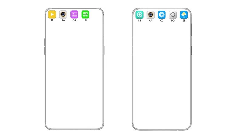
In the second patent, however, it seems that the permanence of the camera app can also be turned off, allowing it to scroll along the display. This seems to be an intelligent way to hide the hole in the display while we are still waiting to see better solutions.
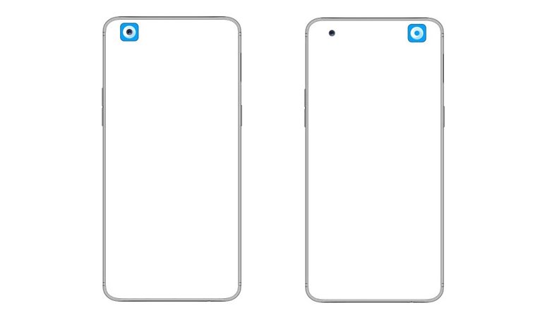
It must also be said that OPPO is not the first to present such an idea. In fact, Samsung has recently patented a similar system, showing how the area around the front camera can show animations, so as to make the sensor less intrusive. It remains to be seen whether any of these ideas will ever materialize.
Which would you prefer more? Or are you against the now-trendy display hole?
Source: Android Authority











Wouldn't it be better to just bring back the bezel?
Simpatic masking method! And even more beautiful would have been to move and hole simultaneously with moving the icon !!
LOL, so their solution is to put icons up at the top, where the notifications typically are? How about just using a tiny bezel at the top of the screen. Personally, I don't think the hole is a big deal, but I guess the fashion/style types do.
That's only meaningful for time spent in the main UI. In app, still a problem.