Poll results: The camera cutout trend is a step too far
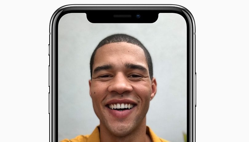

More favorable screen to body ratios are leading to shrinking bezels on the top flagships of 2017, like the Galaxy S8 and LG G6. Once a display becomes large enough though, it leads to the question of where to put the front camera. That's where the controversial notch comes in. Here's what our readers had to say about the camera cutouts seen on the Essential Phone and iPhone X.
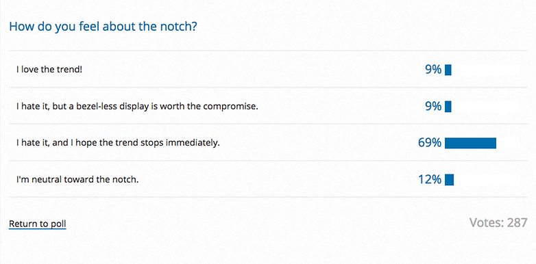
While a lot of people can get behind the bezel-less display trend, the notch may be a step too far for most, as 69 percent of poll respondents said they hate it and hope that the trend stops immediately. Another 9 percent of users also hate it, but think a bezel-less display is nevertheless worth the compromise.
This particular design compromise means that the display wraps around the front facing camera and sensors of the smartphone. From my perspective, it stands out in a bad way, as if someone took a bite out of the screen. Users described it as "deformed" and "distracting" in the comments.
Only a small proportion of users, 9 percent, see things differently and love the notch trend. In any case, most people feel pretty strongly about it, as only 12 percent said they are neutral toward the notch.
The iPhone X and Essential Phone have introduced the camera cutout, or notch, trend to iOS and Android users respectively. With any luck, other manufacturers won't feel inspired by it. And if they do, let's hope they try to blend it in by making the status bar at the top of the display black. In the comments, a couple of users mentioned that they don't mind bezels at all if there's a benefit to them, like having front facing speakers. So maybe big bezels could come back in vogue.
Do you agree with the majority? Why or why not?






It might be tolerable in portait mode, where at least it's symmetrical - the worst image I saw of an iPhone X was a landscape game play screenshot, the Notch intruding into the left side. I don't see how you get used to that.
Intolerable in any orientation..... Would we accept and justify a TV with a similar notch cut into the viewing area!?!? I think not (phones are basically mini TVs)