Round vs square smartwatch designs
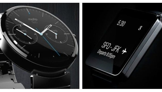

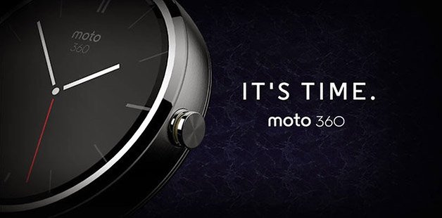
When the Moto 360 was unveiled a couple of days ago, pretty much everyone fell in love with Motorola's sophisticated round watch design. The teaser images were beautiful, that spinning GIF was mesmerizing and well, the thing just looked sexy and classy. The old-fashioned skin made the smartwatch look like anything but a smartwatch, especially because it wasn't a chunky square brick. So what does a round watch face offer compared to a square design?
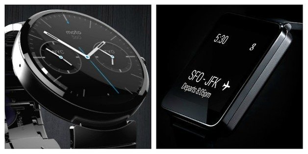
I have to admit, when I saw the Moto 360 my first response was that a round face was an awful display format for a smartwatch. Sure, the Google demo video made it look pretty great, and it is definitely impressive to look at, but what about all that wasted space in the corners that a square watch can take advantage of? When I saw the LG G Watch I thought ''that's it!'' because all I really want from a smartwatch is an unassuming slab of display. But there's pros and cons to both options, which we'll lay out for you below.
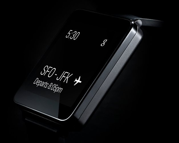
Square face
It goes without saying that the Android platform was designed for a rectangular format. Taking a rectangle and squeezing it into a square hardly takes much imagination where design is concerned, but the square format manages to take advantage of as much screen real estate as possible, and is familiar based on what we're already used to with our smartphones and tablets. Icons can be neatly stacked and notifications and messages are easy to read. But with this familiarity comes a certain sense of boredom.
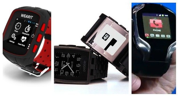
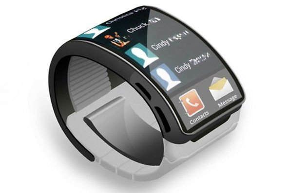
Right now there's not too much going on in terms of excitement or wow factor on a square format smartwatch. Square is basically what we've seen from day one, if you ignore the various fitness bands and the new Gear Fit with a curved AMOLED display. As far as watches go though, square has pretty much become the standard format and while it clearly works for obvious reasons, there doesn't seem to be too much innovation going on for the format. At least not yet. Add to this the fact that pretty much every square format smartwatch sticks out like crazy as a smartwatch – they always make me think of calculator watches from the 80s.
Round face
Clearly the engineers at Motorola decided it was time to think outside the box, seeing that the box is square, and come up with something entirely original. So they decided on the bold move of making their first smartwatch with a round design, and the initial response seems to be that consumers can't wait to get their hands on it. Beyond the novelty factor, the Moto 360 design is the first edge-to-edge smartwatch we've seen too, making the interface pretty much everything. The display looks expansive rather than cramped and a circular watch, especially with ''real-world'' skins could easily pass as the modern timepiece Motorola are so keen on.

A circular format offers up some pretty interesting possibilities too, some tied to convenience, like using a gyroscope to rotate the display to a workable orientation no matter which way you have the watch held, and others just on an interface level – all of a sudden the opportunity to animate traditional watch functions appear. I for one love the circular loading animation demoed in the developer preview video when a message is sent. I was also happy to realize that the Moto 360 format doesn't lose the corners, but extends beyond those corners – if you look closely at the pictures you'll see that the Moto 360 display seems capable of swallowing up the G Watch's screen.
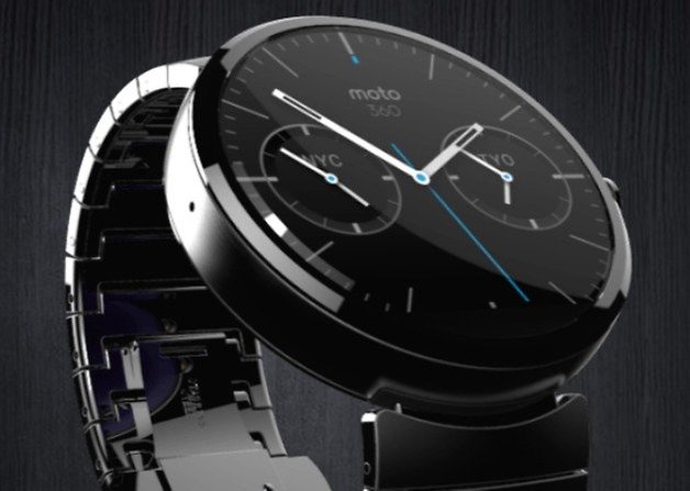
But there's also some issues. If the face is capable of being rotated on a software level, what happens with the flat bezel on the bottom, which most likely houses the various sensors? We're also going to need a new pixel measuring standard for circular devices and it seems likely that many developers will simply expand their square-format apps outwards for a round design, which will hardly be optimizing the space available. The alternative is that square format apps will simply become cropped versions of the round app. And notifications and messages are always going to be centered, which means there's likely to be that wasted space issue anyway. It will probably take some time for the full impact and possibilities of the round format to be felt by users, but there's pros and cons to every new development.
What comes next?
Whichever format you prefer, the simple fact remains that with Android Wear, Google has pretty much colonized the wearable space. It seems pretty unlikely that the Tizen horizon will arrive anytime soon, especially when you consider that Samsung was listed as an Android Wear partner in the various press releases, and it will be very hard for smaller forked versions of Android to compete against the Google juggernaut now that it has set its focus on the wearable world. I can't wait to see what incredible new applications appear to take advantage of the new platform (that are not simple ports from standard Android) and especially for the new round format, which I think, ultimately, has more room for innovation.
Which style display do you prefer? What possibilities can you imagine for a round format?





Apparently LG have said they will consider releasing a round format smartwatch in future too, so it seems they're paying attention to the response. Despite the near universal preference for the Moto 360, our survey brought back a pretty close race with the round format only just pipping the square.
I prefer round, some square\rectangular look ok BUT the LG G looks like an EE senior design project in a Radio Shack case (yuck).
I really like the look of the Moto360, it looks classier and a lot more sleek and sophisticated than the likes of the Samsung Gear, LG G Watch (the best looking of the square format in my opinion), Pebble etc. I'm still not 100% convinced that I will buy a smartwatch, I've been toying with the idea on and off for quite some time now, nearly brought myself a Pebble and then talked myself out of it. I don't wear a conventional watch anymore as 1) I have a habit of hitting them on things, 2) I have a habit of taking them off to shower or go to bed and forgetting to put it back on for like a week, 3) Since my phone goes everywhere with me I just check the time on my phone.
I like the round watch.
For me, the round option is timeless, compared to the square one's witch for me looks like something from the 80's. Square design is pretty much outdated if you ask me.
What they miss in the round design, is some colour variants for the ladies.
I would like to think, that a type of subtle, almost transparent palette of reddish, green and yellow colours would suit the ladies well.
Such a type of colour, that would allow you to see a slight hint of the material, in wich the product are build from.
well both dont look bad and if properly dont both can be pretty nice, but probably the main point is that you should make smartwatches unexpensive so that ppl can buy it before thinking too much about design which would swallow too much money...
I'm gonna guess the G Watch will be Nexus-priced and come in well under $200. The Moto 360 on the other hand... I'm kinda getting a ''premium'' pricing structure vibe for that one. I wouldn't be surprised if it's $400.
Even more than samsung? I can't rly imagine that, especially considering Motorola's situation...