Why the strange notch on the Pixel 3 XL isn't all that bad
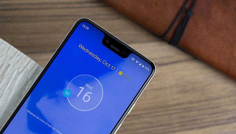

It's impossible to talk about the Pixel 3 XL display without taking a moment to dwell on the huge notch. I have seen and heard people complaining about it endlessly in the past couple of weeks, but I wanted to take this opportunity to offer my personal two cents. Let's take a closer look.
A short introduction
I'll start with the fact that notches have never really bothered me (except on the P20 Pro because of the thick upper bezel, but I have my personal reasons for that). The indent on the Pixel 3 XL display is quite broad, but you won't find yourself noticing it much during daily use.
After a few minutes with the device you'll forget that it's there, as is the case with many new smartphones that have a notch. You'll only really notice it when you watch videos or when gaming in landscape mode. But don't worry - videos and games won't be covered up by the notch (unless you manually zoom in while using YouTube).
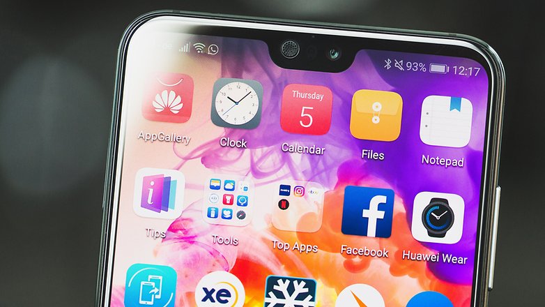
The notch in numbers
With this 9 mm indent in the display, the Pixel 3 XL takes home the award for having the largest notch of 2018, but I feel compelled to present another side to the notch argument.
First of all, it is less ugly in person than it looks in photos. You cannot fully understand this unless you've actually held the device in your hands. The slim bezels on the sides of the display are nice to look at and have actually improved the device's appearance compared to the Pixel 2 XL. The lower frame, on the other hand, is somewhat larger and you unfortunately can't get rid of it.
But to get back to the raw numbers, the display area occupied by the notch on the Pixel 3 XL is only 2.3% of the total, which isn't that huge of a number. The iPhone X and iPhone XS, for example, have a shallower notch that takes up 2% of the total display. That's not so drastically different, is it? Of course, Google and Apple use completely different approaches.
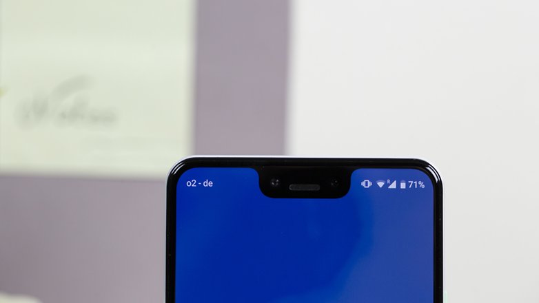
Wide and thin vs narrow and deep
Google has decided to keep the notch as narrow as possible in an effort to preserve space for the many icons that populate the Android status bar. The inclusion of 2 front cameras and a powerful speaker certainly played an important role in Google's design choices. However, the benefits from this choice are, in my opinion, more important than any 'annoyances' that the notch might cause.
Apple, on the other hand, uses a thinner and wider notch, which has allowed them to include the necessary hardware for FaceID, and to remove the display areas on either side of the notch, which in my opinion, makes it even harder to manage software. This means that Google has a wider viewing area on the sides of the notch, compared to other manufacturers. And although they might not be utilizing this extra space efficiently right now, there could be benefits to it in the near future.
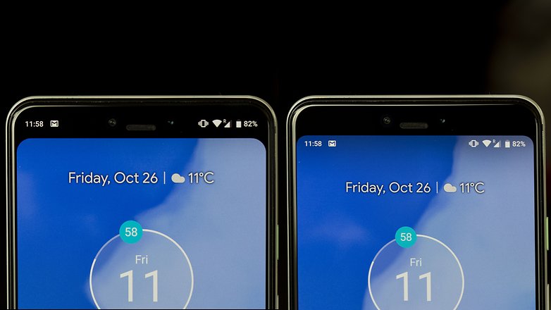
But the choice between notch or no notch is personal. If you just can't stand it, I would recommend buying the smaller Pixel 3. Yet, if you don't want to give up on the large display, you can also hide the notch via the Developer options or by using a handy app called Nacho Notch. The app was perfect when I first used it (although I don't use it much anymore).
What do you find most annoying about the notch? The shape, the size, or its existence itself?





lol it's this article that's annoying. you're basically telling everyone they're wrong. well, they're not. it's objectively poor use of space and displeasing to the eye. google's design team screwed the pooch on this design and it should be noted so they don't do it again. i was actually getting close to buying a pixel... until i saw it.
Not everyone. Only about half