WhatsApp comparison: iOS vs Android


The iOS version of WhatsApp has just received a significant update that brings it in line with the same design changes that arrived in iOS 7. We’ve taken this update as an opportunity to make a comparison between the iOS and Android WhatsApp versions and to see which one looks better.

Chat Overview
The iOS and Android version of WhatsApp are built pretty similar. On the far left, the profile picture of your chat partner is displayed along with contact name and the date of last message. Under the name is a short excerpt from that last chat message received in that conversation.
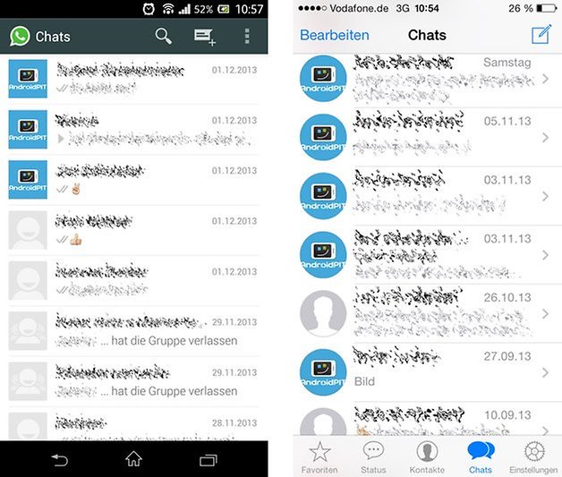
The major changes between the chat overview lies in the design and visible elements. While the iOS version looks much more sterile due to the choice of color elements, options such as contacts and settings can be accessed right away from the lower navigation bar. With Android, these are hidden behind the menu in the action bar.
Chat Window
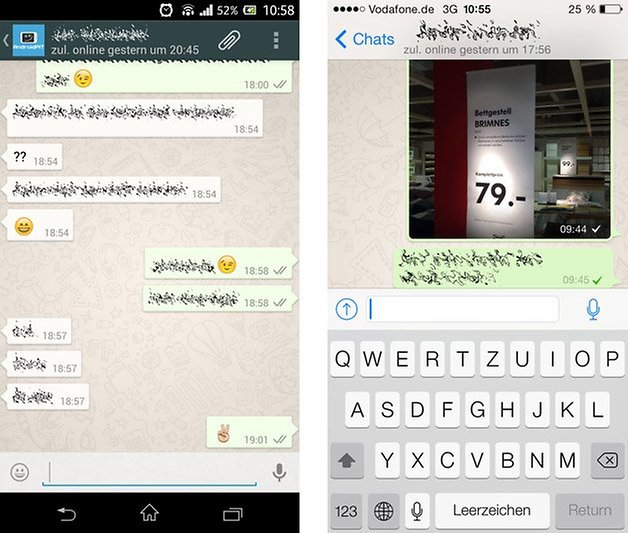
Again, there are only minor differences between the chat windows. The actual chat looks relatively identical and only the representation of icons and speech bubbles vary slightly. The button to attach files has been moved down to the text bar in iOS while that’s the area where the emoticon symbol is at for Android.
Selecting contacts
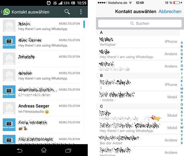
WhatsApp in iOS has grouped contact alphabetically and is easy to manage for direct access, enabling you to jump right to a certain letter when looking for a contact. For Android, WhatsApp doesn’t offer this option unfortunately and all the contact appears one after another, which at times can be a little overwhelming.
Notifications
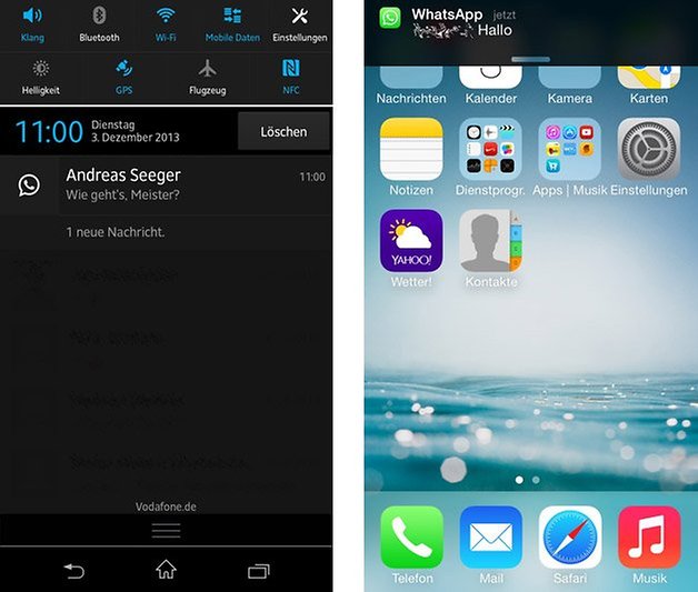
Whether in Android or iOS, there is no interactive button that allows you to reply directly to messages outside the app. Taping on the notification itself merely results in the app firing up and being able to reply from within WhatsApp. Android does have a small advantage here though, as it provides a little bit more information provided when in the notification bar.
Settings
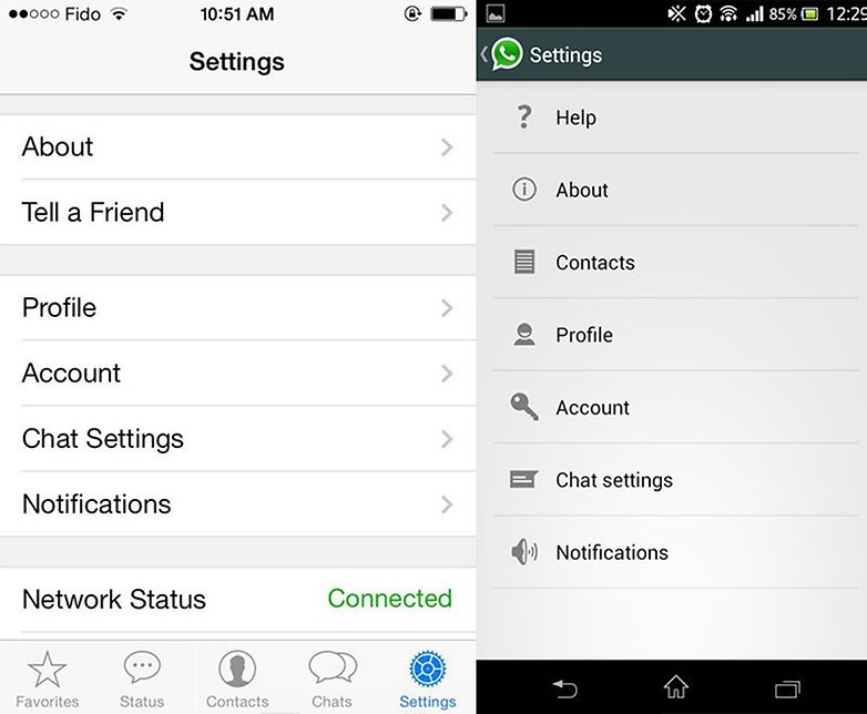
The iOS version of WhatsApp has it’s setting grouped based on type and allows a little bit more intuitive navigation to the settings of your choice. However, the Android version has small icons to the left of the settings that allow a quick visual representation of what you’re looking for.
Conclusion
Virtually, the iOS version of WhatsApp has been given a new look based on the design choices behind the latest iOS 7 version. The Android version of the popular messaging app is based loosely on prevailing design guidelines that are found around the Android app atmosphere, however, this could be polished quite a bit from what we have right now. Fortunately, there are a numerous amount of fan mockups of a redesigned WhatsApp that are more appealing to the eye, including this one by Nadav Fima. Hopefully the WhatsApp designers will take note when they do the next Android overhaul of WhatsApp.












Why is not possible to save audio files in Whatsapp (iOS version)? If its possible, then how?
Whatsapp developers are just sitting back and relaxing. User interface needs a do over. Much better looking messaging apps but because it's so popular they just think it's fine as it is. Also having no tabs to switch between chats and contacts makes navigation really difficult.
Is there any API for whatsapp that we can use to build some specific design? I used the mockups of Nadav Fima but, I'm not satisfied with that, it not the same as it was on your iPhone, or Samsung phone.