2018 is the year to love and hate the notch
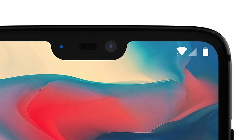

Love it or hate it, but maybe that’s not quite the case. Two events in the past days have shown that enthusiasts have made up their minds: the notch's takeover of smartphone displays is evil! There have rarely been discussions about the matter, some arguments have been exchanged. But now things are getting uncomfortable for manufacturers.
Let’s start with LG
There was something curious on Reddit. An account name LG_Support asked users what they thought of the notch. The account was supposedly verified, which turned out later to be unsubstantiated: one moderator admitted they were “bamboozled”: nothing was official and the verification was apparently fraudulent. You can find more details at AndroidPolice.com.
You can still read the answers from users, which show that they aren't in favor of the notch.
Change of scenery: OnePlus
OnePlus co-founder Carl Pei said “learn to love the notch”, without the tone of voice appropriate for a company that is conscious of its community. What happened? OnePlus organized an interview for Pei with Verge journalist Vlad Savov, who had spoken out against the notch in an article. In the article, Pei talks about the motivations behind the notch.
The article doesn’t quite show whether Savov follows the argument, but afterwards he speaks less ruthlessly about the notch. And Pei? Whose reasoning persuaded a Verge journalist? He had to swiftly delete a tweet, because it was clear pretty quickly: OnePlus users don’t want to learn to love the notch.
And now?
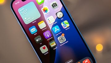
Two examples that illustrate one thing: The notch is unpopular among users. I confess that I myself am rejecting the notch. I'm struggling with the smaller space in the notification bar. I feel like the cutout ruins the symmetry of the display. I'm struggling with the fact that the notch makes the device seem like a thinly veiled copy of an iPhone. It pains me to read notch comparisons.
Manufacturers relying on a notch will have a hard time this year. Huawei has already been experiencing this: many comments in our first review for the P20 Pro contain a more or less negative sentiment about the notch.
It’s clear that the first user feedback will be more negative, especially from users of notch smartphones. And their criticism is justified: we lost the battle against built-in batteries, and our fight to keep the headphone jack. And now it’s the notch.
Some hope remains that manufacturers will learn from this. To respond to Carl Pei’s tweet: It’s not the users who have to learn to love, it’s the manufacturers who have to learn to forget. Forget the notch.
But let’s hear what you think! What could inspire you to buy a device with the notch?





The LG V20 actually has a notch even though it has bezels. The "second screen" really isn't a separate screen at all. That portion of the screen just works independently from the rest of the screen. You can see this when you turn the phone on. It all appears as one screen and there is a notch in the upper left corner for the front-facing camera and the sensors.
The second screen provides access to recently used apps, controls for the music player and notifications. It looks a lot better than the notch in the middle and does something useful.
I don't know if LG has a patent on this. They could use this on their phones and it would definately help their sales. I would rather have a bezel than that ugly notch any day but if it has to be there, put it off to the corner.
Tell us what the notch is used for, and maybe we can then comment on its usefulness... ... ...
The notch Sucks !!!!
Don't worry. As soon as Apple gets rid of it, possibly this year, Android will too..
It's certainly looks bad and like weak design. Most of them are very large and intrusive. These designs are probably better off with a larger bezel, maybe domed or angled like a roof. But everyone's too afraid of the form factor and that the rectangle is holy.
From what I read hereg and on other sites it sounds like a lot of users string up of ton of notifications in their notification/status bar. That would be awkward with the notch. However I have a notch phone,the essential ph1. I turn off most notifications because most of them are just noise, not useful. Lots of them are just ads. The notch on the phone is truly minimal. It doesn't interfere with the function. It looks stupid, but the function bears it out.
The notch is only temporary any way. We'll soon design right past the need for a notch and have displays that cameras, sensors and finger pints can function through. I can live with a temporary design weakness that actually increases function and minimizes bulk.
I'll stick with Samsung, the most feature packed and NO ridiculous notch!