[Hands-On User Review] First Look at Samsung Galaxy Nexus with Ice Cream Sandwich
![[Hands-On User Review] First Look at Samsung Galaxy Nexus with Ice Cream Sandwich](https://static.npstatic.com/img/article/hero-fallback.jpg)

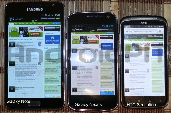
Here at AndroidPIT, we're lucky to have some very well-connected users. One by the name of Stefan T. had the good fortune of getting his hands on a pre-production model of the new Samsung Galaxy Nexus with Android Ice Cream Sandwich. He had a chance to play around with the device and record his thoughts. Here's what Stefan had to say about the newest Google-built smartphone:
Look and feel:
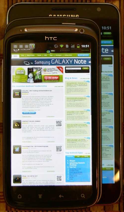
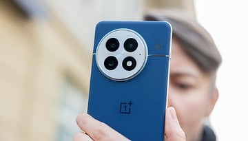
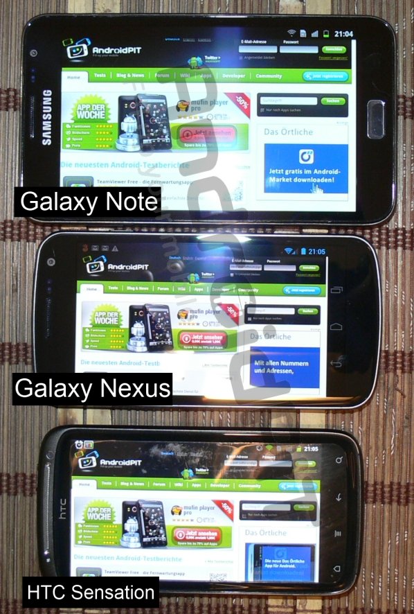
My hands loved the Galaxy Nexus. With a rubberized back, the phone feels secure in your palm. With a screen size of 4.65 inches and 1280x720p resolution, it is anything but small but still feels easily pocket-able. Once the phone is in the hand, it's really hard to let it go.
Ice Cream Sandwich:
When you first turn on the Galaxy Nexus, a blue and very appealingly-designed homescreen appears that feels very clean but it seems somehow different from the one with which we're accustomed. What is happening to my beloved Android? Where is the menu button? Where can I find the settings.
Yes, ICS is new. However, it won't feel new to anyone who has ever used Honeycomb. However, the new Android is much easier to use. My initial impluse is to install a new launcher whenever I buy a new Android to replace the stock – and often boring – standard one. But ICS's launcher leaves little to be desired. In ICS, users can arrange their apps in folders on the mainscreen. But these don't look like your standard folders: they've been redesigned to show the contained apps at a glance. You can even place a folder in the launch bar at the bottom of the screen.
Now you may be asking yourself where the menu has gone. To access the menu, you now need to go to the notification bar. In my opinion, everyone should be able to navigate the black and blue redesigned menu with new typeface. The division of sub menus is similarly easy to understand.
The notification bar looks quite spiffy with its semi-transulecent background.
Google has probably noticed that the long tap (to select recently-opened applications) is often error-prone and now, when you're in an app, you can see the long tap next to the three buttons (back, home and active applications); they've added a button with three small dots that performs the same functions.
The new Android Market should be familiar to most of you by now. As far as compatibility is concerned, some apps tend to force close. However, I hope these bugs are fixed when ICS is officially launched.
Altogether, one can say that everything works well together and you can also really feel the power of the dual-core processor. Rapidly switching between apps is no problem.
Display:
Google has got everything right here. Sure – at 4.65-inches – the screen could be qualified as "unusually large." But compared to the iPhone 4(S), the Nexus display just looks right. It's actually the best looking display I've ever seen on a phone!
Processor and Battery:
To test the battery life I streamed content live over 3G for an hour. My data bill suffered but my battery did not! The Galaxy Nexus still had 62% juice left! In my opinion, that's quite impressive. Despite the demands of dual-core processors, the battery still lasted well through a day even when pushed to the brink.
As for the processor (as I menitioned shortly before), no matter which app you open, all of the animations run smoothly.
Camera:
I think the camera is one of the best I've ever seen in a smartphone. Auto focus actually works! And the camera is quick to take photos in succsssion. Panoramic function is built into the software. The numbers alone might not make it the best camera phone on the market but the pictures speak for themselves.
Here are some pictures and screenshots for you to check out:
Related:
[Hands-On Video] iPhone 4S vs. Galaxy Nexus in Camera Speed Test
Samsung Galaxy Nexus vs. Samsung Galaxy Note: Which is the Better Smartphone?
[Infographic] The Evolution of the Google Nexus
Source: AndroidPIT.de
