Android 12 has everything I expect from an operating system. Here is why
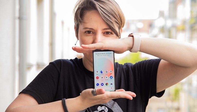

What can one expect from a mobile operating system? The answer to this question can vary from person to person, and in my case, it is based on three points: speed, consistency, and reliability. For a long time now, Google's operating system did not fulfill these three requirements for me. However, Android 12 looks set to change all of that. Find out why in this article.
First, I must make a disclaimer that this is not a review of Android 12 beta (SPB2.210513.011) because it would be unfair to evaluate the new features that arrive on the latest version of Google's mobile operating system based on an unstable version that remains under development. Moreover, some of the features announced during Google I/O 2021 are not available for testing yet, as is the case with the new widgets.
Not having the chance to use all of the features was one of the reasons that made me postpone this post because one of the features I most looked forward to was the Privacy Panel, which was only released in the Android 12 2.1 beta.
The main intention of this article is to show just how far Android OS has come, arriving at the point of its greatest maturity and consistency since the first release. In short, Android 12 is everything I expect to see and use in an operating system.
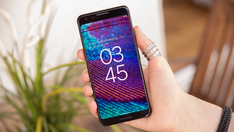
Speed: 22% optimization of the main system services
One of the first apps to receive Android 12's splash screen animation was Google Drive. With this, the experience of launching the app on a smartphone has become smoother. In addition, Google claimed that this is also attributed to a faster response time based on the operating system's optimizations.
Google's vice president of engineering, Dave Burke, mentioned that the Android 12 team made "significant and deep investments in performance". This was possible by reducing the CPU time for the main services of the system by 22%. On top of that, we also get to enjoy a more efficient use of Android's power due to the reduction of large core usage by the system server by another 15%. In other words, apart from having a faster smartphone, you will be able to use the device for a longer time before having to charge the battery.
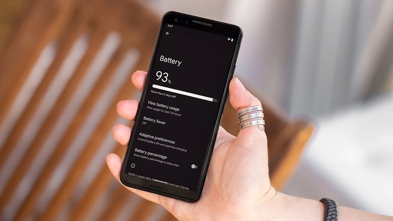
And it is important to say here that this doesn't just apply to high-end smartphones, as any model which runs on Android 12 will deliver a more fluid experience. Which, let's agree, is really important for a system that runs across a wide range of smartphones.
As mentioned above, I'm using the beta version of Android 12, which should not be subjected to any final judgment when it comes to performance. However, I believe that the animation and transitions in the mobile operating system serve to make the experience a more pleasant and fluid one.
In this sense, Google has brought about some improvements regarding the startup time of applications, providing the operating system with enough time to load an app before the notification appears on the notification bar of the device.
This was made possible by restrictions on notification springboards, which reduced the latency of apps launched from a notification. In other words, when you click an action button from a notification ("view" or "reply") pane, the time to arrive at the specific screen in the app is shorter in Android 12. According to Google, this change resulted in the Google Photos app loading 34% faster compared to Android 11.
TL;DR: In general, whenever an operating system hits the market, the goal is to be faster compared to its predecessor, among other things. In this sense, Android 12 brings about significant changes for both the developer community and for Android smartphone users, as it optimizes people's experience by decreasing the loading time of services, reduces CPU time by 22%, and yet still manages to offer a greater battery life for the hardware - whether it is mid-range or flagship devices.
Consistency: Material You integrated system-wide
For a long time now, Android's developer team has acted conservatively when it comes to the operating system's User Interface (UI). On the one hand, this offered a world of possibilities for Google's manufacturing partners, such as Samsung, which with their own OneUI was able to redesign Android and make the UI experience a unique one.
However, the so-called pure or stock Android, the version that runs on the Pixel range, has changed a lot with the new Material You design guidelines. From system settings to the smartphone's wallpaper, we now have a greater integration of colors, shapes, and functions.
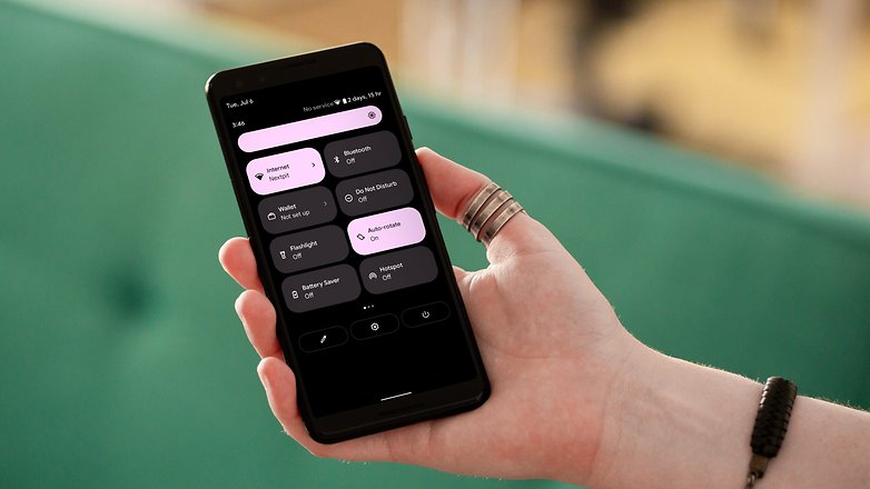
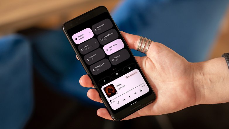
This way, when changing the wallpaper, the system-wide color palette changes by default based on the brightness of the wallpaper tones in order to offer more or less contrast. Also, the quick shortcuts that are shown in the notification bar will take up a larger percentage of the screen in order to offer a more intuitive visual experience as and when required, such as activating airplane mode before a flight.
Small, minimalist icons have also given way to a more consistent experience with the smartphone's features. The same can be seen in the shortcut to shut down and restart the device, as well as the layout of the button to increase and decrease the volume. Everything is bigger and, even for a minimalist person like me, it simply looks better.
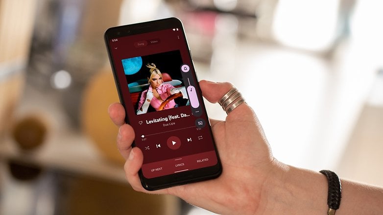
The same can be said for notifications, which take full advantage of the greater contrast provided by the system colors. Thus, this allows one to distinguish between the subject of the notification or even the application that demands your attention.
And this system integration isn't just visual as the one-handed mode, a long-awaited native system function can be activated from any screen via a simple gesture in the navigation bar. And the best thing about it is, you can do so in an intuitive, simple, and functional manner.
The presence of widgets also promise to make your smartphone more attuned to your usage pattern. For a long time now, Android remained in the comfort zone of manufacturers' interfaces or was dependent on the creativity of its developers. However, with Android 12, Google is taking responsibility and once again, after a while, has rethought this feature.
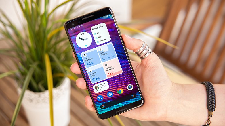
The widgets in Android 12 rely a whole lot on customization, as they offer a variety of shapes and colors for you to find the best match. More than that, the features can finally be adjusted to people's daily lives, such as the dedicated widget for conversations (Instant Messengers).
Personally, I'm not a fan of keeping WhatsApp open all the time, especially since the app insists on letting people know whenever I'm online. Hence, a widget that offers me an exclusive space for my main chats can even change the way I interact with selected services on a mobile platform.
TL;DR: From the smartphone's lock screen to the wallpaper, and to the quick shortcuts to access information that really matters to you, Android 12 has taken a leap in quality with Material You. New shapes, color sets, and features with "one-handed mode" have made the OS more intuitive and thus, more consistent. For the first time in many years, it seems to me that the Android development team has decided to make things simple but with a great impact to people's lives.
Confidence: You control your smartphone's resources
It has been a long time now that I have lived with Android's shortcomings, as I have always found a way to get around the lack of features and the dodgy security and privacy issues that are present in Google's ecosystem. However, the funnel was narrowing and, soon after purchasing an iPhone 11 Pro Max, at which time all issues regarding privacy took shape in the form of an online discussion, the distance between iOS and Android felt all the more real.
Well, that was until Google I/O 2021 happened!
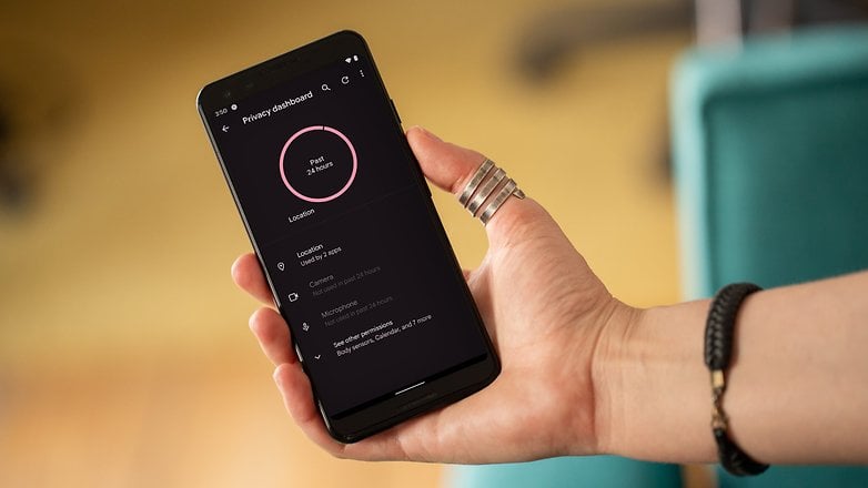
During the time I used the preview version of Android 12 for developers, the Privacy Dashboard was still a rumor. The same goes for notifications of hardware resource usage by apps and the location permission pop-up. However, these three features are now available in beta 2.1 of Android 12, and I must say that the delay in delivering these features was well worth the wait. The Google team has nailed these features spot-on!
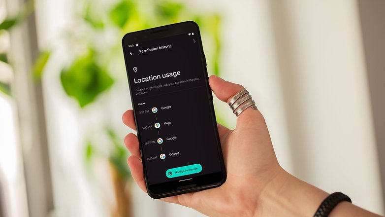
I'm not going to lie, with app permissions and personal data mining becoming more and more obvious and rampant, I've started disabling location permission for most apps on Android. Also, apps and services that required deep layers of permissions to access my smartphone's resources have been uninstalled within minutes. Privacy is a very relevant issue to me, so much so that my relationship with most services offered by apps can be said to be precarious at times.
However, the Android 12 Privacy Dashboard is able to compile mobile resource usage information by app, service, and access time. If you normally use the Digital Wellness feature on your Android handset, you would like to know that the experience is very similar. However, instead of identifying the amount of time that you devote to an app during your day, it shows the timestamps whenever a service took note of your location, microphone, or camera. Nifty!
More than that, it's from this dashboard that you can quickly remove permissions and check out just which apps have shown suspicious behavior. And that provides people with enough data to judge whether to keep an app installed on their smartphone or not.
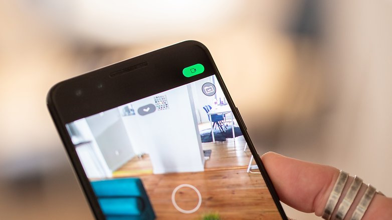
In conjunction with the Privacy Dashboard, Google also delivered a feature that had become practically legendary on Apple devices (and Xiaomi before it): providing a visual sign each time a hardware feature is being used. So if a background app activates the smartphone's microphone, Android 12 will inform you right away.
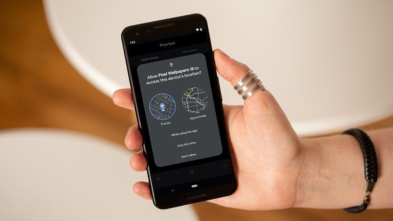
Last but not least, Android 12 is more transparent about the use of your location information. Now, whenever an app demands access to such sensitive information, a dialog box will identify what is the difference between precise location and approximate location. In other words, you don't need to give Google's Wallpaper app your precise location for the wallpaper to understand if it's night or day, as long as it knows you are in a particular region. However, to call Jack, it might be good to know that you live in a particular street with a specific house number.
TL;DR: Android 12 is more transparent about which mobile resources are being used by installed apps. It also explains how certain services can use selected hardware components better, providing us with an overview of what happens in the foreground and background based on the Privacy Dashboard. The result? A greater degree of confidence when using the Android mobile operating system.
Why is Android 12 everything I expect from an operating system?
For some people, Android is the best operating system in the world, while the answer would be iOS for others. Some might prefer Samsung's UI, others prefer Xiaomi's UI, and different folks might lean towards Asus' UI. Three years ago, I chose to use Google Pixel smartphones, where after the Pixel 3, I moved on to the Pixel 5. I'm really happy with my choice so far. On the other hand, I also own an iPhone 11 Pro Max that has expanded my understanding of mobile software.
The so-called pure Android or Google's Android, has always been very practical and functional, without many native (or thought-provoking) customization options. This has changed with Android 12, where for the very first time I feel that Google is taking more risks with its operating system and have listened to its users by rolling out a great stock Android experience.
Doing so also narrows the gap between iOS and Android, though truth be told, both Apple and Google are responsible for this situation.
Once again, what can one expect from a mobile operating system? Speed, consistency, and reliability. And that's Android 12 for me!
Now it's your turn: does Android 12 offer everything you expect from an operating system? I'm really curious to know what you think about the latest Android version.


