iOS 7 vs. Android 4.2: Head-to-Head in our Comparison


Apple has given us a taste of their newest operating system for their mobile devices, such as the iPhone, iPad and iPod. While Android. Here's a comparison between the two operating systems as they stand today.
Lock screens:
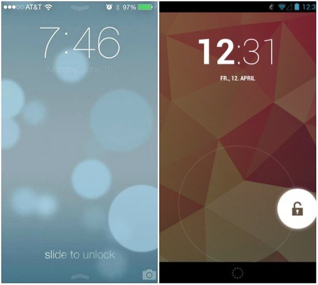
The lock screen from iOS 7 and Android have a similar look to them. At the top, the time is displayed in a large, easy to read font. At the bottom of the screen is an area for gesture based unlocking. Main difference between the two operating systems is that for iOS, you unlock via a sliding gesture and for Android it's with a ring menu.
Home screen:
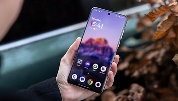
Comparing the two home screens is a little hard to do, despite the recent changes to iOS 7. On the Android side of things, you have a very interactive and dynamic screen where you can store widgets (which in themselves can be interactive), add app shortcuts and folders to your home screen. At the bottom of the dock, you have the ability to store shortcuts or folders that are always displayed, no matter which home screen you're on.
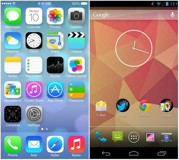
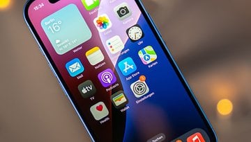
iOS doesn't have compatibility for interactive widgets or an App Drawer. While being organized in a grid manner, the icons of applications are a little bit bigger than those on the Android and are all the same shape. A dock bar is also available which displays a set list of applications across all your home screens. You also have the ability to create folders for applications on iOS 7 and Apple has done away with the limit on how many apps you can within a folder in this update.
Control Center:
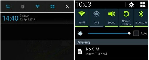
One of the long anticipated changes coming to iOS 7 is the Control Center. Personally, I had long ago jail broken my device just so that I was able to access these types of features quickly and easily, without having to resort to going through a maze of settings and options just to turn on and off my Wi-Fi. New in the update, the iOS 7 Control Center is accessed by a quick swipe up from the bottom of the screen and gives you access to a bunch of different option that you can control by quickly tapping on them. Changing your brightness, access to your music player, quick launch of apps, among many others are now available easily and seamlessly. Siri now also understands commands having to do with turning on and off certain settings as well.
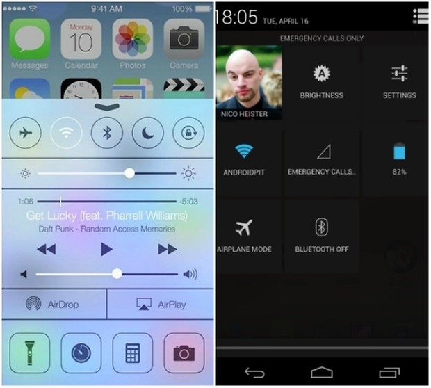
The Quick settings in Android were introduced in version 4.2 with the notification bar at the top of the screen. The functionality is still pretty limited with what you can and can't do within them. However, this can be solved through the addition of more features with custom ROMs or manufacturer ROMS, such as the Quick Settings in Sony devices and Samsung devices.
Notification Center:
Now, from the lock screen (or home screen) you can simple drag the notification center from the top of the screen down to see events, news, notifications, etc in the new iOS. From what we can see, these are organized into three categories: Today, All, and Missed.
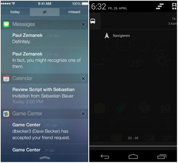
On Android, you access the notification center in the same manner whether you be on the lock screen or one of your home screens. However, one of the main differences is that the notifications aren't sorted into different categories. Apart from that, the main difference lies in the choice of style and colors between the two: iOS relies more on transparent and brighter colors, where Android prefers a darker style.
Multitasking:
Much like the Palm webOS that revolutionized multitasking in 2009, it seems that Apple has borrowed the same concept for their new OS. In their updated view for multitasking, you can swipe horizontally between thumbnails of your open apps, given you a quick view of what is open and what the app is currently displaying. You can easily close apps as well now by just simply swiping upwards on the selected application.
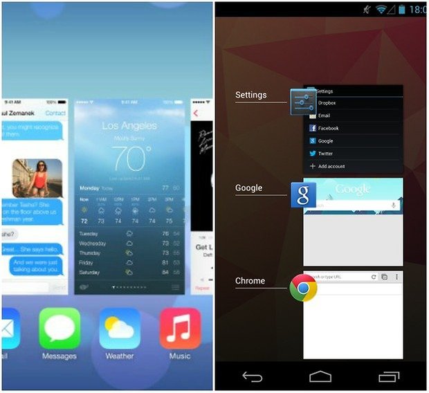
Android has had a similar concept since version 4.0. However, the way it is presented is a little bit different. The list of open apps is shown in a vertical manner, allowing you to see a bit more "cards" of open applications at the same time giving you a better snapshot of what's currently open/running on your device.
Conclusion:
As someone who uses both operating systems on an almost daily basis, it's refreshing to see that both operating systems are starting to get back on par with each other. Sure, Apple has definitely copied some of the more popular features and looks from the Android operating system, but also has taken some inspiration from others as well: notably Windows Mobile and Palm webOS. And while some may argue that Apple has taken a huge artistic liberty when "copying" other systems, it's important to note that it happens across all systems with each borrowing innovative ideas from each other, expanding on them, and then making them their own.
I look forward to being able to try out iOS 7. From the redesign of the UI to some of the "new" features that will be provided with it, I think it's definitely a step in the right direction for Apple, and hopefully, for Android as well. But, as with most things Apple and with what was apparent during the WWDC keynote speech, they really need to tone down their aura of self-importance and trying to reveal everything they release as being "ground-breaking". Sure, iTunes Radio is pretty neat service to get into, but Apple, don't kid yourselves, this is by no means something that has blown us out of the water.
Source: DroidLife






Not bad, just don`t like the pastel colors
I hear you Bojan, the biggest gripe I have with iOS is how locked down everything is. Even with a jailbroken device, it still feels like I can't do what I want with them. Since using Android and flashing my own ROMs, it's been a refreshing experience to be able to customize my devices to what I want them to do.
Lame. I get it that people using iOS see this as a big improvement (but actually not, there are criticism everywhere, quite amount of it) over what is available to them right now, but that is lame to begin with. It may be a matter of taste, but now that I'm on android, I won't be going back. It's simply uncomparable experience.
Edit: forgot to add - apple so full of themselves, again, it's actually getting funny, but it's sad.
Definitely a step in the right direction. I like the look. Now I just need a hands-on experience to really know how it is.
iOS 7 was the overhaul that Apple needed to do .... is it Android? No, but I do feel that Apple has taken notice of what Android OS has done since 2012 ...