Android Lollipop vs Android KitKat comparison: what's different?
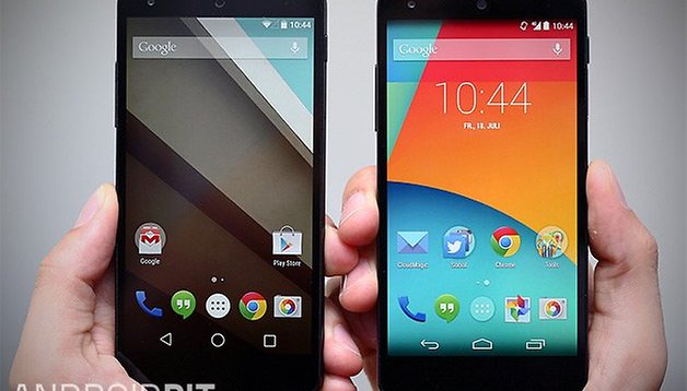

With Android 5.0 Lollipop finally arriving in a polished version, we thought it was time to take a look back at the version that was: Android 4.4.4 KitKat. Now, we know that some of you without Motorola or Nexus devices may still be looking at KitKat longingly, but this Android Lollipop vs Android KitKat comparison should give you an idea of what's to come and what's to come next. We compared both versions on our trusty Nexus 5.
- Android 5.0 Lollipop update: which devices will get it and when?
- Android 5.0 Lollipop features: 5 that will change your life
Holo vs Material Design
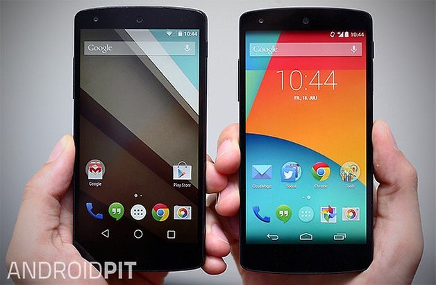
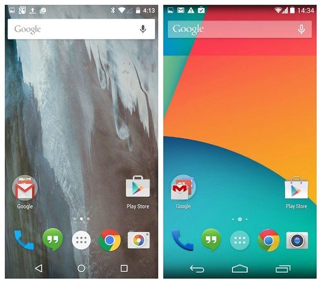
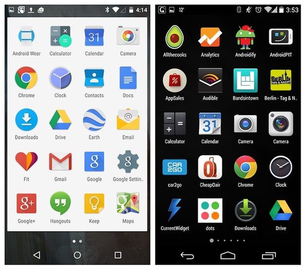
This is the single most visible difference between the two versions of Android. Holo, introduced way back in Android 3.0, has legions of fans. Holo was clean and minimal, but perhaps a little too black and boring for everyone’s tastes. Material Design represents the pendulum swinging back the other way so far that it almost looks like iOS. Bright colors, super flat, card-based design and animations everywhere make Material Design the single most recognizable OS version around. We just hope you like it.
Lock screen all the things!
Android 5.0 is much more geared towards multitasking and convenience than any other version of Android before it. From personal unlocking (which lets you pair trusted devices like a smartwatch to your phone so you can bypass any lock screen security you have set up if you're wearing a trusted device) to notifications and quick settings accessible from the lock screen, Lollipop has it all at your fingertips. While KitKat had a camera shortcut on the lock screen, Lollipop goes one better and adds a dialer shortcut too.
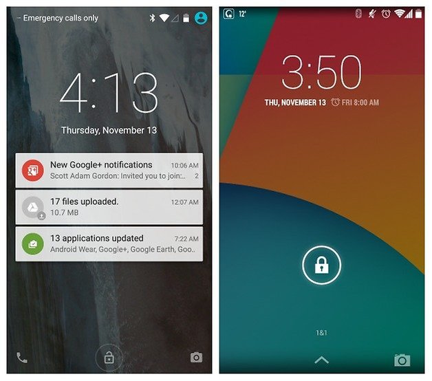
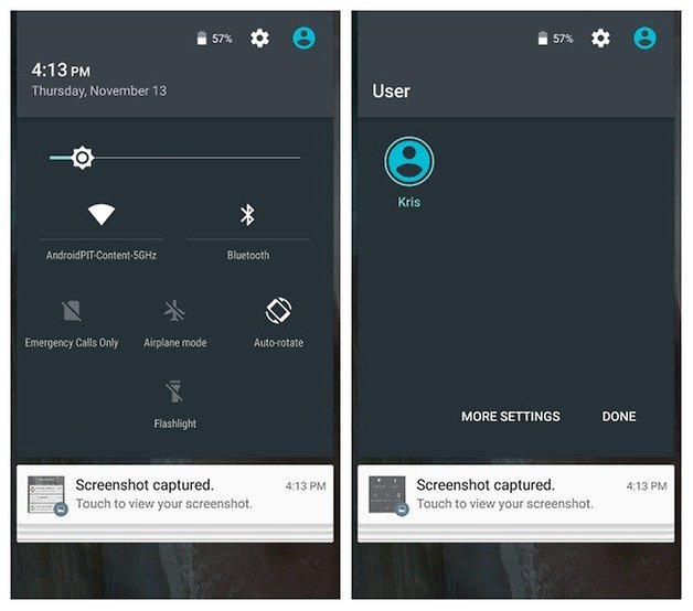
Of course, KitKat also had lock screen notifications and quick settings access, but they weren't front and center quite like they are in lollipop. On KitKat you had to swipe down once for notifications and again (or use a double finger swipe) to access Quick Settings on your lock screen. Lollipop saves you time: notifications are right there waiting for you (with customizable levels of visible information) and a single swipe down gets you to quick settings, with further access to user profile switching, a shortcut to the Settings menu as well as a useful battery meter.
Recent apps
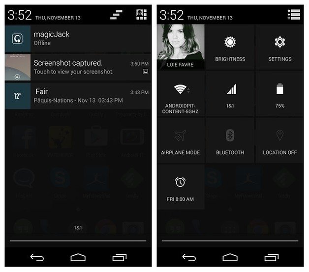
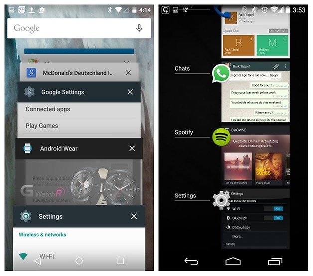
Lollipop introduces a refreshed Recent Apps area, with a scrolling card-based Rolodex stack of your apps. The scrolling is fluid and smooth but they are perhaps not quite as easy to distinguish between one card and another as with the simple layout of KitKat. One thing that bugs me about the Lollipop stack is that if you have multiple Chrome windows open, for example, you have to switch between them through the Recent Apps list, and if you've accessed some other apps in between, your Chrome tabs are separated by default. Lollipop also introduces the search bar to the Recents menu.
- Loving Lollipop? Want to know when the Android 5.0 update is coming for your device?
Settings menu
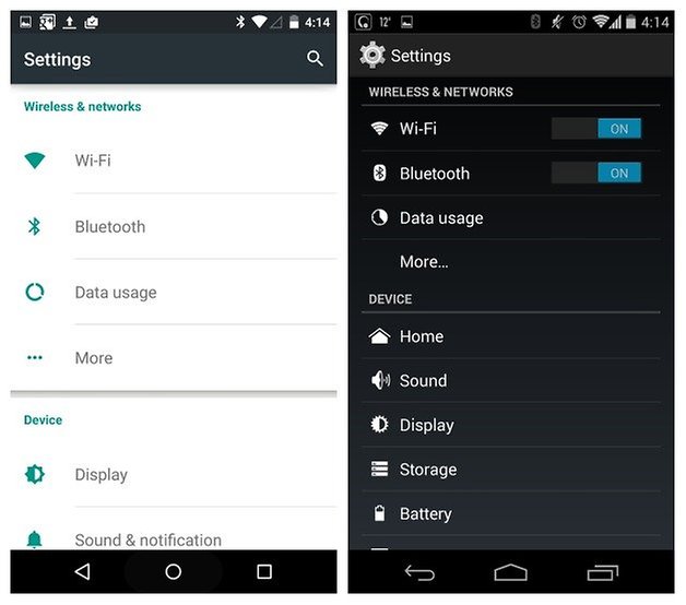
Again, the big change here is from dark to light, with Lollipop opting for a light gray Roboto font with green icons on a white ground, compared to the white on black with blue highlights of Holo-designed KitKat. KitKat put switches up front whereas Lollipop embeds them a layer down. The idea is, of course, that you access those switches via the Quick Settings shortcuts instead. As far as functionality goes, there's a lot to be said: but it all boils down to the simple premise that lollipop is KitKat but better.
- Wonder what's coming up next in the Android M release?
Lollipop has all the core functionality of KitKat but includes some great new features: Interruptions to set up rules for when you want to be interrupted and by what, lock screen notification settings, battery saving mode which you can set to automatically engage at 15% or 5% remaining, RAM monitor in the Apps section, a new Users section for managing user profiles, Tap & Go for instantly transferring old data to your new phone, trusted devices and trusted faces for personal unlocking, screen pinning for keeping your phone locked to a single app (for safer loaning to others) and an all-new Flappy Bird-inspired Easter egg game.
- Get the latest Lollipop-inspired Google apps
Cards, cards, everywhere
The influence of Google Now is even more visible in Lollipop than it was in KitKat. The latter was already piling the Google services on and search everywhere, Hangouts, the Google Now home screen and voice commands were just the beginning. Now you can search for content in apps with voice search, there's a search bar in the Recent Apps menu (along with the dialer and Settings menu) and the highly visible presence of Material Design lets you know just how many Google apps and services you're relying on.
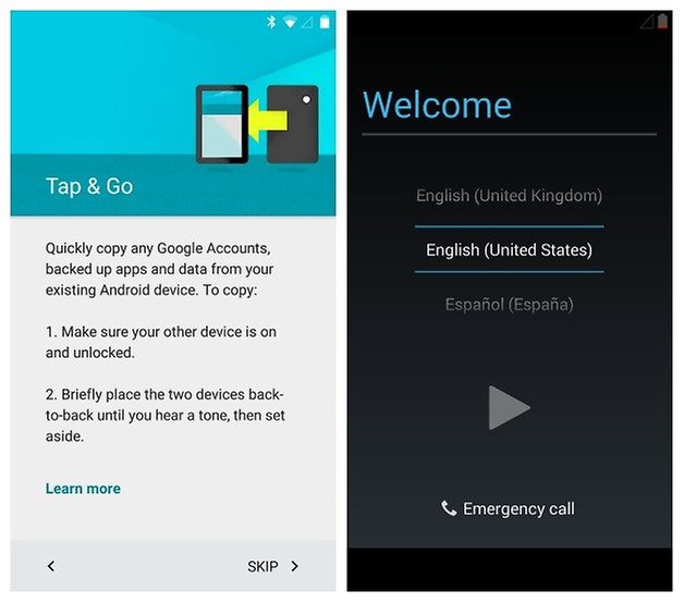
From cards in the Recents list, to card based Settings menu, to card based notifications, an app drawer that is now on cards, and cards dominating the interior of the Google apps as well, cards are here to stay so we hope you like them too. Just setting up your new Lollipop equipped Android phone is a much more colorful and fun experience.
What do you think of Lollipop? Is Holo better than Material Design?




So I am going to buy a new tablet on has kitkatvand one has lollipop so which one been. By the sound of think I should stick with KitKat. But I love to try lollipop
lollipop user interface sucks. too much whithe and the keyboard is ugly.
Well it accomplishes one thing.. Have to get away from Default Google Apps.. this design is simply brain dead..
And since when should my downloaded apps be replaced by Google's own versions, I had a specific weather and news app, Android has decided that I should only have the Google versions, get real Google, if your apps aren't as good as the ones your users want, either upgrade your software or leave well alone, it's called user choice, this one has bothered me, the style one was naive, this much more so, I don't like :-(
Agree totally with the above comments, these fad style are pathetic and outdated, the users should have the choice of styles, making the user experience totally much better, this is such a retrograde step, come on Google, step up to the plate, give the users what they want, not the latest fad and leave it at that, or has Apple taken over Google now ?
As a designer, (in a different industry) I await the return of 3d looking interfaces. I expect 5 years.
Like cars or shoes, the same movements are heralded every few years as the "new and better," Then the manufacturer's and "experts" give it a new name, and then attempt to explain why it is better than what came before. But there are only so many elements in good design, so they always return. Either because they make sense, or just to be different.
From the moment shoe making became a profession, mankind has worn three shapes: pointed toe, rounded toe and square toe. Every 5 to 10 years one of these usurps the other to become the "new". Materials, colors and features may change, but they are always one of the three shapes. Same for other products and especially car design. The '80's vehicles where sharp edges, and squares. The '90's were rounded forms and oval look. The 2000's saw the return of sharp edges, and today, I see the edges slowly being blunted. When Cadillac does it on a future vehicle we'll know the shift is complete.
I look forward to the return of dimensional looking UIs. It's what my eyes prefer.
I concur. To me, this plain design is plain ugly.
Wow, looks like they've made it way more lame... White backgrounds? I hope they let you change it to black. White is hard on my eyes in dim light where I use my phone a lot. Icons all look worse and embedding switches further down? How is that better?? I hope HTC keeps the black with Sense.
What is easter egg game?
It's like Flappy Bird but with an Android and lollipops instead of pipes.
Apart from the flat design it looks great. Flat design seems to be the new theme across all devices these days and it is awful!!!! 3d was invented for a reason!!
Well it's kind of super flat with shadows and elevation. But I know what you're saying!