Android O: first impression of the Developer Preview leaves me wanting more
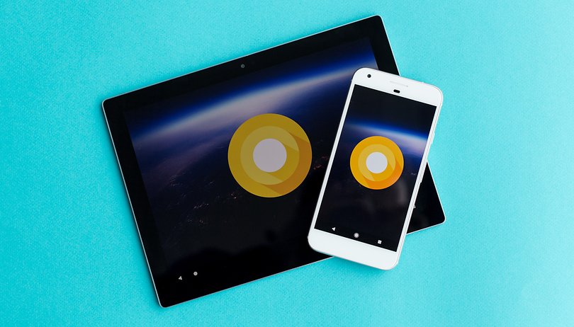

There are a few things users will look for in an Android update: fewer errors, more fluid performance and an improved UI. Smartphone manufacturers hope it will be adaptable, easy to maintain, and that the features will be compatible with the hardware without causing any issues.
The last major overhaul of Android's UI happened in 2014 with the jump from Android 4.4 KitKat to Android 5.0 Lollipop. Andy Rubin, the creator of Android, was replaced by Hiroshi Lockheimer. The latter is still around and choosing to stick with the material design that was introduced with Lollipop. That is why many people's first impressions of the new Android O will be "same as always."
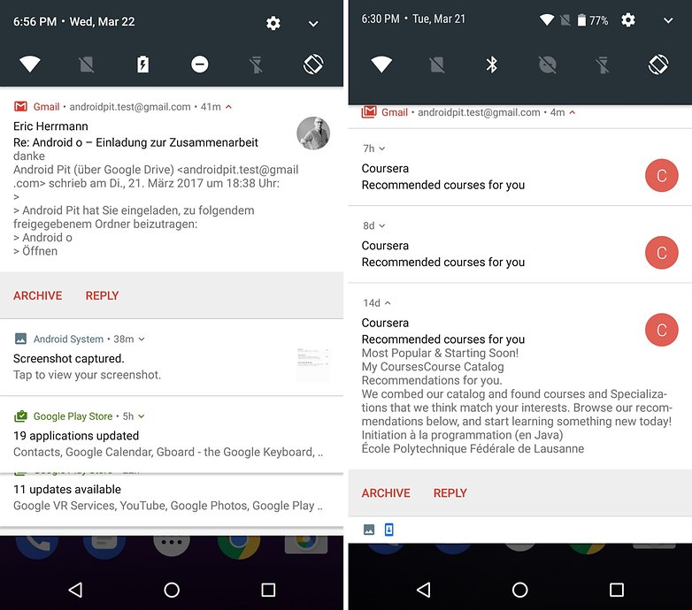
Taking a second, closer look reveals that detailed improvements have been made since Android Nougat. These include the status bar, which sits at the top of your notifications shade even when pulled down, that shows your WiFi connection and other statuses. For Nougat, these were only shown in the quick settings.
New settings
With the Settings menu, Google has taken a step back. Nougat introduced the ability to see the main Settings menu on the left side of the screen, no matter how deep in the Settings menu you are. For Android O, this has disappeared, and you must just press the back button to access the main menu again.
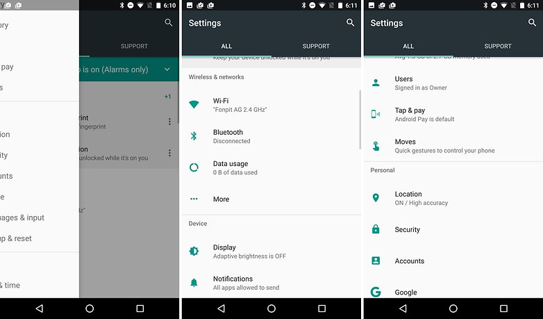
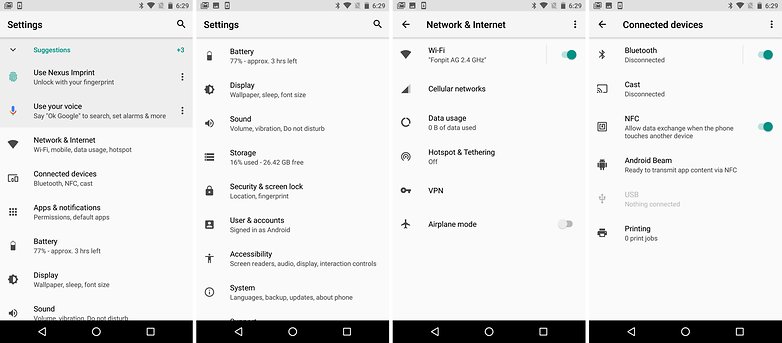
The hierarchy of the Settings menu has been completely restructured. This was completely necessary, as even with a search function, it was impossible to get a good overview of the Settings and make sense of the menu's structure. You can now get an overview of the contents of each section below each section's title. The order appears quite logical.
Under "Network & Internet" you will find options for data consumption or hotspot. "User & Accounts" have now been merged, and include multi-user settings and Android sign-in settings for both tablet and smartphone, as well as accounts for Facebook, Google, Twitter, and other services.
Manually installing apps
Google has changed the way Android handles "apps from unknown sources", like those from F-Droid or the Amazon App Shop. The option has moved from its current location in the Security settings, and you don't have to give access to all external sources just to install one app that you trust. Now, you can go to Apps & Notifications > Special access > Install other apps, and then choose to label an individual app as trustworthy, rather than allowing installation of all APKs.
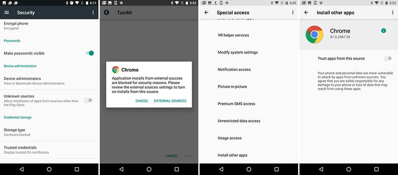
The idea behind this is nice: if you set Chrome as a trusted source for APK files, that means ones from sketchy email attachments won't be automatically installed too. Bundling them all together by allowing "unknown sources" is now a thing of the past - which will be a relief to security experts who see it as a gateway for malware. There is also an additional prompt before every update, for example: F-Droid won't be allowed to automatically update apps in the background without explicit permission like the Play Store can.
SMS Backup
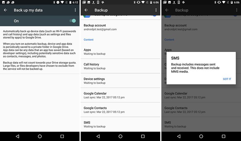
Finally, Android will backup your SMS messages on Google Drive. Since Marshmallow, Android has been able to backup app data and settings, but SMS was never part of the deal. This shortcoming was apparently fixed, but we weren't able to try the feature for ourselves.
File Explorer
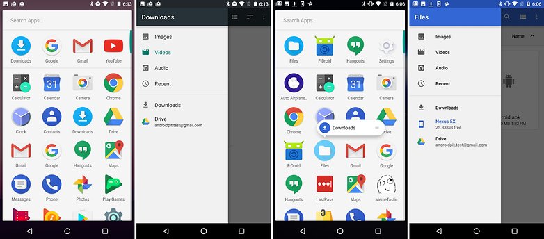
The file explorer, already introduced in Android Marshmallow, now finally comes to the foreground. Before, to access the file explorer, you had to go to Settings > Memory > Explore, but now there's an app icon for it. The app, which was previously just Downloads, was finally renamed to Files, and it now displays the file contents of the internal memory, and external memory (if you have a microSIM card installed). This allows you to search directories and copy, move and delete files.
Managing notifications
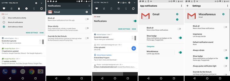
Once again, Google has brought some changes to the notifications. With Android O, Google has introduced Notification Channels. These are app-specific and give users a more fine-grained control over their notifications. A good way to use this would be to only allow alerts for emails labeled as "Important". Provided, of course, that the app supports this new notifications feature. In addition, Google has improved how the notifications are displayed - but, at the moment, this just seems to complicate things.
Conclusion
From a user point of view, never has an Android update changed so little. We will continue to explore the Developer Preview and follow its development. For now, Android O's features aren't completed, and Google has until Q3 to incorporate further improvements. Until then, we're left waiting for some killer new feature. Personally, I'm not too invested in Android O though, as my smartphone won't be updated past Nougat and monthly security updates.








Hey androidpit, what about the adaptive icons keyfeature?
Too the questionnaire I ment to say no not really since let me see im 51 and in the next 15 or so years ill be 65 give or take minus plus one give or take when ill see tht update yea who cares for realss ! Lol got to laigh at tht pls
OOOOOOOOO doesn't look that interesting.