Apple iPhone 15 Pro: Take a First Look at the Rumored "Taptic Buttons"
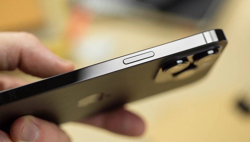

We have reported more than once that tipsters and analysts agree that the Apple iPhone 15 Pro and Pro Max will appear with "solid-state buttons" instead of the traditional "clicky" buttons. However, rendered images had never depicted this fact, as they have been missing on corresponding CAD sketches so far. That changes today, as we present you with the first graphical evidence of the new feature.
This is probably what the "taptic buttons" of the Apple iPhone 15 Pro will look like
It will be another six months before we get the Apple iPhone 15 series announced by Tim Cook. Nevertheless, tipsters and analysts are always trying to keep us up to date with the latest rumors. Among them are source materials that are based on original Apple CAD sketches and thus seem quite authentic.
And of course, that only the Pro and Pro Max models will come with the new Apple A17 Bionic processor. Of course, something can always change at the last minute, but such a drastic measure as changing the old familiar hardware buttons to touch-sensitive ones should probably be out of the question.
- Don't miss it: The best deals on iPhone models
And so everyone seems to agree on the topic that the Apple iPhone 15 Pro and the Apple iPhone 15 Pro Max will be equipped with so-called "taptic buttons". Except for my colleague Antoine Engels, who is against it on principle. The well-known tipster "ShrimpApplePro" has now published two pictures and a TikTik video on Twitter, which according to him are also supposed to be render pictures, but which were created based on newer CAD sketches.
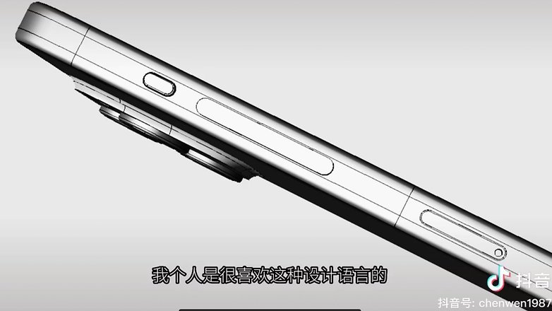
"Taptic Buttons" deliver a new look and functionality
In the pictures, we can only see an elongated button, which can take over several functions at once due to the touch sensitivity, and a small additional button for muting the ringtone. The keys should react to both pressure intensity and slide gestures. Among other things, one button can be used to turn the phone on and off, as well as to regulate the volume. It would also be possible to activate Apple Pay by double-tapping the button. There should be no limits to the imagination here.
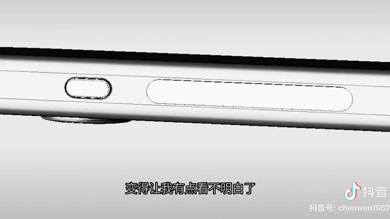
What do you think of the much more modern design and function of the buttons? A real added value or do you suspect sources of error? Write us your opinion in the comments.
Source: ShrimpApplePro







You overload a button, you get 3d touch/haptic touch all over again. It's more than the average user will remember or care about. There are more elegant solutions. Samsung needs to learn this one too.
Simpler us better in UI.
Moto succeeded with their Actions because it didn't reuse behaviors already assigned other tasks.