The Best Nothing OS 2.5 Features for Your Nothing Phone
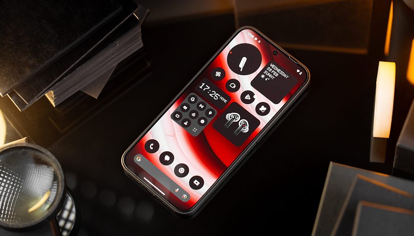

Do you own a Nothing Phone (2) or a Nothing Phone (2a)? Congratulations! You're cool. On a more serious note, we have selected the best Nothing OS 2.5 features, where shortcuts and hidden functions will help make your Nothing smartphone more intuitive. Nothing OS may be a fairly stock Android skin, but the manufacturer managed to incorporate some pretty handy tricks.
Easily scroll the notifications pane
In my opinion, this is quite simply the best Nothing OS feature. Nothing lets you activate a one-handed mode that brings info down to the bottom of the screen, making it more accessible. This mode also allows you to create a tactile gesture to launch the notifications' pane more quickly by simply swiping down from the bottom of your Nothing Phone screen.
- Go to Settings.
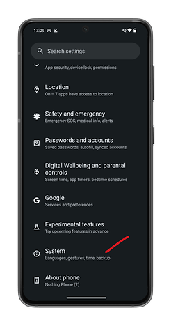
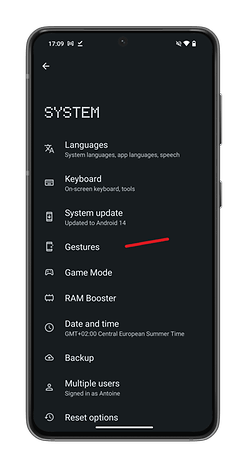
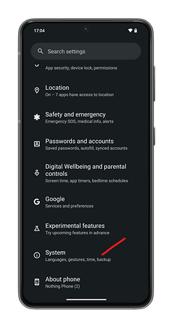
- Scroll down and select System.
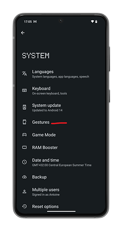
- Select Gestures.
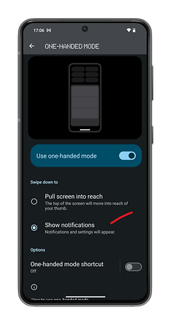
- In Gestures, enable the Use one-handed mode slider button.
- Select the Show notifications radio button below.
Transform the on/off button into an iPhone-style action button
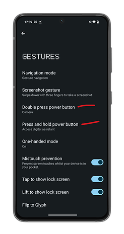
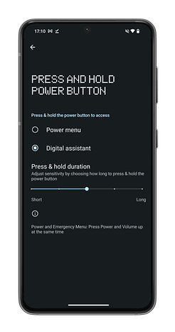
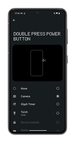
With Nothing OS, you can assign several shortcuts to the power button on your Nothing Phone. You can choose from different system shortcuts: camera, flashlight, timer, or applications. The Nothing Phone can recognize two different shortcuts—a double press and a long press on the on/off button.
- Go to Settings.
- Scroll down and select System.
- Select Gestures.
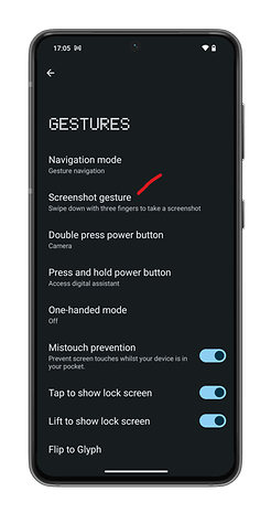
- In Gestures, press Double press power button or Press and hold power button.
- Select the shortcut of your choice.
Take faster screenshots
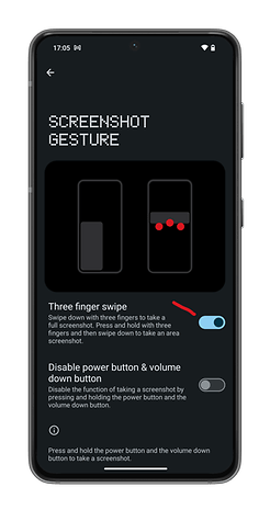
I know, I know. This gesture is nothing new. It's been available for years on other smartphones. However, I think it's still a relatively unknown feature to the public not to mention very practical, too. You can take screenshots, even partial ones, by simply swiping your Nothing Phone screen downwards with three fingers.
- Go to Settings.
- Scroll down and select System.
- Select Gestures
- In Gestures, select Screenshot gesture
- Enable the Three finger swipe slider button.
Hide applications in the application drawer
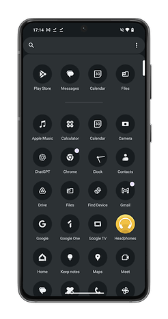
As with any other skin, Nothing OS gives you an application drawer. You swipe up from your home screen to view a list of all your installed applications. However, what if you don't want anyone to see some of your applications? Above all, what if you're too lazy to lock these "sensitive" applications away from prying eyes?
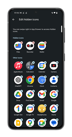
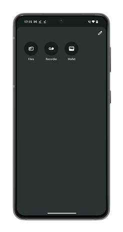
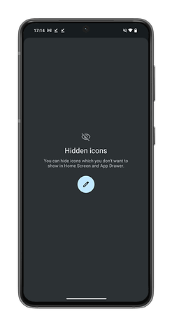
Nothing lets you have a "hidden" pane in your application drawer. Basically, you can have a second pane in your application drawer. It's not visible unless you swipe right in the application drawer view. Mind you, anyone can access this pane since all you need to do is swipe.
While this is not actually protecting your privacy, consider it to be a back-up function. If someone is a tech novice or isn't familiar with Nothing, they may not think about prying around this folder. This is a very handy tip if you don't feel comfortable having the Uber Eats app installed when you promised your other half that you'd gone dieting.
- From your Home screen, swipe up to open the application drawer.
- In the application drawer, swipe right.
- Tap the edit button to add applications you want to hide.
Save your camera application settings
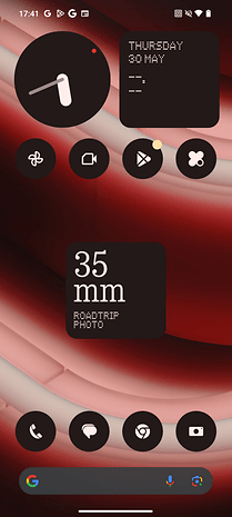
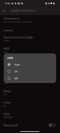
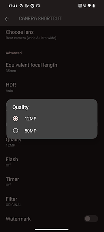
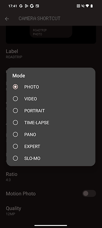
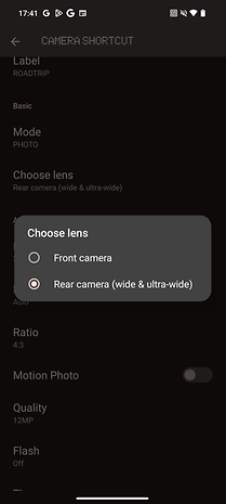
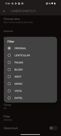
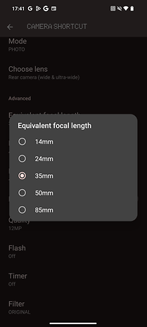
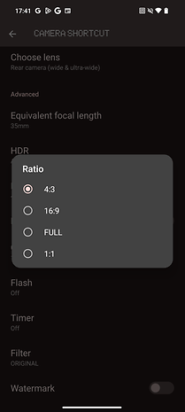
This is a very useful widget, but it's only available on Nothing Phone (2a) for now. It lets you save the camera settings. When you press the widget, the camera application on your Nothing smartphone will automatically launch with these pre-defined settings.
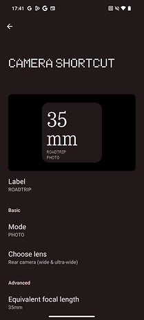
The settings enabled by Nothing are very precise. Not only can you choose which lens and mode you want to use by default, but also the focal length, filters, and so on.
- From your Home screen, long-press to open the Widget menu.
- In the menu, scroll down until you see the Camera widget.
- Add the widget to the home screen.
- Long-press the widget to open its editing parameters.
- Select the camera settings you wish to save.
Add shortcuts to your lock screen
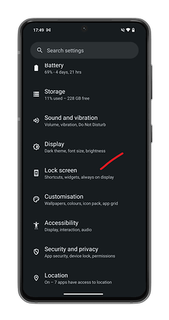
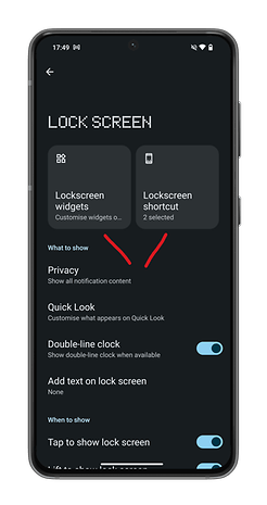
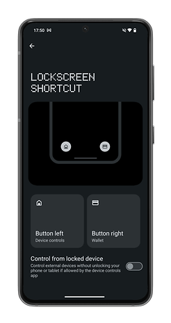
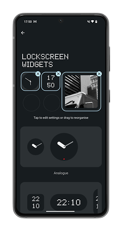
Nothing lets you add shortcuts and widgets to the lock screen of your smartphones. Unfortunately, there's not much to choose from, but it's already far better than what other Android manufacturers offer. The widgets remain visually consistent with the Nothing OS look. I noticed they don't overload the screen of my Nothing Phone (2).
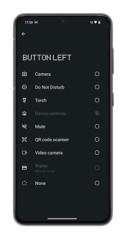
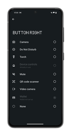
Depending on the selected widget size, you can add up to eight widgets. For shortcuts, there are two buttons at the bottom of the screen. Each can activate only one shortcut at a time.
- Go to Settings.
- Select Lock Screen.
- Select Lockscreen widgets or Lockscreen shortcut.
Personalize your application folders on the home screen
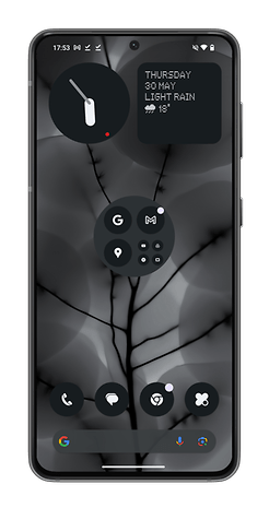
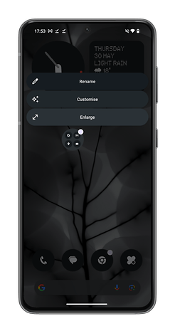
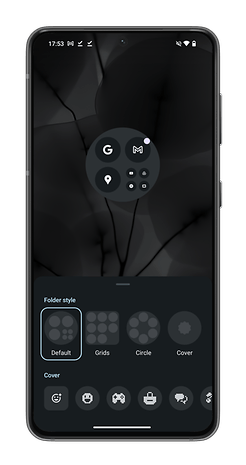
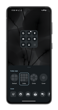
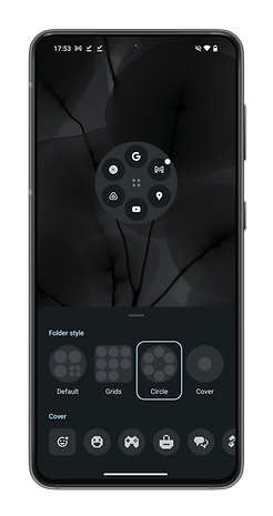
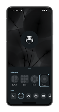
In Nothing OS, you can change the size and look of the application folders on your home screen. You can enlarge the size of your folder icons but you can also change the shape of the folder icon and the arrangement of app icons within the folder. It's not the feature of the century, but I like it a lot because it brings variety to my home screen.
Monitor your screen time with a fun widget
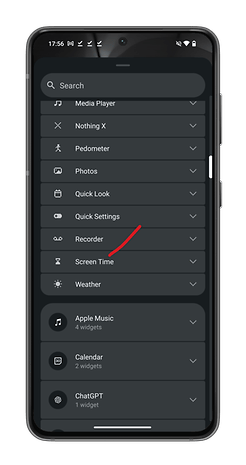
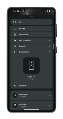
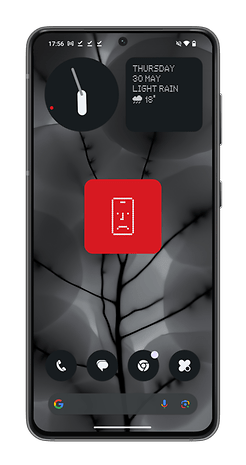
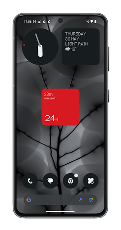
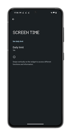
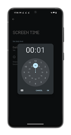
Android's default screen time widget is the only widget I use on a daily basis. The Nothing OS version has a less detailed, but more quirky side that I prefer, featuring an emoji. You can set your daily screen time limit here. Once you've exceeded this limit, the emoji will begin sulking and light up in red, alerting you that it's time to put down your smartphone. By swiping down on this widget, you can view just how much more you've exceeded your daily screen time quota.
- From your home screen, long-press to open the widget menu.
- In the menu under Nothing Widgets, search for the Screen Time widget.
- Add the widget to your home screen.
- Long-press the widget to launch its editing parameters.
- Set your daily screen time limit.
Use the Glyph interface as a Dynamic Island
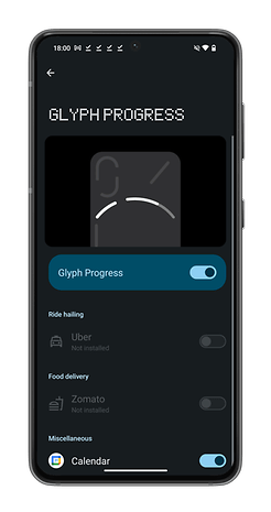
This feature is still rather limited and experimental in nature. It lets you use one of the Glyphs at the back of your Nothing Phone (2) as a progress bar. This somewhat resembles iOS 17's Dynamic Island, but is not as good nor useful. Its potential is the primary reason I've included it in my article.
At the moment, only three applications are supported. Uber, Zomato, and Google Calendar. I decided to use it with Google Calendar. Five minutes before an event, a countdown begins with the Glyph light bar gradually emptying. It's very gimmicky and doesn't work all the time. With my work Google account, it didn't even work at all, so I had to use my personal account.
However, Nothing has released its Glyph SDK on GitHub, allowing developers to fully exploit the capabilities of the Glyph interface and integrate it into their applications. Support for a wider range of applications should therefore be arriving soon.
- Go to Settings.
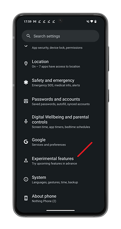
- Scroll down to Experimental features.
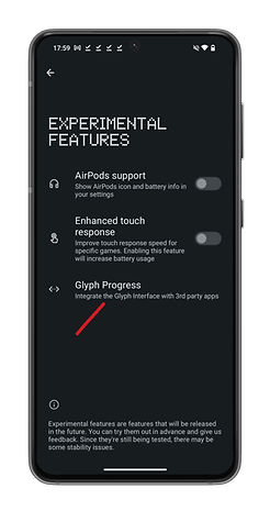
- Press Glyph Progress.
- Enable the Glyph Progress slider button.
What do you think of the selected Nothing OS features here? Are you already aware of them? Have you ever tried out a Nothing smartphone? What do you think of the Nothing OS interface compared with heavily featured Android skins like HyperOS or One UI 6?

