Goodbye navigation buttons, you won't be missed!
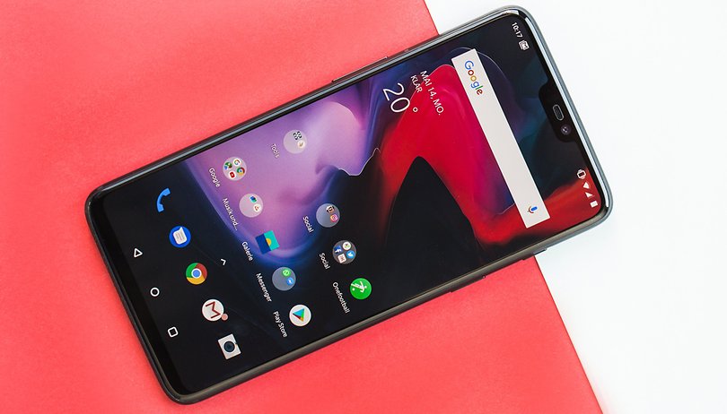

Humans are creatures of habit, and habits are hard to break. When it comes to how you use your smartphone, it's worth giving gesture control a chance. The new innovation is worth the effort of getting used to.
I have been testing the OnePlus 6 for several days now, and at the beginning I refused to use the new gesture control software feature. Although it isn't exclusive to the OnePlus 6 (it can also be used for the OnePlus 5 and 5T with the help of the beta firmware), I was only able to actually try this feature now.
Gesture control is nothing new
Well, gesture control itself is not new. Apple already implemented it on the iPhone X, and Huawei, Honor, Lenovo and many other Chinese manufacturers already offer the feature. But honestly, with the previous gesture controls I felt overwhelmed. The systems I'm familiar with on Android smartphones usually use swiping gestures on the fingerprint scanner and also the areas to the left and right of the biometric sensor. But that was all too complex for me. There were just too many options to choose from.
Huawei, for example, offers four actions with four gestures. If you hold the home button down, you get to the home screen, while a light tap of the same button will trigger the back button. In addition, you can swipe left or right over the home button to get to the screen where you can switch between recent apps, while a swipe up from the left or right side will trigger Google Assistant. Then there's the possibility to show an Android-P-like virtual navigation key. If that's not enough options, you can also show a Navi-Dot, which sits on the screen as a virtual home button wherever you want. Despite the many options, I personally never warmed up to Huawei's solutions.
Simple and intuitive
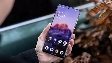
With OnePlus, the gestures which replace the navigation keys are more limited, and that's not a bad thing. Swiping upwards from the middle of the bottom of the screen always brings you back to the home screen. Swiping from the left or right side of the bottom of the screen triggers the back button. To get into your recent apps list, swipe up again from the middle on the bottom and stop in the middle of the screen until the recent apps screen appears.
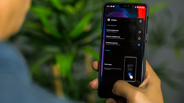
iPhone X users will now argue that OnePlus has simply copied from Apple, and they wouldn't be wrong. But now that I've consistently embraced the gesture control of the OnePlus 6 for several days, I find it to be the most intuitive and easy way to replace the navigation buttons. And if you can't get used to it, you can easily activate the navigation buttons again. It's as simple as that.
But it takes some getting used to
As nice as the new gesture-driven world may be, it also carries the risk that you will settle into a habit that you can no longer easily kick. If you have become so used to a specific manufacturer's implementation of gesture control, then it will be really hard to switch phones since you'll have to relearn the gestures. With time you'll get used to anything, but of course, the change will create some friction at first.
Of course, this article is based on my experience, so I'm interested in what you think about gesture control as a replacement for good old navigation buttons? Have you ever had the opportunity to try out the gesture controls of different manufacturers or even those of Android P? Tell us in the comments!







I'm looking forward to seeing this implementation but agree that the user should be able to customize the experience. I had the droid incredible which had an optical type of trackball sensor and loved it because rather than using don't of the buttons I was able to just use it to perform certain functions. But me being able to adopt what features I want would be better than having to be all in.
I totally agree there should always be the ability to customize. There's no such thing as one-size-fits-all when it comes to a device as personal as a smartphone.
Swiping is definitely less intuitive than tapping a button. No thanks. I don't want gestures.
I thinks that gestures will be new beginning. Using gestures is really smart. Users can enjoy iphone x experience on android phone which I think is great
I am not a fan of gestures because I trigger them too often by mistake and fail to trigger them when I want. Buttons are simple and they work.
I used to think that way too, but like the one plus 6, I keep gestures to a minimum. Swipe down from the top middle goes to recents. Swipe across in middle, is my back( works in apps too, and can choose which apps are for gestures). The app I use for that is xposed edge, that has many more functions than this. Nova Prime takes care of hiding the dock, with a swipe up from bottom, and I’m using the expanded desktop to hide the navigation bar, and can pull it up at the bottom bezel edge, if needed. This is all on nougat. No pill, more screen, personal customability( only I know where the actions are, good for security), great one handed uses, yeah I changed.
I really like force of habit, reinstalling the old ADW launcher and resetting every new device as much as possible the same as former devices, without wasting the time of day on the OEM's brilliant innovations, figuring out how to reconfigure them, and spending weeks getting used to it - not my idea of fun. I would like more configurability of the current nav buttons - almost never look at the "Recent" window list and wouldn't mind reassigning the button to something useful. I'd also note that Greenify manages to turn long-press of "Home" to toggle hibernation, which I prefer to automated. I think some other apps make similar good use of the nav buttons.
About time! Gestures should be the de facto navigation method on every phone.
I prefer the "buttons". As long as I can use a launcher that gives me that option (nova still does), that's what I will use. If you want to hide the buttons and use gestures, that is your choice, but, I hope they continue to GIVE us this choice.
I agree I love the buttons having to swipe the screen to get theM is a pain in the a##
I've used gestures from PIE off and on for years. There are parts I like and parts I don't. The user needs some control for functions they don't want. For example I find the Google Assistant gesture highly invasive. Please let me turn that off. Android doesn't allow that so I use swipeup app to intercept what is for me an unintentional gesture and kill it.
Pie controls seem like glorified nav buttons to me, I wasn’t a fan. Too many implementations for what a pie should be. Gestures, especially unseen, are so much better, and give more screen. Only the notification bar is seen on my screen, I refuse to hide that. You can turn that assistant feature off, and I use nova prime to make sure it swipes from the left. I’m enjoying gestures, and out of 50 phones within a room, mine is the most personal, as my gestures are setup by me. I’m left handed, so setting where, which way, response time, etc.. are all for me, not one plus, Apple, google, just me.