Android Q vs. iOS 13: it's a game of give and take

Read in other languages:
Android and iOS, both major mobile operating systems, will receive an update this year. Which offers the best new features? To some extent, Google and Apple are orienting themselves to what the other has already created. We take a look at Android Q and iOS 13.
Dark Mode
iOS 13 (Julius)
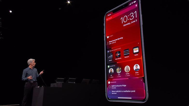
Dark Mode is certainly one of the biggest innovations in iOS 13. Apple introduced it on Mac with macOS Mojave, but iOS has only had a rudimentary possibility to switch to it so far, in the accessibility options. This looks strange, especially with some apps.
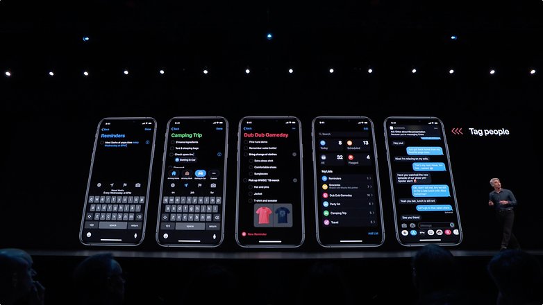
With iOS 13 comes a system-wide Dark Mode, as Android Q will offer. It can be activated either in the system settings or via the Control Center. Then the entire system uses dark colors - including apps. At least, if they support dark mode. It is very likely that at least the big apps will get this sorted before the full release in September.
Android Q (Luca)
Google showed its Dark Mode for Android Q in action during this year's Google I/O. However, many Google apps already have this feature and it can be enabled in the preferences. Now the dark mode is integrated at the system level, so that the user can switch from the light to the dark theme in all applications via Quick Toggle.
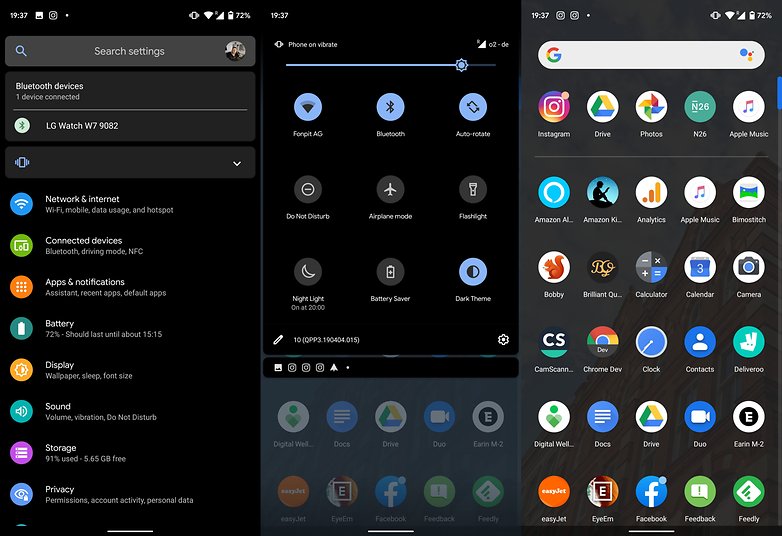
For the time being (Beta 3) the development of the function seems to be going in the right direction. Unfortunately, it doesn't mean that the change will work automatically with third-party applications, as many of the other design changes made to Android in recent years have shown. Google has never ruled with an iron fist - just think how many apps still use Holo or even an older theme. I hope history won't repeat itself this time.
Privacy Policy and Notifications
iOS 13 (Julius)
Android Q focuses on the settings for protecting your data. But many of these new features have been found in iOS for a long time. So you can already fine-tune in iOS 12 whether an app is allowed to access to your location while it is in use or whether it is simply never allowed to do so. With some apps, such as Apple Maps or Google Maps, there is also the option to allow the apps to constantly access location data, even if the app is running in the background. In iOS 13 you can even share the location only once with an app.
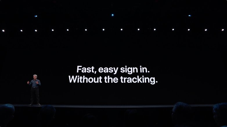
It is also possible to query individually whether apps can access contacts or the camera. Most apps ask for the rights necessary for their function on the first launch - but sometimes you don't have to agree to all of them. It's a good thing you now have similar control on Android.
Android Q (Luca)
Android takes over another feature that has been available in iOS for years and which, to be honest, doesn't go down very well with me. In Android Q, you can no longer delete notifications by swiping from right to left, but only from left to right. In the first case, a menu is displayed in which you can choose how often and how you want to receive this type of notification. A bit like the context menu in iOS notifications.
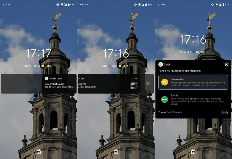
But Google has additionally implemented fast actions directly in notifications. If you receive a notification with a link, it will be suggested to open this link directly from the notification, if you receive an address, Google Maps will be suggested and so on.
Gesture controls
iOS 13 (Julius)
iOS has long been strong when it comes to gesture control. This allows you to navigate back with a right finger swipe. What was pretty silly so far was the gesture to undo an input. For this, you had to shake the device up and down, even still in iOS 12. That may have been funny once, but it's a pain in 2019.
Finally, there is a three-finger gesture to undo or restore an input. Unfortunately, it's only on the iPad. But there have always been a few more gestures, such as the four-finger gesture, to get into the multitasking view on the tablet.
Android Q (Luca)
Gesture navigation was introduced by Google in Android 9.0 Pie, which replaces the navigation bar. Unfortunately, users weren't so happy about it, also because part of the screen is still reserved for the navigation bar.
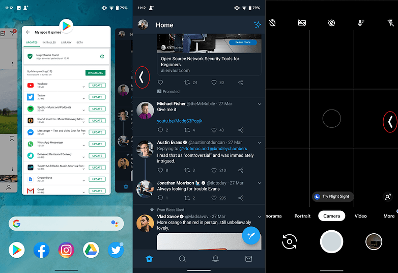
With Android 10 Q, there are new gesture controls which are practically identical to iOS. The back button has been replaced by a gesture that will cause some problems with some menus that open by sliding your finger off the left side of the display and drives developers crazy.
We're still discovering the new features of Android Q and iOS 13 and will update this article when we know more.
Are you looking forward to iOS 13 or Android Q? Are you planning to try out a development version? Let us know.






how can i have?
I have friends with iPhones that look forward to a stable iOS 13, although they are all angry about the ending of
iTunes (can't say I blame them, I would be too if I wasted my ?on iTunes but like Zune from Microsoft? I knew what wasn't worth it!)
Since I'm on Android OS 9.0 ? ? Android OS 10.0 Q doesn't mean ? to me until it's named and implemented onto Android devices (and I don't mean just Pixel)! ??♀️