How to customize your iPhone lock screen with iOS 16
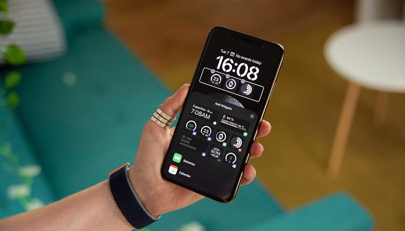

With iOS 16, you can customize your iPhone lock screen with widgets and especially apply a depth effect to your wallpaper. We share just how you can customize your iPhone's lock screen.
All the settings detailed in this article are meant for the iPhone running on iOS 16. For the iPhone 14 (Plus) and iPhone 14 Pro (Max), the lock screen customization options also apply to the Always On Display (AoD). Specifically, you can customize your iPhone's screensaver on three levels: wallpaper, widgets, and depth effect.
How to customize your iPhone lock screen
The way Apple goes about it is very similar to that of the Apple Watch. You can create several lock screens with each of them being very different according to your desires or needs. You can then very easily change the lock screen. Apple does not indicate a limit to the number of lock screens you can create. Here is how you can create a new lock screen:
- On your locked iPhone, long press the screen (you'll then need to either enter your passcode or go through Face ID).
- Press the blue-colored "+" button at the bottom right.
- Select a wallpaper.
- Press Done at the top right.
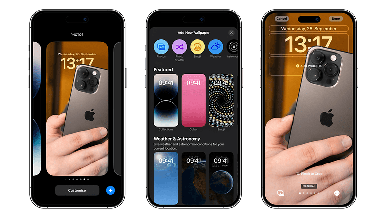
You will then have to choose between the following two options: Set as wallpaper or Customize home screen. This is simply a matter of choosing whether you want the themes of the lock screen and the home screen to be consistent or not.
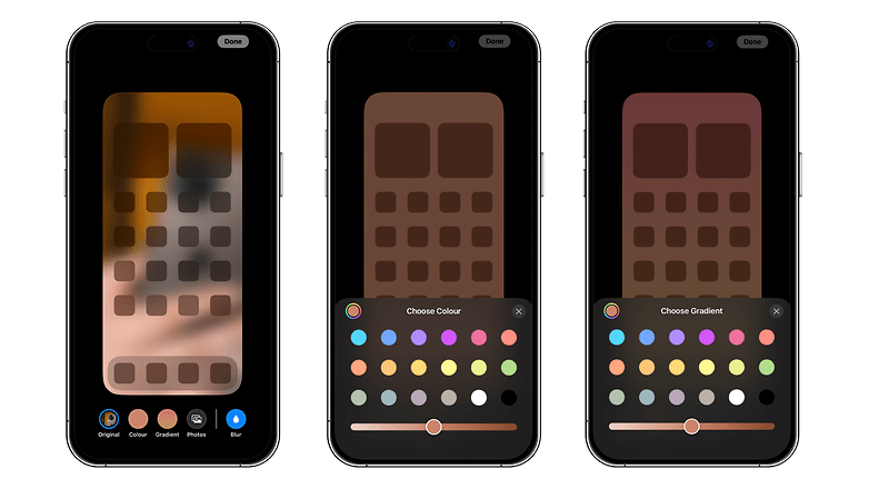
If you picked the first option, your home screen wallpaper will have the same dominant colors as your lock screen. By selecting the second option, you can apply a different color or gradient, or even a photo/image from your gallery. You can also apply a filter to your wallpaper by swiping left.
You can then change your lock screen at any time you like: by performing a long press and selecting Personalize this time around. From this same menu, you can also change your lock screen by swiping left to scroll through your different lock screens.
How do you add or change widgets on your iPhone lock screen?
You can perform all the settings that I'm going to discuss here when creating a new lock screen, although you can do it at a later time as well. iOS 16 offers three areas at the top of your iPhone's lock screen where you can display widgets.
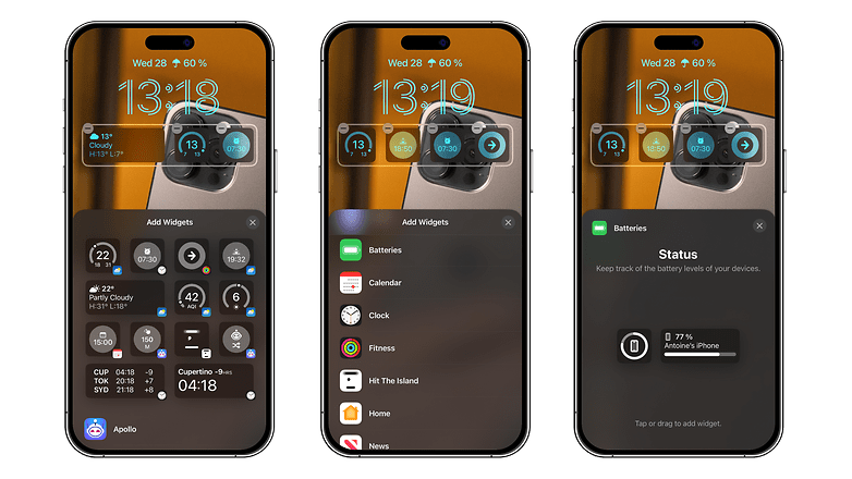
Simply press and hold from the lock screen, followed by selecting Customize to bring up the options for adding/removing widgets.
At the very top, you have a small bar that allows you to display a single, very minimalist widget that is limited to time, weather, reminders, etc.
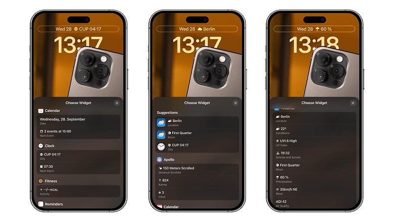
Below, you have the location of the clock widget, which you can adjust the font and color (you can't remove the clock).
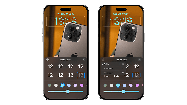
Further down, you have a slot that allows you to add between two and four widgets, depending on their size. This section offers a little bit more choice and more detailed widgets. Be careful though, if you add widgets here, you won't be able to enable the depth effect of your wallpaper, which we'll talk about below.
How to apply the depth effect to your lock screen wallpaper
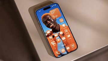
With iOS 16, you can provide depth to your lock screen wallpaper. Basically, it lets you display part of the wallpaper over the clock, making it look like the subject of the wallpaper is in a 3D scene, located in the foreground.
To apply the depth effect to your iPhone wallpaper:
- Press and hold the screen.
- Press the "+" button to add a wallpaper or Customize to change the existing wallpaper.
- At the bottom right, press the 3-dot button.
- Select Depth Effect.
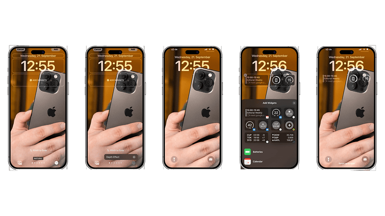
At first, chances are that the Depth Effect option will be grayed out and you won't be able to activate it. This is because the effect is only applicable under specific conditions in which Apple does explicitly specify which are the ones. Thankfully, we have come up with the following parameters in when the depth effect doesn't work:
- Your wallpaper doesn't have enough empty space at the top.
- The clock is too obstructed by the wallpaper.
- You have placed widgets on the lock screen.
Basically, your photo will need to have enough blank space at the top so that the subject doesn't take up the entire frame. Then, when you choose your wallpaper, you need to place the image at the right so that the subject in the foreground does not cover too much of the clock. You can see this happen in real-time as you move the image on whether the depth effect works or not.
So, what do you think of the new customization options for the iPhone lock screen? Can we say that despite the delay, Apple got it right with the solution in iOS 16? Share your opinion in the comments below.






Very noisy UI. Looks as bad as Microsoft's Metro UI.