Why Huawei's Emotion UI isn't as bad as you think
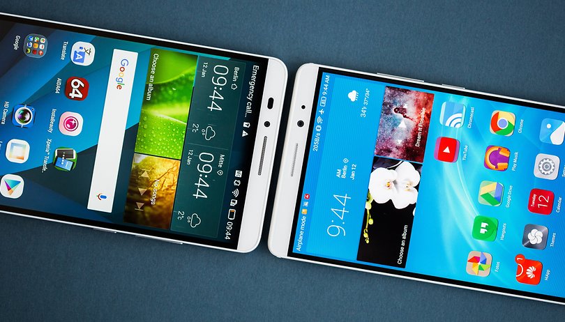

Huawei’s Emotion UI software often comes under fire. Some users say it’s copying Apple iOS, others argue it has performance problems. But EMUI, as it’s also known, brings some very worthwhile ideas to Android. At the very least, it's not as bad as people say.
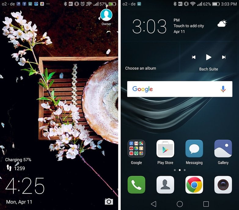
Capture smiles
The EMUI camera software has a feature called Capture smiles. Enabling this means that photos are taken automatically when you smile. I would argue that this is completely sensible in theory; this is a moment when many people want pictures to be taken.
Some may see this as a gimmick, but gimmicks are only gimmicks so long as they aren’t useful: I argue that Capture smiles is useful.
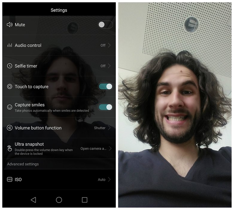
Fingerprint scanner gestures
Using the fingerprint scanner to control different parts of your smartphone makes sense because it’s just like another input. When you pick up a phone to look at it, your thumb usually rests on the side of the device and your index finger on the rear: this formed part of the reason why LG pursued a rear button design on its LG G2, and subsequent phones.
As Huawei’s devices typically have a rear fingerprint scanner, this means that there is an opportunity to make certain actions easier to achieve or more comfortable with one hand. This is logical, which is why letting you pull down the notification shade or access the recent apps menu by interacting with this is a worthwhile idea.
Adding apps to folders
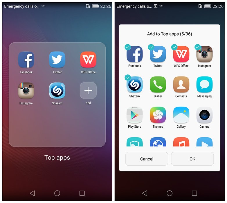
Another feature which makes EMUI great is the ability to add apps easily to folders. In stock Android, you must do this manually with individual apps – dragging and dropping them from the app menu. In Emotion UI, this is done using a tick box method which is altogether faster and more convenient.
These are just some of the things you can do with this software: there are many more features which make it worthwhile. It has a theme store which allows you to customize the look of the interface to a greater extent than stock. It has useful lockscreen shortcuts, like a link to voice recorder. You can also rearrange the order of the capacitive buttons: why doesn't every UI allow this?
Final thoughts
I’m not saying that Huawei was the first to invent any of the above ideas, just that they are interesting additions to Android which aren’t available on stock. This software can be improved, but it’s so often described as "terrible", "broken", "awful": these are unfair criticisms. Weighing its flaws against its successes shows there's more good than bad.
The features listed above are specific advantages, but day-to-day usage is also generally problem-free. There are bugs at times, and some of the menus aren't translated correctly. I can’t deny it’s occasionally laggy and the notifications menu is weird. It's rough around the edges, but just looking at it as a piece of software on a phone – and not comparing it to iOS, which it’s clearly not as efficient as – it’s fine.
An HD screen simply can't display the number of pixels that a QHD screen can. But Huawei's wonky software doesn't lack any critical feature that other UIs have. It's at times dysfunctional but it's not a dealbreaker.
Huawei has tried to go its own way with Emotion UI. While it's not all positive, there are still lots of features to enjoy. What are your thoughts on Emotion UI? Let me know in the comments.









Sometimes I get a feeling of companies being creative just for the sake of being creative, which is _not_ a real value in my view. (Yes, I know I am a boring person :).) In those situations, several good features become accompanied by lots of useless ones, trading overall stability and performance for all sorts of "bells and whistles".
I just can't forgive emui anymore. - At one point my phone did update to a newer version of emui (3, still that version on my P7). And suddenly one of -if not THE- most important features was just removed. - The default data usage was gone, in favour of the data traffic manager.
What's up with that - I don't care about daily doses of traffic - my provider makes me pay a lot when I reach 500 MB monthly traffic. (Like 0.5 euro per MB) - I sure as hell want a warning when I reach the monthly limits, and several before that point.
I just couldn't do that in the default app, and, worse, I couldn't even check clearly how much data I used last X days. (other than manually summing it up). Furthermore it doesn't deviate between WIFI and networked data (well it does on the per app view).
And then there's the "4G use" - is that just a misnomer for all non wifi data? Or why else would I be interested which part is using 4G and when I"m using 3 or 2G?
All in all, there's no excuse to provide a custom feature that is just worse than a default feature - and then hide the default feature. (I know the default data usage tracker is still active - it does trigger when my data usage gets too high, however I can't open it manually to change the settings when it doesn't give a warning.
While I get your point about hiding the default feature etc.,. I have to say something about "why else would I be interested which part is using 4G and when I"m using 3 or 2G". Some mobile operators in some countries charge different rates for 4G/LTE traffic vs. 3G/2G. In that case, some users would like to see the respective traffic amounts separately, just to control their costs.
There are some nice features in E-MUI that you point out, but it doesn't change the fact that it's garish and clashes with the default Android Material Design aesthetic. That would be forgivable if it didn't hobble the performance of their devices so terribly. I bought the Honor last week on your other article recommending it, and I packaged it up and sent it back last than 4 hours after receipt because the performance was so bad and it was so ugly.
Why these Android vendors think that layering a terrible UI on top of Android is a 'differentiator' is beyond me. It slows down the devices performance, and it makes it harder for the vendor to update the device later when Android gets updated.
You have some good points here Scott. I find the fingerprint gestures to be extremely useful, especially the pull down for notification drawer. Also the battery saving features are very useful. Still I have some problems with EMUI, it has some animation slowdowns here and there. Being a person who has used stock Android, CM 13, MIUI and EMUI, I have to say that EMUI has a different take on Android, but that's not bad at all. I mean it's Android, every OEM tries to distinguish itself with it's software. With that being said Huawei's EMUI has a long way to go before it's a competent software (It sure has its bugs ) in the Android world.
Must be pretty hard to stay impartial about what defines a competent software when you've used MIUI. Zero lag fully featured OS with arguably the best battery saver and weekly updates. Is EMUI really that bad or is it just typically android? I've noticed most AOSP roms are about the same when it comes to laggy bugginess.
While we're at it, why not write "Donald Drumpf is not as bad as you think?" Emotion UI DOES add some value to the overall Android experience for Huawei and to their credit does look consistent and uniform throughout, but it does NOT make up for the fact that it is bloated beyond bloat and questionable decisions are abound.
I mean, replacing a launcher takes literally NINE steps (GP Store - home - settings - apps - advanced tab - default app settings - launcher you want - a check box - home button to get new launcher) when other devices can in as little as four (GP Store - home button - press launcher - always.)
Same goes with replacing the browser, SMS, gallery.
Also, you think Samsung's update programme for older phones is miserable, look at Huawei's. They announced when Marshmallow was publically released which Huaweis and Honors would run it, but we're on the verge of Android N(utella?) and there's literally ZERO UPDATES about when they'll be released, other than releasing more phones that actually ran Marshmallow, not cool. Also, the performance issues ARE as bad as folks think it is.
Folks will disagree with this I know, but I've been through Emotion UI and my friends have, and they're not happy about it as much as I was...
Thanks for the interesting comment. I agree, the updates are a mess, but that is operating outside of how the software is to use, you know? Even if EMUI was never updated again, it wouldn't matter: I'm talking about how the software is right now.
"I mean, replacing a launcher takes literally NINE steps (GP Store - home - settings - apps - advanced tab - default app settings - launcher you want - a check box - home button to get new launcher) when other devices can in as little as four (GP Store - home button - press launcher - always.)" -- this highlights part of my point.
How many people will feel the negative impact of this? It adds a matter of seconds to an uncommon process. This is precisely what I'm talking about when I say the software "isn't as bad as people say it is"; it's a minor issue, right? :)
You can replace the Launcher with Google Now, but you're still left with a crappy experience in the Task Switcher, Notification Shade (or whatever Android calls it). Not to mention you're still left with the overhead of their other junk degrading the device's performance.
xiomi, huawei like companies r not big names.....still they have dare to do creative things.....like micromax n moto they can use stock android but they r provoding stunning features in their softwares.....hats off them
Xiaomi and Huawei are pretty big names my friend. They keep trading spots at #3 in the world and #1 in China the largest single market in the world.