iPhone 13 Pro vs. Pixel 6 Pro: Battle of the camera titans
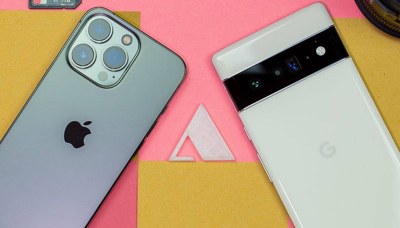

Apple's iPhone 13 Pro was only ahead of the Pixel 6 Pro by a single point in our recent camera blind test. This is more than enough reason to take a closer look at the cameras inside two of these flagships. In this comparison, we discover just which smartphone offers better image quality, more photo fun, and cooler special features in 2021.
If only a few more people had voted for the Pixel 6 Pro in our camera blind test, Google would have beaten Apple! The result, where no one apart from Stefan knew which photo belonged to which smartphone, was so close that we wanted to take another look at the two smartphones. For this, I went on a photo tour with the Pixel 6 Pro and the iPhone 13 Pro and tried out different scenarios.
Since laboratory conditions are sometimes far different from what reality offers, I decided that in this photo comparison, I will take a practical approach. I walked through Berlin and looked for interesting subjects that I wanted to see captured using the cameras of the two smartphones. In doing so, my test is divided into the following sections:
Jump to
You can view the photos in this article in their full resolution glory by clicking on them. I will share my personal impression in one paragraph each, so as not to drag out this comparison too much. Of course, this doesn't mean that you can't talk about the photos in the comments! So let me and other readers know your preferences!
Technical comparison
As in my last "camera battle", I have to attach a little nerdy section that we will need later to clarify some differences in the results. This is necessary because different camera systems are used in both smartphones. You can see exactly how they differ in the table below:
The above is quite a lot of data for anyone to digest, but one can sum it up in just a few words. Google pursued a similar strategy as Apple last year. The iPhone 13 Pro features very large sensors with a lower megapixel count and fast lenses. This should ensure less noise, especially in night shots, because you get more light on a single pixel.
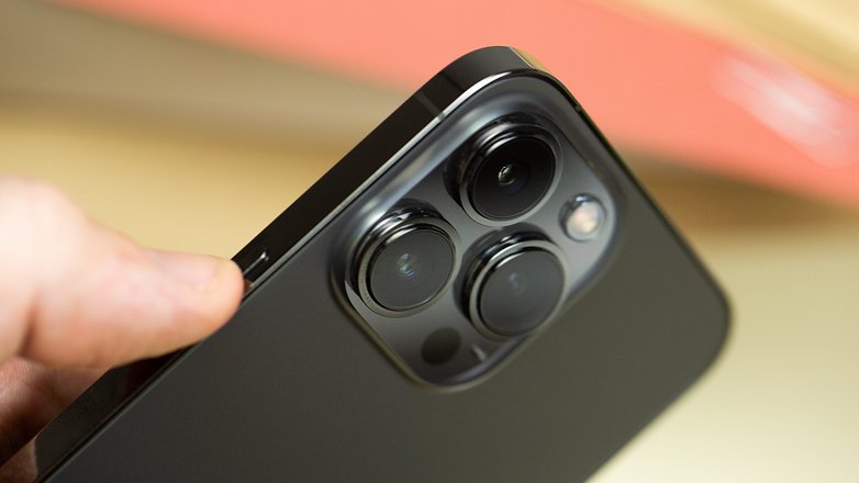
Google, on the other hand, relies on more megapixels in 2021, but also incorporates large sensors. The pixel sizes are smaller in the process, but the software giant makes use of pixel binning to add such information from multiple pixels. It is also noticeable that Apple uses sensor-shift stabilization. Image stabilization that works as the sensor moves instead of the lens. Since the sensors are a little bit lighter, movements can be compensated for in a faster manner. Technically speaking, this is a better solution.
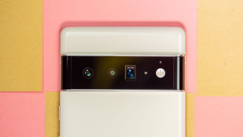
Google's periscope telephoto lens is also very promising. This offers an optical focal length of 104 millimeters, plus additional scope for lossless, digital magnification thanks to the 48-megapixel sensor. Will we notice this in the photos below?
Daytime shots
Let's begin with the daytime shots. This is where smartphones and cameras can usually get the most out of their pixels. However, there are challenges with HDR shooting and portrait features, which we'll see in a moment as well.
Photo in lamplight
In the first shot, we can see a few exciting differences right away. First and foremost, both photos have a high level of detail, and I think the exposure is fine in both photos. Apple depicts the scenery a bit more naturally and allows the photo to have more shadows. Here, Google has already gone full HDR and obtained more detail out of the dark hallway. Color-wise, Google leans more towards the blue, while Apple is a bit warmer.
HDR in sunlight
This impression is confirmed in the next photo. Google renders the scenery bluer, Apple a bit warmer. However, the iPhone now shows that there is also a lot of dynamic range in the sensor. Although the dark areas are still a bit darker, the sign on the entrance door to the NextPit office building can be seen well in each case. What Google performs much better, though, as the little bit of sky at the top of the windows look much more natural than Apple's aquamarine hue.
Zoom from ultra-wide to digital telephoto
When changing focal lengths, the Pixel 6 Pro convinces me more in this case. It is no surprise at all since it has both more megapixels and a longer focal length with the telephoto lens kicking in. In ultra-wide, the iPhone 13 Pro's shot is richer in contrast, but it's at higher zoom levels that the Pixel 6 Pro retains more detail. Google does an impressive job of showing how much power there is in its telephoto lens when you look at the 20x zoom. Even when zoomed in, you can see details that you wouldn't have seen with the naked eye.
HDR in direct backlight
The next photo is taken with the sun as a direct backlight. The biggest challenge here is, of course, to still somehow depict the details of the foliage. In addition, you get a first impression of the portrait mode of the two smartphones here. Both digital bokehs look natural, but I like the iPhone 13 Pro's results better overall. The photo has more contrast and the background is still a bit blurrier.
Adjusting the color temperature
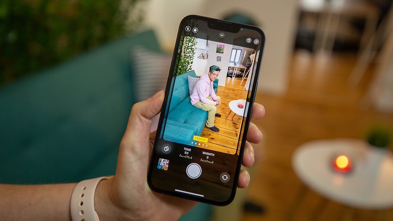
In both Google's Camera app and Apple's "Photographic Styles", you can adjust the color temperature of your images. Here,, we see very clearly why Apple doesn't call its feature a "filter". This is because while Google applies the color temperature adjustment to the entire image, Apple's changes affect some areas more while doing less in other areas.
Portrait shots on selfies and the main camera
Google's main weakness with portrait shots remains the same - the frame is zoomed out when you switch. As a result, the main camera selfie looks more zoomed in on the Pixel 6 Pro than on the iPhone 13 Pro. The blurring is a little nit more precise on the Pixel 6 though, as I had an extra strand of hair hanging out, but the challenging background just makes it look nicer on Apple. I really like that both smartphones get the skin tone right.
Shooting at night
A few hours later, we went outside again with both smartphones. Here I expected a lot more from the iPhone 13 Pro, as the smartphone not only relies on its larger sensors, but was able to achieve a lot of success in the camera blind test in this category.
The first photo in night mode once again confirms how differently both smartphones work. Google takes the warmer route while Apple delivers colder results, but apart from that, the photos are rather similar. Details like the door handle or the leaves on the ground are easy to see. Apple seems to offer a little bit more contrast though, such as the tiny shadows on the walls become easier to see.
This stronger contrast in details, also known as micro-contrast, is a bit of a downfall for the iPhone 13 Pro in the next night photo. The image looks more artificial than the one captured using the Pixel 6 Pro. This is especially noticeable on the car windows on the right or on the cobblestones at the bottom. In return, the Pixel blends the doorbell on the left a bit.
When zooming in night mode, the Pixel 6 Pro rolls out a brighter result overall. The smartphone uses the light source that we don't see in the photo and lets the wall of the courtyard shine brightly. The iPhone 13 Pro, on the other hand, makes the scene look more natural, as dark areas remain really dark as well. To that end, Google spanked the colors in my opinion. After all, the house was not as yellow in real life as depicted in the photo.
Google just likes to show off when it comes to brightening up its photos, this was already the case when it introduced Night Sight in the Pixel 3. If it's really pitch black in such situations, that's also really impressive. With the naked eye I couldn't make out the foliage on the ground, on the Pixel 6 Pro it's clear and obvious where leaves are. Apple manages that as well, but reserves a more natural look here. The subject, i.e. the wooden statue, can be seen well in each case. Google continues with its yellow tint from the previous image.
At night, I also have to hold my face up to the camera. Of course, over here the iPhone 13 Pro depicted my skin tone in a more realistic manner. This is despite the fact that Google claims to have invested a lot of time and brain power here to spruce things up. The problem here also remains the same, with the general yellow cast that Google constantly produces. Sharpness is really good for the lighting conditions in both selfies.
One last night photo before the conditions became too freezing for me! The Pixel 6 Pro is darker than the iPhone for the first time here. Despite the pixel mush, it offers better details at the highest zoom level. Apple brightens up the surroundings more and also shows us what it looks like above the sphere of the Berlin TV tower.
Special functions
Google and Apple head in different directions when it comes to special features. No doubt you would have already gathered from the unveiling of the new iPhone, that Apple's focus in 2021 is on video. That's why there's Cinematic Mode, which we introduce to you in greater detail in the linked article. The ProRes codec also made headlines at the smartphone's launch. As a new photo feature, Apple introduced "Photographic Styles," which we explored a bit above.
Google offers a lot more features in Photos: there's a new "Magic Eraser", a motion blur mode, a long exposure option, and finally, you can change the color temperature of photos. Above, I've picked out an example for each smartphone. But we don't want to go much further into this.
Conclusion
If we were to look at all the photos at the end of this article, we would discover the following: the Google Pixel 6 Pro tends to show subjects and the surroundings in a yellowish or warmer tone in many photos. The iPhone 13 Pro, on the other hand, opts for a cooler look in most situations - as long as you have "Photographic Styles" disabled. This is where I suspect the reason more people opted for the iPhone in the camera blind test.
Apart from this conclusion about the color scheme which can still be easily corrected in the camera app, there's scant difference between the two smartphones. In most situations, the photos are sharp, have little artifacts in post-processing and the exposure is also correct in many shots. Having said that, it's mostly Google trying to get a little more out of dark photos. Again, Apple opts for a more natural look, while Google lets the software run its course.
There are two differences I have deliberately left out of this text, or barely touched on: Price and the video features. The Pixel 6 Pro costs $899 while you have to pay at least $999 for the iPhone 13 Pro. This means Apple has pitted itself against a very capable camera smartphone that is $100 cheaper.
When it comes to video features, though, Apple offers more: there's Cinematic mode, support for the ProRes codec, and the ultra-wide-angle camera can record in 4K at 60 frames per second, just like the main camera. Here, the Pixel 6 Pro switches to Full HD despite the high resolution, as I found out during my tests. Is that worth the extra price to you?
Who is your favorite device for photography in 2021? Are you more of a Pixel 6 Pro fan or an iPhone 13 Pro devotee? Let me know in the comments!


Great comparison, thank you... I'm sticking with the iPhone 12Pro, while the magic eraser is interesting, I have an app for that... and as for the longer zoom... I carry an RX100VI and I truly like the color rendering on iPhone
thats a great improvement