Microsoft Launcher Review: an Apple by any other name?
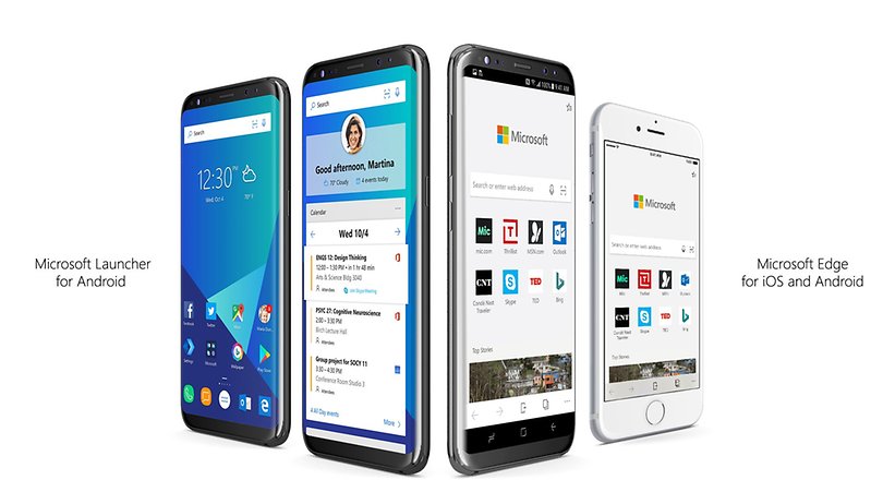

Microsoft’s Arrow launcher has a small but dedicated fan community. Now Microsoft has significantly reworked the Android interface and re-positioned it as the "Microsoft Launcher", and here’s our review.
The Microsoft Launcher was quick to download and install, and Android requests the necessary permissions both at launch and when selecting certain functions. The launcher’s surface seems modern and non-intrusive. App folders are displayed as squares and you can view up to four of the included icons at a glance without opening the folder. Android’s notifications remain untouched by the Microsoft Launcher. Briefly swiping your finger from top to bottom opens a system-wide content search like on the iPhone or current Huawei smartphones.
The feed is strangely familiar.
Two of the launcher’s most essential functions are the feed to the left of the homescreen and the quick menu that can be pulled from the bottom. The feed, which is nearly identical and located in the same place as iOS, displays numerous information, news, frequently used apps, and similar things in a bundle, and users themselves can determine what content is displayed.
Just as on the iPhone, the quick menu is pulled up from below. It contains a second row with five freely arrangeable app shortcuts, five important system settings, and a slider for controlling screen brightness. Unfortunately, the swipe-up feature only works on the homescreen, not across the entire system like with Apple.
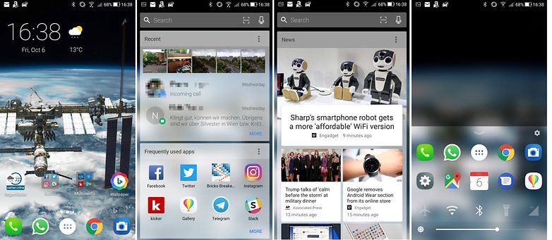
Here’s a nifty little feature: if desired, you can furnish the Microsoft Launcher with sleek background pictures from Bing. Tapping on the wallpaper icon on the homescreen loads a new one whenever you’re tired of seeing the current background. Now for the less rosy part: Bing is, of course, the default search engine in the Microsoft Launcher and its search bar, which is the reason it may quickly disappear from many homescreens.
Many options, fluid performance
The Microsoft Launcher can be configured in a myriad of ways and adjusted to your own preferences. There are options for the notification and menu bar, the notification dots, default applications and much more.
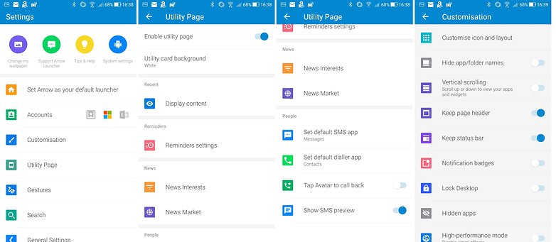
Performance is quite good on the Asus ZenFone 4, the only hitch is that sometimes when you return to the homescreen from an app, it takes a moment until the symbols show up again. Otherwise, the launcher runs smoothly on the Asus smartphone, even without activating high-performance mode.
It’s a bit strange how Microsoft is blatantly conjuring up some of that Apple feel on Android smartphones. But the appearance—even though it's a matter of taste—is pleasant, the performance is good and there are assorted options, so there’s nothing wrong with trying the Microsoft Launcher once to see if it matches your sensibilities.
What is your favorite launcher for Android? Or do you prefer it pure and unadulterated?



I have been using this launcher on my phone for several weeks now..I love it! It somewhat makes my phone feel like a new one lol.
I'm currently using it on my Z Pro. Still tinkering with it. Some of its features are useful. I changed the Bing search to Google search. I'm kind of liking the feed. But I still like the Nova launcher. Time will tell.
Interesting review of the launcher's functions.
Nothing wrong with Bing. It is 20% of the search market and really does deliver different results - which can be great if you need to come up with things your competition - or colleagues at work - haven't thought of or discovered by the next strategy and planning session.
M$ Launcher will let you use 3rd party icon packs - which is great - but it takes a bit of work to change them over as they will change in the app drawer when you select the icons you desire, but they won't change on any pages you may have pinned them to prior to selecting a new icon pack.
Folder formatting isn't as flexible as it is with, say Nova Launcher. In fact, there isn't any folder formatting at all. You want a folder? You get a square with a name below and small icons within.
Page formatting isn't too flexible either. You can have 4 rows by 4 columns all the way up to 5 rows by 6 columns. There are no "half-grid" stops or widget overlapping so it is hard to get things close together sometimes - and wasted space on a launch page is, well, wasted space (but, this is Android, not like we're talking Live Tile-level efficiencies of space utilization here). That said, the development team really need to get onto creating a solution that will allow closer spacing of widgets.
"The feed," while perhaps somewhat reminiscent of whatever they do over in Cupertino, is a much smoother application of the concept than Nova's current patching in of Google Now's feed. Oh. Yeah, the Bing Wallpaper will change automatically each day if you prefer. I should add that you can theme your feed with different key colors and a light, dark or transparent background.
Microsoft really has some interesting offerings in the Android space. Outlook for Android is arguably the best in class for non-G-mailers and those with corporate email accounts which must be attended to. The rest of the Office App suite is there and dependable too: Excel, PowerPoint... all accurately replicating the functionality of their PC brethren. The Bing search app is great. Wunderlist, the nascent To-Do, the adolescent Edge - which has a very cool, unreleased, but fairly stable beta in the Play store - and, of course, Cortana. On PC, they work together to really bring a cohesive experience to Windows 10. If Microsoft can get them to interact well on Android, they will have one heck of a compelling offering.
I use Outlook for my Gmail account as well as others
Smells like market research dressed up as a launcher. What all is it collecting via permissions and such?
LOL. How can anyone invested at all in an Android phone complain about THAT? Perhaps you didn't notice the agreements you made when you first booted up your current Android phone.
Because there are solutions to keeping your privacy for most things in Android. And even denying permissions to apps.
You could deny Microsoft Launcher those same permissions (access to contacts, photos, location...) so, no real difference there. Microsoft's business includes - in large part - server sales, Office suite sales and subscriptions, X-Box and Bing. Google's business is predominantly collecting information from you to sell to marketers. You really can't argue that MS is prying into your life if you have anything to do with Google. bgr.com/2014/02/06/apple-google-microsoft-revenue-sources/
It seems a good launcher after all. The versatile functionality of settings with a lot of options. The bottom swiping menu of wifi and other control is not good looking as apple though. It must be updated to look well.