MIUI 12 review: Xiaomi's Android overlay is out of this world
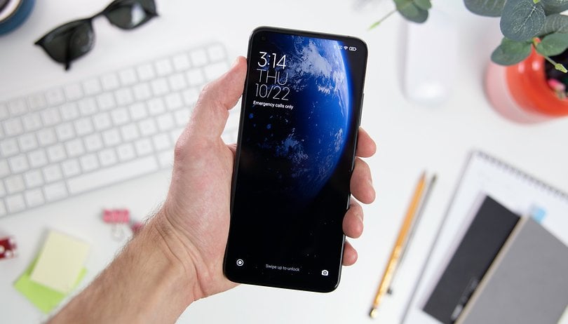

The Xiaomi MIUI's interface happens to be one of the most popular on the market (alongside Samsung's revamped OneUI), but it is also one of the most complicated. Forget about stock Android, MIUI doesn't give in to the idea of minimalism and decided to roll out a slew of native apps, animations, and customizations. Here's my complete review of MIUI 12 for NextPit.
I tested MIUI 12 that was based on Android 10 for a couple of weeks on the Xiaomi Mi 10T Pro. With the progressive deployment of Android 11, vendors are gradually getting up to speed by adapting their software overlay to the latest Google OS version. NextPit intends to perform a thorough review of these interfaces in due time: namely OneUI 3.0, Realme UI 2.0, ColorOS11, MIUI 12, or OxygenOS 11.
Presented last May, MIUI 12 by Xiaomi has already begun its second wave of deployment. Visually, Xiaomi's Android overlay is truly an out-of-this-world implementation. But it's also well-engineered and optimized, as one can notice that a lot of effort has been made by the manufacturer when it comes to privacy concerns, customization capability, and ergonomics.
Contents:
- Animations in MIUI 12: It feels like a Xiaomi movie
- The Mi Control Center is not very intuitive
- Finally an application drawer or "app drawer" in Xiaomi MIUI 12
- Floating windows for multitasking
- In MIUI 12, Xiaomi makes a big effort in personal data protection
- The presence of advertisements in MIUI 12
- Mi Share and the new focus mode
- Conclusion
Animations in MIUI 12: It feels like a Xiaomi movie
As you will notice in MIUI 12, Xiaomi has placed plenty of emphasis on having animations in its interface. Well, I admit that I'm a nerd but I'm not going to give you a speed comparison between MIUI 11 and MIUI 12 for the launch time of an app, nor time the animations the way those good people at XDA-Developers do, sorry (actually, I'm not).
But as soon as the lock screen of MIUI 12 launches, it would not be surprising that one feels as though one was sitting through a movie: with the credits rolling and the experience of what resembles an actual movie scene in terms of feeling. Let's begin with "Super Wallpapers". It's a feature that consists of offering some rather spectacular-looking animated wallpapers.
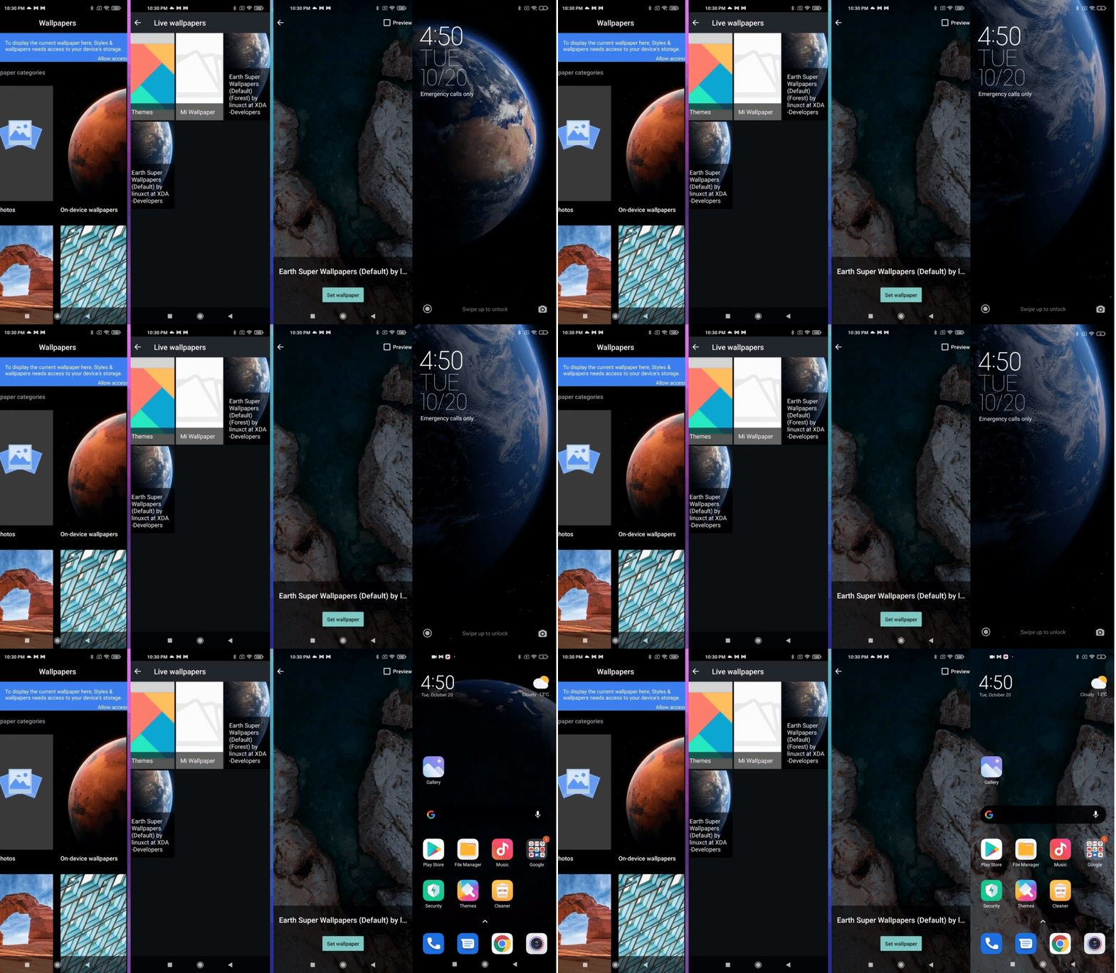
You can choose between three visuals, one of Earth (Super Earth), one of Mars (Super Mars), and one of Saturn (Super Saturn). When you wake up the locked screen, the animation will depict the slow, orbital movement of the planet in question as seen from outer space. Once the screen is unlocked, an animation launches a progressive zoom on each planet as you arrive on the home screen of your Xiaomi smartphone.
At the point of publishing, only a handful of smartphones offer this feature, and my Xiaomi Mi 10T Pro didn't have it - bummer for a flagship device! But there is a fairly simple method (based on downloading an APK and Google Wallpaper) that allows you to enjoy it on virtually any Xiaomi smartphone. I will make a quick guide if you are interested.
In fact, this is but just the beginning - we have animations everywhere. When launching an application, instead of the app itself opening and closing via the middle of the display, every application under MIUI 12 will open directly from the application icon itself and disappears behind it when closing.
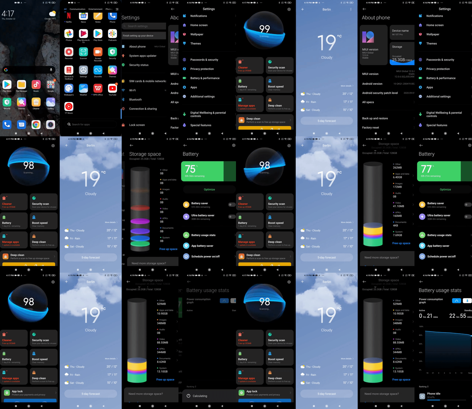
We also have animations in the battery utility as well as under the storage settings. Animations that we can customize, using different choices of icons, etc. Some might think that all of these would end up causing an unnecessary battery drain, but throughout the duration of my review, I didn't find the battery drained to be substantial enough to make a difference compared to a Xiaomi device that ran on MIUI 12, or on smartphones with interfaces that have less "workload", so to speak. In fact, navigating through the entire operating system proved to be a very fluid experience, and that is certainly pretty impressive in my books.
The Mi Control Center is not very intuitive
I know, I know, I can already hear you YELLING in the comments. But Xiaomi's new control center in MIUI 12 undeniably resembles what is implemented in iOS. There, I said it. That's the only time I'll mention You Know Who but it is totally justified here. So, I don't want to hear it!
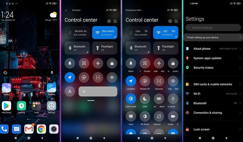
It is not limited to just the expanded drop-down menu of notifications. In fact, the top part of the screen in MIUI is divided into two. By pulling the shade from the top to bottom of the top left corner, you eventually arrive at the notifications screen, nothing more.
In order to access the Mi Control Center, you will have to pull down from the top right corner. It's a bit counter-intuitive at first but eventually, you will get used to it. So you'll find all of the system application shortcuts here, the native screen recorder, dark mode, etc., in addition to network and Bluetooth connectivity information.
And if it's all done well and is fully customizable, I wish I had it all, both the control center and notifications in a single place. In any case, I find it a shame to have to make two different gestures in order to access this information separately.
Finally an application drawer or "app drawer" in Xiaomi MIUI 12
Finally, one of the more-than-welcome features in MIUI 12 would be the arrival of the application drawer, which already existed on the Chinese ROM counterpart of Xiaomi's smartphones under MIUI 11. I haven't used a Xiaomi smartphone in a while, so feel free to correct me if you already had an app drawer on your European ROM.
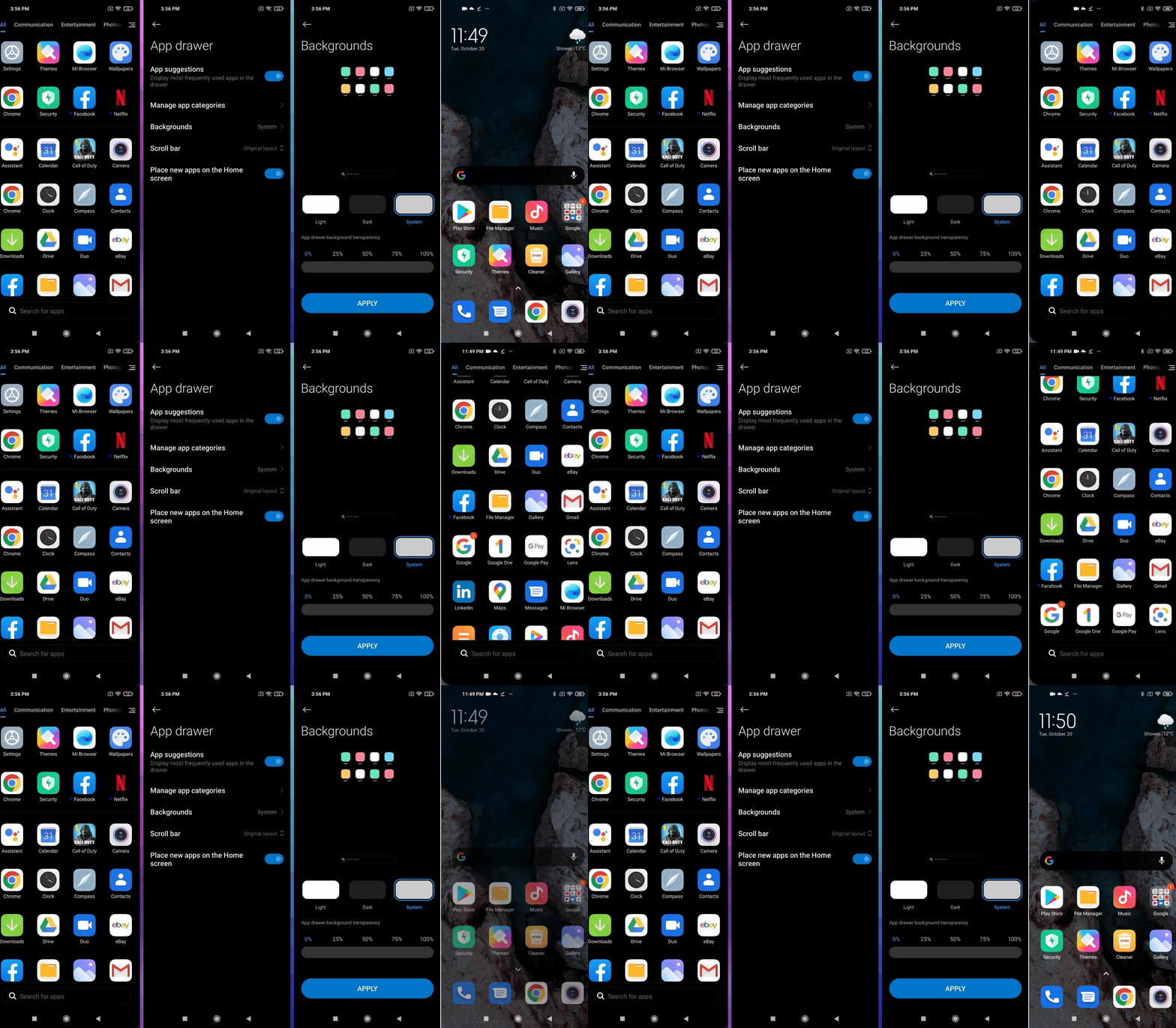
However, this drawer is still optional and not by default. You can customize it by adapting the dark or light theme to correspond with that of the system, choosing different colored backgrounds while setting the transparency of the pane once it is launched.
You will then have 4 tabs - All, Communication, Entertainment, and Photo - which will help you refine the selection as well as having a search bar at the bottom of the screen. This makes the entire experience easy to use with just one hand. It is truly an addition that brings user-friendliness and fluidity for everyday use.
Floating windows for multitasking
Almost all manufacturers have been offering this since Samsung launched its "Pop-up view" to use windowed or multi-windowed applications. If I found this feature to be very effective and especially useful on the Samsung Galaxy Z Fold 2, but I do not see the whole point of having this feature available on a smartphone with a "normal" form factor due to the limited screen size.
And a lot of apps support picture-in-picture. But it's still nice to have a native windowed mode that is available to be called upon as and when required. Just access the corresponding icon via the drop-down menu and the chosen application will be displayed in a smaller, floating window.
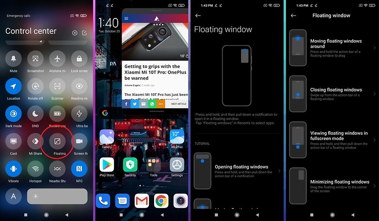
You can change the location and size of the window at will, and MIUI 12 also allows you to "wedge" a window in one of the corners of the screen. Everything worked pretty well during my review, I liked the ability to save my floating windows in the "recent items" menu (swipe up and hold).
It's ultra-smooth and the small windows are displayed over most full-screen applications, mobile games included! Well, it's not much use practically speaking, but I'll tell you about it anyway. On the other hand, there's no way to place YouTube in a window. Logically, the catch to this is, Google reserves this feature for premium subscribers, while this is curiously not the case on iOS.

In MIUI 12, Xiaomi makes a big effort on personal data protection
With MIUI 12, Xiaomi placed a lot of emphasis on protecting your personal data. The new interface includes a system that manages the authorizations granted to applications. It's a total redesign of the permissions manager that allows you to quickly see which applications have what kind of corresponding permissions.
You also have notifications every time an application requests access to the camera, microphone, or location, which are displayed in large print and take up almost a third of the screen. When you first launch a system application, MIUI 12 draws your attention to the kind of information that the application will be able to access. This feature has been named "Barbed Wire" by Xiaomi.
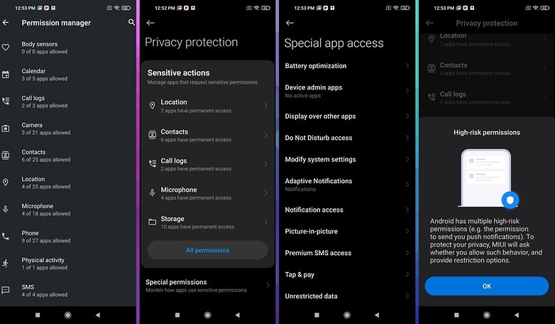
MIUI also sends you an alert whenever an application attempts to use the camera, microphone, or location without your permission. This feature also allows you to keep a log of every time an application uses a certain permission. You can see in real-time how and when an app accessed your data.
Finally, there is another feature called Mask System, which returns dummy or empty messages by default when a third-party application tries to access your call log or messages. This feature is designed to prevent suspicious applications from reading your private data.
Another strong point in terms of security and privacy is the ability to create a virtual ID. Interestingly enough, MIUI 12 allows you to hide browser customization behind a virtual profile. You can reset this virtual ID whenever you prefer to clear any customizations made related to usage or preferences.
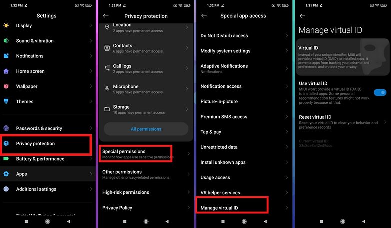
Finally, it is also possible to completely block user credentials, although this can break some websites and should be used with caution. This is a very good effort from Xiaomi, considering the company was called out in early 2020 for a data collection scandal via the default browser, even when one is in Incognito mode!
The presence of ads in MIUI 12
It's the seal of infamy, the negative point, the pain-in-the-ass for Xiaomi. In short, the burden that Xiaomi has been carrying around for some time: the presence of ads in its interface. As I explained above, I reviewed MIUI 12 on a Xiaomi Mi 10T Pro that runs on a Global ROM.
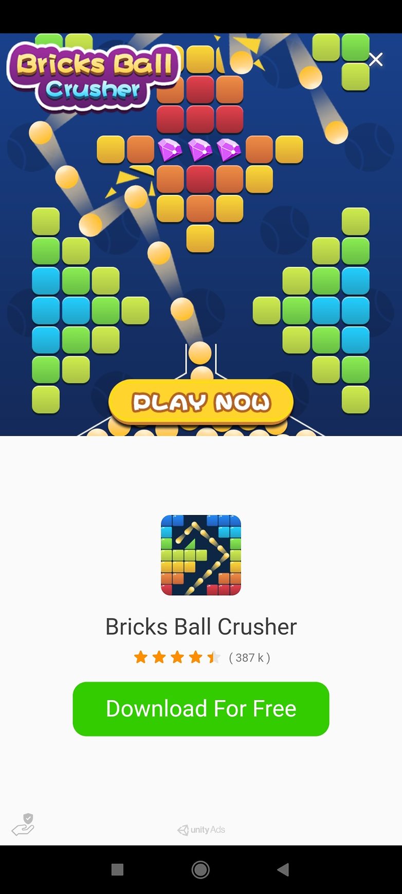
And I did experience a pop-up ad when setting up the smartphone, while trying to install a dynamic wallpaper. So it was an ad in the native Xiaomi Themes app in MIUI 12. I've since written a fairly comprehensive guide to getting rid of MIUI ads, and I haven't seen any since performing all of the recommended steps, at least for the rest of my review duration.
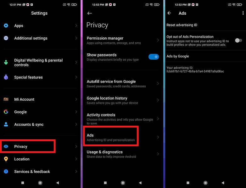
In MIUI 12, you can also disable the ads more easily with a simple switch in the settings, but to be sure, I've got it all figured out. Apply all of the advice that I dished out in the above-mentioned guide by disabling custom ads in each native application (themes, security, browser, etc.), and you should be home free.
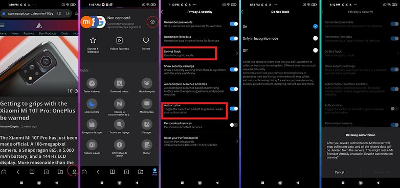
In the browser, you can now block third-party cookies with the "Do not track" function. And if you're like me, you do not use the default browser and want to be sure that you are not being tracked, you can simply revoke the Mi Browser's authorization to collect data. This will prevent the app from working, where it will then close and if you open it again, the authorization will be reset.
Mi Share and the new focus mode
These are features that I haven't really tested because they don't match my usage pattern or simply because it would be difficult or even impossible, given my skills and knowledge, to make a real objective judgment.
But I can cite as an example, the Mi Share feature: a multi-platform file sharing platform which was jointly adopted by Xiaomi, Oppo, and Vivo a few months ago.
MIUI 12 also brings two handy new features to the Photo Gallery as well as the File Manager. The first is the "Memories" option, which can be used to create collages or short videos using existing images or videos you have in your gallery.
For collages, you can choose the orientation, add text, and edit each image individually. For short videos, you can choose from several templates and background scores or download more from the same menu.
In the File Manager, by pressing down on an icon in the top right corner, you will see a new sort menu that will allow you to sort the different files and folders by name, size, creation date, or file type. In addition to sorting, you can also change the display between the list and grid options.
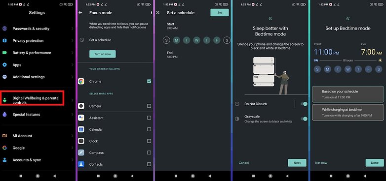
MIUI 12 also offers new digital wellness features. For example, Xiaomi has reworked the screen time dashboard with new graphics for daily and weekly use. You can also add a custom time for Focus mode, a feature that blocks certain applications and their notifications.
Conclusion
With MIUI 12, Xiaomi managed to convince and seduce me, a long-time OxygenOS fan. Although I prefer lightweight interfaces, without being obsessed with stock Android, I found the MIUI 12 overlay to be very capable but also very fluid and visually pleasing.
Everything is really neat: from the animations to the Super Wallpapers and the application drawer. You will feel like you're watching a sequence being shot, where the animations flow together and you end up immersed in the interface.
Apart from such bouquets, I found Xiaomi's efforts when it comes to security and data protection very commendable. I'm not a data expert or a computer scientist, so I can't really verify how effective Xiaomi's filters are. But it's reassuring to have so many options to limit third-party applications from accessing our data.
The presence of ads in the interface is a compromise that I'm still not ready to accept, even if it helps keep the price of Xiaomi smartphones lower than their competitors. The ease of ad deactivation has been made easier in MIUI 12 but I'd like to be sure that my usage habits and preferences are not tracked, at least via native applications or within the system itself.
I also regret the slightly counter-intuitive side of the Mi Control Center, without finding it really detrimental to the user experience. You can disable it, by the way - which is a good thing. With MIUI, Xiaomi is making choices that are drastically opposite, or at least far removed, from what Google is doing. But we always have this impression of choice, of personalization, that I find really nice.
Personally, it's one of the most atypical interfaces on the market but also the neatest. I haven't thought about a scoring system for interface reviews yet, but MIUI 12 is definitely at the top of the list.
Also read on NextPit:








Looks likes a clutter fest and contrast failure. How is it in daylight performance. And who has time to,multiple times per day every day to watch animations playout? To remain interesting theyd have to be different every time.
Counterproductive when the phone must be productive.