Moto 360 review: the smartwatch that couldn't live up to its hype [updated: Wi-Fi support is coming]
![Moto 360 review: the smartwatch that couldn't live up to its hype [updated: Wi-Fi support is coming] moto360 3](https://fs.npstatic.com/userfiles/1017988/image/2014-agosto/moto360-3-w810h462.png)

Google announced Android Wear in March 2014, an operating system for wearable devices which could be used by any manufacturer. Since then, people around the world, myself included, have dreamed of a piece of hardware which would unite the design of a classic watch with the unique features of modern software. That dream was the Moto 360. And now that dream is over.
In the words of the engineers and designers at Motorola, the Moto 360 is the "reinvention of the classic", it is "iconic", and an "amazing piece of technology". "Change has come to the market", they said. The unfortunate truth is that the Moto 360 does not offer anything substantially different from what previous releases like the LG G Watch, or Samsung Gear Live have delivered in terms of user-experience, and in some cases, the experience is even worse. The good news is that Motorola has now confirmed that the Moto 360 will get Wi-Fi functionality with an update to Android Wear.
Good
- Circular design
- Metal construction
- Wireless charging
- Water resistant
- Ambient light sensor
- Heart rate monitor
Bad
- Very thick
- Battery usually lasts less than 24 hours
- Poor processor
- Software bugs
- Wristband quickly shows signs of use
- No NFC
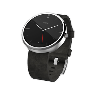
Motorola Moto 360 design and build quality
The Moto 360 stands out among smartwatches for being one of the only watches built in a circular format (the only other major name is the upcoming LG G Watch R). At first glance, the wearable device from Motorola is beautiful and elegant, especially in person. The aluminum frame and a genuine leather strap offer a premium feel, and the fact that the edges of the display are slightly raised creates a nice look even with the screen off.
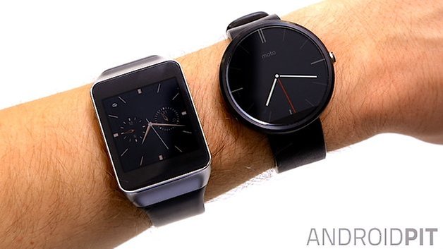
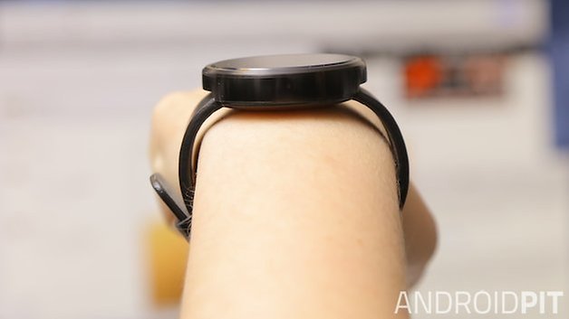
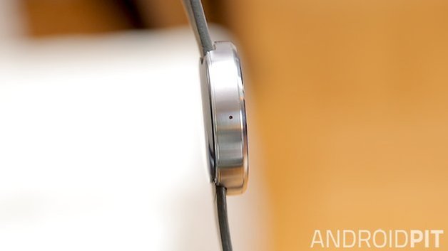
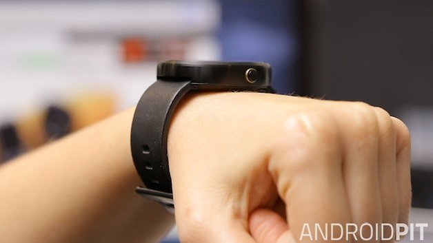
With the Moto 360 on the wrist, the elegant-look does not translate. I have extensive experience when it comes to wearables, I've used the Galaxy Gear, Gear 2, Gear Fit, the Pebble, the LG G Watch and the Gear Live... but none of them feel as strange as the Moto 360. To look at the watch top-down, it looks quite normal, but when you see it from the side, it looks like you are carrying a yo-yo on a strap.
Although thick, the Moto 360 is lightweight. It weighs only 49 grams and the leather strap is soft, but this can become a problem as it is easily scratched, and shows signs of wear quickly. Replacing it won't be difficult, however, and Motorola will also offer wristbands with different patterns and materials from its website later in the year.
The smartwatch is water resistant, meaning it can withstand the rain or survive the washing up, but don't drown it the bath or a pool. The fact that the strap is made of leather will tell you that you shouldn't soak it.
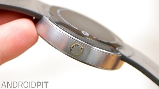
On the right-hand side of the device we find a physical button, as is found on classic watches, but on the Moto 360 it serves to activate and deactivate the screen, or open the display settings when held. It's a shame that Motorola has not afforded the button with other functions, such as quick access to recently used applications or quick shortcuts, as this would be very useful. But, of course, this would also depend on the integration with the software, and it currently doesn't allow for such options.
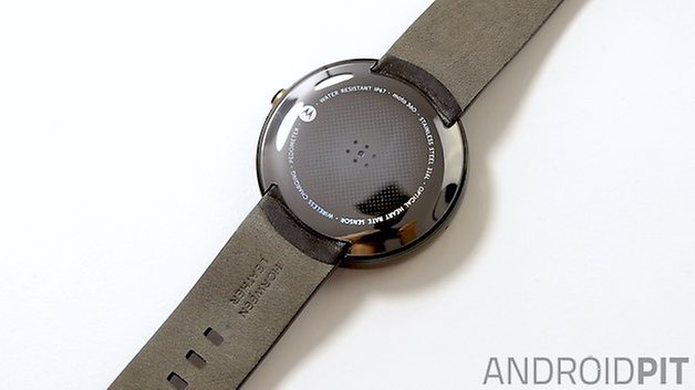
The back of the Moto 360 is made of plastic and contains the heart rate monitor. Just like the Gear Live, the sensor isn't completely accurate and it can take several attempts to get a reading.
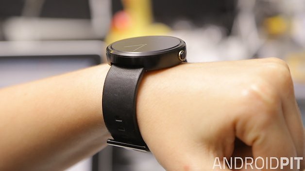
From a design point of view, the Moto 360 definitely appears more interesting when we look at it from afar than when we have it on the wrist. The style draws attention, but it's still not the stuff of dreams, and its thickness prevents it from looking truly suave.
Motorola Moto 360 display
The Moto 360 screen is a 1.56-inch LCD and comes with Corning Gorilla Glass 3 protection. With a resolution of 320 x 290 pixels and a pixel density of 205 ppi, the picture quality, sadly, leaves something to be desired. The impression I have is that videos and photos which are viewed on the Moto 360 look much sharper, with better contrast, than when we are actually looking at the device normally. If you pay attention to the application icons and notifications that appear on-screen, you can almost count the number of pixels that can be seen.
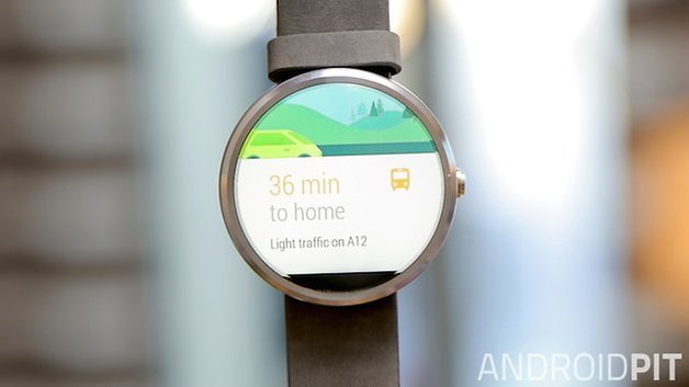
Despite the Moto 360 housing a circular screen, the display is not completely round. Motorola has chosen to include an ambient light sensor on this smartwatch, which ends up occupying a small space at the bottom of the screen. This is not visible in the dark or when the screen is black, but it can clearly be seen in all other circumstances, and I can't deny that it's off-putting.
However, the ambient light sensor makes a huge difference to the experience of using the Moto 360. With it enabled, the device adapts the light of the screen according to the environment you're in, saving you having to access the settings to increase or decrease the screen brightness whenever the lighting conditions change.
Motorola Moto 360 software
Update: Motorola has confirmed that the Moto 360 will get Wi-Fi support with an update to Android Wear. Because the Moto 360 uses an older Texas Instruments processor (compared to the newer Snapdragon 400 found in most other Android Wear smartwatches), there had been concern that the Moto 360 would miss out on this feature. Motorola has now confirmed in a blog post that the Moto 360 will indeed be getting Wi-Fi support, along with new wrist-flick gesture controls, hand-drawn emoji support and always-on apps with better battery management.
The Moto 360 runs on Android Wear, compatible with any device on Android 4.3 or higher. The Moto 360 software makes it possible to interact with the gadget using gestures and voice and in fact, one of the highlights of the device is in how well it allows users to perform certain actions through intelligent voice commands.
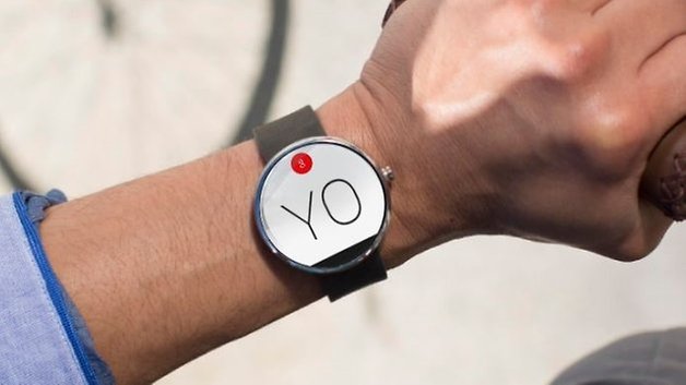
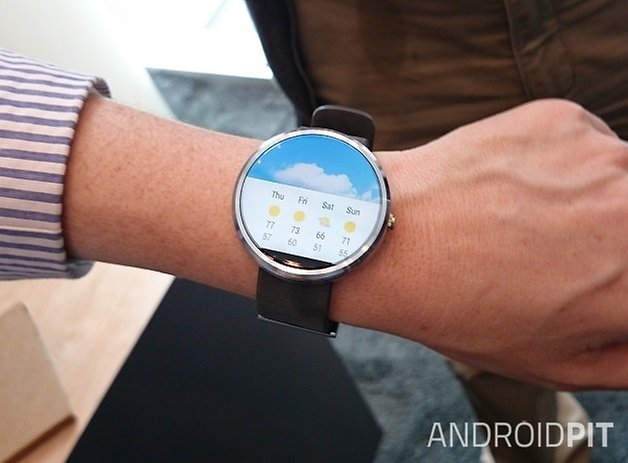
The OS revolves around shared user data from Google accounts, and uses location information from the mobile device it is paired with. It sends notifications from services like Gmail, WhatsApp, Hangouts, Weather etc and in most cases, the information appears when it needs to.
What is slightly disconcerting is that many of the functions for which you use the smartwatch end up being quite invasive - and anybody around you will know the contents of the messages you exchange. Android Wear as yet does not have a native or third-party keyboard app, so everything you wish to send will have to be stated out loud. That being said (if you'll pardon the pun), I can't deny that the voice commands are very welcome when you're busy and need to send a message in a hurry.
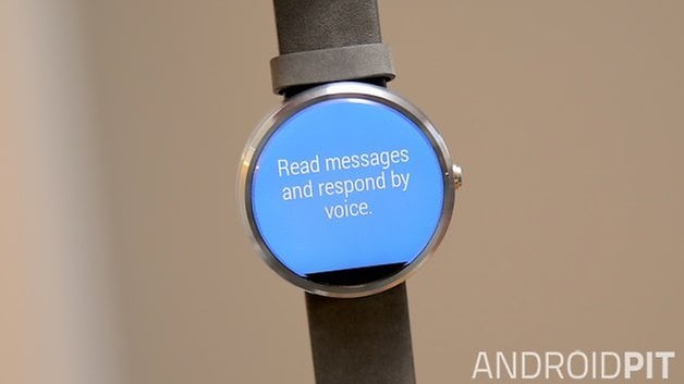
With a tap on the home screen, you begin the voice search, something which can also be started by saying the now infamous words: "Ok, Google". When sliding your finger from the bottom up, you can access the settings. What separates the Moto 360 from other watches running the same OS without a physical button is that you can press and hold the physical button on the side of the device to quickly arrive at the settings page - although it takes a solid two or three seconds to register (the Samsung Gear Live can also do this).
Though Android Wear is still young, it is in need of an urgent review; as it's still far from what it promises. In the case of the Moto 360 this is even more noticeable as most applications are not yet adapted for circular screens, so most third-party apps still appear in square format. Some text elements still get cut off despite the length of time Motorola had this in production. Android Wear 2.0 should be out on October 15th though, so we'll see what changes then.
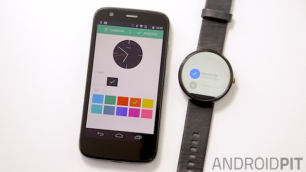
Motorola has provided some unique dials for the Moto 360, and most of these are extremely well designed. Altogether, there are four different layouts that can be customized from Motorola's Connect application. Through this app you can choose different color schemes, as well as specific settings, according to the functions of each display. Although Google does not allow for changes in the Android Wear UI, the manufacturers have some freedom when it comes to the watch faces.
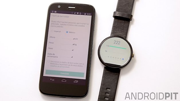
Last but not least, the Moto 360 integrates a heartbeat sensor system via Google FIT for monitoring the physical activities of users. Using the voice command "show my heart rate", the user starts to receive real-time information about their pulse. The information is collected by the sensor on the back of the device and the Moto 360 can also measure the amount of steps taken by the user.
Motorola Moto 360 performance
The Moto 360 does not have great performance, and perhaps this is explained by the fact that the device is packed with the same processor used by Motorola in its first smartwatch, the MOTOACTV, three years ago. The chipset used is the Texas Instruments OMAP 3, based on only a single-core ARM Cortex-A8. This processor was big news... in 2011, so it's not really a surprise that swiping between the screens of the Moto 360 results in some delays.
My guess is that the manufacturer chose this processor in order to cut manufacturing costs. The problem is that this choice might have compromised another part of the project: the battery (don't worry, we're getting there). Regarding the other specs, the Moto 360 has 512 MB of RAM and 4 GB of internal storage.
The Moto 360 has no NFC, so pairing happens with a smartphone via Bluetooth 4.0. Motorola informs us that the maximum distance between the smartphone and the device should be 45 meters, but often the connection to the smartphone ends at about 30 feet away.
Incidentally, pairing the Moto 360 with your smartphone is almost always a headache and, until late April 2015, had no Wi-Fi capabilities either. This meant the Moto 360 was useless without its Bluetooth connection. All smart functions like voice search and messaging became impossible if the Moto 360 lost connectivity to the phone. Fortunately, an update to Android Wear rectified this situation.
Motorola Moto 360 battery
Once the smartwatches running Android Wear were made public, one of the major criticisms was the low battery life of these gadgets. In this regard, the Moto 360 arrived promising up to 2.5 days of use before it needed to be charged again. But, as many critics have already pointed out, this is not the case. On the contrary, as soon as the unit arrived in the newsroom, we noted that in the first few hours of use the battery had fallen by almost 50%.
However, in late September, Motorola released an update to fix the problems with the Moto 360 battery and it seems to have succeeded. After the update, the battery of the Moto 360 did last 24 hours. In my test, the watch remained on from 8 AM Monday right through to 8 AM the next day, meaning it is capable of 24 hours, in ideal conditions. Prior to the update it was lucky to make it 12 hours.
During the time I spent with the watch for this review, I was sending messages via Hangouts, email and WhatsApp, making calls and setting reminders. I used the Moto 360 as a media control on my way to work and to read the various emails I received in the morning. I also did some research using Google Search and practiced my Italian using Duolingo.
Even with this behavior, which I consider moderate, and using the clock with "ambient screen" disabled, it was necessary to charge the Moto 360 at least once at some point during the day. If you consider that your laptop and smartphone already require daily charging, you can decide for yourself whether charging one more device will be a nuisance or not.
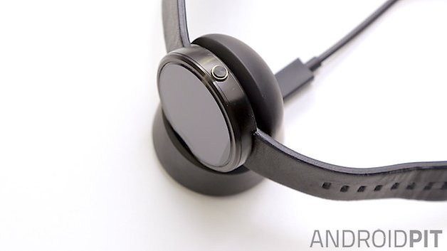
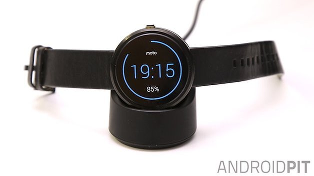
One positive thing about the Moto 360 is that it can be charged without the need for wires. Motorola deliver the Moto 360 with a wireless Qi charging dock and, despite it being a bit big, it is well designed and can stand on your desk or bedside table. To charge the Moto 360, simply plop the clock onto it and it will automatically begin charging. Neat.
Another aspect of the charging which I would like to point out is that the charging time is fast. In 30 minutes the battery life jumped up by 50%, but this should be no surprise given the small 320 mAh capacity.
Price and release date
The Moto 360 price is 249 USD, making it one of the more expensive watches to reach the Android Wear platform thus far. As for the Moto 360 release date, the Motorola wearable is available now from the official Motorola website and in retail stores. Check out the Moto 360 specs below.
Motorola Moto 360 technical specifications
Final verdict
The Moto 360 was advertised as an "iconic" gadget and an "amazing piece of technology". The dream of seeing the first smartwatch in the classic format has ended with the delivery of unimpressive hardware and software that is still in the development stage. The fact that Motorola has innovated in terms of smartwatch design, with its circular watch face and wireless charging, is not enough to put the Moto 360 above what already exists on the market today.
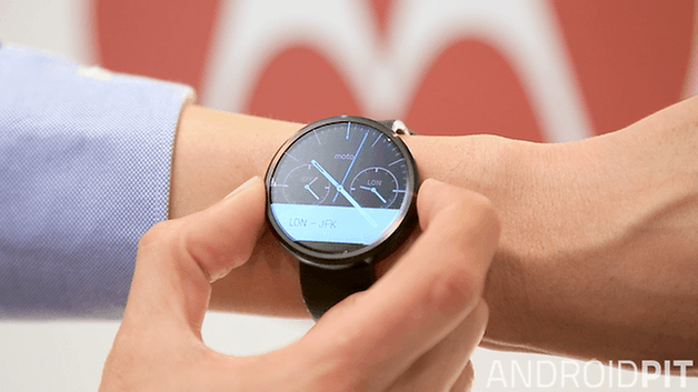
In my opinion, the Moto 360 is not an amazing device, and evidence that Android Wear still needs to improve before we see one. Of course, you can do some interesting things with the Moto 360, quick access to notifications and voice-controlled responses to messages is cool, and the design is very well thought out, despite its thickness.
But, in the end, though, your enjoyment of the Moto 360 will depend on the size of your expectations. And ours may have just been a little too high.
Translated from the original review by Camila Rinaldi for AndroidPIT.com.br.



I like the chinese taken you to a dinner!!!
It's final. This 360 is a GRADE-A piece of S****!
After spending the entire weekend trying to set it up, this google-made piece of S*** operating system, loses 1% battery every 40 seconds. (MEASURED LIVE!)
The ONLY cool thing about it, is the google speak thing. Where you speak to it, and it understands most of the most important commands.
Otherwise, this can't even be considered a TOY for my 6 years-old.
Trying to upgrade the firmware, this piece of junk just shows me a DOWNLOADING screen for 5 seconds and then the entire screen goes dark.
I mean, this S**** is like it was built by F***** retards! At least the software was.
And not to mention the hideous look of the watch it's self, where they advertise it as this nice round watch with great steel casing, when in fact it looks like it's all plastic, and it's so thick that my 6 years-old has a watch that's much better looking.
Final verdict: It just needed 1 Mickey Mouse character on the watch face, to make it what it really is: A piece of shit toy, for kids under 4, that just need a stupid, worthless bracelet, that costs over $250 !!!
Is the hart rate monitor more accurate if the watch is on the under side of the wrist?
I liked your review. This is in line to be the watch I would buy, but not without NFC. When a watch is reviewed I would like to see more information about the calendar, such as perpetual calendar and what that means and how to set the calendar (easy or hard). I would like to see the calendar listed in the specs and weather it is perpetual.
Most of what's on this article is total bs I have had several smart watches. first off tizan sucks so bad I sold my gear 2 within a month! The moto 360 looks great im a big watch guy anyways so it fits perfectly! The 360 doesn't lag at all not even when I'm on the Internet something tizan is is really bad at and typing is also bad on tizan never getting another! Motorola did such a good job on the 360 I'm buying the new one and I'm also thinking about the urban as well.
Dude, leave it alone its a cheap watch with impressive specs for it and a beautiful design that only was matched by other round smartwatches with huge bezels! Quit critisizing the moto 360 saying its terrible when its only tiny things that get annoying at times, for a pricetag just above a pebble its a great smart watch.
I would disagree, I believe the Moto 360 to be one of the best smartwatches currently out there. My biggest complaint with the 360 is the screen's resolution. It's good, but not great. Performance? I've never noticed it lag or stutter while swiping through notifications or menu UI. It's not like we're running games on our watches. The battery is on the smaller side, but I've been able to make it last two full days with ambient screen off and tilt to wake on (turning it off at night). With ambient mode on I've had no problems making it last all day (at least 16-18 hours). I keep the display on level 1 brightness to keep battery usage down and seeing the screen clearly has never been an issue. My first thought upon trying it out for the first time was it's BIG. But after comparing it to my other "regular" watches, I actually have one that's just the same size as the 360. After wearing it for a few days, you don't notice how thick it is. It's not an issue. Who looks at their watch from an angle like that? The image you used to show how thick it is made me laugh. You would never look at a watch from that angle, smart or not; and neither would anyone else. When I'm out in public no one notices that my watch is a smart watch, unless I'm actually interacting with it in front of someone. Just having it on my wrist doesn't give it any attention from friends or passersby. There are third party apps you can download from the Play store to enable keyboard style texting on the watch, if you really want to mess around with the tiny little buttons. By the way, I'm viewing texts, emails and alarms on my watch all day. I frequently use the stopwatch and timers at work, in addition to alarms at home. When I'm in my car I'm placing calls on my watch and transferring them to my hands free system effortlessly. Just to give you an idea of how frequently I use the watch. Many third party apps have round watch face support now, this was not the case when it was first released, but developers have realized how popular the 360 and LG watch have become and have designed their apps accordingly. This is no longer an issue. The watch band shows wear easily? This is such a silly complaint. As with anything you use on a daily basis, wear and tear from normal use will occur. Depending on your use will dictate how much wear and tear your particular device, or watch strap, will endure. I've owned the 360 for over four months now and there's no more wear and tear on its strap than the my normal watch's strap. In fact, I've banged my watch on walls, car doors, and other objects on accident many times with no scratches on the watch face or body.
All in all you have some great points, but to say the Moto 360 doesn't live up to its hype is a bit of a stretch in my opinion. It's a nice looking watch, it was made well, and it performs well too. I'm not sure what kind of expectations you had for the smart watch, but compared to the other watches I've tried, and ones my friends have, all of them (myself included) have preferred the 360 over their own.
OEM's should just take their time as opposed to rushing out a mediocre product. Apple waits to release their products and it hasn't hurt their bottom line, I'm willing to bet other OEM's would have similar results if they had the same patience.
I can't help but feel the same way. I thought the lack of interest in the first round of Android smartwatches would be enough to stop developers doing this, but it seems like this is not the case :(
Agreed
I can't escape the impression that this watch is like Samsung's first one and the only thing this one has it going for it is that it is round and therefore somewhat more likable. I'll state once again what I've been saying for quite some time: it's the same old ugly shit, but in round shape. It's too bulky, too big, that metal frame looks like someone just chopped off a piece of metal somewhere and beat it up to round shape, lacks finer points. I prefer something that looks ordinary, but hides a real power. LG watch is vying for this, I guess, looks like an ordinary sport watch with a twist. I don't want to wear a big bulky round stone around my wrist, as Moto 360 looks like to me. Or make something really cool which gets noticed immediately, but make it cool ffs. I don't get it actually, it's like OEMs choose the lamest possible designs for their devices...
I'm hoping for an improved version to appear sometime next year. At the current standard, for $249, I don't think it's worth it, personally.