Motorola One: up to date software, out of date hardware
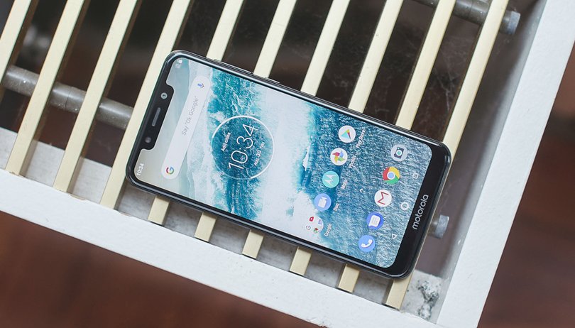

For a long time now, Motorola has been relying on Android OS for its smartphones, aside from making a few adjustments. That means there's little bloatware. But with the Motorola One, they're going one step further and committing to long-term updates. But has the manufacturer been a bit too stingy when it comes to the hardware? Find out in our full review.
Good
- Sleek design
- Pure Android software
Bad
- Outdated hardware
- Display isn't sharp enough
- Price is too high for what's offered
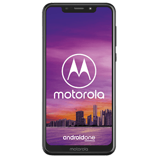
Nearly $400 is still quite a lot
Motorola is asking for 399 dollars for the Motorola One. It is available in the US from Best Buy, both online and in retail stores, and it has the distinction of being the first dual-SIM Motorola phone to be offered in the US. It comes in black and white versions.
Nice but uninspired design
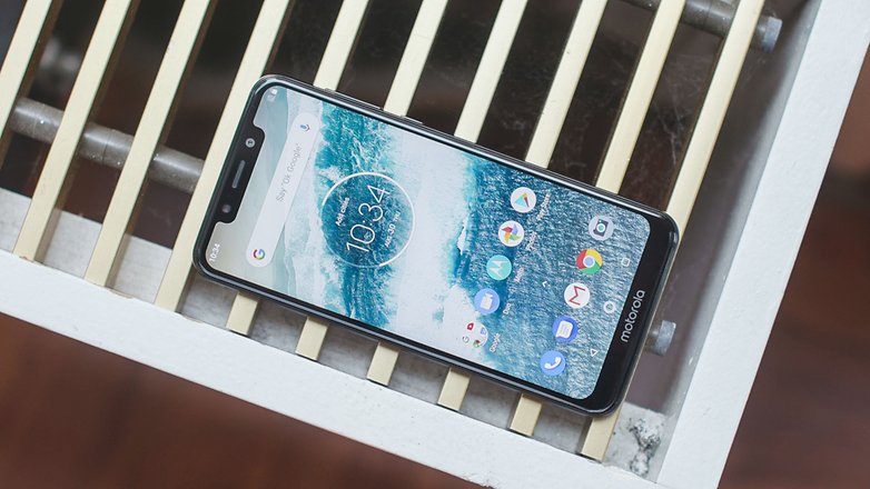
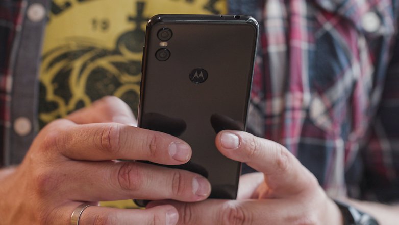
We got to test out the black version, which doesn't offer a particularly original design . Instead of Motorola staying true to its style and setting itself apart from the competition, they've offered the classic (and typical) glass black, a slightly protruding camera stuffed in the corner and a wide notch in the display. As seems to be quite common this year, Motorola has apparently also copied the design of Apple's iPhone X.
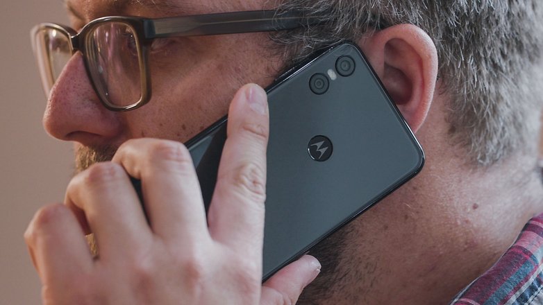
The Motorola One remains a pretty smartphone although, in the end, this is always a matter of taste. The workmanship is well done, and with a thickness of almost 8 millimeters and a weight of 162 grams, the smartphone is well-proportioned. Due to its compact design, which is quite slim compared to the competition, the device feels good in your hand and looks higher quality than the price would suggest.
Not enough resolution
You'll be disappointed when you switch on the Motorola One and take a look at the 5.9-inch, large IPS display and its wide notch . And that's not just because there's little room for icons and messages. The brightness of 490 nits is pretty good and the color reproduction is decent enough, with a Delta E value of 5.
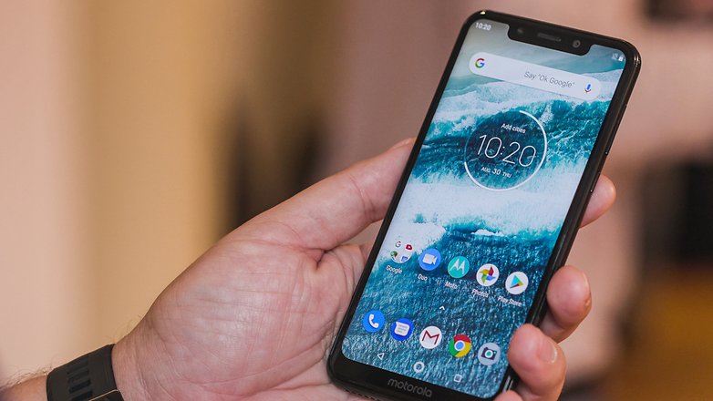
The bigger problem is the resolution, which is quite low at 1,520 x 720 pixels (HD+). During the test, it was annoying again and again because I kept wanting to sharpen the display with some setting that wasn't there. At a price of 400 dollars, this is a real no-go. The Motorola One is visibly inferior to other mid-range devices in this area.
Pure and unadulterated software with notch problems
Motorola has done a better, albeit not perfect job with the software on the Motorola One . The device uses pure Android and has made a promise to provide updates for two years and security patches for three years. The software still isn't perfect because the smartphone comes with Android 8.1 Oreo, although Android 9 Pie will come later this year. Unfortunately, security updates are also lagging behind. Our test model came with the update from August 1st.
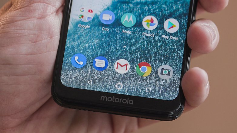
Motorola expanded the software with some small things, like the Moto Actions and Moto Infos. It holds its own against UI skins from manufacturers. The tidy, pure Android without any bloatware is simply great. In addition, Android One has also made life easier for manufacturers like Motorola, since tedious adjustments to the platform are no longer necessary.
This means there are also no special features, like those you might find on manufacturers' software. There's no one-handed mode, special screenshot photos, or dark mode themes.
The notch causes problems
The biggest problem with the software is the much too wide notch. Unfortunately, Motorola didn't make any adjustments to the software, which is why far too few icons are displayed in the notification bar. If you get any ideas about changing the display size to make space, everything goes crazy.
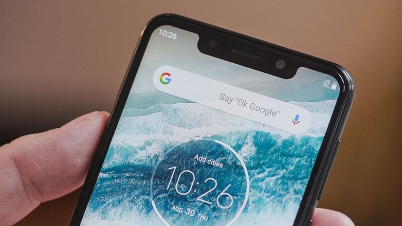
Not that many icons are displayed and existing ones are almost cut off at the edge, and the notch now protrudes into the contents of apps. This reveals that Android 8 isn't "ready" for the notch in its pure state.
Hardware of yesteryear
Although the software is kept up to date, Motorola is content with outdated hardware . The Snapdragon 625, which was introduced more than two years ago, is still on board. That's not a bad processor per se. It's acceptable in everyday use thanks to the slim Android software.
But when it comes to graphically complex apps, the chip can't keep up. Cheaper smartphones like the Mate 20 Lite and the Moto G6 Plus perform much better in relevant benchmarks. The SoC has a generous 4GB of RAM and 64GB of internal storage - more than enough in this price range. You can also expand the memory via a micro SDcard.
Great sound when you need it
The Motorola One has a speaker at the bottom of the device. The volume is great, and the audio quality is good at high volumes , even if it becomes metallic at times. And typical of smartphones, there's a lack of bass, but the pre-installed Dolby audio equalizer allows you to adjust the sound settings.
But there's still the classic disadvantage with the position of the speaker. If you hold the smartphone in landscape format, the opening is all too easily concealed and the speaker is silent. If you prefer to listen to music via headphones, you can connect them via the 3.5 mm jack, but headphones aren't included in the package. The reception and the quality of calls are satisfactory. We didn't notice any problems with the Bluetooth connection.
An iPhone-style camera
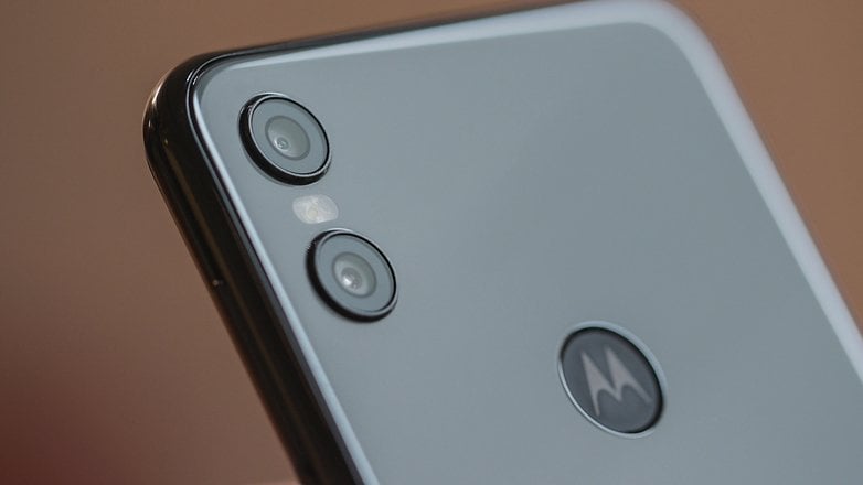
The Motorola One camera is arranged like on the camera compartment on the iPhone XS, but in terms of quality it doesn't at all keep up with the expensive high-end smartphone . There are two sensors on the back, one with 13MP and one with 2MP. There's an 8MP sensor for selfies.
In good lighting conditions, the Motorola One's camera delivers surprisingly good images with sufficient sharpness and detail. As soon as the lighting conditions get worse, however, the image quality drops rapidly and images will start to look noisy and blurred. There's no pro mode to help you get more out of the camera.
In some cases, the color balance is completely distorted and immerses the image in a red flare. In most cases, the portrait mode delivers acceptable results at first glance, but when you zoom in, the limitations became apparent. Sometimes it makes the photos a total mess. The camera might mistakenly focus on faces in the background and blur the foreground. But you can get a good idea of what the photos look like here:
A strong battery to help you get through the day
The Motorola's 3,000 mAh rechargeable battery will get you through the day without any problems , even with intensive use. At noon on the second day, however, I needed to plug the device in. This is due to the combination or pure Android, an economical processor and a low-resolution display. Nevertheless, two full days can be squeezed out of the battery with intermittent use.
Motorola's TurboPower fast-charging technology is available so you can charge the device quickly. Charging takes about one and a half hours with the included accessory.
Motorola One technical specifications
Final verdict: there are better alternative
The Motorola One isn't a bad smartphone at all. Actually, at first glance, it even offers a very coherent overall package. But if you read the fine print, several problems will become apparent. The processor quickly reaches its limits, and apart from everyday apps, the notch takes up too much space and the camera is quickly unusable in bad light.
But the most annoying thing is the display, which is the part of the smartphone you actually spend time looking at. This is a serious mistake. We expected at least a Full-HD panel at this price. The competition can deliver much better results for a smaller price.
In addition to better displays, there are rival devices with stronger processors and better cameras. The Motorola One even has competition from within its own ranks. The Moto G6 Plus and Moto X4 have better processors, both don't have unsightly notches, and are now available for lower prices. Even the Moto Z2 Force is cheaper and you can even afford a battery pack on top of that.
What do you think of the new Motorola One? Let us know in the comments!



285ppi display at 720p, huh? The 625processer, alittle outdated? 400.00 bucks you say? Whose middle leg is Lenovorola pulling this time? Why would any consumer want to purchase this offering? Well, this is definitely a shelf item. They should be embarrassed with this deal!
This company seems to lack focus. It's making too many phones and they are all so so. Nothing stands out.
One hot, one cold...
Something is good, something is not good.
Motorola does not really get 100% to be good ?!
The screen is a disappointing resolution
Lenovorola, why would I spend 400.00 on this. The 625processer has been around for the last 2yrs. Plus a 720p display. Yikes, there are so many much better phones around for that kind of money. The poco F-1 & Nokia 7.1 are cheaper & better. Whatever your smoking I really don't want any. Besides the z3play on Amazon for 369.00. Even the regular g6 with the 450processer would probably perform better!