OxygenOS 11 review: Android 11 overlay from OnePlus divides fans

With the progressive deployment of Android 11, manufacturers are gradually getting up to speed by updating their software overlay to Google's latest OS version. NextPit will perform reviews of these interfaces: namely OneUi 3.0, Realme UI 2.0, ColorOS11, MIUI 12, and OxygenOS 11.
The new overlay of OnePlus' OxygenOS 11, is based on Android 11, and happens to be one of the first to be released in a stable version on the OnePlus 8T, recently on the OnePlus 8 and 8 Pro, and by the end of this year or sometime in early 2021 on the OnePlus 7, 7 Pro and 7T/7T Pro.
Summary:
- A design that loses the stock Android spirit?
- OxygenOS 11 wants to bring its features within reach of the thumb
- Always-on display as a digital wellness tool
- Zen Mode goes multiplayer
- Nice features to come
- Bloatware: OxygenOS still as "burdenless" as ever?
- Conclusion
A design that loses the stock Android spirit?
OxygenOS 11 has gained a lot of attention and buzz since its beta release, especially among the US tech press for its unique position (which is weird since the OnePlus implementation of Android is far from being dominant in the US, but so be it).
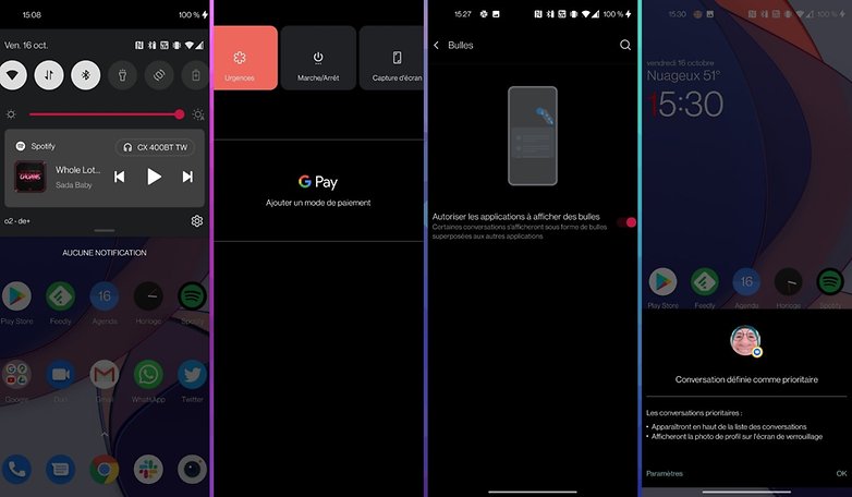
OnePlus has made the closeness of its interface to stock Android to be its trademark and a distinctive call card. And OxygenOS 11 therefore logically embeds the new features inaugurated in Android 11 such as bubble notifications, the Power Menu, the media player in the drop-down menu, etc.
Samsung's OneUI remains the most popular software overlay on Android. But the relative 'lightness' of an interface that does not add too many elements to Google's OS while remaining as close as possible to what you can experience on a Pixel device remains a rather expensive option in the eyes of a significant part of users.
And in a way, OxygenOS has veered very slightly from its loyalty to stock Android in order to take a similar direction to OneUI, but not one that is as drastic as what I read in certain reviews.
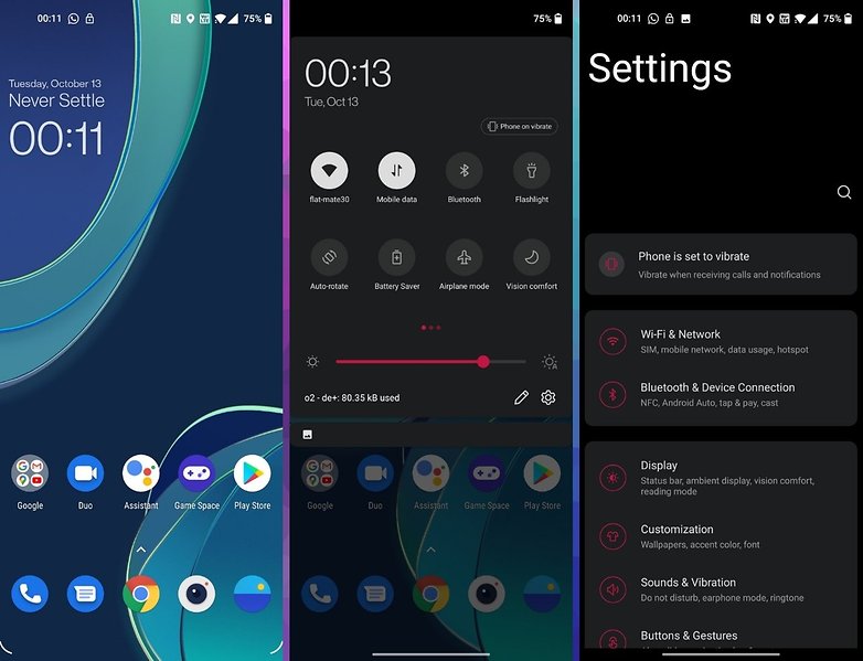
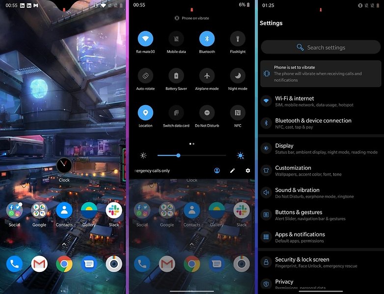
In concrete terms, any changes made are essentially visual. OxygenOS 11 has undoubtedly embarked on the biggest graphic redesign in its recent history. Most starkly, the interface has been redesigned in terms of ergonomics, moving most of the information and touch controls to the bottom of the screen, which is naturally closer to your thumb's reach.
As I mentioned in an article about compact smartphones, this change in visual identity responds to a need for users to be able to use their increasingly larger smartphones with just one hand, and in a more ergonomic manner.
OxygenOS 11 wants to bring its features within reach of your thumb
In a blog post that announced the beta phase of its overlay, OnePlus explained that stock Android has simply not been optimized for the big screens found on modern-day smartphones. The manufacturer went on to detail how they used anthropometric data in order to create a thermal map of screen interactions, resulting in the ultimate ratio for optimizing content and user interface elements.
Logically, this ultimate ratio is focused at the base of the screen, the part of the device that is closest to your thumb when you hold the smartphone in one hand.
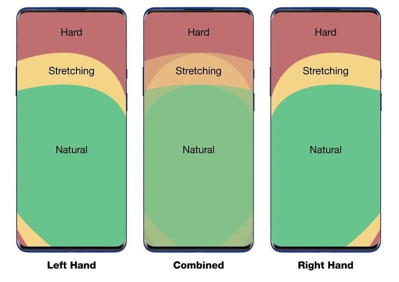
This is a trend that many manufacturers are pursuing, which I have already mentioned. They understand that there needs to be a hierarchy in the elements displayed on the screen. A hierarchy that must take into account the use of a hand in a more natural manner without causing any discomfort to the user.
With OxygenOS 11, access to the various sub-menus is depicted in a more traditional layout and the user must then require both hands, but most surface application activities are well suited for one-handed operation.
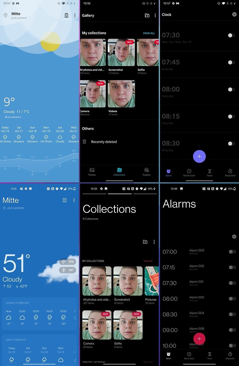
Native OnePlus applications and key areas of the smartphone UX, such as the settings menu, all boast of the new design, while the system's applications remain fairly consistent. So the changes are anything but drastic.
You can see them mainly on the weather application, in the photo gallery, or the alarm clock. The upper part of the screen tends to be quite empty. So OnePlus plugs up the holes somewhat with a larger font. We can moan about this apparent under-utilization of the tactile surface, but I would rather talk about optimization.
The screen at the bottom is not saturated with information either, and the vacuum of space at the top is not too disproportionate. The UI is simply airier and navigation still remains intuitive, with gestures remaining natural. I did not really feel out of place as I initially expected to when I read the first reviews floating online.
Always-on display as a digital wellness tool
With OxygenOS 11, OnePlus has further added a more personal touch to its interface, as well as exclusive features that have been long requested by the community such as the Always-on display. But as usual, OnePlus delivers a twist to a feature that has been around for quite some time with other manufacturers.
- To enable AOD on OxygenOS 11: Settings > Screen > Ambient Display > Enabled (yes, it's Enabled, not Enable, so hush with your comments)
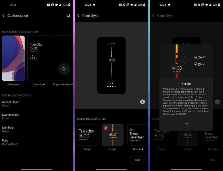
- To enable the AOD Insight on OxygenOS 11: Make sure you have Ambient Display enabled before heading to Settings > Customization > Clock Style > select "Insight".
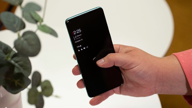
The default always-on display under OxygenOS 11 is quite classic in nature. You can choose from several clocks or "clock faces", display contextual info with your reminders, music player, and of course, notifications.
You can also set an ambient mode of the AOD that will adjust the brightness level according to the amount of ambient light, but doing so would also mean draining the battery a whole lot faster.
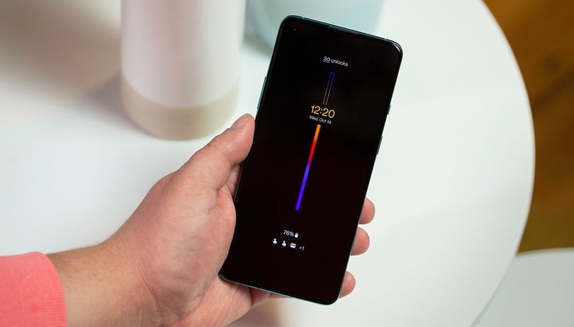
But the most interesting thing is the special version of this feature called "AOD Insight". Basically, it's a visual indicator that takes the form of a colored vertical bar that informs you just how much time you're spending with your smartphone. You have an unlock counter and the bar changes color depending on the length of your screen time.
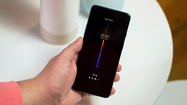
With this option activated, the always-on display gives you an insight into your usage and if it gets too intensive for your liking, you are able to uncheck it for a few moments. Each time you unlock the screen, a blank space is added to the colored vertical bar. The longer your screen time between unlocks, the larger the blank space.
The colour coding of the vertical bar simply represents the 24-hour night/day cycle. I haven't finished my OnePlus 8T battery tests yet, so I can't say how much this AOD Insight affects battery life. Of course, the indicator is not displayed permanently and only appears when you wake up the screen, either by tapping it or lifting the smartphone.
Zen Mode goes Multiplayer
I hate this feature! But I know perfectly well that many users are very fond of the digital wellbeing feature, and so it's a good thing that manufacturers are working to offer some software solutions in order to meet this need.
Zen Mode is not new to OxygenOS - it prevents you from using your smartphone for a period of time that you would have determined earlier. Your phone remains on and you can still use some features, but overall, the idea is to make it as unusable as possible, much to your chagrin.
I hate this mode, even though it's pretty well designed, because it takes control of my device away from me. Once the smartphone enters Zen Mode, it can no longer send SMS, launch applications, browse the Internet, or even access basic settings.
You can receive calls or use the camera to take pictures, but you cannot view them in the Gallery application or edit them on Google Photos. The only number you can call in Zen Mode is the emergency service in your area, and once activated, you can't make changes to your decision. Even if you restart the device, you will still be in Zen Mode until the end of the countdown. Not the most ideal situation to be in should you happen to travel and are in an emergency.
OnePlus has also made a little tweak to the Zen Mode of digital wellness allowing you to create group sessions to synchronize your phases of digital detox with several people. After all, journeying with another person tends to make the entire process more bearable.
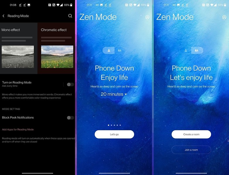
Being the only member of this editorial staff or in my social circle to have taste, I haven't found anyone to review the Zen Mode group sessions with me. Yes, you obviously need a OnePlus smartphone that runs on OxygenOS 11 to enjoy these 'multiplayer' digital detox sessions.
We also have a reading mode that provides better comfort levels for your eyes with a chromatic mode and a monochrome mode. A "canvas" mode in the customization settings allows you to draw an abstract drawing that resembles the contours of one of your photos, just like a sketch.
Unfortunately, I did not have this feature on my updated version of OxygenOS 11. OnePlus explained to me that this feature will only arrive in a later update.
My favourite feature on #OnePlus8T is the Canvas AOD. Something really very innovative and clean. The way the Artistic Sketch morphes into the real picture after unlocking the phone is just amazing. @TechnicalGuruji @OnePlus_IN #OnePlus8T5G pic.twitter.com/UPLRUGCwI8
— Shivam Sharma (@SharmaDTS) October 14, 2020
Nice features to come
A first update is planned for November 20202, where it will be accompanied by two other important elements: Straighten Doc and Voice Note. Straighten Doc is a simple feature for scanning documents with the camera that supposed is able to improve the readability of the text in photos automatically by straightening out the angles, detecting the edges of the document, among other kinds of computational magic.
Voice Note allows your Notes application to convert and transcribe your voice memos into text, thanks to Google's instant transcription feature that was launched with Android 10. I've already been able to use it on the Notes application on the Pixel 4a and it's more than handy when it comes to interviews.
The update will also bring a "Bitmoji AOD" option that will allow your Bitmoji avatar to reflect your current activity as well as "what's going on around you".
Bloatware
Traditionally, OxygenOS is considered to be a lightweight overlay, adding or layering very little to stock Android so that the user experience remains as authentic as possible. In 2020, the situation has changed somewhat and if we can continue to talk about lightness for OxygenOS, it is simply due to its speed and fluidity.
Because OnePlus' UI is under increasing criticism for adding bloatware and some pre-installed applications that are not always so easy to remove from your smartphone. The Facebook bloatware, for example, has been generating plenty of negative attention recently, which apparently prompted the manufacturer to get rid of it on the OnePlus 8T - as I did not see it there.
I hate this so much pic.twitter.com/0cViyKaMGV
— Max Weinbach (@MaxWinebach) August 1, 2020
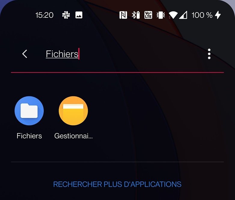
Many additional layers of monetization have been added on the phone, and this in a context where the price of devices continue to increase compared to previous generations. The lightweight argument is taking some serious blows to its reputation. Among the pre-installed apps I've noticed are Netflix, Instagram, and the Google Suite which can cause problems of duplicates, especially with the File Manager.
Well then, I'm not obsessed with bloatware, and as long as they don't significantly hinder the smoothness of the user experience, and I'm not going to be on a witchhunt for pre-installed apps. But the promise of a "bloatware-free" UI that was once touted by OnePlus has lost its luster and credibility.
Conclusion
OxygenOS 11 is still in its infancy, and the OnePlus overlay will, of course, undergo many updates in the future. But after more than a week of use, I really don't see why so many people complained about it.
The interface has changed but the changes are essentially incremental, you really have to be a big nerd writing 4,000 word UI tests in order to notice the differences. Apart from the larger font in the header of some native apps, most of the users will find it a wee bit disorienting at first.
Android 11's new features such as tooltips, the power menu, and the new media player are well integrated. OnePlus has added exclusive features such as the AOD Insight and group sessions for Zen mode.
You don't even have to scroll the notification pane down to adjust the brightness anymore, simply do it once! It's a no-brainer but it makes such a difference to long-term use. I find most of the benefits of OxygenOS 11 to be positive.
Are you using OxygenOS 11 or maybe you have tested some of its features in beta? Please feel free to share your feedback and comments on this review.
Other interesting reads on NextPit:
