ColorOS 13 review: The Oppo interface based on Android 13
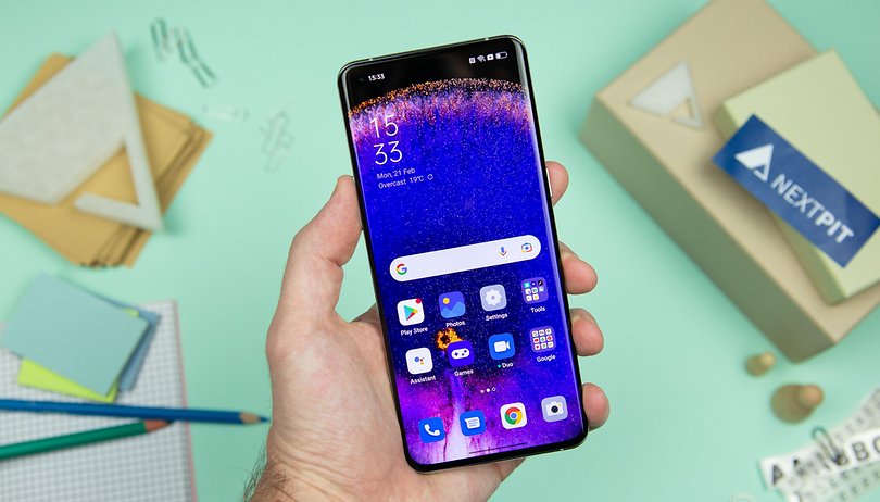

ColorOS 13, Oppo 's new interface based on Android 13 is available globally since August 18th. We were able to test the new mobile OS on the Oppo Find X5 Pro and here is our review on the design and features of this overlay that succeeds ColorOS 12.
Jump to:
- ColorOS 13: Design
- ColorOS 13: Ergonomics and fluidity
- ColorOS 13: Features
- ColorOS 13: Privacy
- ColorOS 13: Updates and compatibility
- Our take on the ColorOS 13
ColorOS 13: Design
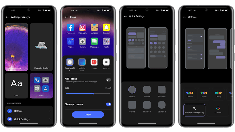
For ColorOS 13, Oppo has opted for a new design called aquamorphic. It is inspired by the movements of water and is supposed to convey a feeling of fluidity in its icons and animations.
So we move away from the Material design of Android 12 with softer and less angular elements, more textured and less minimalist. But it's far from a drastic change, especially since you can always switch back to the Material style via the customization options.
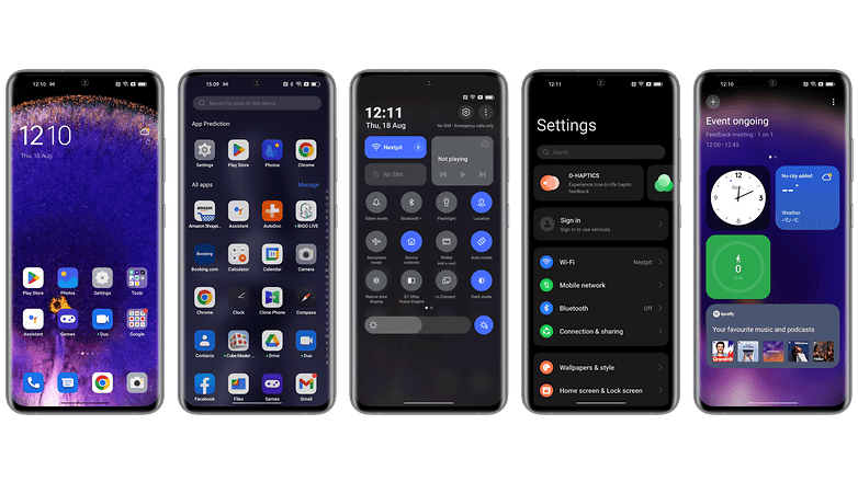
A more notable visual change is what Oppo calls Card-Design. Basically, we switch to a system of tiles or cards to structure the interface of certain applications like the file manager or the Shelf pane. This configuration allows to better aerate the information displayed on the screen. But I find that the tiles also take a lot of space for not much. It's a matter of taste and at least it has the merit of not overloading the screen.
Last visual innovation, Oppo has added new styles for the Always on Display. The manufacturer calls this new series "Homeland" and explains that it wants to represent different animal species in a logic of respect for the environment and biodiversity.
So we have three new Always on display that represent a family of polar bears, a family of penguins and a fish. Oppo claims to want to raise awareness of the impact of global warming on these species.
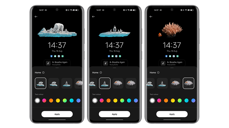
In its explanations, the manufacturer suggests that the animations of these Always on Display are scalable, showing, for example, the ice floe gradually shrinking under the paws of the polar bear. But when I activated it, I always had the same animation. It's a pity, even if it's a nice gimmick, it might as well work.
ColorOS 13: Ergonomics and fluidity
As mentioned before, we tested ColorOS 13 on an Oppo Find X5 Pro, a high-end smartphone with a state-of-the-art Snapdragon 8 Gen 1 SoC. So it's obvious that I didn't experience any slowdowns or fluidity issues. To give you a more relevant opinion on this point, I would have to test ColorOS 13 on less powerful mid-range Oppo smartphones.
With this disclaimer in mind, I really have nothing bad to say about the fluidity and ergonomics of ColorOS 13. The animations for opening and closing applications are very smooth. The dynamic wallpapers are very nice to see when they are activated when unlocking the smartphone.
A special mention for the scroll down gesture from the home screen. Usually, this allows you to access the notifications pane. But in ColorOS 13, Oppo also offers you to assign this gesture to open its Shelf menu.
If you have a OnePlus, you know what this Shelf menu is. If not, I'll explain it right below. But basically, I find this option less intuitive because it forces you to reach your thumb to the top of the screen to access the notifications pane and the quick settings. Personally, I would opt for the classic system.
I also think it's a shame to have to deal with a dedicated application to manage utilities (battery, storage, privacy). They are already in the settings, why put them in an application called Phone Manager, like in MIUI 13 at Xiaomi? It's superfluous and can confuse users.
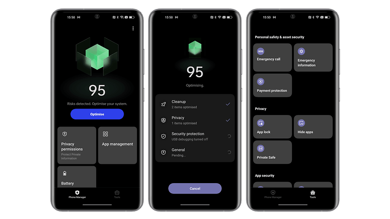
Oppo's multitasking still works well on the other hand. I think only Samsung can compete in terms of intuitiveness. The floating windows, the split screen, everything works without any friction.
Oppo also claims that thanks to its software work and the new Android 13 core, battery efficiency is now better with ColorOS 13. Also, more apps can stay active in the background, thanks to better memory management, which Oppo calls Always-alive apps. Both improvements are part of what Oppo calls its Dynamic Computing Engine.
ColorOS 13: Features
With ColorOS 13, Oppo is bringing five notable new features.
Contextual information for Always on Display
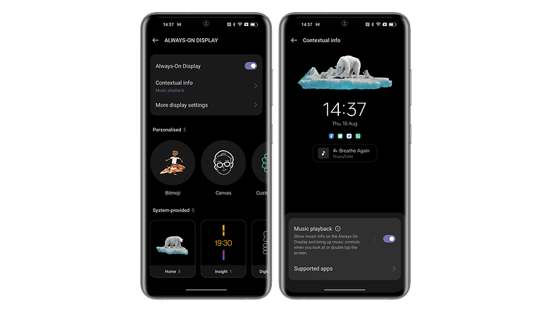
The first is Always on Display. ColorOS 13 allows you to display visible contextual information like a Spotify widget or to track the progress of a food delivery without having to unlock your smartphone.
User control prediction
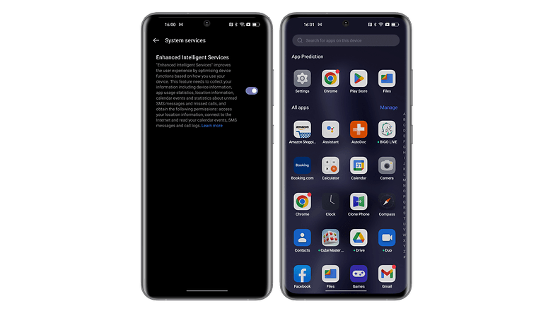
Oppo also emphasizes its new technology for predicting user control intentions. ColorOS 13 is supposed to learn from your usage to make browsing easier by providing options based on your habits. In concrete terms, the only time I saw this system materialize was when searching for applications via the app drawer. ColorOS 13 then offered me a list of applications I use frequently, so I didn't have to search for them.
Meeting assistant
Another interesting feature is the meeting assistant to optimize your video conference calls. This feature can automatically prioritize wireless data packets to provide a more stable connection. It also simplifies banner notifications to minimize distractions, while allowing users to add a shortcut to Oppo Notes that allows you to take notes via a small pop-up window.
However, in my version, it was impossible to find this feature. The Oppo Notes app doesn't seem to exist at the moment either. Too bad.
Multiscreen connect
The multiscreen connect feature is supposed to ensure seamless connectivity between smartphones, and between smartphones and PCs. In particular, it boosts file transfers by supporting more file formats without hardware limitations. You can also display multiple mobile applications on the PC screen simultaneously. Basically, it's an enhanced version of the PC Connect feature implemented in ColorOS 12 last year.
Automatically pixelate screenshots of your chats
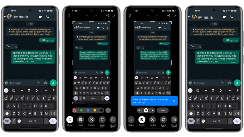
Finally, ColorOS 13 offers a new privacy feature that I find very interesting. It allows you to automatically recognize and blur profile pictures and names in screenshots with one touch. This is very handy if you want to share a snippet of a WhatsApp conversation, for example. And the feature actually works very well.
ColorOS 13: Privacy
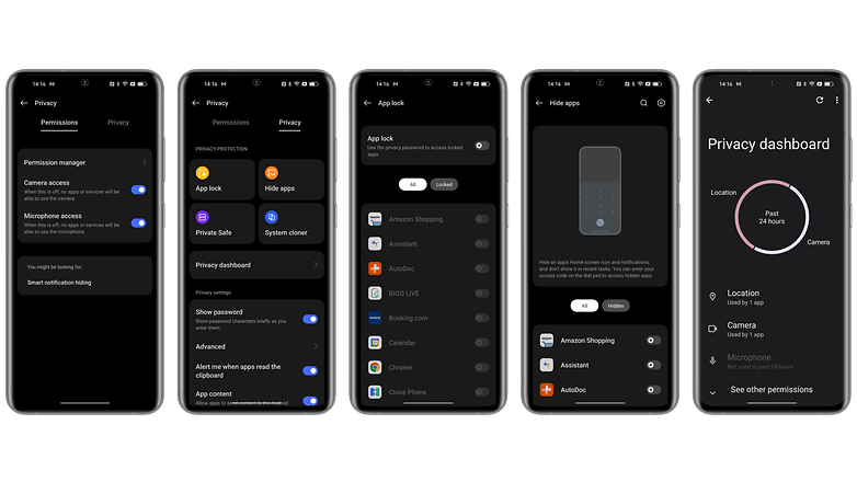
ColorOS 13 incorporates all the privacy features of Android 13. For example, the system automatically deletes the clipboard history after a little while, preventing information leaks caused by malware. In addition, with the Nearby Wi-Fi feature, you connect to Wi-Fi without revealing your specific location information.
ColorOS 13 also introduces a new private vault that is encrypted with AES to provide high levels of security.
ColorOS 13: Updates and compatibility
For the global rollout of ColorOS 13, Oppo plans to update nearly 35 smartphone models within a year, covering more than 60 countries and regions, and no less than 160 million users. This is the largest update plan ever in the history of ColorOS, according to the manufacturer.
The rollout begins this August 18, 2022, on the Find X5 Pro and Find X5 lines with the official release of ColorOS 13 and will continue on more than 20 other devices starting in 2023.
You can find the full list of Oppo smartphones eligible for the upgrade to ColorOS 13 in a dedicated article.
Conclusion
ColorOS 13 is an Android overlay that gets better every year. It's still light enough not to lose you in a mass of options and features like MIUI 13 or One UI 4. But it still offers a wide range of customizations to adjust the user experience to your own tastes.
We can see that Oppo is making efforts to implement the new features of each Android version. The design change doesn't bring much to the table and the famous aquamorphic look it's not really special. Now we need to see how the OS reacts on less premium and therefore less powerful smartphones, in terms of fluidity.
In terms of features, the ColorOS 13 brings some interesting changes, especially to optimize productivity and multitasking, which were already big highlights of the last version.






Drifting into bloat. I prefer more streamlining and less from the OEM towards a more AOSP experience. All I want from the OEM is hardware drivers and camera app. Let me install what I want for the rest of it and keep your bloat out of the ROM so there's more available RAM for ME. No video or music player or sound equalizer.
I'll accept a default web browser so I can get to my preferred installation sources. No brand account nonsense or brand store.