Poll: What do you think of the camera cutout design trend?
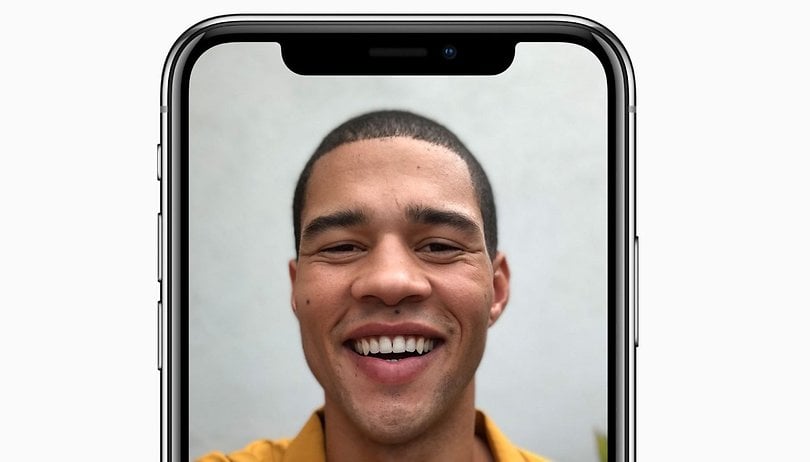

The industry trend toward bezel-less displays is bringing more favorable screen to body ratios to more smartphone users, and I think that's a great thing. But, some manufacturers are making controversial design compromises in order to achieve these smaller frames. We want to know what you think of the already notorious notches of the iPhone X and Essential Phone.
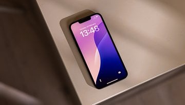
Also known as a camera cutout, the notch refers to the area where the display wraps around the front facing camera and sensors of a device. The Essential Phone and the iPhone X are introducing the design concept to Android and iOS users, respectively. These are two highly visible devices, so there's a good chance that other manufacturers could pick up cues from them and incorporate the notch into future designs of their own devices.
While I like bezel-less displays, I'm not a fan of this particular design compromise on either of the aforementioned devices. While the camera cutout certainly stands out in a sea of rectangular displays, I don't think it sticks out in a good way. It leaves a sense of there being something missing, and neither Apple nor Essential made an effort to blend it in by making the status bar black.
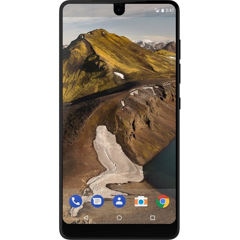
With this shift toward bezel-less displays, our collective idea of what a smartphone looks like could change radically. Home buttons are migrating to the back of devices or disappearing entirely. The iconic iPhone look, a home button and big bezels at the top and bottom of the display, is going to be a thing of the past. Do we really want the notch to replace it as the defining characteristic that helps us recognize the brand? Do we want camera cutouts distracting from the beauty of various Android flagships' impressive displays?
We want to know what you think. Do you love the notch? Do you think it looks like someone ruined the iPhone X by taking a bite out of it? Do you hate way the tiny camera cutout looks on the Essential Phone? Is a bezel-less display worth the compromise? Vote in the poll below and let us know your thoughts in the comments!









I think that the cutouts and notches look ? terrible, but I’m afraid that we’ll be seeing a lot more of them, unfortunately.
I'm not a huge fan of bezelless devices, the tradeoff between design and quality/strength is to great. Though I think Samsung have nailed it with the S8/Note 8, but I guess it's a design feature that will be used by most manufacturers.
Apple have not designed a device in any meaningful way, they're long term plans were to keep the same IPhone design and continue to rip their customers off, instead they were forced to bring out the X as a reaction to Samsung superior design and quality. Samsung needs to keep to the script and not to react to Apple.
Peace ?
Ive a xzpremium and all you hear from people is its got big bezels! Well i dont give a shit about bezels why! because for one they house the best stereo speakers on any phone there is, theres plenty of room for the front camera and flash by the way its the best front facing camera there is and the main thing with bezels it makes the phone stronger as people will find out when they drop their bezeless phones? Plus bezels makes no difference to your viewing experience on a phone screen.
The bezels are ok if you have two stereo front facing speakers! The notch or cut outs could be very distracting while viewing video's!
Samsung will copy the design cues and we will all experience deformed screens
I really don't care for the cut out or notch on the X or essential. For myself it kinda looks distracting when viewing video's. Is it me or am I just seeing things. Why would they do this?