Samsung's Touchwiz Nature UX 2.0 vs. Stock Android 4.2: Which is Best?
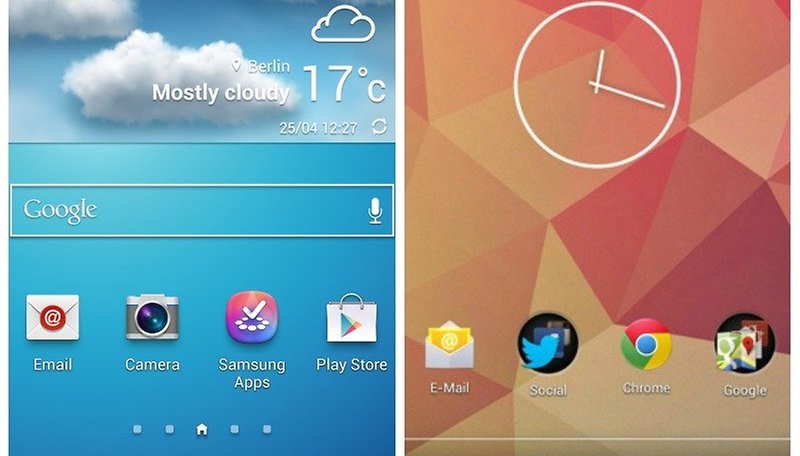

Samsung's Touchwiz and stock Android 4.2 both have their benefits and drawbacks. © NextPit
We all know Android is an open and adaptable platform, with an endless number of skins available to manufacturers. Icons and color schemes are regularly altered by companies like Sony, HTC and LG – so much so that you can barely recognize the stock Android lying underneath all the additions. Here we'll compare Samsung's TouchWiz Nature UX 2.0 on the Galaxy S4 with the Nexus 4's stock Android 4.2.
Lockscreen
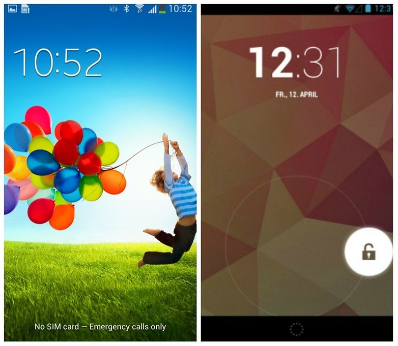
Swiping vs. flicking © NextPit
Samsung's lockscreen solution does not differ greatly from pure Android 4.2. The only difference is the unlocking process: with Samsung's lockscreen, you can simply swipe the screen to unlock while stock Android requires the user to flick a ring away from the lock icon.
Homescreen

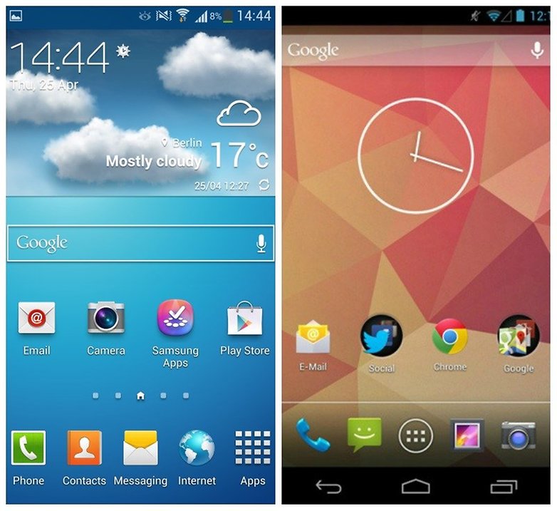
© AndroidPIT
Touchwiz's homescreen's parallels with Android are clearly visible here. at the bottom there is a dock with reprogrammable app shortcuts and the space between the status bar and the dock can be used for widgets or apps. Samsung also allows users to completely remove the Google search bar, which is impossible on the Nexus 4 unless you download an alternative launcher.
Using pinch to zoom, you reach Samsung's homescreen index. Here you can delete everything on your home screen, re-arrange it or add new pages if you need more space. Stock Android has no options like this; again, you'd have to download an alternative launcher.
Notification Bar
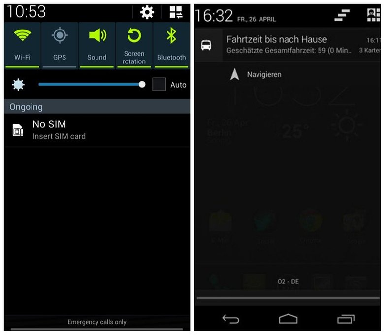
Touchwiz's notification bar, AKA Quick Settings, allows you to change your ringtone, or easily switch off Bluetooth. Directly below, you can find a slider to change your phone's brightness, and under that you can see your notifications. The top bar displays all possible Quick Settings, which you can add to or delete quite easily.
© NextPit
Stock Android 4.2's quick settings are accessible by clicking a button on the top right of the notification tray, allowing for more space for messages to be shown.
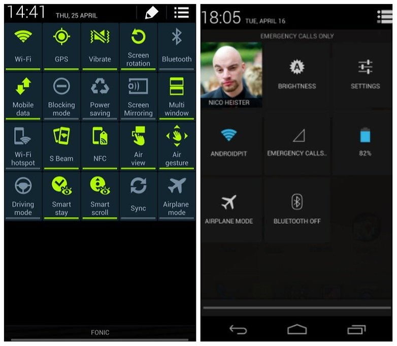
© NextPit
App Drawer
Colors and icons aside, the Samsung's app drawer first appears nearly identical to stock Android. On the top right, you can switch between all apps, downloaded apps and widgets. But pressing on the menu button reveals a whole host of additional settings: folders you can create yourself, apps that can be arranged in a list or even hidden. This brings real value to the rather barren app drawer of Android 4.2.
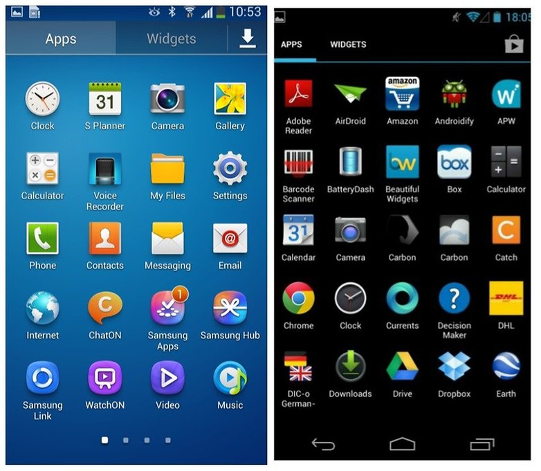
Light or dark? Touchwiz's app drawer vs. stock Android 4.2. © NextPit
Recently-Opened Apps
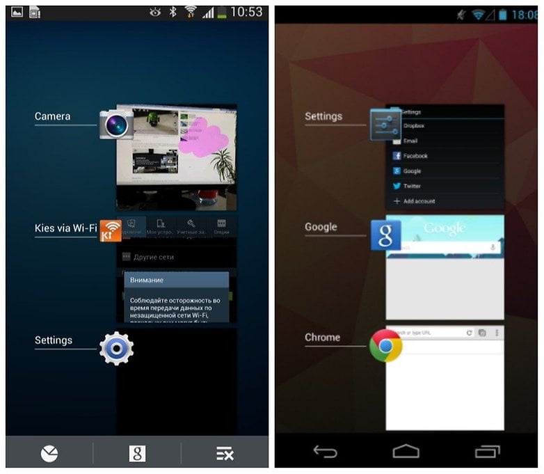
Looks similar at first, but Samsung has the edge. / © NextPit
Touchwiz and stock Android are pretty similar here. You can see large thumbnails of your recently-opened apps while pressing the windows button. Samsung offers an additional button bar with the option to Google search and exit all open apps.
Settings
Samsung has separated the settings function into multiple taps to help users find their way more easily. But you can't simply swipe from tab to tab, which is super annoying and contradicts Google's own developer guidelines set forth all the way back with the introduction of Android Ice Cream Sandwich. In stock Android, there are several clear categories but no tabs, which I actually like better.
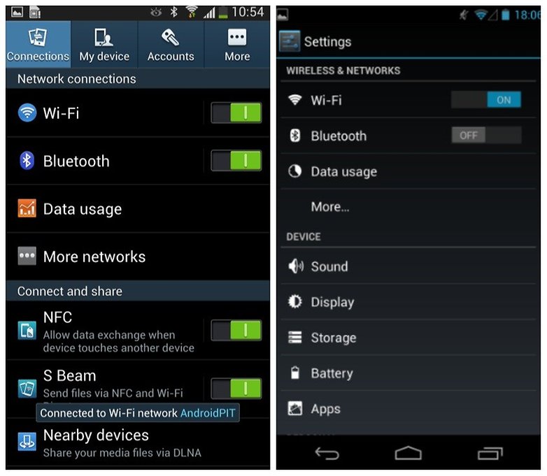
Sammy's tabs are nice, but what's with the lack of swipe support? © NextPit
Additional Features

Conclusion
Samsung's Touchwiz has a lot of useful features that even Google couldn't think of. There's definitely a convenience factor to being able to close all windows simultaneously, re-organize your app drawer or get rid of the Google search bar on your homescreen.
That said, my own personal opinion is that Samsung's design language is still seriously out of date. The icons follow the design of Android 2.x, which was released over two years ago. But I suppose it all boils down to personal preference. Which do you prefer - Samsung's extra features or stock Android's more streamlined design?


TOUCH WIZ FOREVE !!!
THE Android 4.2 on nexus 4 looks like cyanogen mod !!
TOUCH WIZ FOREVER !!!
Of course Nexus Android looks Like Cyanomod, or better Cyano looks like nexus Android Since Cyano is based on the original Android.
probably Settings -> More... -> Tethering & portable hotspot
Hi everyone
Does anybody knows how I can use the "hot spot" option in Sumsung Galexy S2plus?
@Hend the TW Launcher is bad, since it wastes space as you say but pimp your TW with a neat Go Launcher EX or some other you like any it is WAY Better...
Thank you for give very nice knowledges What a cool site. but i think android 4.2 is much better infront of other.
http://www.pairsocial.com/android-app-development.html
I have used Touch wiz, stock Android and HTC Sense. I think that Sense is the best. Touch Wiz is too much, wastes a lot of space at the bottom of the home page and has silly icons
I think stock android 4.2 is better. It contains sharper shapes. and I think some application can be developed with that style like window phones apps with sharper icons. i.e. https://play.google.com/store/apps/details?id=us.mron.Limopo
oh yeah sorry , I always forget how stupid American providers are, not only are they putting out a whole new phone for each and every carrier, but they are taking the freedom samsung gives us...
Can't speak for other carriers but AT&T's is locked down tight this time.
w8 a sec, which bootloader unlock??? whatbdo you need that for? shouldn't normally odin suffice???
I probably prefer pure the pure Android experience only because it runs smoother and faster. I've gone back and forth between TW and AOSP ROMs on my Samsung but one thing never changes..... If I want great performance, stock won't do.
This will go double for an S4 that's got over 40% of 16 gigs taken up with OS and bloat. Where I might usually wait and acclimate to the stock experience before heading over to XDA, I wouldn't even consider buying an S4 until there's a ready bootloader unlock and some AOSP goodness waiting to be flashed.