Sony Xperia UI vs. Stock Android: Comparing Manufacturer-Branded ROMS

When it comes down to the hardware found in high-end smartphones, they really don't differ at a lot in how they're built. Like we keep saying again and again, the design and the software is what really makes a difference. Almost all manufacturers are using the Android system with their own interface. So where exactly is the difference and how does each manufacturer-branded ROM set itself apart? Today I compared Sony's Xperia user interface with stock Android. My test devices were the Sony Xperia Z and the Nexus 4 from Google and LG.
>© NextPit
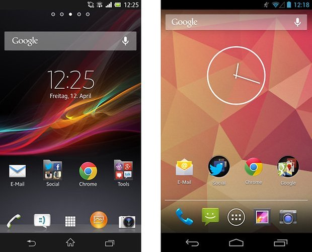
Tip: The left side of the page will always have Sony and on the right, Stock Android.
Lockscreen
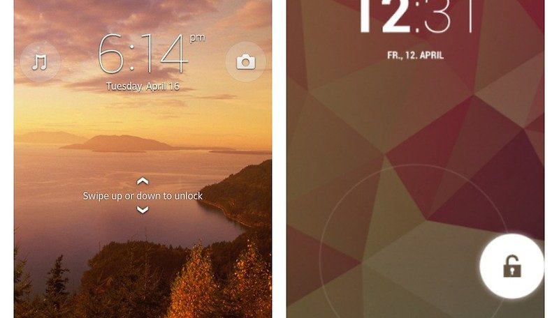
With Sony's UI, the user needs to swipe up or down to unlock the screen. Devices with stock Android, like the Nexus 4 for example, has a circle lock for this purpose. But that's not all: Sony's offers the possibility to directly use your camera and Walkman app. On stock Android, you can open Google Now and with the Android 4.2 update, widgets are also supported for the lockscreen, which can be spread over many pages. The camera is also presented, which you obtain by swiping to the right. In Sony's case, there's only one much plainer page available for the lockscreen.
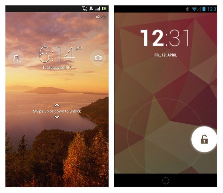
Sony's lockscreen permits you to change the background independently of everything else. ©AndroidPIT
Homescreen
Both homescreens have similar structures: many pages that you can fill up with widgets and app shortcuts. On top of this, there's an applications dock list, which is visible on all pages of your homescreen. In the middle there's a button that will open all of your apps. Stock Android offers a total of 5 pages, in which the Google search bar is always present.
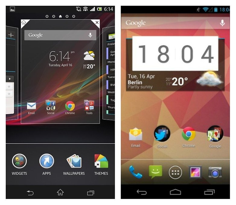
Sony doesn't limit you in the amount of homescreens that you can add or get rid of. The Google search bar is only present on certain widgets, not on every page. The pinch-to-zoom command allows you to customize your homescreens, add widgets or change the design of your Sony smartphone. Stock Android, on the other hand, doesn't offer this option. Widgets can be added via the app drawer.
Notifications
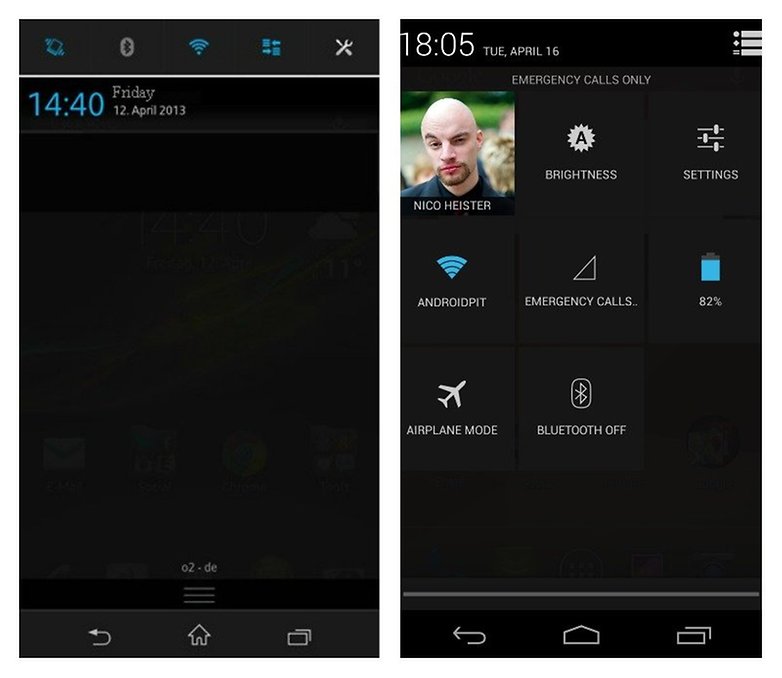
Both device compositions offer a completely different look to the notification bar. Sony offers many switches within its quick settings, while stock Android opens theirs up only by pressing on the symbol in the top right corner of the screen. On the other hand, tablets offer the user two individual notification bars. In my opinion, Sony's approach is much more user-friendly, while both devices unfortunately don't allow you to alter the button arrangement.
App Drawer
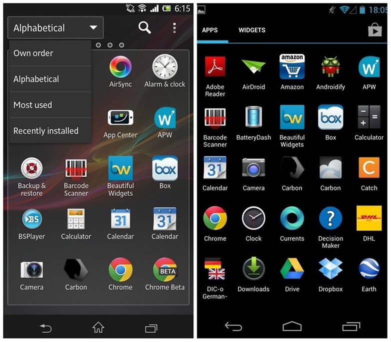
When it comes to Sony, you swipe horizontally to browse through your apps. Google has the widgets listed in the app drawer, as well an easy-accessible shortcut to the Google Play Store. Sony allows you to either sort your apps via varying criteria or search directly through them. In the mode where you conduct your own sorting, you can also add folders, which will then be shown in the app drawer. Stock Android doesn't offer this.
Recently opened apps
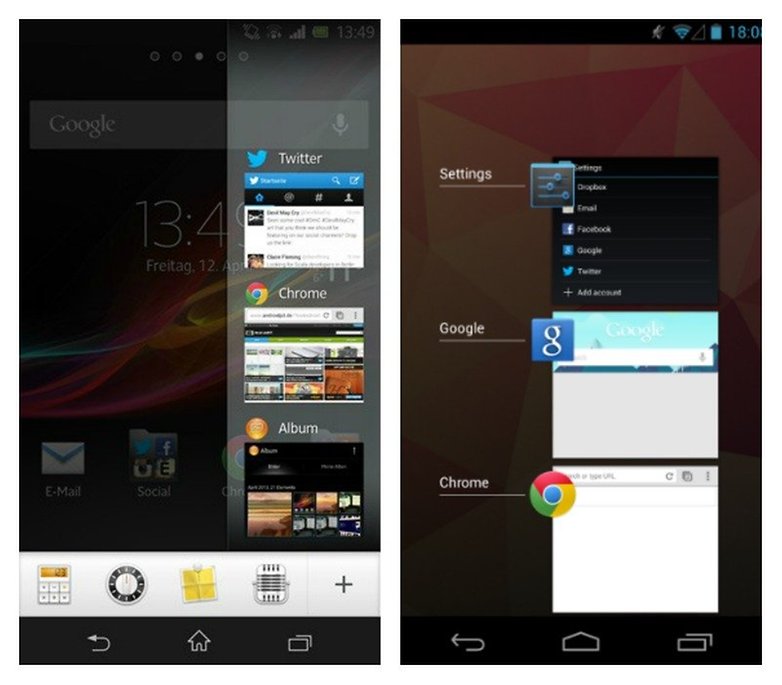
Stock Android shows you a preview window for all the opened apps, which Sony's device doesn't do. The preview windows are quite small and what's more, there's a bar at the bottom of the screen for mini-applications. If you add this type of application to your homescreen, it will appear consistently under all other windows.
Settings
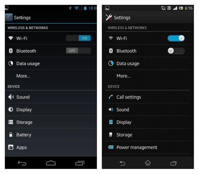
Sony uses other symbols within their settings and even the color design is a little different. Other than that, they basically don't differ, so that it's easy to find your way around Sony, especially if you're used to stock Android.
Extra Functions
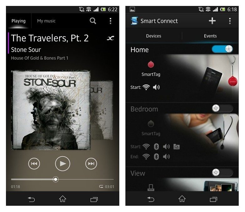
Sony added a few functions and apps to stock Android. The Walkman app is a very nicely set-up music player, whose stamina mode helps save battery. Its ''Smart Connect'' also allows you to configure various events, which are influenced by your Sony smartphone's properties. Stock Android only permits you to install extra apps. You can take screenshots by either simultaneously pressing the power button and volume up or via the power menu. Stock Android only allows screenshots by simultaneous button pressing.
Bottom Line
Sony made some really decent changes to the Android system, all the while staying faithful to the Google design. Those who are familiar with Android won't have to go through a huge learning curve in order to find their way around the headset. Sony's pre-installed extra apps and functions make the user's experience a much richer one, while also binding the client to a tight-knit ecosystem. All in all Sony's UI left me with a very positive impression. This also has to do with the fact that the system wasn't completely upended like the first Android smartphones. At the time, they weren't a solo effort on the part of Sony, but produced in a joint venture with the Swedish network supplier Ericsson (Sony Ericsson). This brought about something quite different, where Android was hardly recognizable and felt really different.



I actually <3 the LG interface more then the HTC Sense (which I enjoyed on the HTC Droid Incredible - until neither Verizon or HTC would help Dinc owners with our problems via last update(s) ....
I <3 everything about my LG Spriit 4G with the exception of the Camera (although this 5 megapixel is actually taking better pictures then my Dinc's 8 megapixel - could it be a better screen, or better software, or better rom - or all 3?) and the fact I am going to have to root it in order to get a Jelly Bean Android OS 4.2 update ....
If you don't want to pay more for a Galaxy S3, if you want a screen larger then the Galaxy S2, if you want a no contract Android Smart Phone that is actually clocking better then both thee S2 & S3? MetroPCS is offering that LG Spirit 4G for a bargain post mail-in rebate ($200) ....
Great article comparing Screens, Nico ! :-)
C J