These are the worst Android UIs

User interfaces are supposed to provide a smooth interaction between man and machine, a gateway to effective communication and feedback. But when they go wrong, UIs create a frustrating tangle of buttons and menus that seem designed to torture you into submission. Light your torches of discontent: these are the worst UIs on Android.
Things have come a long way since the days of MS-DOS command-line interfaces. Now there are a plethora of beautiful graphical user interfaces that make interacting with technology fun, playful and fast. We can gain access to the information we need with just a few taps of our nimble fingers, navigate menus with intuitive ease and change settings to suit our preferences at the swipe of a toggle.
But creating a UI that does these things requires the steady hands of skilled designers and developers. The effort of the amateur can all too easily create a confusing and infuriating mess. And nothing sends my anxiety spiraling out of control quicker than a UI rabbit hole. Let's take a moment to name and shame the worst offenders.
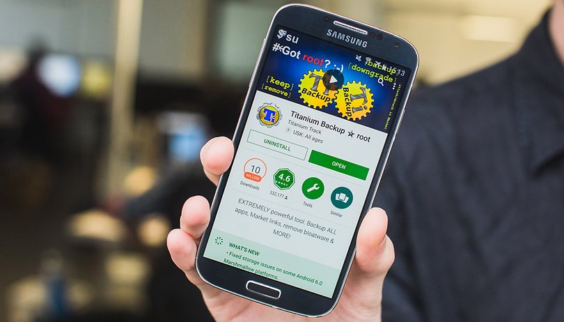
Titanium Backup
Remaining unchanged for years is rarely a smart move – unless you're The Eagles or a family recipe. But when you start life in a state of unholy ugliness and, for years, refuse to make any effort to improve your appearance, especially in a market as fast-moving as the Google Play Store, then you're asking for a public shaming.
Why, oh why, has Titanium Backup not hired a UI designer?
Titanium Backup, rather than considering how users might approach an app and trying to mold its UI to suit, simply throws everything into a huge, confusing and hideous pile. It makes you spend hours figuring out how the developer wants you to use his chaotic creation. In essence, it provides the exact opposite of what a good UI should.
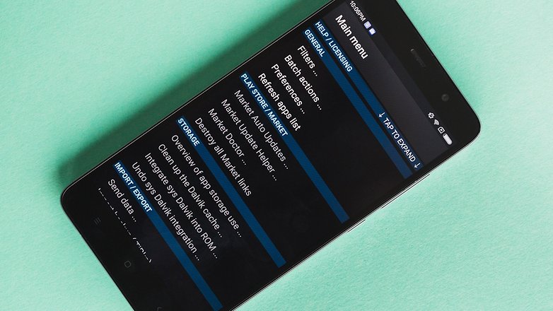
The only reason Titanium Backup hasn't gone the way of other unapproachable apps is that there still, for some unfathomable reason, isn't an alternative that offers the same variety of options.
But when an app costing $7 has been downloaded between one and five million times, amounting to, at the very least, hundreds of thousands of dollars in revenue, why, oh why, have they not hired a UI designer?
Snapchat
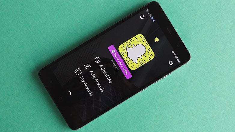
Inventing a new UI for every screen doesn't seem like the brightest idea, but that's exactly what Snapchat seems set on doing. The result is an interface that seems to have been designed for users with brains far different to the standard homo sapien's. This UI, based on a series of slidable screens, makes buttons appear, disappear, change places, design, colors in an endless, kaleidoscopic nightmare vision of an app from a parallel universe made of bubblegum.
Snapchat is a colorful nonsense world
Just to get to the settings menu requires up to four actions and then there's a hamburger menu button that is actually just a 'scroll right' button. The whole thing seems designed specifically to go against logic, with a single press making the app leap around chaotically inside its own colorful nonsense world. Essentially, it behaves like an app designed by a six-year-old.
Then, sometimes, there are multiple buttons on a screen that seem to do the same thing. Why are there two buttons that do the same thing? I fear the answer will lead only to more questions. All we can say for certain is that Snapchat designers move in mysterious ways.
Poweramp
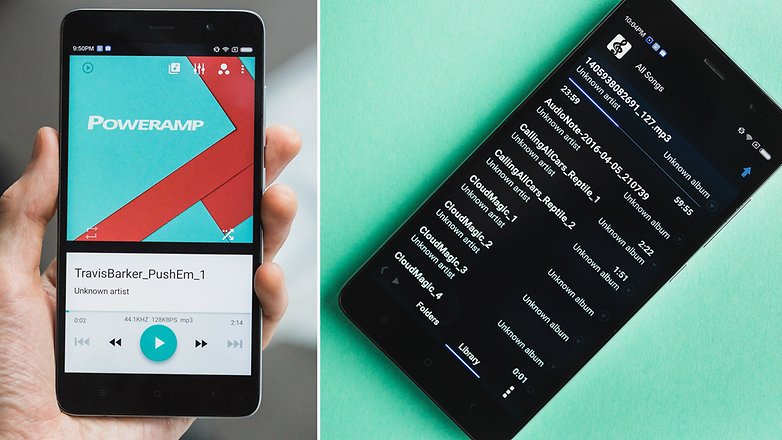
If Android had never been developed beyond Gingerbread, Poweramp might seem somewhat at home. In reality, it looks awful. If you're into MP4-player nostalgia dating back to the early 2000s, then maybe Poweramp possesses some charm. For everyone else, it's clunky, confusing and incongruous, especially when placed within Lollipop and Marshmallow's Material Design language. The interface is littered with buttons, and the menus build a labyrinth seemingly without end, creating a Kafkaesque struggle for meaning in a senseless world when all I wanted was to view my playlist.
Having said that, there is a Material Design skin for the app, but it's like throwing pearls in front of pigs, as they say here in Germany. Without an internal overhaul of the design, the app will always be a clunky, confusing heap.
At least it has a nice equalizer, right?
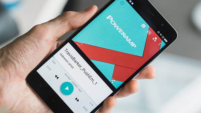
What apps have UIs that make you scream in horror and dismay? Do you agree that these three apps offer UIs unworthy of human interaction? Let me know in the comments.








Those are some serious migraine inducing User Interface examples, but the worst by far (my opinion) is Samsung's TouchWiz (I'd to take a whiz on whomever is responsible for it!) ....
HTC had a good idea with Sense
Motorola (under Google) created something more brilliant / voice activated
Everyone (including Nexus) learned from that
The key is to less bloatware, more stock Android
I do agree with this PowerAmp's UI has been the same though there are PowerAmp's skins all over PlayStore and Snapchat,s UI seems creepy sometimes with that Ghost pic in the Dark which seems Gloomy and Creepy.
I also thought it was about touchwiz n sense… but 1 thing for sure ..poweramp is the best ..if u cant see then go to an optisian
Snapchat isn't all that bad!
I don't have the latest Android, but seems to me the Settings Menu is pretty poor, and could at least use a search box (it's Google after all) to help users find something.
Gesture search app to find anything on your phone.
The thing about titanium is so unwelcome, juat because ita not supoosed to be user friendly, but more technical. It only works with root users. And lets assume that, if a person knows the use of rooting, then he will probably know how to use the features..
U cant ask for door bell kind of switches in a cockpit pannel, simply because one is too technical and other is user friendly. It serves what it is meant for, it does some great jobs under its ugly ( as u say it) skin.. And it does it neat and clean. Its there from the starting of android, and it is still the same.. The matter is in work, not in looks.
Peace.
Touchwiz is a great UI, yes there are some aspects of it that should be changed but generally it's very good.
A lot of apps try to get the UI to be smooth and slick, but a lot fail with the details. Some have a poor understanding of how powerful Android can be, some will put a app out just because they think they should.
There are some great developers making great apps and have done proper testing.
My favourite is Playerpro Music Player and X-plore File Manager app.
My Boots shopping app is pretty poor and was probably bought as is rather than being designed and developed to suit the needs of the user, whilst promoting the businesses values.
Peace ✌
TOUCHWIZ ........
it's like buying a Rolls Royce with plastic seat covers...
NEXUS.....
It's like using a Formula 1 car as a CITY commuting car, I don't see your point here.
app backup too
the poweramp ui isnt that bad. i can use it without any problems.
I've agreed with the article, Poweramp has lost its relevance in today's app contest. Talking about sound frequency, it's Jet audio plus. The worst problem I have with this Poweramp is that, it's always checking purchase verification, so without internet connectivity, the app becomes useless.
You're talking bullshit.
Jet Audio Plus produces WORSE sound than Poweramp, especially with the latter's newest Alpha build with an updated audio engine. Note 3 with SOL REPUBLIC Jax. Poweramp sounds cleaner and better with ALL music I have.
This article is misleading! I dont know , maybe am to dumb understand simple english... I though this was about the ToughWiz UI , Xperia UI , LG UI etc *shrugs*
i thiught yhe same
I thought the same but it also applies.
The title of the article is misleading since I to expected to see discussion on touchwiz, sense, etc.
Only thing I do agree with is that snapchat is challenging to use.
Poweramp is the best music player!
Maybe it's confusing to you.