Xiaomi Pocophone F1 display: there's always a catch!
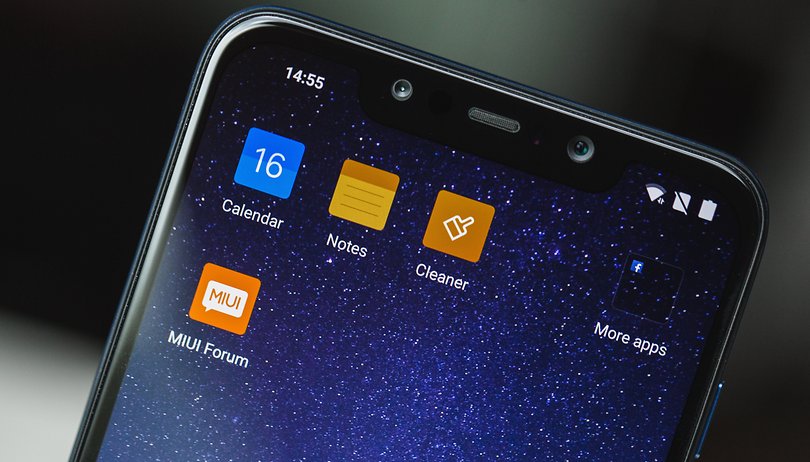

Xiaomi is shaking up the smartphone market with its outrageously cheap Pocophone F1. So it makes sense to take a closer look at this new candidate in the race for smartphone of the year. To get the price this cheap, the Chinese brand must have been cutting corners somewhere. Could it perhaps have been on the display?
First, let’s get to the key data for the Pocophone F1’s display: the screen has an LCD panel with a 6.18-inch diagonal and a fairly wide notch at the top. The new smartphone has a screen resolution of 2246 x 1080 pixels, which results in a pixel density of 403 ppi. There’s more to it than that, but on paper, that’s not bad.
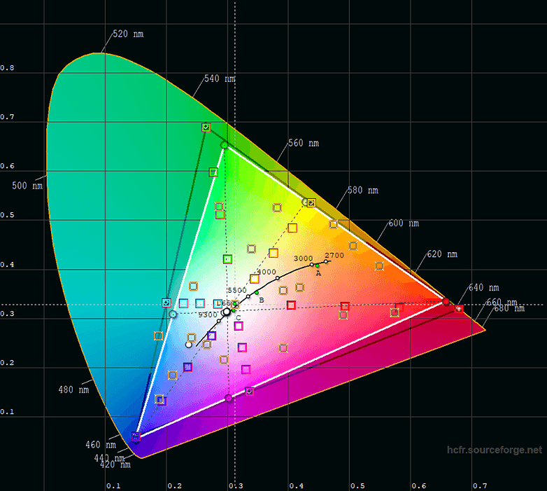
But the results from our test speak for themselves, and they’re less generous. The maximum brightness is 454 cd/m², which isn’t very high and makes the device difficult to read in bright sunshine. The deviations in color representation and grayscales, which are expressed in Delta E values, are too high. That’s especially the case with the grayscales, which have an average of 8.11. The colors are too far from ideal, especially with cyan, magenta and white.
You’ll notice the issues with your own eyes
You’ll notice the display’s shortcoming with your eyes when you take a closer look at the Pocophone F1 display. The colors don’t shine like on an OLED panel, and the blacks aren’t quite deep enough; they seem slightly gray. The viewing angle stability is also a bit shaky, as the display darkens relatively quickly when you view it from a sharp angle. The panel also doesn’t evenly illuminate, and clear halos can be seen at the lower end.
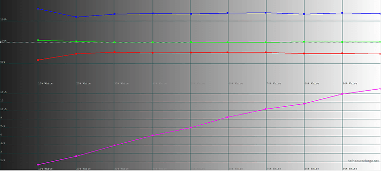
The Pocophone F1 is well on its way in terms of contrasts: 1,302:1 is a good value for an LCD screen. In the standard setting, red and blue are also pretty close to the 100% mark, and green is exactly on it. That speaks for a balanced display.
Saving money on the display is dangerous
The settings options offered by Xiaomi on the Pocophone F1 display are quite good. Not only can you freely set the basic color temperature, the contrasts can also be adjusted in three stages (normal, increased and automatic according to ambient light). The owner of a Pocophone F1 can configure the night and reading modes in terms of intensity and also define periods during which the display switches automatically.
The bottom line is the Xiaomi Pocophone F1’s display isn’t good enough to compete in the luxury class. The weaknesses aren’t all that serious, but they run through all the major components ranging from brightness to viewing angle to color display: there’s room for improvement in all facets. But it should be noted: the Pocophone F1 can compete with top-range devices in many aspects of the equipment, but costs only $349. The smartphone’s performance is alright for this price class. Nevertheless, if you’re looking for a caveat in the Pocophone F1’s amazing value for money, you’ll find it in the display.
How important is a smartphone’s display to you?




I've been using this phone for almost 3 months now. This phone is absolutely perfect to me. Don't see any grey in stead of black at all. All the other remarks seem over the top for a normal consumer like me.
Wow this is really embarrassing to read from so called phone proffessional reviewers, how low is this, to compare this phone with the elite and say it isn't good enough to compete with the luxury class, but it only costs $350, when in reality it was launched for $300, can verify this in many other sites, second, in phone arena, displays are categorized as good down to 400 nits or 400 cd/m2, lower than that and it's considered average brightness, now here are some phones that fall on the average level of brightness:
Honor play 398 nits
Google pixel 398 nits
Samsung Galaxy S7 Active 391 nits
Huawei P8 lite 382 nits
Aple iPad Pro 379 nits.
Now check this out, here are some phones that are considered to have good level of brightness, so above 400 nits, but full under the Pocophone F1, which Xiaomi says it's 500 nits you say 454, where it is 439 nits in phone arena, which also puts the nits measurements in doubt:
HTC U12+ only 406 nits
Take this, Google Pixel 3Xl, yes, only 407 nits, and yes it's qualified as good
OnePlus3T, yep 407 nits
Google Pixel 3 even better brightness at 408 nits
Google Pixel 2 same 408 nits
OnePlus 3 at 409 nits (yes CG1212 your phone has 30 nits less than The Pocophone F1), according to phone arena.
Apple iPad Air 2 at 410 nits
Sony Xperia L 410 nits
OnePlus 5T is good at 420 nits
But OnePlus 6 is even more improved at 423 nits
Samsung Galaxy J7 (2016) 423 nits
Xiaomi Mi Note Pro 424
Sony Xperia Z Ultra 425
Apple iPad mini 4 is 426
Apple iPad Air 426
Samsung Galaxy S4 Active 427
Google Pixel Xl 433
OnePlus 5 has 435
Sony Xperia Z3 Compact 436
OnePlus 6T great phone is at 437
Sony Xperia XZ2 PREMIUM 437
LG G2 438
but Pocophone F1 only has 439 nits. Thank you.
I don't know what he's talking about. I think the screen is fantastic and I would compare it favourably with a Samsung galaxy S8. A work colleague has that and while it is better, it's pretty marginal. Yes, more colourful but not a real issue at all. On every other score, the pocophone F1 obliterates the S8 including battery life.
I hoped I had read this review earlier! I'm happy with the Pocophone so far, after 3 days use. Today I mounted the phone on my car, put on my sunglasses and was shocked to realise the screen is 0% visible in bright sunlight. This never happened in my OP3. I turned the brightness to Full and still can't see anything. So for navigation, I need to use another device, maybe my old OP3.....
Thats because you have polarized glasses, rotate the glasses or your phone and notice the magic.
I did not have to change my sunglass with my previous phone. If this is packaged as a flagship killer, it's not complete. The screen is an important element for smartphones. Its a great phone for now, but my personal experience is that the screen disappoints with respect to how i normally use the phone for daily navigation functions.
You have no clue what you're talking about. AMOLED/OLED screens are easily visible when seen through polarised glasses, LCD not so much.
Source: Tried this on my Oneplus X and Oneplus 3T vs HTC 10 and Pocophone F1.
I don't give a flip about the screen. Give me fast performance and a nice camera and I'm happy.
My first choice is for manufacturers to cut costs on the camera. I agree with both Steve and Albin, the screen is important and it really needs to be optimized for black. Having gray, which is a battery waster, seems a foolish design choice.
Screen's the number one battery eater. I've never read a battery drain comparison of decent LCD versus AMOLED, including one optimized with black - no power - interface and apps, which are becoming more popular for that reason.
To me the screen is the main feature that I look for then everything else if good is a bonus. Manufacturers will always have to make cuts of some description to get the costs down but tech reviewers on YouTube have been waxing lyrical about this device since they got their hands on it and it's all been fairly positive for now.