Yotaphone 2 review: a three-star phone enhanced by a five-star feature
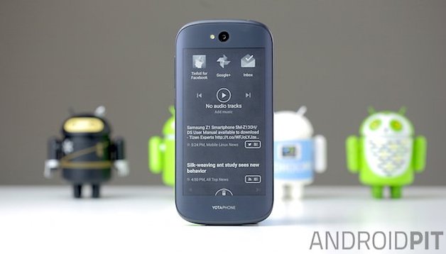

The YotaPhone 2 is, straight off the bat, a vast improvement over the original YotaPhone. While that device holds a special place in my heart for being so unique, it was, admittedly, a rather ugly brick with limited rear-screen functionality. All that has changed in the second generation YotaPhone 2. Read on for the full YotaPhone 2 review to see just how much better things can be, second time around.
Good
- Much improved design
- Second e-ink touchscreen display
- Greater second screen functionality
- Excellent battery performance
- Near-stock Android
Bad
- Very pricey
- Mid-range specs
- Poor camera
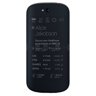
YotaPhone 2 design and build quality
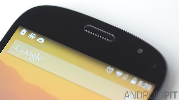
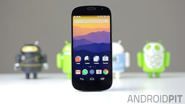
The new YotaPhone 2 is a much, much better looking device than the original door wedge. The YotaPhone 2 features smooth curves everywhere, from the rounded corners to the gently curved back panel. The phone is roughly the same size as a Nexus 5 and is equally bare on the front, with just a few sensors and an ear piece detail offsetting the otherwise flat slab of Gorilla Glass 3.
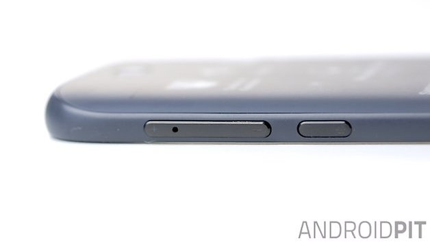
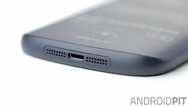
The top edge of the YotaPhone 2 is only interrupted by a headphone port, while the bottom edge has twin speaker grills and a USB 2.0 charging port. The left side of the phone is clean with the right side hosting the power button and a volume rocker that hides a SIM card slot underneath. The edges of the phone are a matte rubberized plastic. The phone feels very solid and smooth in the hand when held ''right way up'' and slightly boxier when held with the e-ink display upright.
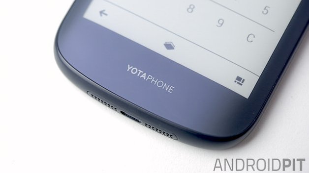
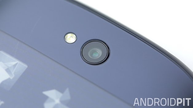
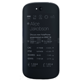
On the back, the curved Electronic Paper Display (EPD) is slightly rounded and is also covered in Gorilla Glass 3. The rear display isn't anywhere near as conspicuous as it was on the original YotaPhone and it blends into the design seamlessly. Above the rear touchscreen there's just a camera lens and single LED flash with Yota's logo at the bottom. While the original YotaPhone also felt very solidly built, the new version has much more sex appeal.
YotaPhone 2 display
The YotaPhone 2 is all about dual-screened action. The front display is a pretty standard 5-inch Full HD AMOLED screen with 442 pixels per inch. Colors are punchy and vibrant with good contrast and deep blacks, although viewing angles aren't brilliant and outdoor viewing suffers a little.
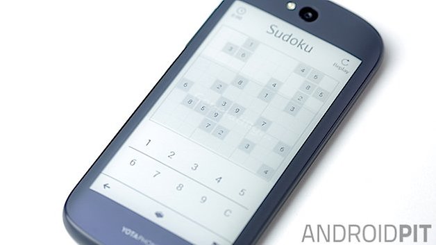
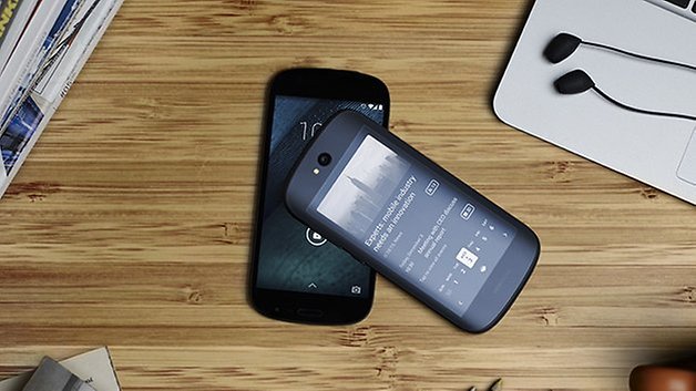
This is where the rear touchscreen comes in though. The back display is a 4.7-inch qHD e-paper display with 16 shades of gray scale. Similar to a Kindle display, the back screen is great for reading, outdoor viewing and almost ridiculous battery savings, but more on that later.
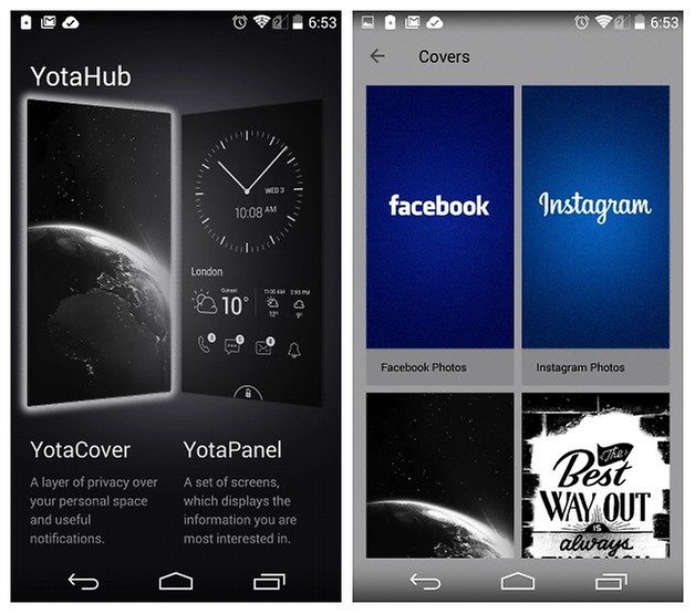
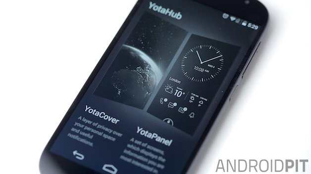
The rear screen can do everything the front screen can by using the YotaMirror shortcut to flick the color screen content to the back, but it also has a couple of extra modes: YotaCover for a little bit of public privacy and YotaPanel, for a more fully featured rear-view experience. YotaCover lets you upload any wallpaper you like, including Facebook or Instagram image feeds, with a few must-have icons at the bottom (dialer/recent call log, messages, email and notifications).
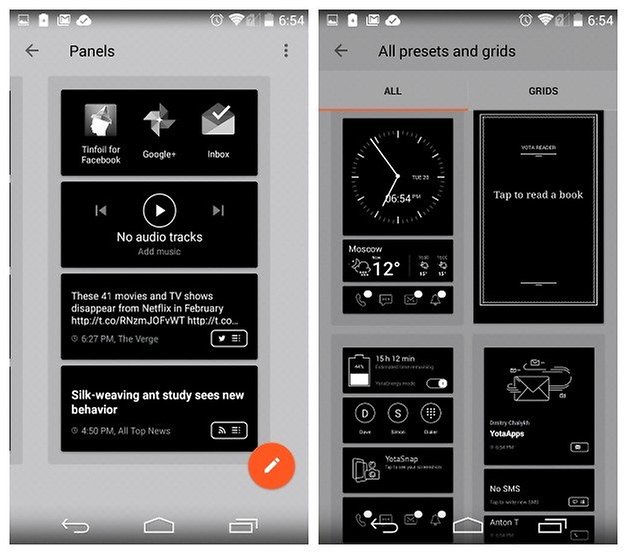
YotaPanel lets you get funky: you can add multiple widget screens to the back touchscreen and customize them at will. There are several preset panels, with widgets for weather, social feeds, calendar and appointment schedules, screenshots, frequent contacts, dialer, an e-reader, clock, music controls and screenshot viewer.
You can also build your own widget screens by mixing and matching any of the above-mentioned widgets for a custom YotaPanel, including shortcuts to your favorite apps like WhatsApp, Facebook or Gmail. All apps work perfectly well on the back screen and you can use the back screen exactly as you would your normal color display.
Scrolling is surprisingly fine and you can even watch videos if you want. Of course, there is a slight delay, a little flicker when the screen refreshes and ghosting artifacts from the last screen visited, but these are all fairly standard for an e-paper display and easy to get used to.
YotaPhone 2 software
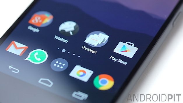
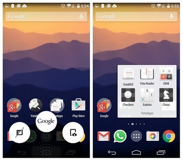
The YotaPhone 2 runs near-stock Android 4.4.3 KitKat, so the experience up front is very much like you would find on a Motorola device: stock Android with just a couple of additional elements added in. Besides YotaHub, which provides access to YotaPanel and YotaCover, you've got a couple of pre-loaded Yota apps for the back screen: from an RSS feed and e-book reader to some simple included games like 2048, chess and Sudoku.
Swiping up from the bottom edge on the front screen will provide you two additional shortcuts alongside Google Now: YotaMirror, which will pop your color screen content onto the back display, and a screenshot function which will instantly display whatever was just on the front screen on the back. It's great for having directions, a shopping list or a to-do list always on hand. Flipping between YotaCover and YotaPanel on the back display is a simple matter, courtesy of a pop-up nav bar that disappears with a tap of the screen, and you can swipe between YotaPanels as you normally would.
Depending on which way you are holding the phone, pressing the power button will unlock the uppermost display, and occasionally you will be prompted to flip from the e-ink screen to the full screen, like when you want to read your notifications. This is perhaps my only gripe with the rear screen: the e-ink display will tell me I have three notifications, but I can't see what they are unless I flip the phone over. Likewise things get a little weird with the endless flipping sometimes too; the YotaPhone 2 is not a phone for those with butter fingers.
While I have to admit it does take a little bit of getting used to, once you actually manage to train yourself to use the e-ink display more you find yourself wondering how you ever lived without it. The benefits of an additional, always-on display that persists even if your battery dies cannot be overstated. While you may not go the whole hog and always turn the rear screen on first, the more you use it the better your YotaPhone 2 experience becomes. And the longer your battery lasts.
YotaPhone 2 performance
With the YotaPhone 2 being announced at last year's CES 2014, it has decidedly late 2013/early 2014 specs: a quad-core Snapdragon 800 clocked at 2.3 GHz, 2 GB of RAM and 32 GB of internal storage - it's basically a Nexus 5 inside.
While this is more than enough for the average person, the YotaPhone 2 can't really compete with its current competition packing early 2015 specs sheets. Especially when one considers the premium price tag attached to the YotaPhone 2.
The lack of expandable storage is also a shame, especially considering the ease with which you can fill up 32 GB these days. The Full HD display is perfectly fine, although touch responsiveness seems a little patchy: I have similar problems to others when typing. Even swipe typing is a bit of a hit and miss affair, regardless of the app I'm using.
Likewise the camera, but no one is going to buy a YotaPhone 2 for the specs sheet: it truly is all about that second screen, and it makes up for a lot of other shortcomings in the device.
YotaPhone 2 camera
The YotaPhone features a decidedly ''meh'' 8 MP camera that will suffice for snapping social media pics and general shooting but won't come close to being your go-to camera for important moments.
A cute ''smile'' image comes up on the rear display when shooting a photo and you can YotaMirror the viewfinder to the back screen so you can use the main camera and its flash for selfies. It's not the most graceful solution but it's a pretty clever one that makes up for the lack of a better front-facing camera.
Yota has opted for the Google Camera as the stock camera app and I'm happy enough with it. While focusing and shooting speeds are not up to par with devices like the LG G3 or Galaxy S5, the camera/app combo is perfectly acceptable, but not much more. Of course, you've got access to HDR, PhotoSpheres, panoramas, 1080p video and lens blur.
The 2 MP front-facing camera is really only useful for video-calling, as the YotaMirror viewfinder trick replaces the need for a front-facing selfie camera.
YotaPhone 2 battery
The YotaPhone 2 specs include a reasonable 2,500 mAh non-removable battery, but as mentioned above, battery life is relative with the YotaPhone 2. Depending on how much you use each display, you can go from four and a half hours of screen-on time up front to 100 hours of e-book reading on the back display.
The more you wean yourself off always using the color display the greater the battery experience you will get out of your YotaPhone 2. One would assume the reason you opted for a YotaPhone 2 is because you want to use the always-on e-ink screen, so the more you embrace it the better.
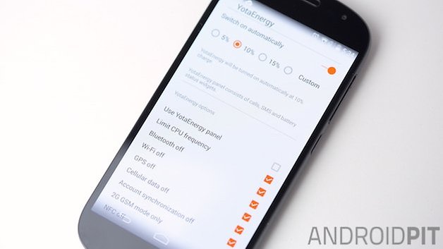
The YotaPhone 2 also supports Qi wireless charging and has a very handy YotaEnergy mode, which can be switched on from the back display and tweaked like crazy in the settings. Like most other power saving modes, YotaEnergy limits certain functionality to suck more life out of each charge. The nice thing here is that you have full control over what features to enable or disable with YotaEnergy. It can also be set to switch on automatically at a preset battery level.
Release Date and Price
The YotaPhone 2 release date depends on the particular market you find yourself in, with it already being available in the UK for 555 GBP. The YotaPhone 2 price in the US converts to around 850 USD, but no American release has officially been announced. It should be available very soon in the US though.
YotaPhone 2 technical specifications
Final verdict
The YotaPhone 2 is a vastly improved progression from the first proof-of-concept device. The second e-ink screen on the back is infinitely more useful, with full touch controls and a range of applications, widgets and use cases to take advantage of. While the internal components are a little dated, the YotaPhone 2 is about more than the specs race, introducing a new way of thinking about your smartphone and revolutionizing battery life in the process.
Specs hounds and camera fiends will likely look elsewhere and for good reason, but for those with an adventurous slant to your smartphone tastes, the YotaPhone 2 represents a groundbreaking approach to what we can expect from our smartphones and what our smartphones can actually do. With battery life calculated in days, an always-on touchscreen and the benefits of both a full color and e-ink display, the YotaPhone has many faces, and all of them are worth looking at. It's a three-star phone empowered with a five-star feature and we can't wait to see more.



I guess this will send this to santa for my wish list ;)
nice
wait a sec videos on e-ink?
can you show?