Android 4.4 KitKat: This is why the status icons are white
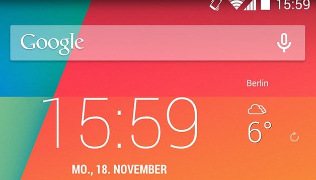

Android 4.4 has brought a fresh look to the Android operating system and a lot of design changes that include a transparent system tray and the new Google Experience launcher. As well, the status icons have been changed over from the default blue to a complete white. A Google developer has stepped in to explain the reason behind Google changing the status icons.
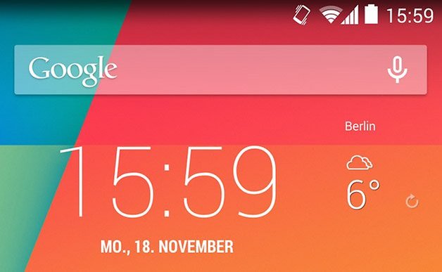
Many Android users were a bit mystified by this change, as the blue signified that there was a connection between the device and Google servers. If the connection was interrupted, for whatever reason, this was signaled by the status icons changing to a gray’ish color. Now, with Android 4.4, the icons are always white and it is only when you head over to the Quick Settings that you’ll be able to tell whether the connection is severed as they will appear as an orange-red colors.

According to a developer over at Google, Dan Sandler, there were two reasons for the color change in Android 4.4. In a comment on Google+, he has said that the blue icons didn’t fit well with the transparent strips with that latest update. As well, most Android users didn’t even know the purpose of the different colors, blue and gray, that the status icons represented.

Another change that has shown up in Android 4.4 is the small arrows that indicated whether data was being sent or received. Again, with KitKat, this is only shown when you bring up Quick Settings and is gone all together from the status bar. Sandler has indicated that the representation of the arrows had some effect on the CPU and GPU, albeit a minimal effect, and was therefore removed.
How do you stand on the color change? Does it bother you or do you really not care about it? Unless you’re using a Nexus device, you probably didn’t even notice the difference between the blue and gray status icons as most manufacturers applied their own skins to their devices, or you just never noticed them. Personally, I’m a fan of the white icons because they now fall in line with the color of the soft buttons at the bottom of the screen and are a clean design choice.
Via: Android Police Source: Google+









One more thought... as hardware gets more powerful, our software gets more ignorant? Its function over fashion when it comes to software... make it smart then design it user friendly and customizable.
Android is supposed to be all about customization and choice. Now as google gets bigger and its hands around the market, they're almost turning into another apple. And now google making excuses and lies etc. A tiny little arrow making a noticeable impact on battery or cpu, really?! Also, it would be 1 thing for google dumbing down and making the icons boring white but they're imposing their ignorance on app developers... notice how recent app updates are making their icons all white as well? Instead of lowering your standards to the masses, why not try to educate the masses? Include a tutorial such as a video or a screen tip that pops up once explaining or just a video link section? If people chose to remain ignorant to features and options, a few simple check boxes to turn of extra features would be far more intuitive and desirable. Why do you think people root their devices and use xposed like me or choose to change the os completely? You want people to get all the benefits possible from your product to boost your popularity and sales don't you? And those who don't care and want "simplicity" ie dumb iPhones are going to remain that way and buy that garbage either way.
Where can I/we post this stuff so google can see it?!?
I like the colour indication as you get immediate confirmation of connection to the internet not just a successful WiFi hook-up.
Looks ("design") over function. There was absolutely no substantial reason for these changes. At most the function and behavior should have been left alone. Busy work and over tinkering instead of advancing the technology (e.g kernel merge). But that takes effort and knowledge.