Android 5.0 Lollipop review: Material Design, more functions and overall more intuitive


Google finally announced the new Nexus devices which will all come running Android 5.0 Lollipop, the latest iteration of Android. Although it has yet to officially come to the Nexus line, not to mention other Android devices, we’ve been able to test a preview version of the OS, inspired by the Material Design found in the SDK and factory images for the Nexus 5 and the Nexus 7 (2013). Thanks to this, we can safely confirm that Google has completely renovated the entire user interface as well as introduced a great deal of new features. Check out our Android Lollipop review.

Before I get started, I just want to point out that the review was done on a preview version of Android 5.0 for the Nexus 5, and that some features may change by the time the final version arrives. Also, errors and instabilities that I encountered throughout the test will likely not be present in the official version (or so we hope).
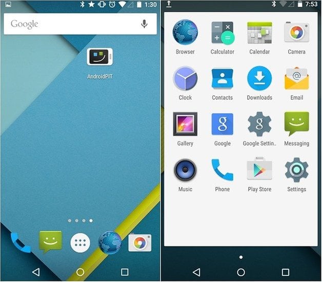
It should also be noted that what we had previously reported about Android L right after the Google I/O has changed quite a bit, both in regards to the user interface and the features. There are small changes everywhere, while some other apps have undergone a bigger overhaul, and some features are completely new! The changes are a lot different than Android KitKat, which you’ll likely notice in the screenshots. The further I explored the Android 5.0, the more I realized how different it actually is from the previous update.
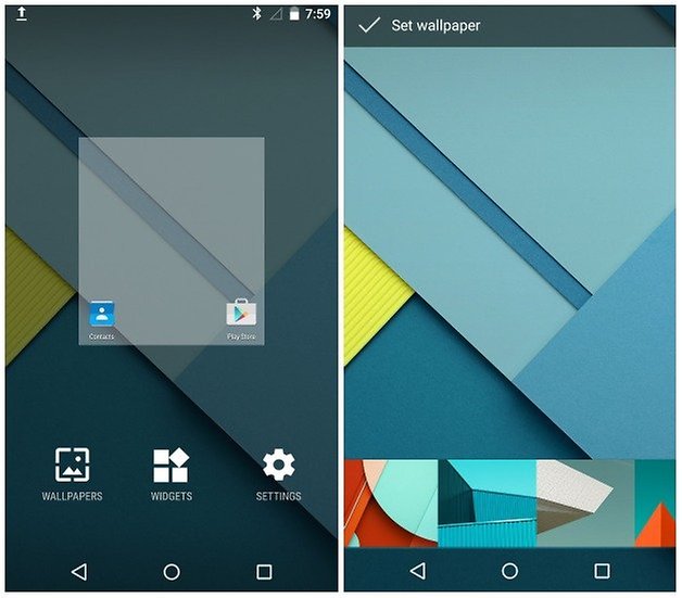
Thankfully, most of the features that we’ve come to love about Android are still a part of the operating system, the new design gives an overall refreshing look and feel. The new visuals added by Material Design are more than just colors and a flatter overall look, Google has gone so far as to change the icons, and add much richer animations and features, all of which create a more unified and consistent interface as a whole.
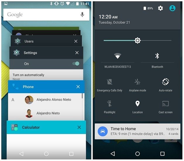
Lollipop Android 5.0 offers more settings options
Right off the bat, new icons are visible in the status bar with a new choice of color and a flatter design. Compared to the design changes brought by Android 4.4, it’s a lot different: the dark theme was dropped and everything has become a lot more colorful.
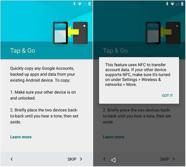
What first caught my attention wasn’t how Material Design was completely integrated across the entire system, but rather the introduction of two very appealing features: you can now migrate data from your Google accounts, and back up apps and data from one Android phone to another using NFC. Another great element is that data and apps can be recovered in respect to the device you are currently using, you don't have to transfer all of them. As I have a fairly large list of devices, it only makes sense for me to install apps that really interest me on a particular device.
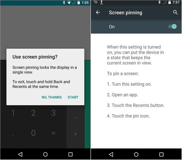
Android 5.0 Lollipop lets you ''pin a screen''
Speaking of new features: Android 5.0 Lollipop lets you can block your device so that it’s ‘’pinned’’ on one particular screen. For example, if a friend wants to use your phone to read an article on the AndroidPIT app, you can activate this feature by going into the Settings, then Security, and finally Screen pinning which is found under Advanced. This way you can prevent them from accessing other more sensitive apps, such as WhatsApp. The only issue though is that the person could actually get out of the screen in question because the system itself displays instructions on how to unpin the page and access the rest of the phone by pressing the new and back buttons simultaneously, which is sort of frustrating.
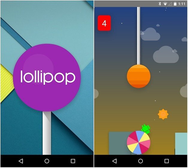
Android 5.0 Lollipop has a Flappy Bird Easter Egg clone
Like the other versions of Android, Google’s developers have hidden a surprise within the system, which they refer to as Easter Eggs. In the case of Android 5.0 Lollipop, it pays tribute to one of the most popular apps of the year, that being Flappy Bird (check out Android 5.0 Flappy Bird in action below). Having played many hours of Flappy Bird myself, I can guarantee that Google’s version is much more difficult. The Android developer version features lollipops instead of pipes and your character is, of course, a little green Android. To access the game, go through the settings menu, then tap several times on the Android version number. Finally, long press the lollipop image that appears (pressing on it quickly will have it change color).
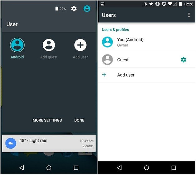
Android 5.0 Lollipop brings multiple user profiles to smartphones
Finally, Google has incorporated the possibility to add multiple users to one Android smartphone. The setup can be done quite simply right from the Quick Settings menu by tapping on the profile icon on the top right corner. Here you can add a guest or a new user. You can also switch users from this area. This is a great feature if you use your phone in many different settings, like work or private life, or if your children often use your phone. Each user profile's space can be configured individually.
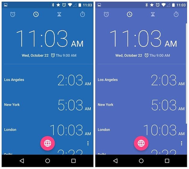
Android 5.0 Lollipop changes the clock app background to match the time of day
Though the clock app hasn’t changed radically like other system apps on Android 5.0 Lollipop, it’s received a small detail that’s made it a bit nicer: Google has introduced different color profiles according to the time of day. It will change automatically, from more vivid colors in the morning to deep ones in the evening, and then everything in between.
Android 5.0 Lollipop facilitates custom user profile image
With Android 5.0 Lollipop, the Google developers have now made it a whole lot easier to customize your user information that you’ll see in the quick settings, such as profile image and username. This is accessed again in the Quick Settings, then More settings, where you will see a list of users and profiles. Tapping on the profile icon will prompt you to either take a picture or choose one from the gallery. You are no longer restricted to your Google+ profile picture.
Android Lollipop is full of new animations, effects and transitions. Unfortunately, it’s hard to show these in screenshots, but you can take a look at the video to see these in action. Something to watch out for are the active notifications and Quick settings from the lockscreen, which make the user experience a lot more intuitive.
Link to Android 5.0 Lollipop preview video
You can probably tell by now that Material Design is much better integrated into the overall Android system, many apps have been optimized with the new design guidelines to create a uniform look and feel from one corner of the OS to the other. Some subtle changes have been put in place in respect to the dialer app: it’s now a lighter blue and the icons have been redesigned with the new flat look.
Android 5.0 Lollipop offers choice of priorities for volume and notifications
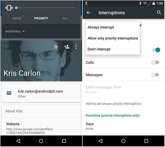
Android 5.0 brings a new volume function, which allows you to briefly interrupt the profile in which your device is currently set. For example, you can designate certain calls and notifications to breach silent mode by setting a new level of priority for an app or a contact, a function which reminds me a lot of Motorola Assist. This feature can be accessed by pressing up or down on the volume buttons, where you choose either ‘’None’’, ‘’Priority’’, or ‘’All’’. When an app or a contact has been identified as a priority, then you’ll see a star next to it, plus you can also choose if it applies indefinitely or for a specific amount of time, as well as the volume at which your phone will ring.
Android 5.0 Lollipop brings optimized usage and battery saving mode battery invasive
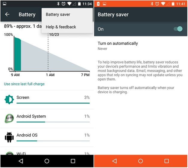
Like mentioned earlier in the article, I tested out a preview version of Android 5.0 Lollipop, so by the time it comes to your Android phone, it may be a bit different. For one, we noticed a few instabilities in respect to the battery. After flashing the factory image of Lollipop, I noticed that battery drained a lot quicker than normal. However, after a few wipes, charging the Nexus 5 fully and restarting it, I noticed that power consumption was indeed lower. After 24 hours, I was still left with 43%, which is surprisingly good considering the problems the Google phone normally has.
When Lollipop’s new power saving mode ''Battery Saver'' is activated, the navigation and status bar changes to orange, a decision they made so it matches the Material Design. This new feature took a bit of getting used to as the colors were kept this way throughout the entire UI, though it seems to be the system’s way of informing the user that a limited amount of resources are currently being used.
Android 5.0 Lollipop comes with a smarter Google Now
Google Now has also been spruced up in respect to design and functionality. For starters, the search bar is now permanently fixed to the home screen and can be accessed from any screen system-wide. Now it will also allow quick access to the Google Now settings menu via the hamburger icon on the right side.
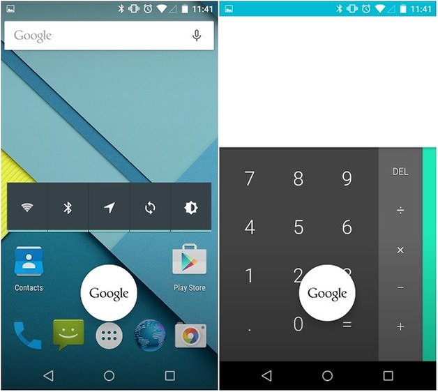
What I liked the most is that I could use the voice command hotword “Ok, Google!” from any screen, with the exception of the lock screen. I noticed that the answers were more accurate and appeared in a timely manner. What’s more, searching throughout the phone’s own system has also been optimized, like when looking for apps.
Preliminary Verdict
Well, there you have it, an initial review of Android 5.0 Lollipop based on what what’s been released by Google so far. After using the new OS on my Nexus 5 for the last 24 hours, the experience was mainly positive, and what pleased me the most was the introduction and optimization of many new and useful features. On the other hand, the colorful interface brought by Material Design will take some getting used to. I also found the new notifications and quick shortcuts to be really handy.
Android 5.0 Lollipop reminds me of when LG came out with the LG G3, when the UI became a lot flatter and introduced more basic colors. I found this to be on the childish side at the time. Now it seems like Google is on the same page with the flat and colorful Material Design, and this is a trend that I’ll need to get used to. That being said, Lollipop brings many changes to the OS that users were expecting and overall I think it's been integrated very well.
What do you think of the new features and design changes brought by Android 5.0 Lollipop? What do you notice is different than the previous OS? We’d love to hear your feedback about our Android 5.0 Lollipop review in the comments below.





It sucks to read,read,read,read, about L ,and don't know when it will be running on My Note 3 !
Great article..... can't wait to get my hands on the nexus 9