Apple Watch vs Moto 360 comparison: which is the better smartwatch?


Apple’s first smartwatch will be upon us soon. With price and availability details outlined earlier today by Apple CEO Tim Cook, expectations are extremely high for the Apple Watch. But how will it compare to one of the most popular Android Wear smartwatches of the moment, the Motorola Moto 360? Let's find out in our Apple Watch vs Moto 360 comparison.
Apple Watch vs Moto 360: price and availability
The Apple Watch release date is April 24, with pre-orders and in-store demos starting April 10. The Moto 360 was launched on September 5th.
The Apple Watch price is set at 349 USD for the 1.5-inch sport version and 399 USD for the 1.7-inch version. You are then looking to pay between 549 and 1,099 USD for standard versions. The luxury ''edition'' model made of 18 carat gold rolls in at the 10,000+ USD mark. The Moto 360 costs 249 USD.
Apple Watch vs Moto 360: display
The screen on the Apple Watch is a sapphire touchscreen which will come in 1.5-inch or a 1.7-inch variants. Motorola's watch has a 1.56-inch LCD (320 x 290 pixels), and 205 ppi display. We can't yet make a call on which display looks more impressive, but we'll bring more details when we get our hands on an Apple Watch on April 24.
- Motorola Moto 360 review: get the whole story
Apple Watch vs Moto 360: design and build quality
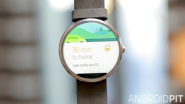
Of course, style is a huge focus for Apple, and there are clear differences right from the beginning between the two watches. The Apple Watch has a rectangular bezel and a rectangular screen, while the Moto 360 has a round screen and bezel. The strap for both the Apple Watch and Moto 360 can be easily switched out.
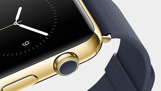
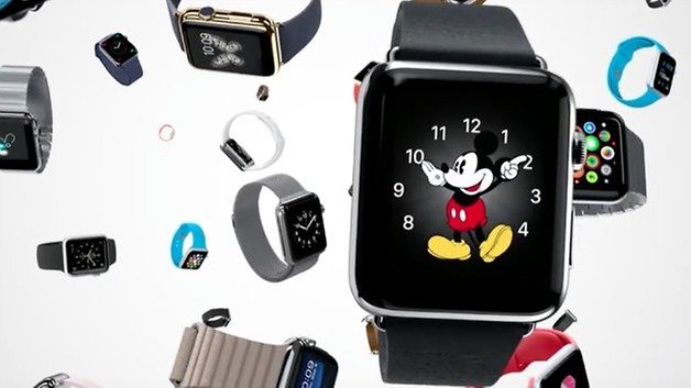
Not surprisingly, Apple has created a premium 18-karat version of the watch. There also looks to be a gold and silver version of the metal chassis. There are two sizes of Apple Watch, as well as three collections, ''Apple Watch", with a polished or space black stainless steel case and a choice of straps; "Apple Watch Sport", with a space gray or silver anodized aluminum case and Sport Band; and "Apple Watch Edition", with an 18-karat rose or yellow gold case and a choice of straps exclusive to this collection.''
Apple Watch vs Moto 360: software
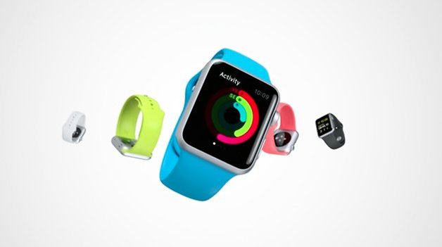
The home screen on the Apple Watch face is just as bright and over the top as any Apple UI, which is quite different to the Moto 360. The Apple Watch's home screen is packed with apps in a honeycomb-like structure and is capable of displaying any notification that you could receive on your phone. The Apple Watch also communicates right from your wrist by sending and receiving messages, as well as making calls.
Both Motorola and the Apple watches are health and fitness devices, though Motorola said that it didn't want to only focus on this, and rather offer something stylish that anyone would want to wear. Like the Moto 360, the Apple Watch has an accelerometer, but does not have its own GPS. It will also measure your heartbeat, if that's your thing.
For zooming into the UI of the Apple Watch, you turn the watch dial that they called the Digital Crown. You can zoom into a map, as well as scroll down a list. Pressing the crown will bring you to the home screen, while pressing it on the Moto 360 brings you to the settings.
The Apple Watch requires a paired iPhone, as far as we know, just as the Moto 360 requires a smartphone. Some other cool things you can do is sketch on screen, and send these to your friends. Like the Moto 360, you can choose through a variety of widgets. Apple Pay which is new with iOS 8 and will work on the Apple Watch, and this is something that the Moto 360 won't be able to compete with.
Apple Watch vs Moto 360: Battery
In Apple's "Spring Forward" presentation, Tim Cook announced that the Apple Watch would have an 18-hour battery life. This means that it is in the same ball-park as the Moto 360. Recent tests have shown that the Moto 360 battery is capable of lasting for 20+ hours on a single charge with normal use, but this would still mean that the device should be charged every night.
Reports of poor battery life are rife for both camps, and it looks like a daily charge is going to be a requirement for most smartwatches for the foreseeable future.
- Moto 360 battery life causing issues worldwide
Apple Watch vs Moto 360: tech specs
| Moto 360 | Apple Watch Sport | |
|---|---|---|
| Display | 1.56-inch LCD, 320 x 290 pixels, 205 ppi | 1.5-inches (38 mm ver.) / 1.7 inches (42 mm ver.), Retina display |
| Processor | Texas Instruments OMAP 3 | S1 SiP (System in Package) to miniaturize an entire computer architecture onto a single chip. |
| RAM | 512 MB | TBA |
| Internal storage | 4 GB | TBA |
| Battery | 320 mAh | TBA |
| System | Android Wear | Watch OS |
| Dimensions | 46 mm diameter, 11 mm high | 21.2mm x 26.5mm x 33.5mm (38 mm ver.), 24.3mm x 30.5mm x 39mm (42 mm ver.) |
| Extras | Splash proof, Heart rate monitor, Light Sensor, wireless Qi charging | Wi-Fi 802.11b/g, Bluetooth 4.0, NFC |
| Price | 249 USD | 349 (38 mm ver.) or 399 (42 mm ver.) |
Apple Watch vs Moto 360: early verdict
It's a bit too early to compare the two decisively, however we can already see the key differences: square vs round, loud vs modest designs, many customization options for the bands on the Apple Watch vs leather elegance for the Moto 360. The thing is, I think you have to ask yourself: do you want a smartphone on your wrist in the case of the Apple Watch, or something that looks more modest and less futuristic, like the Moto 360?
Also, don't forget price: the Apple Watch will be available in early 2015 starting at 349 USD for the smaller Watch and 399 USD for the larger, while the Moto 360 costs 249 USD - over a hundred bucks difference.
We'll update this article with more details as we hear them, but in the meantime, let us know what you think!





This article has some technical errors. First the Moto 360 is rated to IP67, which is submersible to 1 meter for 30 minutes (not splash proof like the article shows in the table)
It also refers to the leather band of the Moto 360, but it can be ordered with Gold, Black and Silver tones, with multi-color leather bands and stainless steel watch bands.
The Mickey Mouse watch says it all! Face on looks 'not to bad' but to thick. Moto's inductive charging is a major plus and zero openings. The iWatch looks like my old Timex LED watch from the '70 s. It was much thinner. Definitely need 2 or 3 more design cycles to come close to WATCH status not wrist mounted tech toys. Just read a CNET article, I forgot Apple brought in the former CO of Yves Saint Laurent, while Intel is partnering with Fossil. YSL jobs out watches to the 'Hated Swiss' (swiss movements) or electronic watch movement; they're about STYLE. Intel may have it right?
Fossil don't use many of their own movements. They also produce watches for DKNY, Diesel, Emporio Armani, Burberry, Marc Jacobs, Michael Kors....the list goes on.
Most of the movements in these watches are bog standard Japanese quartz. Styling is key these days. Until recently I worked in the watch sales and repair trade.
I actually think the physical design of the apple watch IS elegant. one thing we can't deny is they know design and provide superb build quality. For instance, the way the straps fit and lock is brilliant.
But! The software is horrendous. The way you scroll through apps on the map is chaotic. If I was an iPhone owner waiting for the watch I would be disappointed.
Moto 360 is indeed a very nice android wear device and certainly one of the most elegant designs we've seen so far. And that's just it.....so far. Its very early days for android wear. In a generation or two we will see some beautiful things, hard and software based.
Although I have no interest in owning a Smart Watch, its almost not worth doing a comparison until one actually has all relevant consumer electronics before them (I'd rather spend the $ on another Tablet) .....
I think most of us agree that it will be the 2nd and 3rd gen Smart Watch that captures our attention (this is such new tech, its not that one is expecting a James Bond device from Q .... but consumers deserve to have an electronic device I consider worth buying and neither is appealing to me) ...
This note3 was far from cheap £620 uk day one last year why do apple fan's still boast price over everything else? Look at me am pimped with my iPhone and gold apple watch.
You must be kidding...The Moto 360 looks waay better than that...The apple watch (yeah what an original name) looks like a joke, if so many people rant about the Samsung Gear designs, they look dope comparing design with this thing...And i thought the UI was going to be beautiful, but Android Wear looks way better, it is more like Tizen all black...
I agree with you, Apple watch is too ugly, not elegant at all, the moto 360 is far more simple and intersting. And the iOS doesnt seem to have any attrative, I still prefere Android Wear. The only thing I liked in the Apple watch is the connectivity, that makes it more independent, but maybe we have a better exemplar with Android Wear, the Gear Solo.
Gear Solo is tizen not android wear
Interesting article. I am not seduced by the idea of using gold. Gold can be elegant, it can also just as easily be quite crass, so that won't sway me. I still like the idea of the Motorola, I prefer the round look over the square, besides I don't own & don't want an iPhone. Android thanks, for now that's my Moto G 4G LTE. So bring on the Moto 360 please, you can keep your Apple watch.
I'm sorry but did you watch the keynote? Apple's watches start at $349.99 and go up from there ($1000+). You say the moto 360 (actually 270) is more elegant but apple offers their watches in18karat gold with a sapphire screen. I'm not sure about you but I think high end materials make a watch more elegant. Android OEM's cannot compete with these offerings because their clients will not be interested in paying the premium required to craft high end watches. Also the watches have 8GB of storage. They also have comprehensive fitness tracking and health monitoring capabilities beyond a heart rate monitor and pedometer. Get the details at the verge or Engadget.
Besides I'm waiting for gen 2.0 when they really figure this thing out.
No, we just make this stuff up without bothering with keynotes. The Apple Watch is 349/399 depending on which size you go for, and in my opinion at least, gold doesn't equal elegant. One relates to a material, the other to appearances. I've seen all kinds of awful looking gold jewellery in my time!
yeah, you're 100 percent correct. the iWatch is totally over the top, is stuck full to the brim with things nobody needs like so much storage memory, as if you want to replace your phone by a watch. people have seen too many Knightrider episodes (the real, original one, with the Hoff - not that terrible reboot from a few years ago)
no, the only thing I agree on is waiting for the next generation somewhere mid-end 2015.
btw, it's not really "gen 2.0".
arguably we are currently already looking at generation 3 or 4 of the smartwatches
I guess the conclusion is rather simple, unless one of all of those marvellous battery technologies becomes affordable and mainstream, smartwatches will stay crap, for the simple reason that to have cool features on one, you need processing power/battery power - which is something we don't get, unless we accept having a huge bulky thing on our wrist - far bulkier than the Moto 360.
"Elegant" is a composite of all aspects of design. Material choice is just one aspect. Gold does not make a design elegant! If that were true, Donald Trump would be the most elegant man with the most elegant things out there. Gold is and overpowering material in the realm of design. And more often that not, appears tacky or ostentatious. It is why a lot of truly elegant design uses gold as an accent rather the whole shebang.
@CalypsoSir, great explanation.
A crappie watch made of platinum is still a crappie watch. So far the smart watches are crappie watches as far as watch specs are concerned. A broken tech toy on my wrist is useless. The companies are going to the 'splash proof' case spec. Does anyone know how wet your watch get after a 10k run? And they are selling the run tracker and heart rate app as a feature.
If you're gonna buy a smartwatch for its materials and price tag, then you don't know what you're buying. Just because the watch bores the iconic symbol of apple doesn't mean it's the best technology you can buy. Remember that real world usability and software / hardware specs dominate the market, the real question is... How will the watch serve you?