Made by Google: the design secret behind Pixel phones revealed


Google made a change in 2016: instead of the announcement of a new Nexus smartphone, we saw the arrival of the Pixel smartphone. And that wasn't simply a name change. Google has reinvented itself - at least in terms of hardware. But why did they make such a huge change? We sat down with Alberto Villarreal, the designer of the Google Pixel 2 XL to find out.
Interview with Alberto Villarreal
Most Android fans out there probably had a Nexus smartphone at some point. Together with other manufacturers (HTC, Samsung, LG, Huawei) Google released a Nexus smartphone that provided a demo device for Android: showcasing the best it can offer.
For example, anyone who wanted to enjoy Android 4.4 Kitkat with all of its features bought a Nexus 5, and thanks to the reasonable pricing, it was a hit for app developers and Android enthusiasts alike. It was so successful that the Nexus 4 and Nexus 5 gave the impression that Nexus smartphones were a bargain. In fact, Nexus smartphones were usually expensive, including the latest Nexus smartphones, the 5X and 6P.
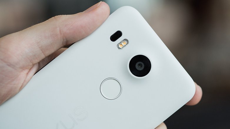
Then again the Nexus 5 was already a turning point for Google devices. Up until this device, Nexus phones have been pure Android. But with the Nexus 5 introduced some minor changes. Hangouts replaced Android's SMS app and the launcher was also initially exclusive to the Nexus 5.
Nevertheless, the Nexus series has always tried to show off what Android can do. Developers were able to test the latest features, as they were quickly updated to the latest Android version.
What changes did 2016 bring?
Why not a new Nexus 7 or Nexus 6?
Alberto Villarreal, Creative Lead/Industrial Design Manager, sees the pixel series as a necessary evolution: "It is always difficult to understand different [partner] teams and their skills. We were therefore unable to establish a common design line. In a way, it was a constant dance and we realized that we had to bring all the steps of smartphone development to Google."

Google has therefore moved away from Nexus, and embarked on its next project: Pixel smartphones. Now, Google has taken over the design, construction and all other development steps, and only the manufacturing process is outsourced to a partner, which is currently HTC.
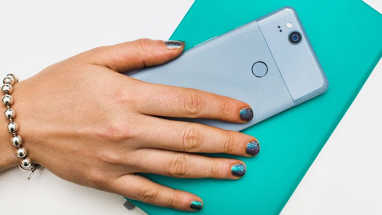
Pixel smartphones have a new goal in mind: they aren't showing the best of Android, but the best of Google, and this is clearly evident with Google Assistant.
This core feature in the first Pixel generation wasn't really impressive at that stage. But if you look interact with Google Home (or Mini), you'll notice the advancement of Assistant to a point where it is actually very useful at controlling your smart home. Looking back, it's clear why Google needed to work on Assistant: The competition isn't sleeping - especially Amazon with Alexa.
Google's vision is clear: The smartphone is the center piece to an ecosystem of devices.
Technology is only half the battle
But great technology alone is not enough. The capabilities of modern smartphones can be complex and overwhelming, so Alberto Villarreal therefore sees the importance in the design of technology, and is particularly proud of Pixel 2 XL. which so far, is his favorite smartphone
How is a smartphone made?
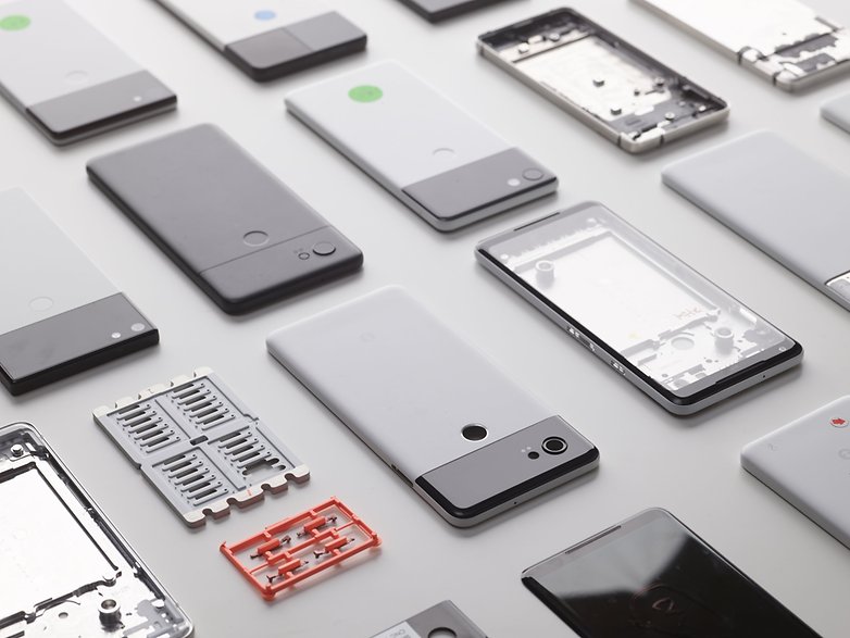
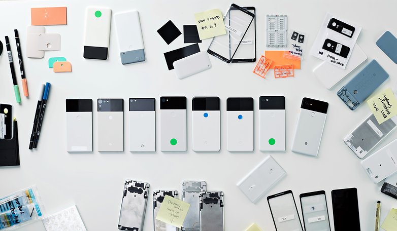
"How do you go about designing a smartphone?", is something I wanted to ask Villarreal. Ultimately, it is a process in which designers and engineers try out ideas. Prototypes and design experiments are constantly being created. Sometimes the work starts on a sheet of paper, and sometimes design concepts are already prepared in advance.
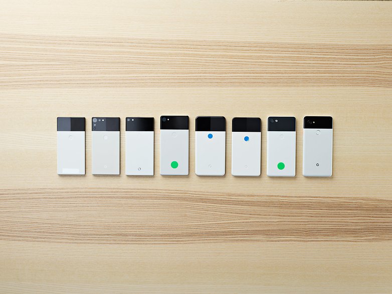
In Mountain View, the team had a seemingly endless number of prototypes for the Pixel 2 (XL) sitting in the drawer. At the prototype stage, ideas are tested, evaluated and implemented. Eventually, they have to decide on the smaller details, deciding what the final finish will look like, to choosing how blue or orange a design accent should be.
That certain something
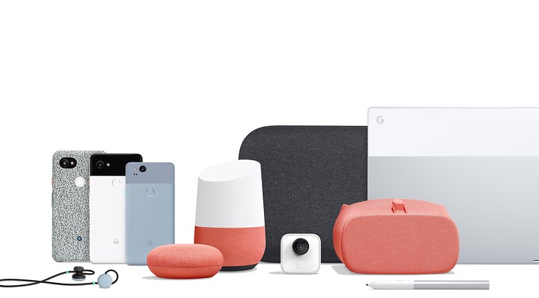
With Pixel 2 XL and its cases, there are some details that make you smile without being too over-the-top. For example, the orange power button on the Panda Edition of the Pixel 2 XL, and the Google Home Mini is available in a bright, unusual color, and this type of design choice makes things interesting. "These are the small elements that give our products that certain something," says Villarreal. "The secret of the Google design is these smaller details, which in your busy and sometimes stressful everyday life, can make you smile".

Google uses fabric on many devices, including on the cases for the Pixel 2 XL and the Daydream VR glasses, for example. However, there are differences. The phone case material is more robust and durable, whereas the VR glasses are made with softer, finer fabric which feels more luxurious to the touch.
Villarreal is enthusiastic about the use of these kind of materials due to the versatility of them. The use of different fabric structures is dependent on the product, for example, the cases suit the tough and more resistant materials due to the way we use them. If we want something to protect our phones, it must be tough and long-lasting.
In addition to the materials, Google also has another consistent design choice that characterizes the devices in this series, which are the contrasting colors. You can see this color split on Google Home, Pixel Smartphones, Pixelbook, and even on the Pixel pen or the Home Mini display. With both the distinctive design and Assistant, the devices are given a common theme and identity.
That is perhaps the bottom line: in the past, Google often had a rather simple technical-looking design that wasn't very appealing. This approach has become a thing of the past. If Google wants to remain as successful as they are right now with Assistant, then every detail has to be perfected. Without an appealing design, a product cannot be successfully marketed.
The design of the Pixel smartphone looks great, don't you think? Leave a comment and let us know your thoughts!



So he's the one who approved such horrible designs! What a poor taste! I bet his real favourite phone is an iPhone
The Nexus 5 was the best design. Felt like a business type of phone with slim bezels, but priced like a phone, not like a laptop
Love the design with the new Google hardware. It is so important for your stuff to look cool which Apple paved the way with.
But the Google Home Mini is where they really nailed it. But the design also enabled it to be put in a case and look like a speaker in your home mounted on the wall. This was rather genius.