Google Pixel 6 review: A new hope
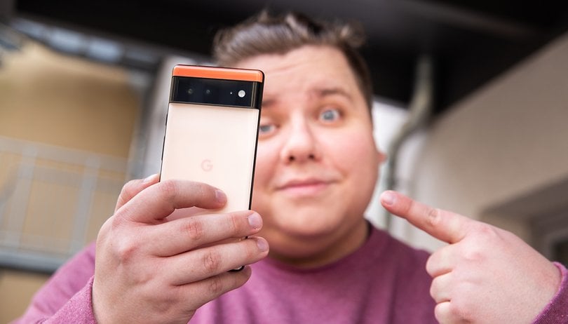

The Pixel 6 is the smartphone that is supposed to mark the revival of Google in the Android market. With a brand new 50+12 MP camera module, a new custom Tensor SoC, and a spanking new daring design, I'll share my detailed opinion about the Google Pixel 6 and tell you whether this is the one or not.
Good
- Potentially iconic design
- Well-calibrated 6.4-inch 90Hz AMOLED display
- Powerful Tensor SoC does not overheat
- Pixel-like photo rendering
- Adequate battery life
- 5 years of security updates
- IP68 + wireless and reverse charging
- Reasonable price
Bad
- Camera module is not versatile enough without a telephoto lens
- Fast charging is too slow and has no included charger
- Night Sight mode is not natural for night shots
- 128GB storage without a microSD port
- "Only" 3 major Android updates
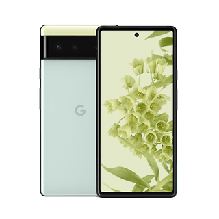
My brief opinion about the Google Pixel 6
Is the Google Pixel 6 really a Pixel smartphone? Since its launch and throughout my review duration, I've had this feeling that Google shouldn't have named its new flagship the Pixel 6.
Sure, the Pixel line has an undeniable brand image, but it also drags a certain connotation that is significantly less than stellar in terms of processing muscle and performance. The Pixel is not the iPhone of the Android world that Google initially dreamed of. For smartphones that are supposed to be flagships, they've always been fairly reserved where processing capability is concerned and occupy a fairly niche space.
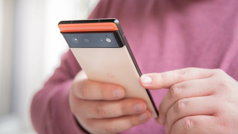
And the Pixel 6, the smartphone marked for this act of revival, truly signifies a 180-degree turn for Google. We find the base of what makes a Pixel with the photo and software experience. But the Pixel 6 is more than just a Pixel in my opinion and deserves to be a new product category for Google to finally break into the Android market.
Design and screen: A breath of fresh air
The Google Pixel 6 marks a real break compared to its predecessors, if only visually. The screen is a little less dreamy though.
What I liked:
- A design that has the potential to be inconic
- Horizontally arranged camera module
- Kinda Coral color is very nice
- 90Hz refresh rate and screen is well calibrated
- IP68 rating
What I disliked:
- The glass back
- Imposing weight because of its form factor
- No microSD slot or 3.5mm audio jack
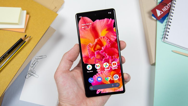
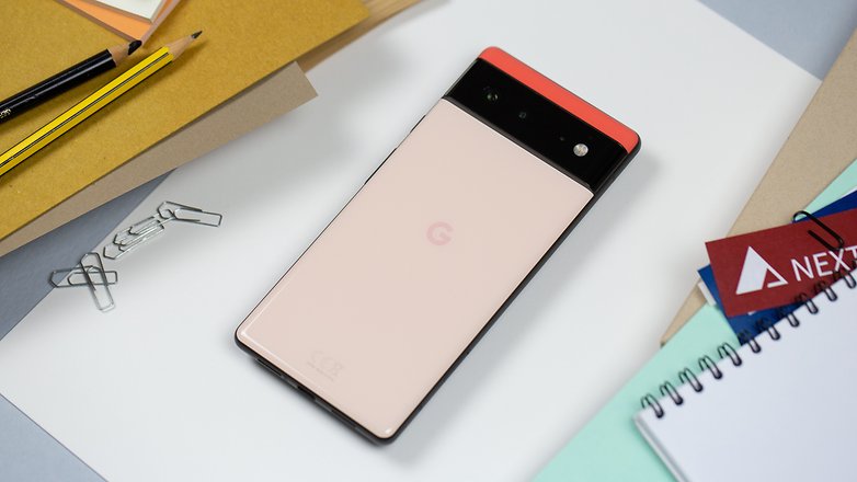
I really like the design of the Pixel 6. I know, right? How original. However, I think that visually, Google has really tried taking on the risk of offering something new and has pulled it off successfully in my opinion.
I also appreciate how Google has retained the matte coating for its edges, allowing the smartphone's grip to be better. On the other hand, the Pixel 6 is one of the only smartphones that I really want to use with a protective case because the glass at the back is unpleasant to touch. It gets greasy and sweaty all too easily with the slightest touch, and is a surefire fingerprint magnet.
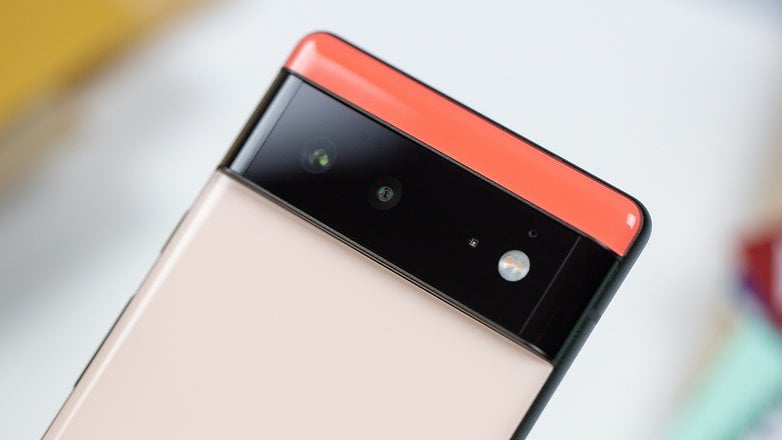
The Kinda Coral color that sports salmon and orange tones is very nice to look at. The horizontally arranged camera module that Google has dubbed as the camera bar has everything to become a signature of the Pixel range. However, it tips the scales at 207 grams and the dimensions that measure 158.6 x 74.8 x 8.9mm is not a form factor that will suit everyone.
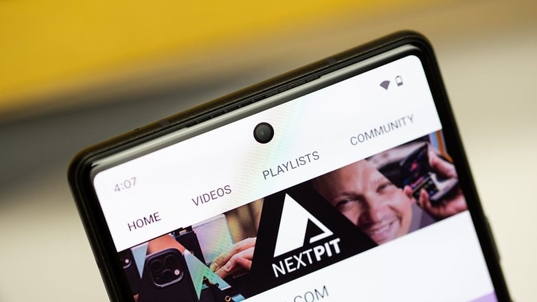
As for the 6.4-inch Full HD+ (1080 x 2400) AMOLED display, I'm not really disappointed that its refresh rate is limited to "just" 90Hz. It's quite smooth and the adaptive refresh rate seems rather smart (I went from 60 FPS in a game to 30 then 10 as soon as I launched the quick access menu). There is a mode to increase the touch sampling rate and make the screen more sensitive also works very well.
If you look at the Pixel 6 from afar, with its flat screen, squarer corners, and thinner bezels, it almost looks like a Galaxy Note 20 or Galaxy Note 10.
Interface: Stock Android 12 or Pixel UI?
The Pixel 6 debuts with Android 12 intow, Google's latest mobile OS version that marks a serious change in its looks.
What I liked:
- Dynamic Theme
- Stock Android Stock is far more basic
- Game Dashboard, Privacy Dashboard, all Dashboards
- 3 major Android updates and 5 years of security patches
What I disliked:
- Home screen space is underutilized
- "Only" 3 major Android versions are guaranteed
I'm really not going to expand on this section because I've never been a Pixel fan in my life and I do not have a fetish for stock Android. In any case, there's already a lot of content about Android 12 including an in-depth review, a presentation of the Material You design or a guide to understand how the Privacy Panel works.
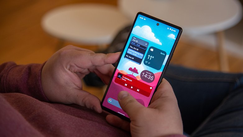
Overall, it really felt as though I was using a Pixel UI, where the widgets are big and round, with quick access menu buttons in the same design language, not to mention the brightness bar that simply announces itself. The Dynamic Theme, which matches the interface color to the dominant wallpaper color, is really nice and is applied in a subtle matter. All these are exclusive to Pixel devices.
On the other hand, I find the home screen to be very poorly optimized in terms of space utilization and arrangement. The screen is surrounded at the top and bottom by two elements that cannot be removed. At the bottom lies the Google search bar that is literally something that I would never use, while the top features an "At a glance" widget that refuses to be removed. Add to that the size of the widgets and the customization options are ultimately rather limited due to a lack of space.
I'll pass on the heresy of assigning the screenshot function to the Power + Volume Down button, making it physically impossible to manipulate with one hand (yes, I know you can do it with a gesture, but it's still dumb).
Let's finish this segment with a real positive point: the Game Dashboard. It's an interactive gaming menu like many others, but I find Google's implementation to be particularly intuitive. There is a FPS counter in the form of a bubble that you can hide and have it appear with a simple swipe, a Do Not Disturb mode and shortcuts to capture or stream your gameplay.
- Also read: Gaming modes: Do they work or not?
Performance: Tensor processor is excellent
The Google Pixel 6 packs the famous Tensor SoC coupled with a Mali G-78 GPU and 8GB of RAM.
What I liked:
- Very good scores on graphics benchmarks
What I disliked:
- No overheating issues
- CPU benchmark scores are mixed
Tensor is a custom-developed system on a chip (SoC) that is the first in the world to feature not one, but two large Cortex-X1 cores in its processor. On paper, its computing power is already greater than the Snapdragon 888 with a single Cortex-X1 core.
The Tensor also has two intermediate Cortex-A76 cores and four Cortex-A55 cores for less power-hungry tasks, while the Snapdragon 888 uses the same four Cortex-A55 cores. The Snapdragon 888 relies on the same four Cortex-A55 cores and a trio of Cortex-A78 cores, which are both more powerful per cycle and support a higher clock speed than Tensor's Cortex-A76.
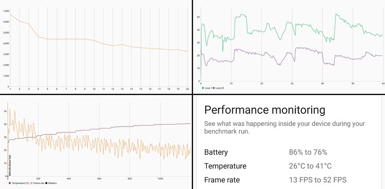
In terms of raw performance, Google's Tensor chip leaves the competition eating dust when it comes to graphics calculations, a little less so on CPU calculations. I submitted the Pixel 6 to a trio of benchmarks from 3D Mark:
- Wild Life: Simulates gaming usage for 1 minute
- Wilde Life Stress Test: Simulates gaming use for 20 minutes
- Wild Life Stress Test: Simulates mixed, intensive, and prolonged use for 20 minutes
And on every benchmark, Google's Tensor SoC performed significantly better than the high-end Snapdragon 888 processor in the Xiaomi Mi 11 or the Exynos 2100 in the Samsung Galaxy S21. Well, unsurprisingly, the iPhone 13's A15 Bionic SoC remains far ahead of the pack.
Google Pixel 6
| Model/Benchmark | Google Pixel 6 | Samsung Galaxy S21 (Exynos) | Xiaomi Mi 11 | iPhone 13 |
|---|---|---|---|---|
| Geekbench 5 (single/multi) | 1031/2803 | 899/2961 | 722/2259 | 1716/4555 |
| 3DMark Wild Life | 6721 | 5461 | 5390 | 8819 |
| 3DMark Wild Life Stress Test | 6707 | 5609 | 5407 | 8905 |
| 3DMark Wild Life Extreme Stress Test | 2017 | 1785 | 1226 | 2566 |
In actual use, I was able to run all my games at a constant 60 FPS with the graphics cranked all the way to the max. I didn't notice any major slowdowns even after an hour of gaming. Most importantly, the smartphone doesn't overheat, which is rare for an Android flagship in 2021. The temperature never exceeded the 41°C mark.
Tensor is supposed to be an AI-focused SoC rather than a graphics-focused one, and most importantly, it's supposed to be power-efficient. This explains why the SoC finally heats up little but also why it barely exceeds its competitors in computing power (CPU).
Photos: Is Google taking back its throne as king of cameras?
The Pixel 6 ushers in a long-awaited technological leap from Google in its camera hardware. We're finally turning the page on 12-megapixel camera modules. Well, almost - with the integration of a 50MP wide-angle lens accompanied by a 12MP ultra-wide-angle lens.
What I liked:
- Well managed colorimetry and dynamic range
- Very good level of detail
- Amazing Night Sight
- Camera application is easy to use and intuitive
What I disliked:
- No dedicated telephoto lens
- Night Sight photos do not look the most natural
The main 50 MP lens captures 12 MP photos via pixel binning, which is why I said Google "almost" turned the page. But this lens relies on a Samsung GN1 sensor with a size of 1/1.31 inches (with 1.2µm pixels) with an f/1.85 aperture as well as optical stabilization (OIS).
Google's camera app is still very comprehensive, sporting sliders to adjust exposure, contrast, and white balance with a simple gesture on the fly. Do take note that all photos below were captured in automatic mode.
- Also read: The ultimate smartphone camera buying guide
I personally found the colorimetry to be handled very well. I'm not against a slightly pronounced treatment, without being too aggressive. And I think that Google managed to achieve a very nice balance. Photos are sublime compared to what the scene looks like in reality, but the result is not artificial. On the contrary, they looked just right.
I was also convinced by the dynamic range that the Pixel 6 was able to reproduce. In scenes with complex exposures, such as mid to late autumn afternoons, the shadows are not too dark and details are not drowned out. Add to this the very present sharpness and one obtains detailed, readable, and also harmonious shots.
As for the ultra wide-angle lens, the Google Pixel 6 uses a 12 MP sensor with an f/2.2 aperture (pixel size 1.25µm) with a field of view of 114 degrees. I noticed some color inconsistencies compared to the main lens and a dynamic range that is not as well managed since this type of lens normally captures less light (no thanks to its smaller sensor and aperture).
For this review, I also took the same pictures with an iPhone 13 to compare results. iPhones are traditionally known to offer very natural rendering, with far lighter processing than other manufacturers.
But I have to say that during the day, I definitely prefer the Pixel 6's rendering. The photos are more vibrant and less bland. In short, they have texture and especially better exposure management (look at the wide-angle foliage that is drowned by shadows on the iPhone 13).
I won't dwell on the zoom since the Pixel 6 lacks the dedicated 48 MP telephoto lens that is reserved for the Pixel 6 Pro. So you'll have to make do with Google's purely digital Super High Res Zoom that goes all the way to 7x magnification.
As magnification is limited, so is the loss of detail. There is nothing much else to report here. It's not the most versatile zoom option on the market, and it loses effectiveness quickly once you get past the 2x level.
The Pixel 6's portrait mode is not customizable in the sense that you cannot choose the style of blur effect or its intensity. But the effect is very effective, in my opinion. I don't really use this mode on a daily basis, no matter which smartphone I use. With the Pixel 6, I've found the cropping to be very clean. Even the tiniest strand of hair in my ugly mane doesn't escape Google.
Historically, night shots were Google's expertise. The Pixel 3 has long been looked upon as the best camera smartphone not only for daytime shots, but especially at night.
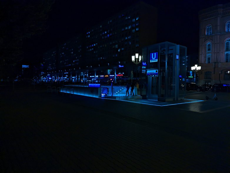
Personally, I really liked the renders of my shots taken in the early evening, around 6:00/18:30 pm, the time when the sun sets in Berlin at this time of the year. The Pixel 6's night mode (also known as Night Sight) is automatic (and you can't adjust the exposure time), and the digital noise is almost non-existent which makes the shots very sharp. But it is true that the rendering is not natural, especially when compared to the iPhone 13 as seen below.
The pictures below were taken around 8 pm, so it was dark and despite this, we found ourselves looking at a blue sky even without activating the Night Sight mode. If we were to look at the same photos taken with the iPhone 13, we can notice a much darker and warmer rendering, which some would say is more natural.
As for me, I find that the rendering of the Pixel 6 remains better. The colors do not turn orange and the light from the street lamps doesn't burn the image. There is also less digital noise and a better level of detail. But it's true that the picture may look like it was taken during the day and not at night.
Personally, I prefer a viewable night shot even if it means sacrificing the natural, darker, and less detailed rendering. But this is a choice that I know is not shared by everyone!
Note that the different sliders of the camera application can provide rather interesting results at night, especially when there are lights around. For example, I tried to set the white balance to the coldest level while pushing the contrast level to the maximum (without touching the exposure slider). The result is not crazy and I'm not proud of it, but I tell myself that a real photographer will know how to exploit these sliders to the maximum potential.
Finally, let's finish with the video capability. The PIxel 6 is able to shoot in 4K at 60 FPS and offers 4 types of stabilization depending on the use and situation. There is a basic mode, an active mode to compensate for very sudden movements, a fixed mode for zoomed videos (2x only), and a panel mode to make, well, panels (the latter works very well by the way).
Google Pixel 6 battery
The Google Pixel 6 packs a 4,614 mAh battery that supports 30-watt wired charging, 21-watt wireless charging as well as reverse wireless charging.
What I liked:
- Wireless + reverse charging supported
- Adequate battery life
What I disliked:
- Charger is not included
- Fast charging is too slow
- Battery utility is too limited
On paper, Google promises that the Pixel 6 is capable of lasting for more than 24 hours and that its battery charges to 50% in just 30 minutes. I can't definitively comment on this since I didn't use the Pixel 6 long enough and couldn't perform a benchmark for its battery life due to time constraints.
With heavy use, I didn't manage to make it last 24 hours. On a day that consisted of an hour of gaming on CoD Mobile and a 3-hour photo taking session (Google Maps and Spotify running in the background as well) including 30 minutes of the camera app being active, I easily lasted more than 15 hours seeing the battery life fall below the 20% mark.
As for fast charging, I found it to be very slow, way too slow, in fact. By default, the Pixel 6 offers an adaptive charging mode and is supposed to be charged at night while you sleep. The charge cycle is therefore logically very long, taking me 1 hour and 21 minutes to go from 0 to 50% via this method.
Once this mode was deactivated, the battery is charged in a little over an hour, which is still a long time in my eyes. Do note that I used my OnePlus Warp Charge 65 charger, which is capable of delivering 45W via USB Power Delivery.
The battery utility is really lacking in versatility. It only tracks usage over the last 24 hours. I find that on this point, Oppo's ColorOS 12 is superior.
Technical specifications
| The Pixel range of 2021 | ||
|---|---|---|
| Device name | ||
| Image |  |
 |
| Screen | 6.4-inch OLED, resolution 1080 x 2400 pixels (411 PPP), 90 Hertz refresh rate |
6.7-inch OLED LTPO, resolution 1440 x 3120 pixels (512 PPP), 120 Hertz refresh rate |
| SoC | Google Tensor 2x ARM Cortex-X1 @ 2.80 GHz 2x ARM Cortex-A76 @ 2.25 GHz 4x ARM Cortex-A55 @ 1.80 GHz 20x ARM Mali-G78 (GPU) |
|
| Memory (varies by region) |
8 GB LPDDR5-6400 RAM 128 or 256 GB of storage in UFS 3.1 |
12 GB of LPDDR5-6400 RAM 128, 256, or 512 UFS 3.1 storage |
| Expandable storage | No | |
| Main Camera | 50 MP | f1.85 aperture | 25 mm focal length | 1.2 µm sensor size | 82° viewing angle| OIS (Samsung GN1 sensor: 1/1.31") |
|
| Ultra Wide Angle Camera | 12 MP | f/2.2 aperture | 16.3 mm focal length | 114° angle of view | |
| Telephoto lens | No | 48 MP | f/3.5 aperture | 104 mm focal length | 0.8 µm sensor size | 23.4° angle of view | 4x optical zoom | OIS (Sony IMX586 sensor: 1/2'') |
| Video | 4K at 60 fps (rear) 1080p at 30 fps (front) |
4K at 60 fps (rear) 4K at 30 fps (front) |
| Selfie | 8 MP | aperture f/2.0 | sensor size 1.12 µm | angle of view 84 | 11 MP | aperture f/2.2 | sensor size 1.22 µm | angle of view 94 |
| Audio | Stereo speakers | |
| Battery | 4614 mAh | 5003 mAh |
| Cable charging | Max. 30 W | |
| Wireless charging (Qi) | Max. 21 W | Max. 23 w |
| UWB | No | Yes |
| Rating |
|
|
| Price | From $599 onwards | From $899 onwards |
| Pre-order | Pre-order | |
Conclusion
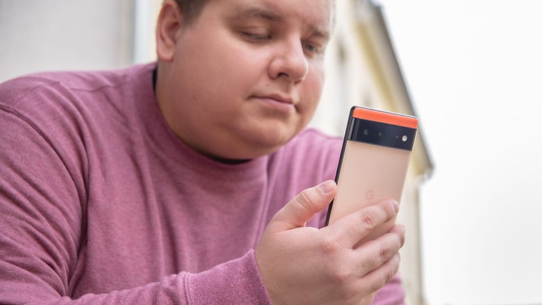
The Google Pixel 6 is, in my opinion, a big slap in the face of the Android market in 2021. Google is taking back what makes the soul of the Pixel, namely the photo-taking and software experience, while opening up to a new audience on a wider scale at an extremely attractive price point.
After reviewing the Pixel 6, I wonder whether OnePlus has a selling point in the future. Google has certainly struck hard and taken risks that, in my opinion, have everything to be winning bets.
The photo rendering is excellent even without a telephoto lens, and the easy learning curve for the slew of photo and video editing functions seems to be a very attractive proposition. The Tensor SoC, while inferior to recent Apple processors, outperforms its Exynos and Snapdragon competitors in terms of graphical power. Battery life is also rather decent although I need to do perform more in-depth testing to find out.
Not everything is perfect, of course. Fast charging is a little too slow for my liking, the 3 years of major Android updates are far from revolutionary when you see what Samsung is already doing. I think that the limited availability of the Pixel 6 in selected countries only, the limited choice of colors, and especially the limited storage space in the 128GB version without a microSD slot are also obstacles to greater success for Google.
But for $599 at the moment, no manufacturer can currently compete with the Pixel 6 in terms of value for money when it comes to the flagship segment. If I were to buy or give away an Android flagship this year, I'd clearly choose the Pixel 6 or Pixel 6 Pro (for the additional storage and telephoto lens).





Very excellent review which included screenies of the UI! How would u compare this to Oppo Reno 7 pro? As in which phone would you get? Thx!
I like it! Thanks.
The reason it didnt charge to full in 1h is likely because you didnt use a PD 3.0 PPS Charger which is able to deliver 3.3V-21V/1.5A - this is not compatible to things like WrapCharge, Quick-Charge or whatnot which are all fixed maximum Voltage/Watt only since it scales the Voltage of the charger dynamically. Samsung also uses that nowadays. The Pixel Stand 2 will have different levels of charging speed and adaptive charging without it will be a lot more granular too.
excellent and comprehensive article. may be there is one omission: according to my knowledge - no autofocus on any of the cameras - I would be happy to get more info about that feature.
my phone is a pixel 2 and I am happy, but was looking forward to buy the new one.
unfortunately I wouldn't, mainly because of the weight.