iPhone 12: my first weekend with the latest Apple smartphone
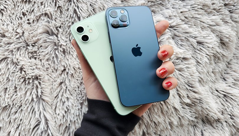

On Friday, two new iPhone models arrived at my home: the iPhone 12 and the iPhone 12 Pro. In this article, I would like to share my first impressions of Cupertino's latest handsets with you. How does Apple's new flagship smartphones perform in everyday life?
iPhone 12: a new form factor
The iPhone 12 is the first Apple smartphone that was not designed by Jony Ive, and yet we can recognize Ive's signature in the new (yet familiar) form factor. Getting the iPhone 12 out of its significantly reduced box, which now no longer contains a charger, was a brief trip down memory lane. It is fascinating how similar the new iPhone is to the 4 and 5 series models. It is almost as if the iPhone has given up on its teenage phase that is full of self-discovery and experimental looks. The question of existence, "Who am I?" is answered by this model in a graceful manner: I am an iPhone. The best version of myself.
Is this really the best version? Well, yes. The iPhone 12 Pro is really beautiful. The back section keeps the matte glass plate that was already used on the iPhone 11 Pro. When I run my finger over it, it results in a pleasant sensation, similar to how your loved one strokes the area behind your ear, right between the hairline and the earlobe. This is exactly how the texture of the frosted glass sounds and feels. This nerdy-sensual experience is absent in the iPhone 12, which is a pity. I suppose that the differentiating mark makes the iPhone 12 Pro all the more premium.
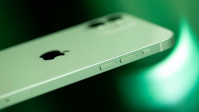
Here, there is no matte glass for you to indulge your senses in, and the finger tends to stick slightly to it when trying to caress the iPhone 12. While this not only provides an excellent grip, it also ends up as a fingerprint magnet. And while the older, more curvy design generally resulted in a rather insecure feeling when holding such an expensive piece of equipment, the new iPhone 12 now lies safely and firmly in the palm of my hand. This is due to flat edges, which are made of stainless steel on the Pro model and aluminum on the basic version.
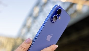
The stainless steel frame of the iPhone 12 Pro really stands out here. The frame of the new blue iPhone is cool and solid to the touch. In fact, it feels as though the smartphone absorbs your body heat and ends up feeling very comfortable when using it. While the back of the basic model is covered with fingerprints and the aluminum frame exudes a nice and matte experience, the iPhone 12 Pro and its shiny stainless steel frame requires more wipe downs each day.
No more CE marking on the back
Something else is different when we take a closer look at the back of the new iPhone. The ugly CE marking is more embedded in the glass directly below the Apple symbol, having been relegated to a flat surface. Only upon closer inspection, the mandatory symbols as required by EU regulations can be seen, which makes it one of the tidiest backs of an iPhone I have ever seen. Unfortunately, the giant camera island sticks out like a sore thumb.
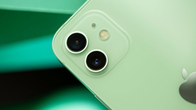
On the iPhone 12, we have two lenses and a LED flash that makes up a dual-camera setup, which rests on a thin matte glass plate. The iPhone 12 Pro uses three lenses and rests on a shiny surface. The camera design is debatable, and every manufacturer arranges the lenses differently at the back. Honestly speaking: I tend to see my smartphone from the front most of the time - and this is where the iPhone 12 ought to be looked at.
iPhone 12:tThe OLED panel of the Pro model is larger than ever
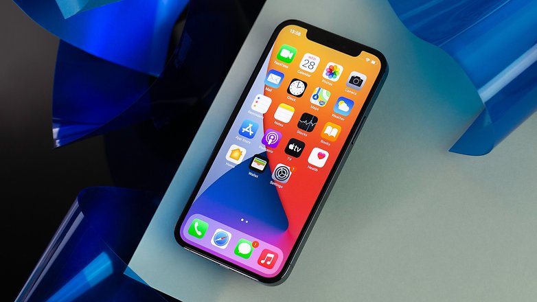
When I first unpacked both models, I immediately noticed that the display of the Pro version has become larger. I was pleasantly surprised because, for me, this meant that my choice this year will not be the Pro Max model. Personally, 6.1-inches (compared to 5.8-inches on the iPhone 11 Pro) are sufficient for me. I already consider both of the iPhone 12 models to be rather large in the first place. The display of the iPhone 12 differs from the Pro model in terms of brightness (800 nits vs 625 nits), otherwise, it is the same display that was already used in the previous models of the Pro version. We are therefore dealing with a 6.1-inch OLED panel in both iPhone 12 models, which Apple has named as the Super Retina XDR display. Last year, the iPhone 11 still came with an LCD display, while OLEDs were reserved for the Pro models.
So iPhone users who switch from an older model - with the exception of the iPhone 11 Pro - can only win here. But if you switch from an Android smartphone with a refresh rate of 90 Hz or more, you'll notice the difference when scrolling. I had hoped for an improved display on the iPhone 12, but according to insiders, Apple decided against a panel with a higher refresh rate and settled for reasonable battery life instead due to 5G support. Make no mistake about it, I still think the display of the iPhone 12 is great. It offers crisp and sharp visuals, while content seems to look right under the glass.
iPhone 12 Pro: the first test photos
I also spent the weekend doing some work with the iPhone 12 Pro's camera. Compared to the iPhone 11 Pro, Apple has improved on the wide-angle sensor. We find a larger aperture in the specifications sheet (ƒ/1.6 vs. ƒ/1.8) and Smart HDR 3. The iPhone 12 Pro includes the telephoto lens, which is missing on the vanilla iPhone 12 model. In front now, night mode is also enabled for portrait pictures. The front camera has been improved with the implementation of Smart HDR 3 and hence, snaps reliable bokeh pictures. In a more detailed review, you will learn more about the camera setup of the new iPhones.


MagSafe on the iPhone 12
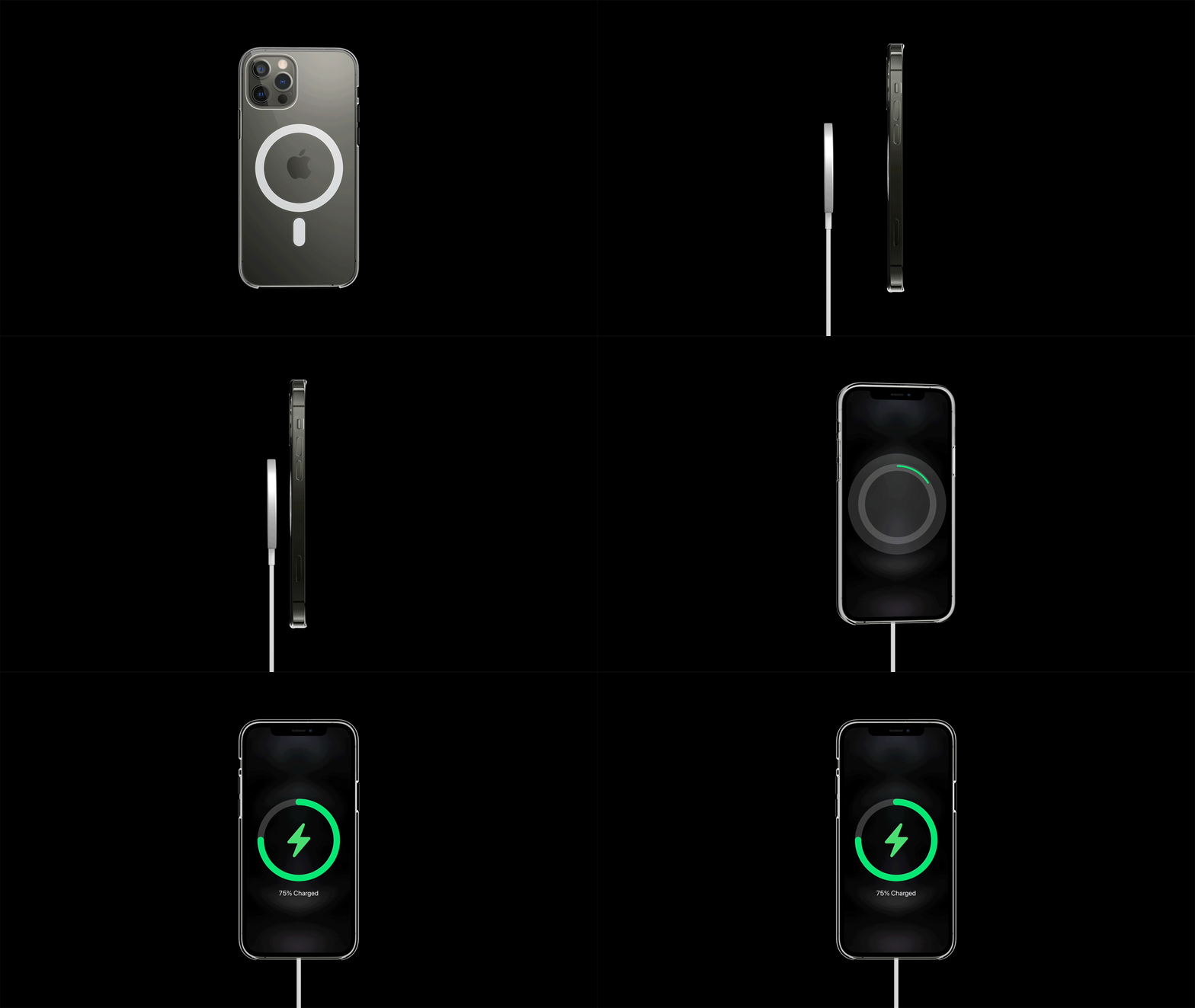
Apple also included two mobile phone cases and the new MagSafe charger with our review units. Magnets at the back of the iPhones as well as in special MagSafe accessories enable wireless charging of up to 15 watts. What can I say after a weekend with the iPhone models? The MagSafe charger docks neatly and simply stays put. When working in tandem with the MagSafe-compatible cases, the round plate holds on to the back side securely. In the coming days, I will have to do run more tests with the battery and charging times of the new iPhones in order to draw meaningful conclusions. My first impression, however, is that charging with a MagSafe charger takes too long for my liking and I prefer to use the 20-watt brick.
Interim conclusion: all eyes on the iPhone 12
I was able to put the iPhone 12 and the Pro model in the hands of a few people over the weekend. Opinion about the design was divided here. iPhone connoisseurs were rather enthusiastic and recognized Apple's "Back to the Roots" approach immediately. Others found the design to be too angular, some others, too massive. Personally, I like the flat edges very much. First and foremost, it provides a good grip, and the iPhone 12 is the first model in years where I can imagine using it without a case again.
Do you have any questions for our iPhone 12 and iPhone 12 Pro review? What are you interested in particularly? Feel free to leave me a few comments below this article and I look forward to addressing them.
You might also find these interesting on NextPit:



Considering the performance of phones at the US $500 or even $300 dollar level, is the value really there?
Flagships any more strike me as status symbols and not value. They tend to prioritize looks, which means disposability and software bloat which means privacy and performance overhead.
If you could spec what was on your phone in hardware and software for a price point, would it include the skin, bloat, and apple lock-in-ware? The glass everywhere, a lack of standard IO ports or open charging standards? Or is that just the price of entry?