LG Watch Urbane review: Android Wear goes premium
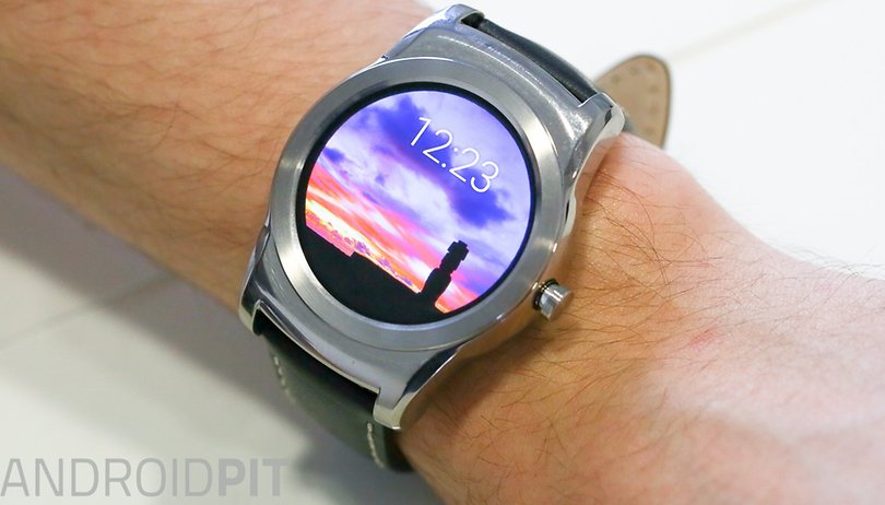

The LG Watch Urbane is the first Android Wear watch on the market following the much-hyped launch of the Apple Watch. How does it stack up against Apple's offering, and Android Wear in general? As successor to the circular LG G Watch R, but with a more 'premium' design and all the benefits of Wi-Fi, this should be a top-shelf device. But is it? Find out in this LG Watch Urbane review.
Good
- Today's best Android smartwatch display
- Comes with the latest version of Android Wear
- Good battery life
Bad
- Expensive
- Bulky
- Not much of an upgrade over the LG G Watch R
LG Watch Urbane release date and price
The LG Watch Urbane release date was May 8, and LG Watch Urbane price is set at 349 USD (or 259 GBP). This puts it at the higher end of the smartwatch price spectrum, costing around 50 USD more the the LG G Watch R, and 100 USD more than the original Moto 360 price.
LG Watch Urbane design and build quality
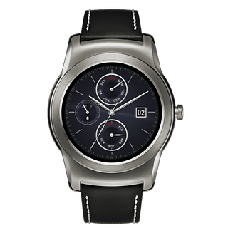
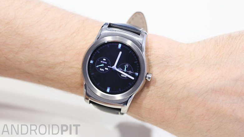
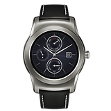
With the Watch Urbane, LG has attempted to make a more sophisticated counterpart to the more sporty LG G Watch R. It’s almost exactly the same as the LG G Watch R in terms of build, though it’s lacking the numbers and dashes from the G Watch R’s rim. It’s a chunky stainless steel body with a (completely) round face and rather noticeable crown on the side.
That “premium feel” LG is trying to instill continues with a genuine stitched leather strap, but it’s a fraction stiff at first.
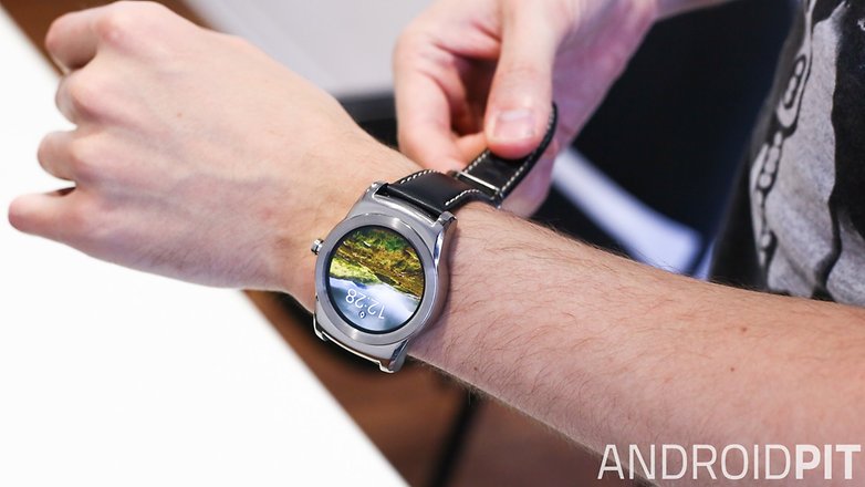
Our test model is the silver Watch Urbane variant (it also comes in gold), and it has a somewhat transient aesthetic. What I mean is, occasionally I would glance at the Watch Urbane and find it quite striking, whereas other times the wide chrome-like block appeared quite tragic on the end of my wrist.
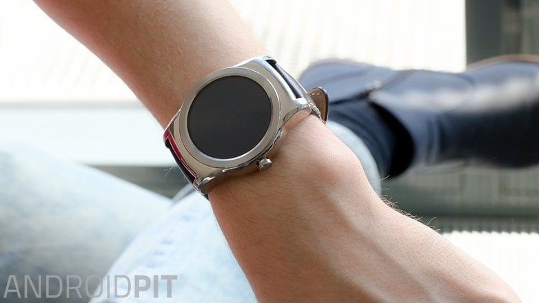
I attribute this to the circular ring which surrounds the display, and the fact that the display itself is awkwardly inset. When the screen is black, it’s like looking through a porthole into the abyss, accentuating a circle of nothingness.
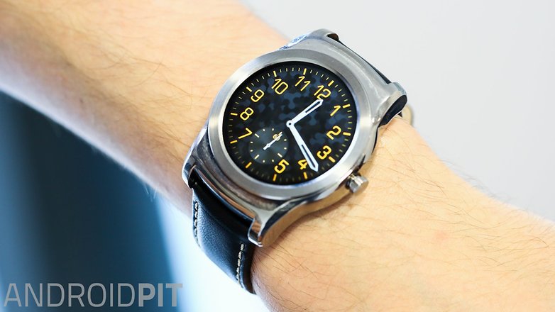
With the display on, it can be a different story, particularly if you use the “photo” watch face, which frequently changes the background image to a variety of pleasant scenes.
The stainless steel design doesn’t just occasionally look awkward, though, but it feels awkward too. It is a bulky number, and frequently got caught on surfaces while I was wearing it. I worried about scratches and scuffs but thankfully it does appear to be reasonably resistant.
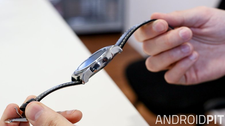
In addition to being thick, the Watch Urbane is wide, almost wider than my wrist, and was sometimes unruly. If you have small wrists, it might not be particularly comfortable.
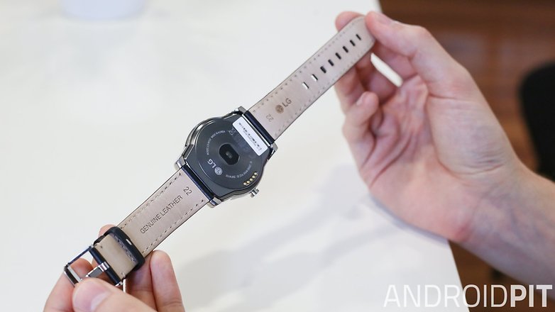
LG Watch Urbane display
The LG Watch Urbane sports a 1.3-inch P-OLED display, with 320 x 320 pixel resolution and 245 ppi. It’s the same display specs that can be found on the LG G Watch R (as are all of the LG Watch Urbane specs, outside of the design). The Urbane display is slightly smaller than the Moto 360 which comes in at 1.56-inches, and looks prettier.
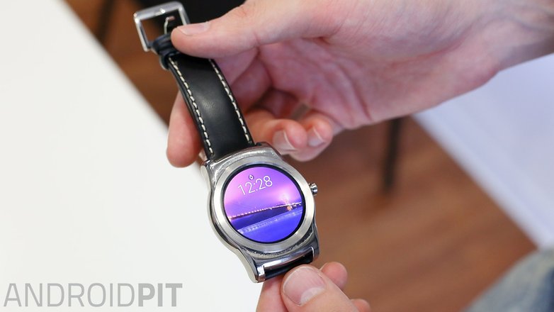
Having a rounded display is a real pleasure, as opposed to the cut-away strip which is housed at the bottom of the Moto 360 screen, and it’s surprisingly saturated. It’s an OLED display, so it’s not back-lit like an LCD screen, which makes sense for battery life, but it’s not ideal for outdoors in direct sunlight. It’s reasonably bright, however in extremely sunny conditions it might strain your eyes to view it. With all that in mind, it’s still a fantastic Android Wear display -- I’d even say the best.
LG Watch Urbane software
The LG Watch Urbane is the first device to launch with Android Wear 5.1, the latest version of Google’s own smartphone operating system. Android Wear is largely based around notification cards which pop up on your smartwatch. These can tell you how many steps you’ve taken, let you peek at recent emails, inform you of a WhatsApp message and more.
The level of interaction with content on your smartwatch is more limited than on your smartphone, and the main appeal is that you get the smartphone notifications without having to look at your handset.
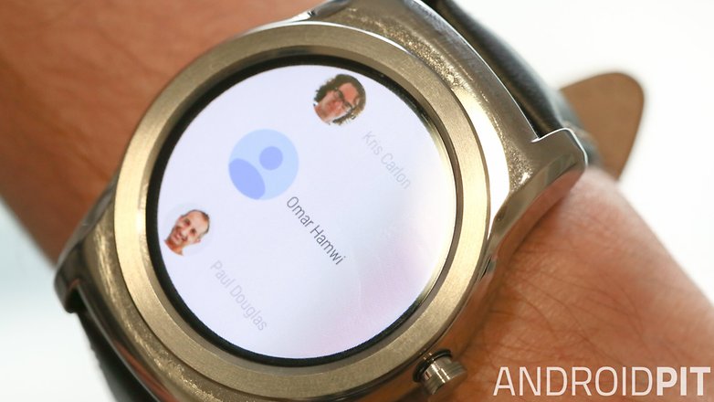
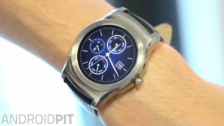
Android Wear is improving...slowly. The 5.1 menu is easier to navigate, there are more watch faces than ever before, and they look better and do more interesting things than previously (the moon cycle face, while pixelated, is a cute idea).
Pressing and holding the crown on the side of the watch launches the app drawer, which is a useful new addition. The number of Android Wear compatible apps also continues to grow. There’s a new gesture which lets you scroll through cards with one hand with a flick of the wrist, which works quite nicely when you scroll down, but is more difficult when scrolling back up. Overall, the small improvements are a step in the right direction for Android Wear.
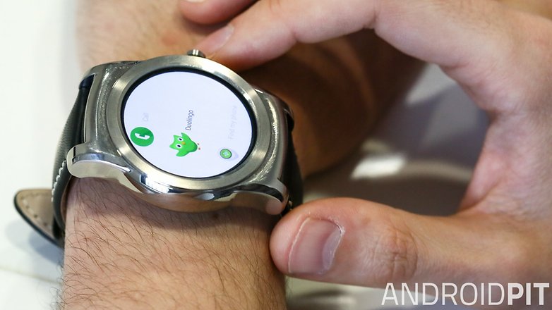
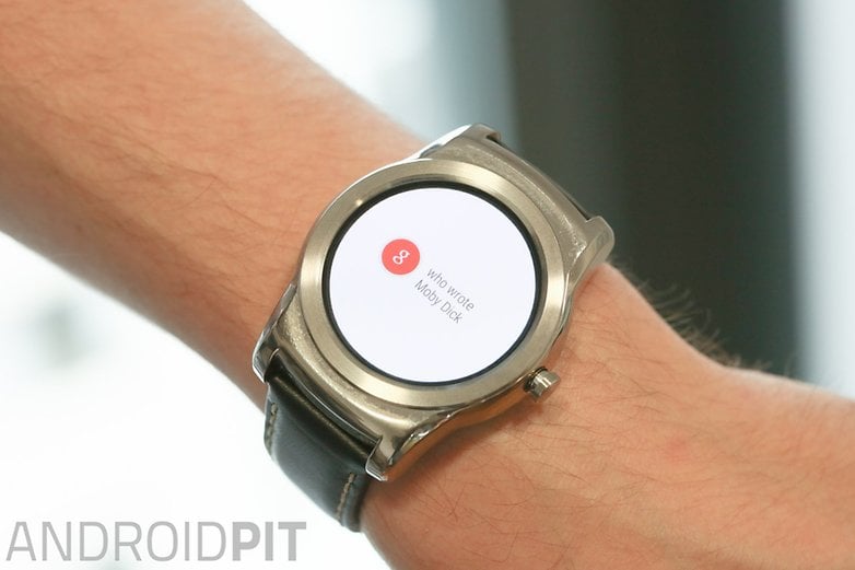
It still irks me that you have to wake the device to say “OK, Google” though. I appreciate that an “always listening” device can have severe battery life consequences - but at least give me the option. The ecstasy of successfully landing an “OK, Google” query in one take is telling of just how frustrating it can be to achieve this.
Emoji drawing is a new feature in 5.1 which seeks to let you send emojis to contacts by physically drawing them on the watch display. However, it isn’t quite accurate enough to interpret all of the gestures being scribbled. There is only a tiny area to draw on and while sketching a happy or sad face worked most times, anything more complex was tricky. It’s gimmicky and not particularly well-suited to the small displays of smartwatches.
Wi-Fi
A lot of excitement has surrounded the new prospect of Wi-Fi on Android Wear devices. Typically, your watch needs to be connected to your smartphone via Bluetooth, and your phone must be connected to the internet via data or Wi-Fi. The Apple Watch doesn’t require Bluetooth, as it can connect to the same Wi-Fi network as the user’s iPhone. Google has gone a step further: your phone can be in another location and the a Wi-Fi enabled Android Wear device can connect to another Wi-Fi source.
And it’s almost completely pointless.
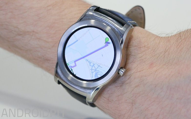
How often is a person without their phone? Leaving it on a desk? In another room while they use the bathroom, perhaps? Aside from some rare occasions, our phones are almost always with us, so there are few instances where this functionality is necessary.
Not only that, smartwatches often rely heavily on smartphones to “open” or make use of certain information. Any Android Wear smartwatch user will frequently see an “open on Phone” message on the watch -- in these situations smartwatch Wi-Fi only acts as a tease.
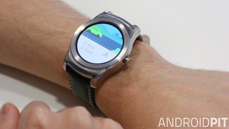
Then there are times when you need your device at hand to manually connect to a network first. You can’t input a Wi-Fi password on the smartwatch itself, your smartphone must have connected to the Wi-Fi first in order for the watch to be able to use it. This also hinders the LG Watch Urbane’s application in any shop or outlet where you need to go through a security screen before connecting to the Wi-Fi source (like in a Starbucks, for example).
The Android Wear smartwatch Wi-Fi system is a poorly-implemented, rarely necessary, shambles of a feature and it baffles me that it has garnered so much attention - from consumers and developers alike.
LG Watch Urbane performance
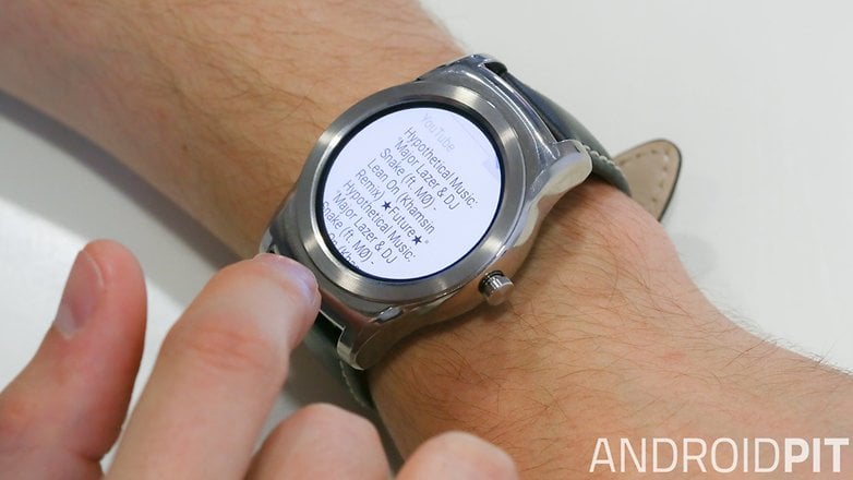
Inside the LG Watch Urbane you’ll get a Snapdragon 400 clocked at 1.2 GHz along with 4 GB of internal storage and 512 MB of RAM. Performance is as good as you’ll find on any Android Wear smartwatch, but wearables are still not as powerful as they really ought to be, so software performance can be sticky.
Frequent stutters and slow load times peppered my experience. One could argue that this was to be expected, given the technology that has been crammed into such small housing (an opinion I disagree with). But it’s noticeably laggy, and I found myself getting frustrated quite often. A future patch may address stability issues, but there’s no guarantee.
LG Watch Urbane battery
The Watch Urbane houses a 410 mAh battery, making it one of the longest-lasting smartwatches running Android Wear. You’re almost guaranteed 24 hours with it, even with the always-on display and brightness whacked up.
It’s something we already witnessed on the LG G Watch R. Two-day battery life is possible with the screen off and automatic brightness off and “cinema mode” on (which means the clocks isn’t always displayed). No sign of a lifetime smartwatch battery life yet, though.
LG Watch Urbane technical specifications
Final verdict
The LG Watch Urbane is, fundamentally, a great Android Wear watch which is still not a great product. It’s nicer than the Moto 360, but it comes at a much higher price, and even given slight improvements, it’s still not enough to justify the purchase yet.
As an alternative to the LG G Watch R, it’s not perfect either. It costs 50 dollars more, the Wi-Fi feature adds nothing, and the design, for me, isn’t as good. With Google I/O just around the corner, I’d stay clear of any smartwatch - but if you must have one, I’d still recommend the LG G Watch R first.





And as far as the battery goes, charging is fast. as you stated in this article, it has a long lasting battery and I can easily get through a whole day. But I was truly shocked when I looked down at mine about 45 minutes after I docked it and saw that it had gone from 33% to 100%.
You say the WiFi feature adds nothing but I have to disagree. after looking into the "help and information" section on the android wear app, I read that as long as the watch is connected to WiFi and your phone has a data connection of any kind, your watch will still receive notification from your phone. So if your at work and forget your phone at home, or at home and forget you phone at work, you won't miss calls or messages.