MIUI 13 review: The Android 12 skin that balances tradition and modernity
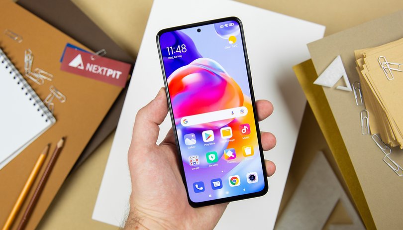

MIUI 13, Xiaomi's new skin that is based on Android 12, has been available since February 2022. I reviewed this Android skin with some of the other more popular choices in the market in order to share my thoughts about its design, features, and fluidity.
The deployment of MIUI 13 continues to happen on more and more Xiaomi, Redmi, and Poco smartphones. I was able to use this Android skin which is based on Android 12, on many different models like the Xiaomi 12X, Poco F4 GT, or Redmi Note 11 Pro+ 5G. MIUI 13 may be a rather convoluted interface that missed the mark a bit on Android 12, but I like it for its many customization options and variety of features. And that's despite its very noticeable flaws.
- Check if your smartphone is eligible for an upgrade to MIUI 13
For this comprehensive MIUI 13 review, I'll cover the overall interface design, feature set, smoothness, and stability as well as Xiaomi's update policy.
Jump to:
Design
MIUI has always been a very cluttered interface and is very far removed from the original stock Android design. MIUI 13 is no exception. There are animations everywhere, which is a very marked visual identity. In short, MIUI is flashy.
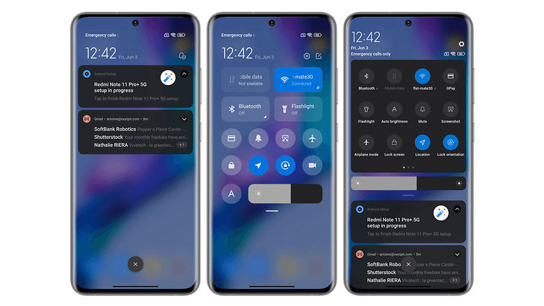
Sometimes, I think that is a very good thing, like with the Xiaomi Super Wallpapers, which proved to be very successful where animated wallpapers are concerned. What about the MIUI Control Center, where this shortcut menu has large, easy-to-read, and great looking icons. Regardless of what the haters say, MIUI 13 clearly has an iOS feel to its design and that's a good thing in my opinion.
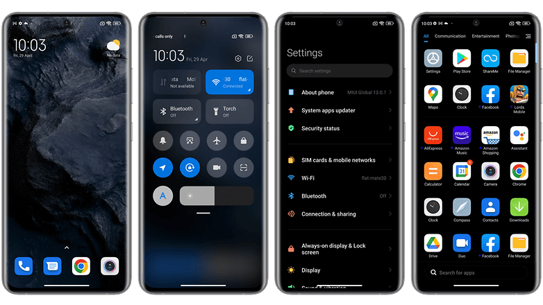
Other times, however, I find that the design of MIUI 13 lacks refinement and finesse. Notifications or quick access menu items are frankly less pretty than their Android 12 counterparts, which are far more sober and minimalist in nature. Besides, I think it's a shame that Xiaomi didn't make the effort to implement the dynamic themes found in Android 12, which adapt the interface color to the dominant color of your wallpaper.
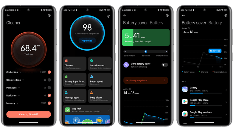
Some native apps, like Security, Cleaner, or the battery utility, have beautiful animations and an intuitive interface. However when it comes to other apps such as the browser, these are frankly overloaded and sorely lacking in refinement.
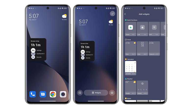
MIUI 13's widgets are also very cool and visually appealing. That is, if you have a Xiaomi smartphone with a Chinese ROM. Yes, this is because the famous widgets that Xiaomi was dangling like a carrot in front of us are, well, a carrot. They are not available on the global and European ROMs of MIUI 13.
Features
MIUI 13 is a very feature-rich Android skin. I think you'll have noticed this from my many dedicated tutorials by now if you follow NextPit religiously.
- Check out our complete list of the best MIUI 13 features
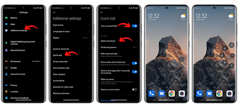
I could mention in no particular order here, the Back Tap feature, which allows you to tap the back of the Xiaomi smartphone to perform certain actions, such as an additional shortcut button. Or the Quick Ball menu, which allows you to access a range of shortcuts via a floating bubble from your home screen.
Some options are more unusual, like the function to self-clean the speakers of your Xiaomi smartphone. Now that's something that you do not see in other smartphones. But you can really have fun poking around the settings and experimenting with the slew of features. I think it's really nice that Xiaomi offers so many possibilities to its users.
MIUI also offers a whole range of native applications to clear the cache, free up storage and make room in your RAM, such as the Security and Cleaning applications. I still believe that Xiaomi should simply integrate them into the settings rather than making them separate applications.
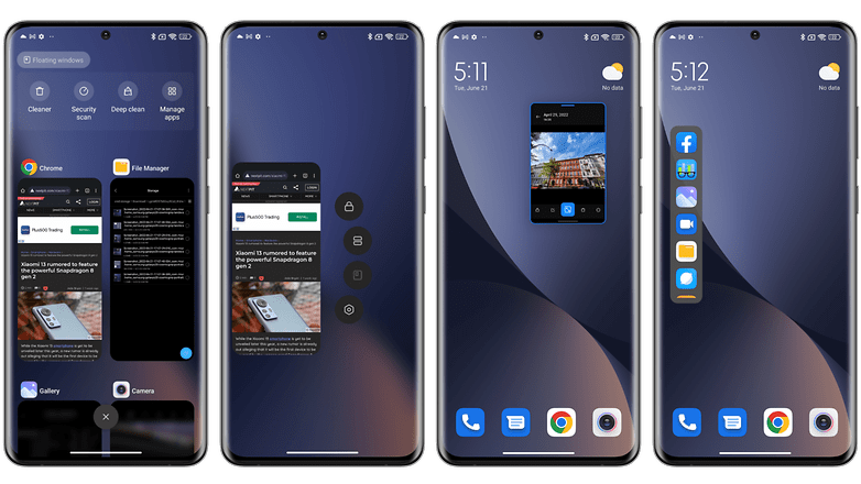
MIUI 13 also offers plenty of features for multitasking such as floating windows, which are very intuitive, or the sidebar that allows you to access your favorite apps via a contextual menu by swiping on the edge of your home screen.
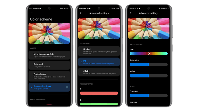
The screen settings are also very comprehensive and allow you to customize the color scheme in a far deeper manner compared to other manufacturers. This is my pet peeve though - the battery utility of MIUI 13 is one of the best among all Android skins. There's a rich amount of information that you can glean from it, sporting an interactive graph, a nice animation to indicate the charge level, and an ergonomic slider button that lets you switch between battery preservation modes. Samsung and Oppo should take notes.
Privacy
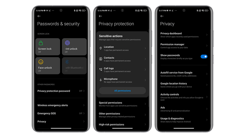
Finally, MIUI 13 also focuses on privacy just like everyone else. We find it to resemble the Privacy Dashboard in Android 12 that helps manage all its permissions.
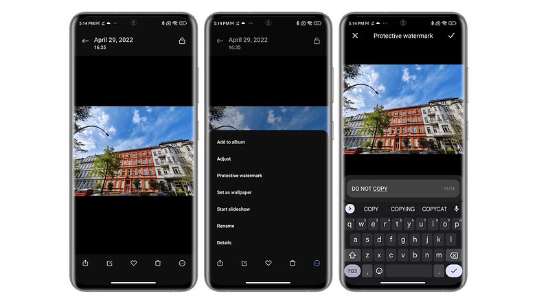
Xiaomi also offers some additional options that I find to be very smart. One example is the ability to apply a "watermark" or signature to images that you want to share. This allows you to track them if someone decides to hijack one of your selfies to make a meme (but also for more serious situations like plagiarism or even harassment).
But the privacy settings have been seriously reduced compared to MIUI 12.5, at least that is what I experienced. You can no longer create a Virtual ID to give a generic advertising ID when you browse the web, for instance.
And there are still irritating ads in MIUI 13. This is certainly the biggest flaw of this skin and it affects smartphones from all price ranges, even high-end smartphones.
Of course, you can easily disable ads in MIUI, but it's still a big disservice to users. This clearly affects buyer confidence in the manufacturer.
Ergonomics, smoothness, and stability
If MIUI 13 can boast of one great quality compared to other Android skins, it is the overall smoothness. Animations, transitions between two applications, scrolling of menus or news feeds when you navigate the interface, etc - everything runs buttery smooth.
I've used MIUI 13 on both high-end $1,000 smartphones and mid-range $200 smartphones, but Xiaomi has mastered the optimization of its skin very well. It is the continuity of this smoothness that elevates the user experience to a whole new level (yes, I know, it might mean nothing to some of us). What I mean by this is, as soon as you lock the device, you are immersed in a series of animations that follow up with each other very well.
On the other hand, I think that Xiaomi has a lot of progress to make when it comes to the intuitiveness of its interface. The fact that you have to swipe down from the left side to pull up the notification drawer and from the right to access the MIUI Control Center is really annoying. Fortunately, you can return to the old system where everything is grouped together.
- Follow our tutorial to disable the MIUI Control Center
Having 15 different menus for privacy settings is also a big flaw. We have a dedicated Security app, a Privacy Dashboard section, a Passwords & Security section, and a Privacy section (Google data). It's a real hoot when you have to juggle between all these menus to be sure you have activated and deactivated what you need.
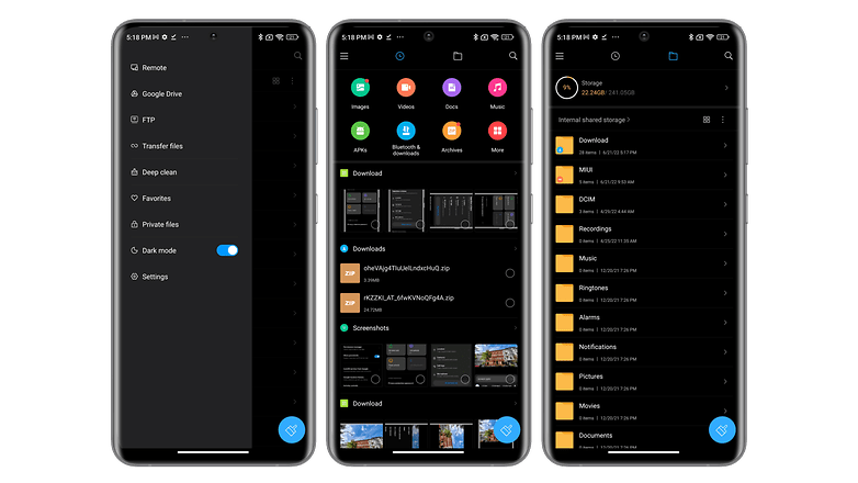
Finally, a word about the file manager. Xiaomi wanted it to be too comprehensive, close to what one experiences on a Windows PC. There are too many folders and you can quickly get lost in this labyrinth of folders.
Updates and compatibility
One of the other advantages of MIUI is its very high compatibility rate. For each of Xiaomi's lines and sub-brands, we have several dozen models that have already received or will receive the update to MIUI 13.
The only small hitch is that not all versions of MIUI 13 are based on Android 12, especially on the brand's most affordable smartphones. Sometimes you remain stuck on Android 11.
We must also take into account the great lack of transparency of Xiaomi regarding its update policy. I do want to acknowledge that the manufacturer has made some serious efforts lately, clarifying the software update of selected models, especially flagships. Unlike Samsung, Xiaomi is content that the vast majority of their smartphones still carry the bare minimum of two versions of Android and three years of security updates.
In any case, Xiaomi never indicated how often security patches will be released (monthly, quarterly, or biannually?) and it is difficult to know how long your Xiaomi, Redmi, or Poco smartphone will be kept up-to-date. We can console ourselves by saying that we will benefit from many updates of MIUI in order not to be left too far behind by Android and Google in terms of features over time.
Conclusion
With MIUI 13, Xiaomi has not fundamentally changed the recipe of MIUI 12.5. Its Android interface is still smooth, customizable, and rich in features. However, it missed the boat with Android 12 in terms of design, which is a real shame. And I also find that the global and European (EEA) ROMs are too bereft in terms of new features.
In addition to its overall smoothness, which remains the biggest strength of MIUI 13, it is also above all, the choice that Xiaomi leaves to its users. We have a complete software solution that adjusts to our user experience, our needs, and preferences. Even the less relevant features, such as heart rate measurement via the fingerprint reader, are still a little extra that is always good to have.
However, the downside of this variety of features and customization options is the impression that sometimes (certainly not all the time), it is simply lacking substance. Xiaomi should also work harder on privacy matters and offer clearer, more centralized settings. I also think that ads have no place on high-end smartphones.
What about you - what do you think of MIUI 13? Do you use the Android skin on a daily basis? What are your thoughts on the matter?


