NextPit gets a facelift: Welcome to our new homepage
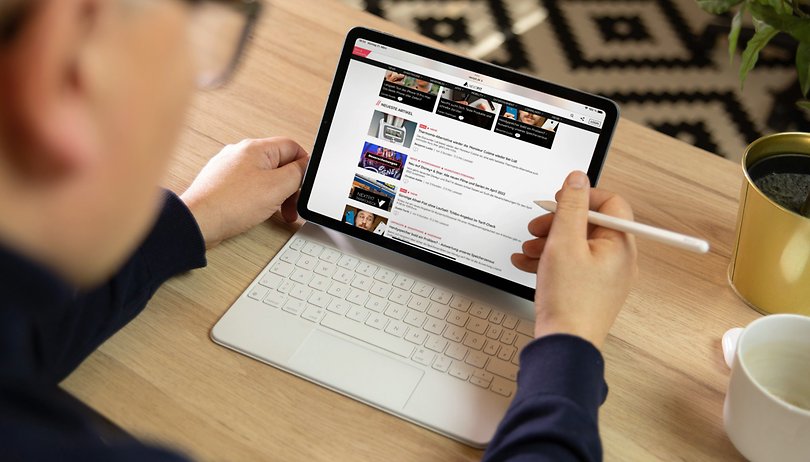

With the new season in bloom, so is NextPit changing, March not only brings us Spring, but also a new homepage for the website. Things change, and we don't mean only the design, as you will soon understand.
The old lady was getting a bit long in the tooth. Although she was still doing her job reliably, you could see that she was having a hard time with the new times. Day after day, year after year, she reliably listed news after news in chronological order. She also knew how to set accents: At the top, she kept the most important news shining like a beacon.
But times change. The workload increased, the topics more complex - multitasking, so to speak, was required. It was not her fault, but ours. There was a lack of further training, so to speak, which we had to postpone again and again due to a lack of opportunities. For quite a while, we had even openly flirted with her dismissal - cue "WordPress conversion". We thought we would be better positioned for the future.
But that has long been off the table! A new broom does not always sweep better. It pays to be loyal! The NextPit homepage didn't take it badly and stayed. Thanks for that, dear homepage! Because we thanked you with various further developments - and made you really pretty again.
More topics, more content, better overview
With the new NextPit homepage there are not only many more modules, but we want to offer you more topics at a glance. Until now, many of our articles quickly disappeared into the ether, out of your (and sometimes our) field of vision.
Out of sight, out of mind. This is what the new site is supposed to fix. We have tried to put our beautiful hero pictures in a better light, to show you different formats (like our podcast or our best lists) or to list our different topics.
The community is especially important to us at NextPit. It also gets more visibility on our most important page again.
The homepage is our most important page. And the NextPit community is our heart. That's why we're especially happy that the latest comments can also be found on the homepage.
The NextPit newsletter is also new
A few weeks ago, we also relaunched our newsletter from scratch. There is not only a new design but also a new backend, which finally allows us to promote it here on the pages as well.
It may sound like a small step for you. But for us it is humanity. Or something like that - I think you know what I mean.
You haven't subscribed to the NextPit newsletter yet? You can do that right here. Existing subscribers will of course stay in the mailing system - and can now sit back and relax. But for all the others —> REGISTER!! ;-)
Now it's your turn: What do you think about our new homepage? We are looking forward to your comments.
P.S.: By the way, this is only the start. We have treated our homepage to a whole series of upgrades, which will take even more time to complete. So stay tuned.















hello
Thanks Nextpit! Hope you continue to block the "I earn XXXX working from home" spammers. :)
-
Admin
-
Staff
Mar 25, 2022 Link to commentthat never ending battle...
Nice redesign, team. And wish you all the best for NextPit's journey ahead!