One UI 4.0 beta: 3 main highlights from Samsung's latest beta
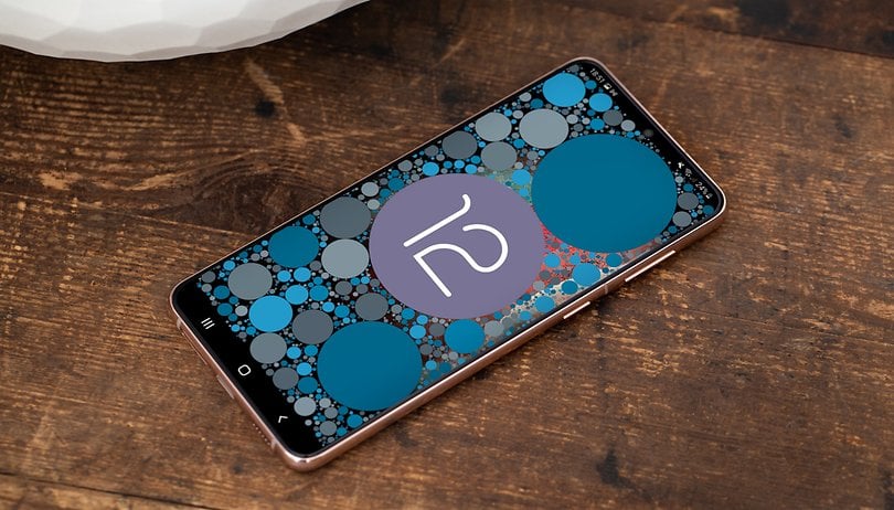

I've been testing Android 12 ever since the first beta appeared back in February on the Pixel 3. So when Samsung announced the One UI 4.0 beta, I made sure I installed the update on the Galaxy S21+ in order to understand how the manufacturer has adapted Android 12 to the primary user interface of its range of Galaxy devices. In this article, you will learn what are the similarities are between One UI 4.0 and Google's upcoming Android 12 mobile operating system.
Last week, Samsung opened the Android 12 beta testing program for the Galaxy S21, Galaxy S21+, and Galaxy S21 Ultra models. Available in selected countries such as the United States, United Kingdom, China, India, Germany, Poland, and South Korea, you can sign up for the program from the Samsung Members app.
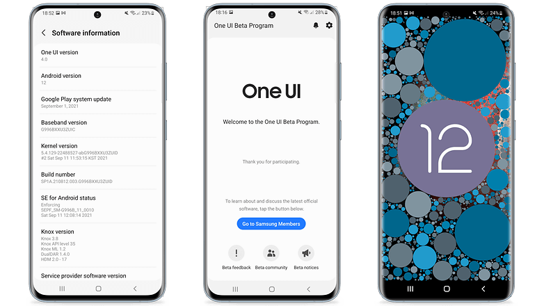
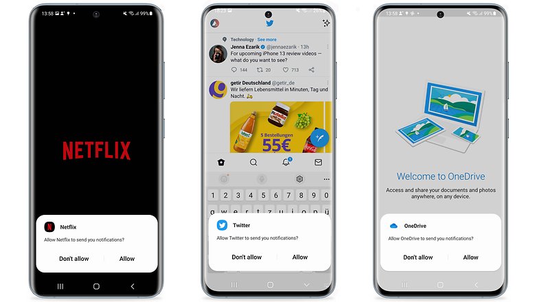
However, I don't recommend using the beta version of One UI 4.0 right now as it is still bug-ridden and unstable. An example of this is the removal of the permission to send notifications from previously selected apps. Using the beta version, every time you launch a service, a popup message will ask for your permission to send notifications.
Three major highlights of One UI 4.0 beta
1. Everything looks very similar visually
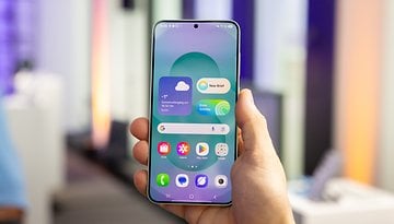
There are very few visual changes that we found in One UI 4.0 so far. If on one hand, Android 12 is said to deliver a major visual impact with Material You on Google's Pixel line, in this first beta version of Samsung's new UI, there were very few references to Android's new visual standard.
Everything is still very similar to One UI 3.0/3.1. However, we have the addition of the microphone and camera shortcuts from the quick settings menu, as well as new visual features found in the screen brightness control bar.
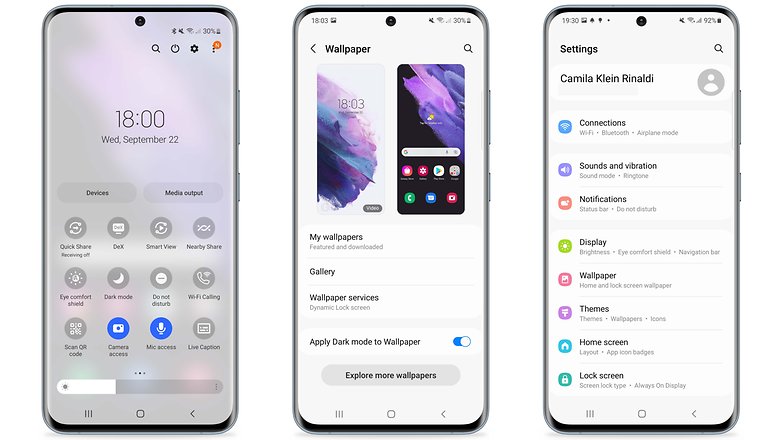
Although One UI 4.0's codename is "Pallete", we don't have Android 12's main design feature as found on the Pixels: the dynamic theme. Soon, as we change the Galaxy S21+'s wallpaper, we don't have the same level of integration when it comes to system colors and app icons as seen on Google's devices.
2. Android 12's privacy panel arrives on Galaxy devices
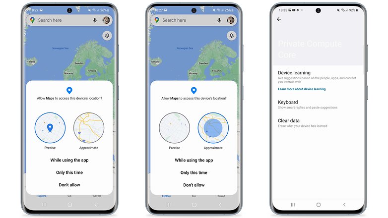
If you continue to have doubts about Material You, bear in mind that the security and privacy features optimized in Android 12 have been adapted into the system settings. Thus, we have the Privacy Panel and the Android Private Compute Core function included, as well as the new animations and explanations concerning location permissions.
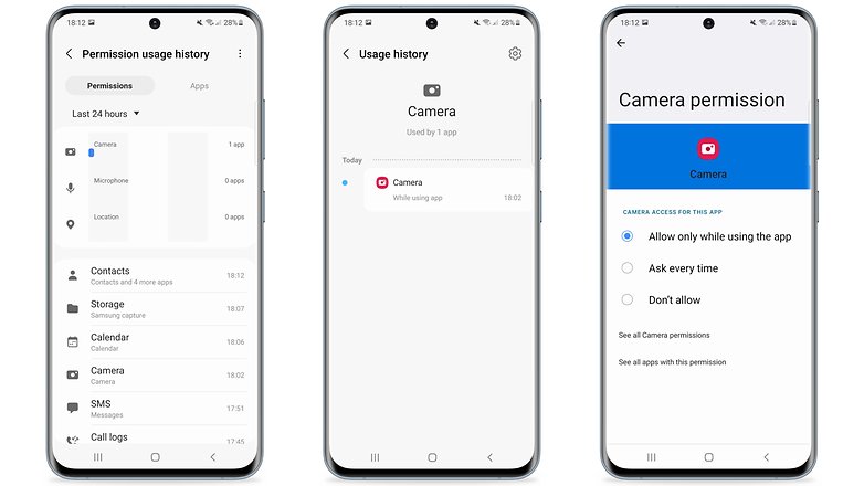
While the Privacy Dashboard functions as a usage report for the smartphone's permissions, such as camera and location, the "Private Compute Core" technology is a secure partition in the system whose sole purpose is to process information generated based on Artificial Intelligence (AI) and Machine Learning (ML). As such, your data remains in a private place on the device instead of being sent to the cloud.
- Also read: Android 12: How the Privacy Panel works
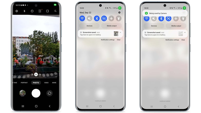
Another very welcome feature of Android 12 that also arrives at One UI 4.0 are the alerts for the use of system resources, such as the camera and microphone. With this, every time an app activates one of these services, the camera or microphone icon will appear prominently in the notification bar in the right corner, and will remain as a dot until the camera or microphone are deactivated.
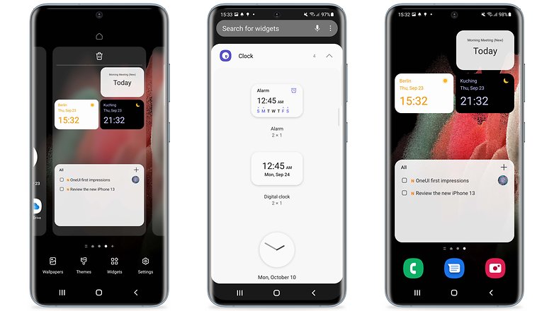
3. So far, One UI 4.0 is all about minor optimizations
One UI is a very mature Android skin by Samsung, and has always brought more interesting features than the so-called stock Android. An example of this is Samsung's widgets, which have long offered a far superior experience over Google's stock Android. In this area, we've seen minor changes, but it's worth mentioning that the dual watch now features an animation showing the difference between day and night in the chosen locations.
- Related: 11 Samsung One UI tips & tricks
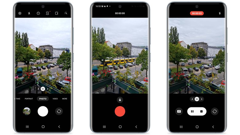
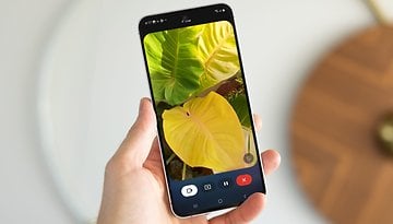
We also have new camera, gallery, and image editor software features. When launching the camera, you will end up with a simpler layout, with the Portrait and Night mode settings already optimized. It's also easier to understand which Zoom level you are at via the lens icons.
Also, it's easier to start recording a video in Photo mode by simply tapping and holding the shutter button to begin. Dragging your finger to the lock icon, just like what happens when we send audio chats over WhatsApp, your hand will be freed as the video keeps recording.
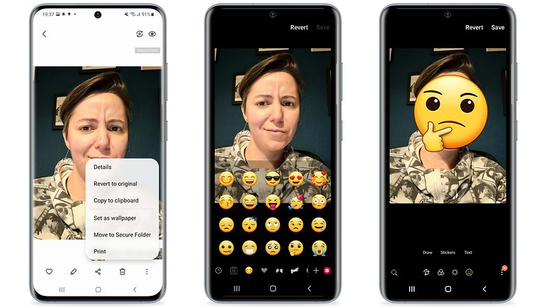
Regarding the gallery, an interesting new feature of One UI 4.0 is the ability to revert remastered photos to the original version even after they've been saved. And you can also add emojis and stickers to photos and videos captured using Samsung's camera from the image editor.
Finally, it was clear that this first beta is about one-off improvements and few new features. According to Sammobile who specializes in Samsung news, One UI already features more than 60 (minor) optimizations to date. The impression that I received is this: Yes, we will have an upgrade but one that is incremental.
Conclusion
It is still too early to express any opinion about the new features that are present in One UI 4.0. However, Samsung is known to offer a unique user interface, complete with its own set of visual characteristics and very mature features. Chances are, the impact of Android 12 will be far greater on the Pixel line than on Galaxy devices.
However, Samsung continues to work even more closely with Google in 2021, as we saw via the Wear OS partnership that was announced earlier this year. Therefore, I'm still hopeful to see Android 12's dynamic theme being incorporated into One UI 4.0, considering the codename given to this update.
On the other hand, it's a great boost to see privacy and security features being fully integrated into Samsung's UI, as it's almost guaranteed that all of Google's other partner manufacturers will follow the same route.
Of course, we still look forward to having a number of other new features being added to One UI 4.0. However, I've decided to talk only about some of the highlights surrounding the latest beta version of Samsung's interface. This article will be updated as the beta program develops further. Unfortunately, we don't have a set timeline for the upcoming updates.
However, Samsung has stated that it will release the stable version of Android 12 for its devices before the end of 2021. As always, the company's flagship models will be the first to feature the new operating system and One UI 4.0 user interface. In other words, we can expect to see Android 12 arriving for the Galaxy S and very likely, Galaxy Z lines as well.
To find out if your Samsung smartphone is eligible to receive the latest Google's operating system version and its new UI, visit our Android 12 update guide for Samsung devices.
So, what did you think of the first beta of Android 12 released by Samsung? What are your expectations from One UI 4.0? I'm curious to know what you think!



Samsung needs to not only UI.but also need to improved there game mode its laggy specialy midrange smartphone are suffering while launching the game