Samsung One UI 6 Review: Just About Right!

With every new Android version, Samsung also gives us an update to One UI, its mobile operating system skin for Galaxy devices. Together with the Galaxy S24 series and Android 14, we have arrived at One UI 6. After spending the past few years not using a Samsung smartphone, I'm back and had a good look at the new skin on my Galaxy S24 Ultra. Here is the One UI 6 review.
One UI has been based on Android for Galaxy devices since 2018 and has become an extremely popular skin. For many Android fans, Samsung struck the perfect balance between design and functionality. New versions are usually not design revolutions or chock-full of features but offer sensible improvements over their predecessors. With this in mind, I took a look at One UI 6 and want to share the most exciting new features with you in addition to my overall impression in this review.
- A blast from the past: One UI 5 review
To be fair, I want to admit from the beginning that I have only used One UI sporadically in recent years, namely when I had a review unit from Samsung in my hands. This includes the Galaxy S23 FE (read review). Interestingly, the hands-on device was initially available with One UI 5 and fortunately, the review unit arrived fresh from the factory with One UI 6. Let us see what Samsung has to offer with One UI in 2024.
One UI 6: Design
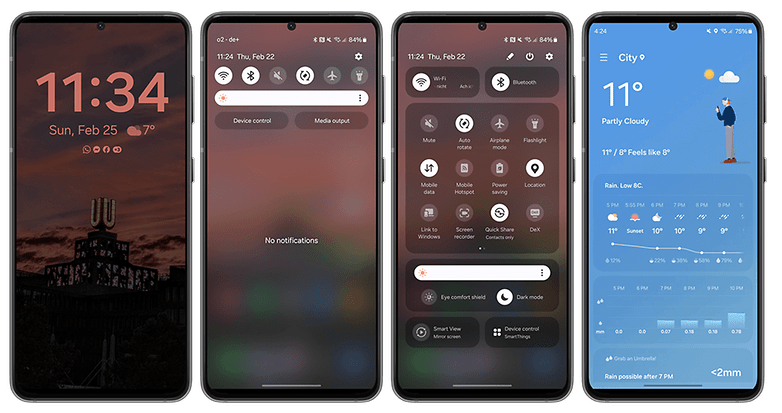
Honestly? At first glance, I would have gone out on a limb and accused Samsung of being ambivalent when it comes to the look of One UI. However, the differences and revisions are there. They are subtle at times, but undoubtedly, they are there and sometimes even prove to be very useful. Exhibit A? The quick settings and notification bar in addition to system apps.
The improvements tend to go deeper than what you can see — which would mean everything else that goes on underneath the hood. I might sound like a cryptic and wannabe philosopher, but in this case, it's true. The icons have undergone a minor revision, but it is precisely those tiny changes such as a difference in space that end up making everything look so much better.
The changes do not stop there, as Samsung has renamed certain system apps. For instance, Samsung Internet is now known as Internet, S Health ends up as Health. It might not amount to much, but it means Samsung now displays all these names using a single line, creating more space and order.
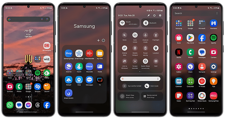
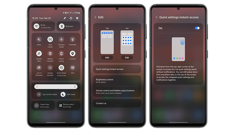
If you were to pull the notification bar down to access the quick settings, everything looks tidier here as well. The time, day, and date are displayed in a single line at the top left and everything is shown uniformly. Below that, we see the most important quick settings, where the brightness bar remains always visible further down. If you don't like this, you can change that in the settings to view the brightness bar only in the expanded quick settings.
Icons for various functions such as Wi-Fi, Bluetooth, etc. are slightly smaller now and thus congruent with the overall tidy look of One UI 6. The same applies to the two buttons for device control and media output, which look almost unchanged albeit having shed a little weight.
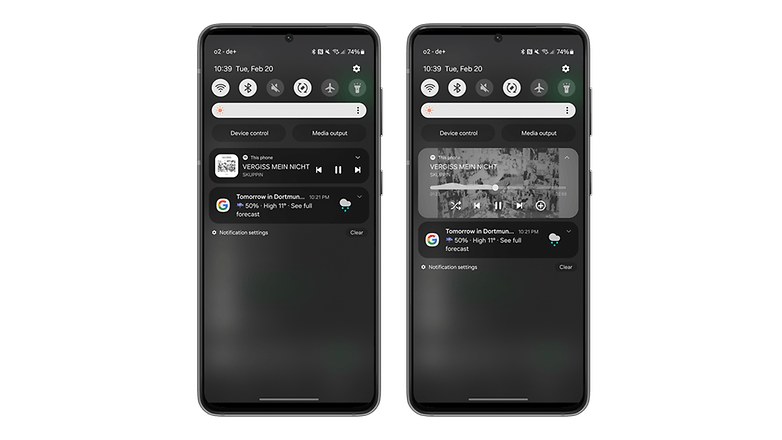
What else has changed in terms of design? When playing music, the media player puts the album cover under significantly more limelight, with the visualizer accompanying the audio playback. Overall, it looks cool. You can also customize the clock on the lock screen in more ways than before, which means that I can always enjoy a view of the time always.
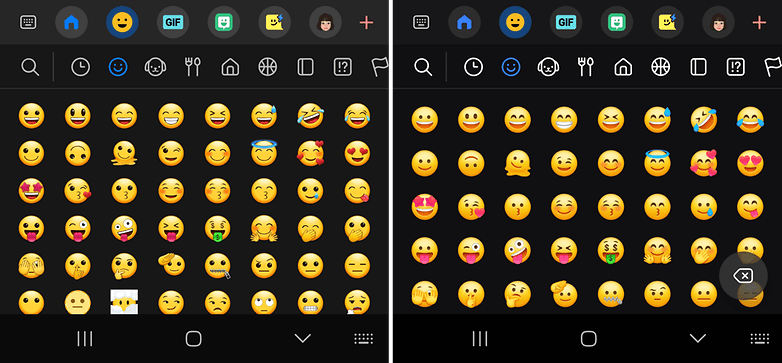
Another visual change (which I reverted quickly) is the new Samsung Sans font, which replaced Roboto as the default font. I am back to using Roboto in a flash. The emojis have also been redesigned, but honestly, friends: I simply don't have the time, energy, or even the inclination to get worked up about slightly altered emoji faces. I think they look a little less stupid compared to One UI 5, but yes, ultimately I'm not interested at all in this, and it's a matter of personal preference, anyway.
One UI 6: Functions
You won't find a terribly large number of new functions, and once again, this doesn't necessarily have to be a bad thing. New features just for the sake of new features don't really help anyone. It's better to make selective improvements, as Samsung has done with the quick settings and the notification bar, for example. A swipe from top to bottom takes you to your notifications.
Swiping down again then opens the expanded quick settings window. If you like, you can now set it so that you can swipe down from the top right for the expanded quick settings menu for "Instant Access". Swiping down from anywhere else on the display opens the collapsed view with the notifications as usual.
You may be more interested in what Samsung plans to do with Galaxy AI on compatible smartphones, but we have already covered this in detail elsewhere. I will revisit this review over the next few days to add more comments about the features.
- Want to find out more about this? Read our Samsung Galaxy AI review.
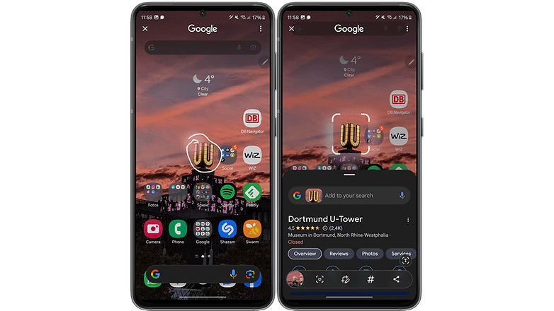
The most frequently cited new feature from the AI department is probably the "Circle to Search" feature. This is extremely practical, as I can activate the feature by pressing the bottom edge and circling any object using the S Pen or finger, which is then detected automatically. Anyone familiar with Google Lens knows what happens next: An object is recognized, and you will be given further information (if any). I think it's really cool, but I use it approximately once every three weeks (a rough estimate).
The Galaxy AI feature related to the keyboard is also rather niche. You can select different "Writing Styles" when you use the Samsung keyboard. You can choose between original, professional, casual, #social, polite, and emoji-heavy and yes, it's quite impressive every now and then when you turn a colloquial sentence into something you could use in a business environment.
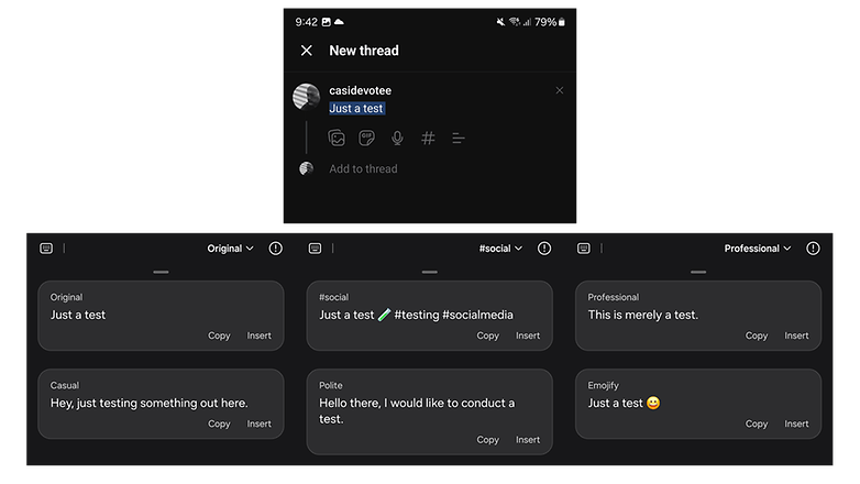
As I mentioned, this is very niche and holds another catch for me: I can only use it exclusively with the Samsung keyboard. Personally, I just don't like it that much, as I prefer Swift Key and have assigned it as my default keyboard on my phone.
Goodbye, nice AI feature! The same also applies to converting handwriting into text. This happens extremely precisely and quickly. It is too fast to take screenshots (maybe my screenshot fingers are just too lame ^^). Fortunately, you can adjust the timing of a wee bit via the settings.
Exciting: "Studio" for editing videos
There's a relatively hidden update in the gallery, but it's really fun: I'm talking about the Studio app for editing videos. Until now, you have edited clips in the gallery, but there is now a separate app to do so. Strangely enough, Samsung has buried it quite deep under layers of menus.
You have to click on the hamburger menu at the bottom of the standard gallery before you are directed to the Studio application. From there, you can specify in the kebab menu that Studio is displayed as a regular app.
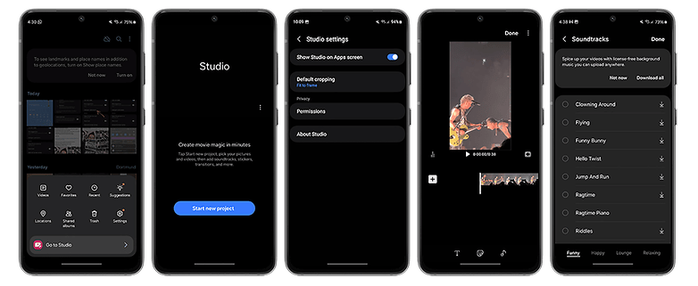
I'm afraid that Samsung will have to explain to me why this fine application doesn't end up directly in the Samsung folder, but is buried knee-deep somewhere in the operating system. The app may still be very basic if we were to compare it with other third-party apps or look at Apple's offering. However, it is effortless to use and lets you cut videos, add videos to the current project, include stickers or subtitles, and insert music in clips.
Come to think of it, I almost believe that Samsung wants to improve this app further in the future, which is perhaps why it has been so shy with it to date. What do you think?
There are also some minor changes that directly affect the camera app and make our lives easier. For instance, you get more watermark options which I barely use. I'm more pleased that I can select the megapixel count and the image format directly via the top of the app's main screen. You can also place camera widgets on the home screen to directly launch the app in your favorite mode.
What else? Oh yes! Samsung has separated the scene optimizer and the text scan function. Under "Advanced intelligent processing options" you will be able to find the scene optimization, but can also select from three different levels on whether images should be optimized to maximum, medium, or minimum. Bear in mind, however, that a higher optimization level increases the required time to take a photo.
One UI 6: Data protection
As far as data protection is concerned, only a handful of changes has occurred. I just realized that I was expecting more in each department, but that's absolutely not the case. I think One UI is a beautiful and highly functional skin that takes Android to a new level year after year. In many areas, there is no need to make drastic changes. In fact, I like it when things aren't changed for the sake of change, but fine-tuned instead.
Back to data protection: the Auto Blocker function, which can be accessed via the security settings, is new. It is deactivated by default, which I personally think should be otherwise. It prevents you from installing apps from unauthorized app stores. Most of us use Google Play or the Galaxy Store anyway, and anyone could simply disable this function in the first place.
In the same setting, you will also find options to block software updates via USB and to prevent downloading images in Messenger that could contain malware.
- Also worth reading: Samsung Galaxy A or S: What's the difference?
One UI 6: Ergonomics, speed, and stability
One UI 6 runs incredibly fast, but that probably doesn't surprise anyone here, does it? The Snapdragon 8 Gen 3 on my S24 Ultra does the rest to ensure that I don't have to spend seconds waiting for apps to launch or staring at choppy transitions. Speaking of transitions: Please try opening the notification bar yourself in slow motion or switching to another screen. The transitions are incredibly smooth that it's a real pleasure playing with it.
Weighing in at just under 18 GB, the operating system is rather large, but it's manageable and as mentioned, it doesn't slow the system at any point. While there are some apps that arrive pre-installed, most of them are tools from Samsung or apps by Microsoft and Google.
The system is also stable, as I did not encounter any crashes to date. I don't have a direct comparison with One UI 5, but One UI 6 doesn't seem to consume too much battery. However, this can also be attributed to the SoC, so I cannot judge whether this is different from other Samsung smartphones.
I think the usability has improved further, although folks with smaller hands than mine will have difficulties from time to time if they want to access the Wi-Fi menu using just one hand. For me, the fact that the respective screens are tidier contributes to better usability.
However, this also translates to having the functions or settings arranged more sensibly in the menus. The battery settings are a prime example. Previously parked under "Device maintenance", the app has now been allotted its own item in the settings menu.
One UI 6: Updates and compatibility
With five years of security updates and four years of Android updates, Samsung was the class leader for a long time until Google made a seven-year update promise with the Pixel 8 Pro (review). The five years that Samsung also grants to its more affordable smartphones are commendable and better than what most other Android manufacturers offer.
Nevertheless, the South Koreans have also increased the support for their flagship models to seven years. That's really wonderful, and I can tell you this: I will actually try to use my S24 Ultra for seven years, and will keep you up to date on this.
Google and Samsung are not only closely interlinked when it comes to Galaxy AI, as Samsung will also receive updates faster and has clearly benefitted from the good working relationship with the California company. By the way: Be sure to take a look at our update tracker, which will tell you if and when your Galaxy phone will receive Android 14.
Just for the sake of completeness, I'd like to mention that I'm now using One UI 6.1, which, together with the Galaxy AI features, will be available on other models from the Galaxy cosmos by the end of March. My smartphone has also recently been provided with the March security update.
- Read more on this: You should know these 41 One UI tips
One UI 6: Conclusion
In my opinion, the updates in One UI 6 proved to be very remarkable. What made it exciting for me was not the marketing fireworks that surrounded Galaxy AI, but the fact that One UI feels very familiar at every corner, even though there were a number of design changes and function updates.
Samsung managed the balancing act between revisions and the tried-and-tested areas well. At first glance, everything seemed more uniform, mature, and clearer, without really being explicit about what changed since One UI 5.
I haven't touched on other points in this review, including selected Galaxy AI features, the adorable animations in the weather app, or the optimized gallery. I want to make it clear once again that even an update that felt incremental at first glance can contain a lot of substance.
In general, I found Galaxy AI to be exciting, and I appreciated the translation and transcript functions in particular. Overall, I do agree with my colleague Antoine, who dismissed some of the AI functions as gimmicks and "nice to have" at best.
They will certainly become very useful functions in everyday life, but currently I see most Galaxy AI stories more as a feasibility study by Samsung or Google.
As an ancient creature of habit, I like One UI 6 or 6.1 because the user interface doesn't overwhelm me with new design approaches and rearranged features. Nevertheless, the current version feels modern and fresh, while remaining consistent and coherent. I don't know why I haven't wanted to use a Samsung phone with this compelling software for so long.
What's your opinion on One UI in general and version 6.0/6.1 in particular? You are welcome to share in the comments and let me know which change you liked the most or what you missed.



I'm not a fan of not being able to "talk to text". The icon has been replaced and the "cutsie" icon does not allow it. HELP!
Battery charger samsung
-
Admin
-
Staff
11 months ago Link to commentFor a list of suggested chargers for your Samsung phone, please check this list:
https://www.nextpit.com/best-samsung-phone-chargers-2024-apr
The »Samsung One UI 6«/»Android 14« came to my »Samsung Galaxy S22 Ultra« about a mounth ago. Everything is fine exept for me one big disheartening giant roars:
Their crazy idea that it should be better with only one line to display names of apps, icons or shortcuts on the Home Screen.
I often put shortcuts fra websites into icons on my Home Screen. And now I only can describe them with two words. What a totally crazy idea! Sorry to say!
Maybe sombody knows if it is possible to change this?