Xiaomi HyperOS Review: Is MIUI's Replacement Up to the Challenge? Well...

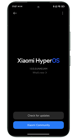
MOUI 15, that's what Xiaomi's new Android overlay should have been called. Because despite all the hype Xiaomi has created around HyperOS, I could sum up my impressions with a simple "phew". HyperOS looks a lot like MIUI 14 and there aren't many new features. Worse still, some very popular features have been lost. And the famous new AI functions are still not available. In short, if you haven't yet been able to install HyperOS on your Xiaomi smartphone, find out what's in store for you in this interface test.
For this HyperOS test, I used the Xiaomi 14 and the Xiaomi 14 Ultra. Not all features are available on all Xiaomi, Redmi, and Poco smartphones. You can check out the list of smartphones eligible to upgrade to HyperOS and our list of the best MIUI/HyperOS features to find out more.
Design and ergonomics
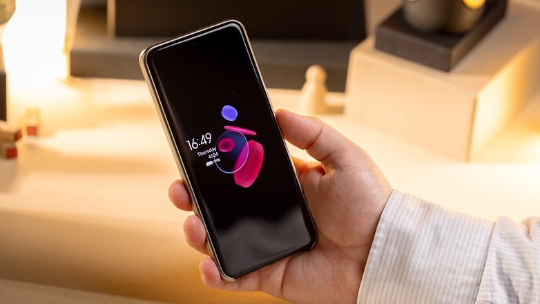
HyperOS is a visually appealing interface. The Always on display and Control Center really give the impression of being on an iPhone.
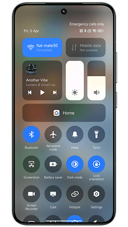
A cleaner Control Center
The Control Center is a little more streamlined. Xiaomi has decided to remove the text under each quick menu icon. Admittedly, this is more minimalist and allows more icons to be placed in the Control Center. But if you don't know the meaning of the icons by heart, you may have to guess which function is which. The result is a slight loss of intuitiveness, but this option can be reactivated via the settings.
I'm sticking with this Control Center. You can now long-press the Wi-Fi and Bluetooth icons to see which networks and devices are available/connected. It's just like on iOS. And that's just as well, because before, pressing these icons would redirect you to the settings in a new window.
HyperOS also adds animations to the status bar that remind me of those in iOS 17's Dynamic Island. When you charge the smartphone, connect headphones, or switch to Do Not Disturb mode, a bubble scrolls across the top of the screen for a few seconds. Rest assured, you can also dismiss it by swiping upwards, so there's no need to wait for the animation to finish.
New widgets and a new font
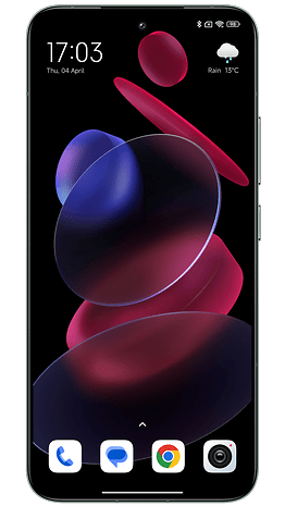
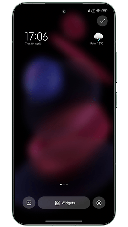
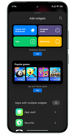
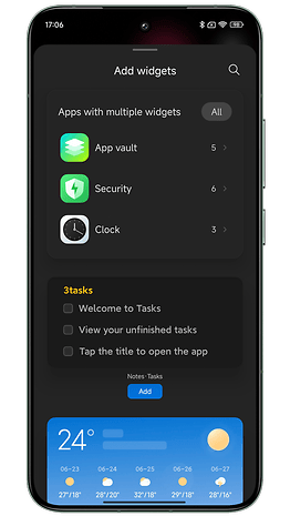
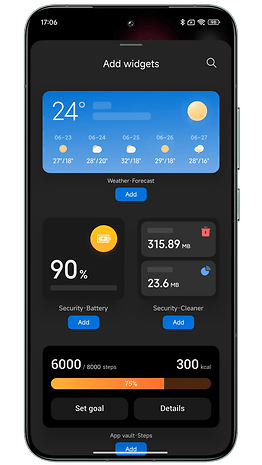
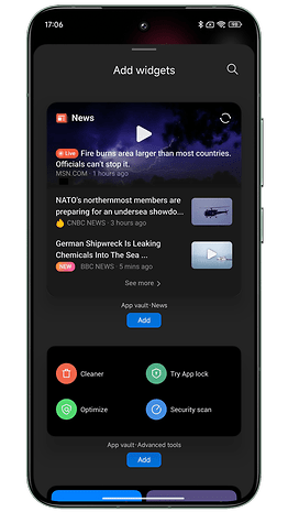
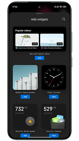
Let's move on to the home screen. Strictly speaking, nothing has changed. We've added a few widgets, some of them very nice.
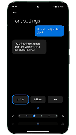
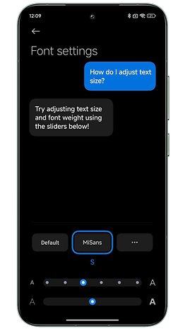
Xiaomi has also developed a new font called Mi Sans. It's a little thicker than the default, and the info is a little more legible, but I didn't find this a very noticeable change.
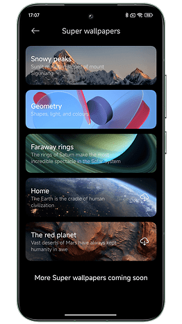
Super Wallpapers, those animated wallpapers that zoom in as you unlock your screen, are still there.
On the home screen, some native application icons have been reworked. But these changes are rather anecdotal, in my opinion. On the other hand, I still appreciate the animations inside certain icons when you open/close an application.
A lock screen like iOS 17
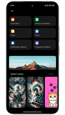
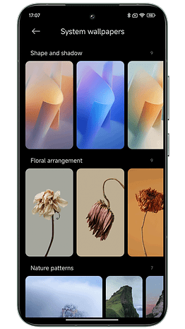
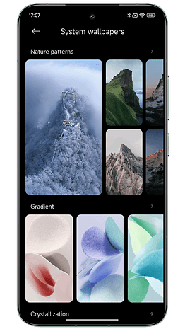
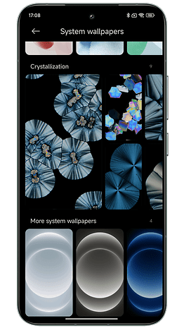
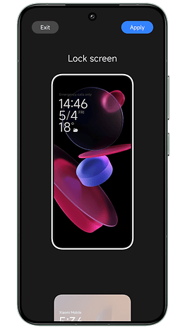
The big change is the wallpapers for the home and lock screens. Once again, Xiaomi has drawn inspiration from Apple. I know it's infuriating to constantly compare Android manufacturers to Apple. But here, it's too obvious to ignore.
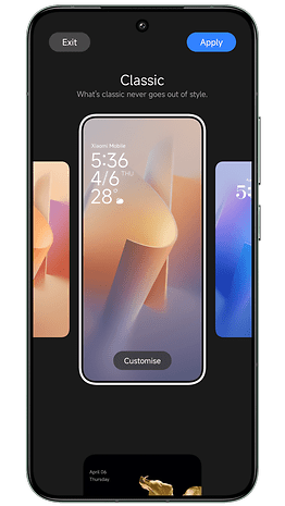
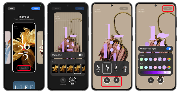
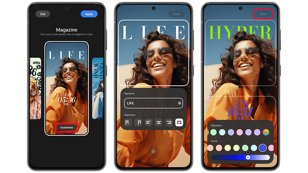
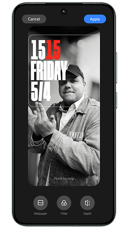
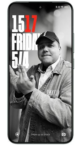
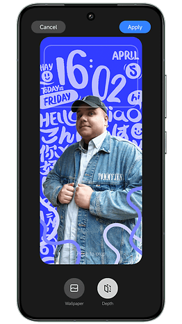
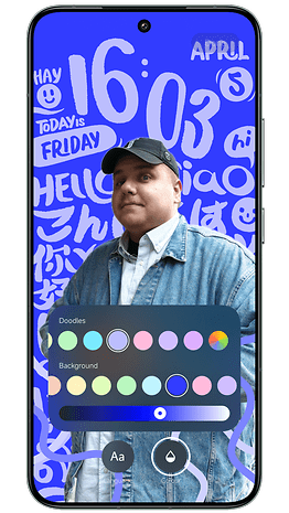
With HyperOS, you can apply a depth effect to your wallpaper on the lock screen. Basically, you can move your image or photo into the background, behind the clock, to give it depth. Xiaomi has also added new styles for the clock on the lock screen, and I think they're very nice.
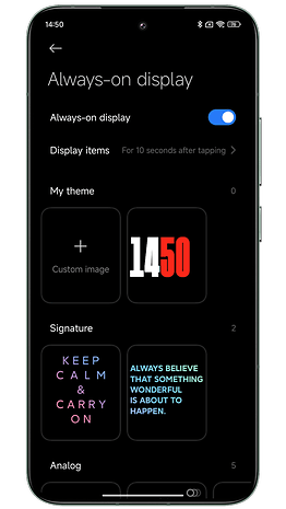
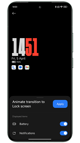
On the other hand, I think it's a shame that I can't add widgets to my lock screen. Wallpaper and clock, nothing more. As for the Always on Display, it's not really customizable.
You can, however, replace the clock with a custom image (you can always display the time and date in small type). But I don't think the effect looks very good.
Features
HyperOS doesn't bring any big new features compared to MIUI 14. But Xiaomi has also removed two features that are very dear to my heart. And the AI features are currently only in beta testing. I'll be devoting a full article to them shortly.
Let's start with the negative. Xiaomi no longer lets you switch back to the old-style Control Center. I'm talking about the one that displays the quick access menu (with all the shortcut icons) and the notifications pane. Under MIUI 14, you could still change the style of the Control Center. Under HyperOS, this is no longer possible.
However, Xiaomi allows you to swipe right from the Control Center to switch to the notifications pane. This is more intuitive than the default method of swiping down from the top left/right corner to scroll each pane separately.
Second negative point: It is no longer possible to play content on YouTube with the screen off. Xiaomi has removed this function, and not just in HyperOS. This is probably due to pressure from Google. But it's an unfortunate choice because I loved this function and I'm not the only one.
As for the rest, I still love multitasking on HyperOS. Xiaomi has made the management of floating windows even more intuitive.
What's new in HyperOS is that you can toggle between floating window mode and split-screen mode via a small button directly integrated into each window. It's very similar to what Samsung does in One UI 6 (review). And it's so good!
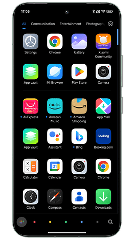
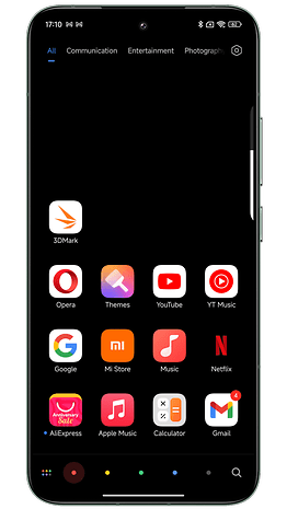
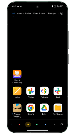
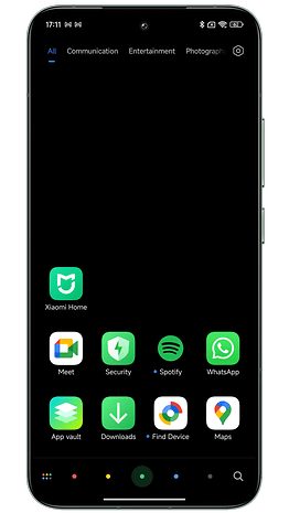
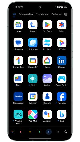
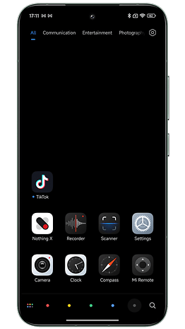
Another feature I really like is the ability to sort the icons in your application drawer by color.
I find my apps much easier this way. And the animation you can activate when scrolling between the different colors is visually very pleasing.
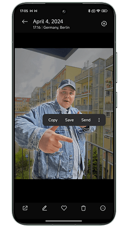
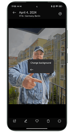
The HyperOS photo gallery also offers a slightly reworked clipping function. Clipping can now be done with a single long press on the subject of the photo in question.
A pop-up window opens, allowing you to directly copy, save, or send your cropped photo. You can also change the background. Basically, it's a way of creating stickers that you can send on WhatsApp. Nothing revolutionary, but it's fun and intuitive.
Security and privacy
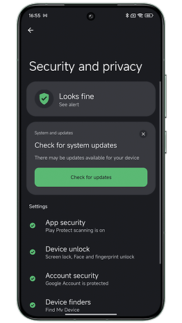
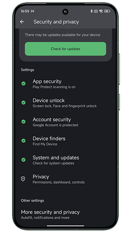
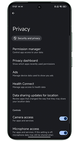
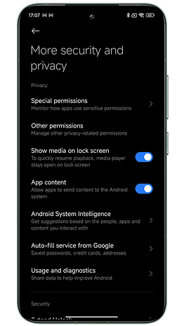
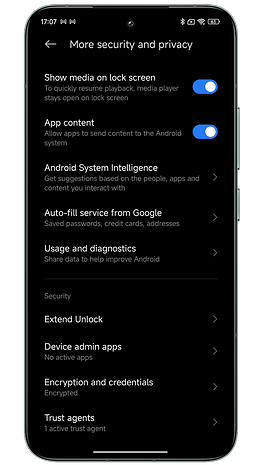
On the security front, I didn't notice any new features. Xiaomi has adopted the essentials of what Google offers in Android 14. But there's an extra layer in the form of a dedicated native security application.
As with previous versions of MIUI, I found this Security app to be duplicative. Many tools are already present in the system settings. I find it unnecessary to add them in a separate application.
Xiaomi also put a lot of emphasis on its in-house developed TEE (Trusted Execution Environment) system. TEE refers to a location on your CPU where Xiaomi stores your most sensitive data. It's an independent microkernel on which your fingerprints and facial data are stored, as well as your hidden or locked files and photos.
I'm woefully lacking in security knowledge. But I would like to point out that this TEE has had its problems in the past. Depending on the SoC your smartphone is equipped with, the type of TEE may vary. And in 2022, a cybersecurity research company discovered a flaw in the TEE of Xiaomi smartphones equipped with MediaTek SoCs.
The flaw was quickly corrected. And Xiaomi is by no means the only manufacturer to have suffered security breaches. But it's important to keep the superlatives surrounding this famous homemade TEE in perspective.
And even on the Xiaomi 14 Ultra, I came across an ad in the application. It's really unbearable.
Bloatware is also rife. Xiaomi claims that you can now uninstall bloatware more easily. You can even delete Xiaomi applications. Yes, but not all of them.
Updates and compatibility
HyperOS has already begun to be deployed on several Xiaomi devices. You can find a list of all eligible models and those that have already been updated to HyperOS.
The HyperOS kernel is based on Linux and the Vela system, the IoT platform developed by Xiaomi. HyperOS supports over 200 processor types and more than 20 standard file systems. HyperOS can run on as little as 64 KB of RAM but can support up to 24 GB if required.
We can see Xiaomi's determination to make HyperOS a global interface, not just confined to smartphones. In essence, what Huawei promised with HarmonyOS back in the day. Xiaomi has integrated a whole framework called HyperConnect to enable different devices to interact more intuitively. I wasn't able to test these functions, but I could devote an article to them if you're interested.
But I do have one negative point to make. Xiaomi is still very confused about HyperOS functionality. Some smartphones have HyperOS based on Android 14, others on Android 13. We never know whether this or that feature will be available on all the manufacturer's smartphones or not.
And that's pretty maddening, not only as a tester, but as a user. I've lost count of the number of people who comment under a HyperOS or MIUI 14 tutorial that they don't see the feature I'm describing on their smartphone. Xiaomi should be clearer in the patch notes for its updates.
Conclusion
HyperOS is a divisive Android overlay. For users who are prejudiced against Chinese manufacturers, and for whom Apple and Samsung are the patron saints of software quality, HyperOS is still too cumbersome and confusing an interface.
Personally, I still prefer One UI 6 to HyperOS, but Xiaomi is considerably narrowing the gap with Samsung. The manufacturer's update policy is improving year on year. The Xiaomi 14 Ultra will receive 4 Android versions and 5 years of security updates.
On multitasking, with floating windows and split screen, Xiaomi does almost as well as Samsung, in my opinion. The manufacturer has also ventured into AI functions, which I'll be presenting shortly.
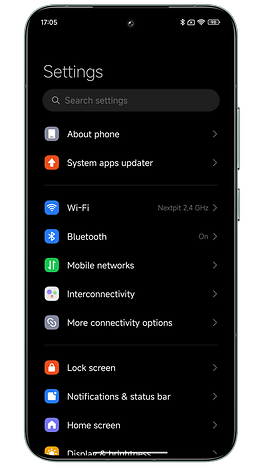
Xiaomi has also streamlined its interface considerably. Certain sub-menus have been grouped together for greater clarity in settings. The control center is cleaner and easier to read. And there are still plenty of visual customization options for the home and lock screens.
I just wish Xiaomi would do away with ads in its interface and bloatware. There also needs to be more transparency and consistency in the deployment of new features across the different models—flagships, Redmi, Poco, etc. All these shortcomings tarnish Xiaomi's premium image and reinforce the prejudices of users who still see Xiaomi as a sub-brand that's not high-end enough. Which Xiaomi clearly hasn't been for years.
What do you think of HyperOS, Xiaomi's new interface, after this test? What aspects or features of HyperOS do you think I could have included in this article? What points would you like to see explained in more detail? And what is your favorite Android interface in 2024?
