Android UI comparison: 2017 edition
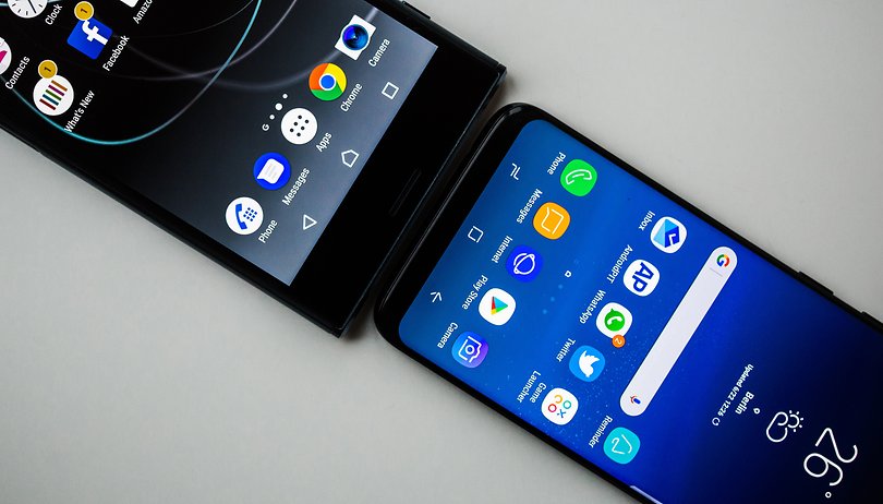

True to the motto “be together, not the same”, every smartphone manufacturer overlays its own adjustments to the Android operating system. We took a closer look at the typical differences and are putting together a UI comparison of smartphones that have been released so far in 2017.
Samsung TouchWiz
The most popular Android smartphone manufacturer still relies on its tried-and-true TouchWiz. It exclusively offers Bixby, an AI assistant aimed at competing with Siri, Alexa and the Google Assistant.
Samsung equips its top devices with the Game Launcher, although some models of the A-series now sport it, too. It records games, suppresses incoming notifications and background services while you’re playing, and ensures an immersive player experience. Modes for greater performance and battery-saving modes give you greater control over performance, mainly on higher-end Samsung devices.
Security updates released on time practically every month currently make Samsung smartphones among the most secure on the market.
Huawei EMUI
Huawei has incorporated the long-missing app drawer in its launcher’s portfolio. Leica-branded models offer comprehensive profile modes in the camera app to give your photos a unique character.
Huawei uses machine learning-supported memory optimization under the hood. Based on your behavior, the most frequently used apps are kept ready for quick access. This makes the smartphone just as snappy as when you first started using it, even after several months of use.
Huawei also provides updates, but not as frequently as Samsung. It mainly provides new features or refinement to the existing range of functions.
HTC Sense
The user interface on the HTC U11 is spruced up with squeeze gestures and Sense Companion. The former offers two freely-selectable squeeze gestures. Squeezing the device in your hand starts an app or activates a function. In contrast, Sense Companion is an AI assistant that learns from you over time and helps you use your device, although its learning phase is so long that, even after several weeks of use, the first test devices did not show if it was really worth its salt.
HTC provides swift updates and new software versions. Sometimes it is so fast that updates must be postponed for troubleshooting. But, it ensures a continuously improving user experience, especially for the top models. HTC uses many apps and functions from Google and vanilla Android instead of its own developments, leaving more storage space free for you.
LG UX
Even LG looks delightfully slim and mostly foregoes its own add-ons that would not already be present by Google or Android standards. The dual-screen mode was slightly optimized so that display errors due to incompatible apps are reduced. An app recycling bin keeps apps on your smartphone for 24 hours after being uninstalled before storage space is permanently freed up.
LG is not particularly quick with updates. The manufacturer is notably slow with large version changes and is one of the last ones to provide the upgrade.
Google Pixel UI with Android O (Beta)
There is no such thing as stock Android anymore. Google gives its Pixel smartphones features that are not available for Nexus devices with the same software version. Its peculiarities: Google Assistant for search, help and smart home control. Pixel owners also have unlimited storage for high-resolution photos in Google Photos.
As a general rule, the pure Google experience and the quickest software updates will give you the purest Android that you can get for your money. The video above is with the Android O Beta, but Android 8.0 Oreo has since been released.
Sony Xperia UI
Sony delivers an Android variant whose interface does not stray too far from the original. Only the start screens, app drawer and keyboard are visibly different. Despite a number of comparable improvements to the core Android system, Stamina mode for extending battery life is still around. Furthermore, Sony offers an assistant for freeing up internal memory.
Sony currently manages to provide timely software updates for its top devices. Unfortunately, the camera app is unclear and fractured. Moreover, its faulty image processing delivers results don't live up to the expectations of the camera hardware, which is actually good.
Conclusion
Some manufacturers provide true added value to the user through their interpretations of Android. Samsung has invented an exciting solution for gamers with Game Mode. Huawei’s background optimizations actually work, even if they are not immediately apparent. Google Photos’ free storage with automatic storage optimization ensures that your storage will never be full due to photos.
Other manufacturers such as Sony or HTC provide extras whose benefits are not apparent to everyone. These manufacturers ought to stand out by providing good and consistent software updates, since this continues to be a point of criticism and an often-underappreciated added value for us users, since our smartphones not only move our personal data but are also becoming the center of our increasingly connected life.





I think the Author here is trying to pretend that Xiomi should not be in the list ?
Where is Miui ? The best UI now by all reviewers in 2018 !!!
Plz update ur article with Miui
sony is best
The stock android boasts for speed at the price of features. With advancement in hardware, it leaves no room for excuses for lack of features to make the user experience better. Google needs a lot of work on its UI. I agree with a lot of comments, google can learn from MIUI
After experiencing all of these UIs I'm gonna have to go with stock... well Pixel since it doesn't get any more Android then that. However, since I'm an iOS aesthetics fan I'd use EMUI or MIUI any day and it is pretty snappy. I absolutely hate HTC Sense UIs bloatedness and LG is just too boring.
What about the MIUI apart from the icons the UI looks Great. better than sony lg htc
Unreadable because it slows my phone down to a turtle because of all the youtube videos that have to load....
OnePlus' Oxygen OS could easily compete with the Pixel's Android O for the best android UI award. Xiaomi's MIUI is pretty decent too!
I was hoping to see Lenovo, OnePlus, Xiaomi and Asus UIs too.
I have no problem with TouchWIZ myself.
Oxygen Os
Is it possible to change de UI in the OEM android phones without root them?
I still prefer Stock Android UI
Good Lock is a feature on TouchWiz that completely changes the notifications, lock screen and recents if you so choose.
Of the ones mentioned I like Xperia UI the best. It looks less juvenile that the others and everything appears very clear and organised.
for me xperia ui is not good because they are making screen smaller by putting softkey at the bottom of the screen instead of having their own separated softkeys.. & xperia getting very hot like a flat iron..
You don't know about sony phones it never heat and better than stock, htc, samsung, LG as well as ios
Where is MIUI ...??!!!
I think you need to update this article with MIUI..
It's the best UI
Miui is the best UI for android
MIUI is very heavy to run, spend a lot of RAM, so often multitasking interrupted, the phone is equipped with a great specification but feels like regural phone, because the pursuit of UI. MIUI has a great UI, but it has its menus as well, just like the others.
MIUI Is the best UI In all types of android mobile