Google Drive is the first app to feature Splash Screen animation on Android 12

Read in other languages:
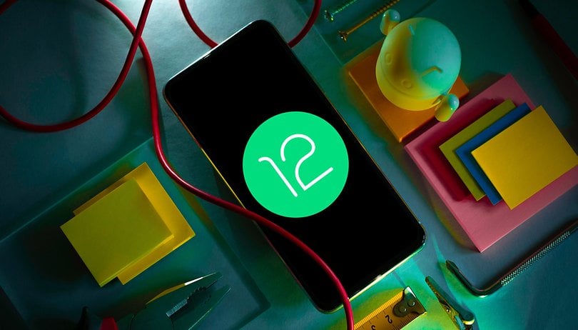
More interesting than testing Android 12 out on a daily basis, is to compare the new operating system to the old version. Material You, Google's new user interface, offers a number of new animations that might seem to be slight improvements, but they do manage to make the overall Android experience a more enjoyable one. One example of this is the so-called Splash Screens, which Google recently released for the Drive app in the beta version of Android 12.
- The Splash Screen API serves to make the experience with the operating system more fluid.
- This feature can be customized by developers.
- Drive is the first Google app to use the animated splash screen in Android 12.
"Splash Screens" were integrated in the third preview of Android 12 and consist of full-screen animations when an app is first launched. This week, Google released a Drive update for Android 12 beta and we had a chance to catch a glimpse of how the feature works.
When you launch the Drive app, the icon will expand until it reaches the four corners of the display while the service loads. At the end of the animation, the main screen will appear. I need not mention that everything happens so very quickly, and it is more pleasant compared to what we see on Android 11 today. In the video below, you can see the transition happening on my Google Pixel 3:
When you will see the Splash Screen animation?
On the Android developer page, Google explained that the Splash Screen feature will only be shown for apps that are not currently running (a process known as "cold startup") or apps that have been opened without creating any background activity (known as "warm startup").
Hence if the app is running in the background, which is referred to as "hot startup", the Splash Screen will not be shown, since there is no need for the system to load the app.
As we can see in the video above, once the app is ready to open, the animation is terminated.
The idea behind this is for each developer to use the API to customize the opening animation of their respective apps, being creative with the background color, icon, custom animation, and even control the timing of these visual effects.
Personally, system animations and transitions make my experience of using the device better and, in this case, the Splash Screen API is very much welcome. What is your opinion on the matter?
Via: Phone Arena
