What is the notch? Is it a necessary evil?


Smartphones with the notch are horrible! We want smartphones without the notch, and hiding the notch does not completely get rid of it...we hear you! But do you know what the notch is? The so-called notch, also known as a display cutout, is one of the main design trends of late 2017 and all of 2018, and in this article, we will briefly explain what it is, what it's for and why it's a necessary evil.
Jump to section:
- What is the notch?
- What components are in the notch?
- Can you hide the notch?
- Is it a necessary evil?
- Some exceptions
What is the notch?
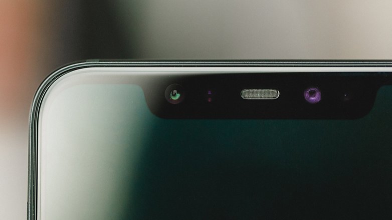
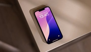
The notch is a gap usually positioned at the top of the display of the latest generation of smartphones. The so-called notch can have different sizes and shapes, but its main purpose is always the same: increase the surface area of the display on the front of the devices without giving up the front cameras or the various sensors.
What components are in the notch?
It depends. The answer varies from manufacturer to manufacturer and from model to model. Some manufacturers, like Essential, have tried to reduce the size of the notch to the bare minimum by putting only the front camera there. The sensors and the speaker for calls are usually hidden under the display or in the narrow space between the frame and the display.
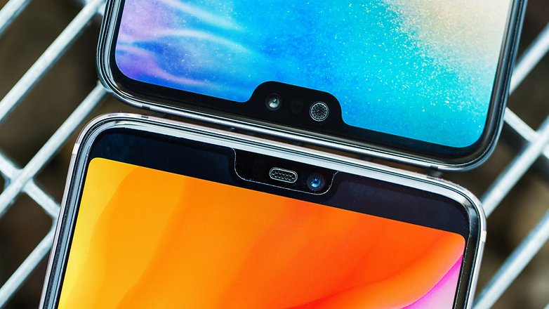
Other manufacturers, like Huawei, OnePlus and LG, use a slightly wider notch to house, in addition to the camera, the classic proximity and ambient light sensors that couldn't found space under the display (probably to keep production costs low).
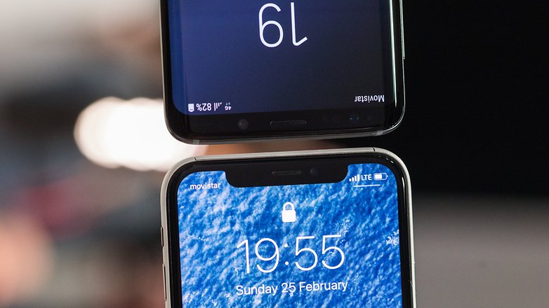
Finally, there are smartphones like the Xiaomi Mi8 Explorer Edition or the iPhone X that use a noticeable notch. These manufacturers do this to introduce additional sensors such as those necessary for unlocking with FaceID style 3D face recognition.
Can you hide the notch?
In this case as well, the answer varies from model to model. Huawei and OnePlus, for example, allow you to disable the display area on the sides of the notch at the system level. In this way, this part of the display will always remain black and blend in (to some extent) with the smartphone's bezels. Obviously, this works best with an OLED display.
This isn't possible on the LG G7 ThinQ, since the notch is only deactivated on LG system applications (not those installed later). On the OPPO R15 Pro, you can disable the notch for each app, but this doesn't work all the time.
Is it a necessary evil?
Some manufacturers say yes. According to many manufacturers who have smartphones with a notch in their catalogs, having a notch is the only way to extend the surface area of the display in ways not possible before now. According to these brands, this is just a transitional period, while we wait for the technologies necessary to avoid the notch to become reliable and easily available.
Moreover, the temptation to follow trends is always strong and copying the trends of top smartphones is one of the weapons used by minor producers to try to carve out a slice of the market.
Some exceptions
Manufacturers like Samsung have decided to remain faithful to the classic notch-free style, simply trying to minimize the thickness of the bezels without necessarily introducing a notch into the display. Still others, such as Xiaomi on the Mi MIX 2S, have already adopted original solutions for positioning cameras and all the necessary components by making smartphones with virtually no bezels and no notches.
OPPO and Vivo (which belong to the same parent company BBK Electronics) have even adopted motorized cameras on the Find X and NEX that, when not in use, are hidden inside the body of the devices and open/close automatically when needed.
Have you got used to the idea of seeing the notch on new smartphones, or are you still trying to avoid it with all your might?








I am passionately against the notch! I hate it so much. It literally feels like a failure of engineering and design. Steve Jobs would've never stood for it. I hate that it protrudes and cuts off parts of my apps when I'm using them. And if the solution is just to put black bars up there to make it less ugly, then just leave the bezel in the first place so developers don't have to add black bars to everything! I like a nice straight bezel on the top you can use to open and close your laptop. At least it's not as ugly as a protruding notch! I was thinking of getting a new MacBook pro, and when it saw the notch, I said "NO WAY"! The programs I use WOULD suffer from the protruding notch, and I don't want them to put a giant black bar cutting off screen real estate, just leave the nice bezels, or better yet, put cameras and sensors under the screen like better developers have been doing for years! The notch is clunky and stupid looking and it cuts into my apps I use everyday. I hate it so much........
I have the same issue with both notches and camera punch holes... I find the least invasive positioning to be on the top left of the screen.
I've no interest in a Notch (small bezzle works fine), nor a Fingerprint Scanner on the front (it's better on the back), but that's because I prefer a 1 hand friendly phone.
Someday we'll look back on the notch the same way we now look back at physical keyboards. Something that the manufacturers thought we wanted but never asked. Had they asked the never would have produced them.
I wouldn't pay a dime for a smaller bezel, but am also indifferent to the appearance of the notch - what would be intolerable is the notch intruding into landscape screening, e.g. of videos, games or full screen displays of any kind. Early reporting on the Apple devices showed that, and I haven't kept up with whether and how app developers have managed to fix it. Have to take credit for predicting that when the awe-inspiring Apple introduced it, that was just the first step to notching our entire framed reality: soon all viewing screens, doorways, windows, eyeglasses, will have notches - because they can.
A notch is better than a top bezel if it hides properly (In every App, OLED Screen, moving slightly to protect from burn in etc.)
But the Pixel 2 XL's bezels are fine for me tbh
Depending on the design goals it's a reasonable trade off for some goal sets. Whether that's an acceptable decision is not about right and wrong but about consumer taste and needs.
The only way to stop the debate are for mfgrs to miniaturize the components to a slim (some are honking big) size, so they are less obtrusive. I could live with a little, but haven't seen one yet that doesn't look like a eyesore. They put the scanner under glass, and passed that class, now they gotta go back to class, and figure how to put that under, they got studying to do.
The "notch" is just another marketing thing, just as slim bezels, stylish colors are. I hear people complaining about big bezels. Shoot, until some marketing genius started making screens take up more of the space, no one had ever HEARD of bezels. Now, it's "trendy" to have slim/no bezels, just as it is to say OMG! look at the stupid notch.
It's what is trendy, nothing more.
I have never used a phone with a notch. And I prefer not too. I think this is a passing fad which will probably be dropped after this year. It has received many negative comments! I do not like notches or dongles!