ColorOS 12 review: My take on Oppo's Android 12 skin

ColorOS 12 is the new interface for Oppo smartphones that is based on Android 12. I've been testing ColorOS 12 out on an Oppo Find X3 Pro for a week now and I would like to think that I have a pretty good grip on this Android skin.
ColorOS 12 is not yet available officially and you can find the release schedule in my ColorOS 12 article. The purpose of this article is to provide you with an overview of the Oppo interface, present its features, and share my feedback. Hence, I'm not going to time the animation speed down to the millisecond. I might be a geek but even I have my limits, and there are plenty of competitors who do this better than me.
Summary
- A more "inclusive" design with the real 'fake' Material You
- More customization options and Omojis
- Revamped animations with a new engine
- New features
- Conclusion
The more inclusive design
I'm not going to go into detail about the design of ColorOS 12 as I've dedicated an entire article to it which will provide you with a far more complete overview of the new visual identity of the OS.
- Also read: ColorOS 12: This is what your Oppo (and OnePlus) smartphone will look like with Android 12
Oppo's keyword is inclusiveness. By inclusive, the manufacturer means making its interface more suitable for different audiences. I think it's more relevant to talk about accessibility. Basically, Oppo has cleaned up their interface a bit to lighten up ColorOS visually and make its skin more streamlined.
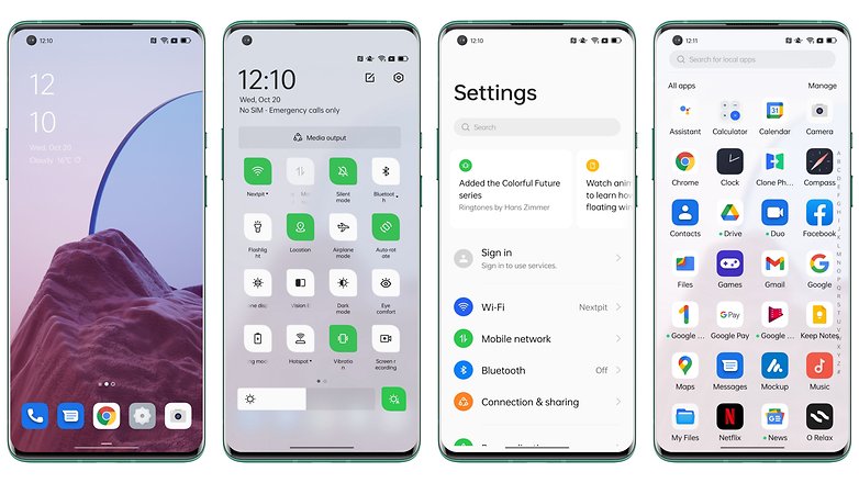
Some of these changes are visible in the Settings where the information presented is less dense, fonts are larger, and the icons in each section are housed in rounded bubbles with bright colors. All of these make the interface easier to read, reduce clutter, and give it a more modern, cleaner look.
Overall, Oppo hasn't made any drastic changes to the look of its overlay, but it's always good to see an interface lighten up, at least visually, as opposed (heh!) to the other way around.
Even more customization options
ColorOS 12 also offers a fair number of options when it comes to customizing its interface. Oppo doesn't push the concept as far as Xiaomi for now. However, I found the range of possibilities to be adequately balanced.
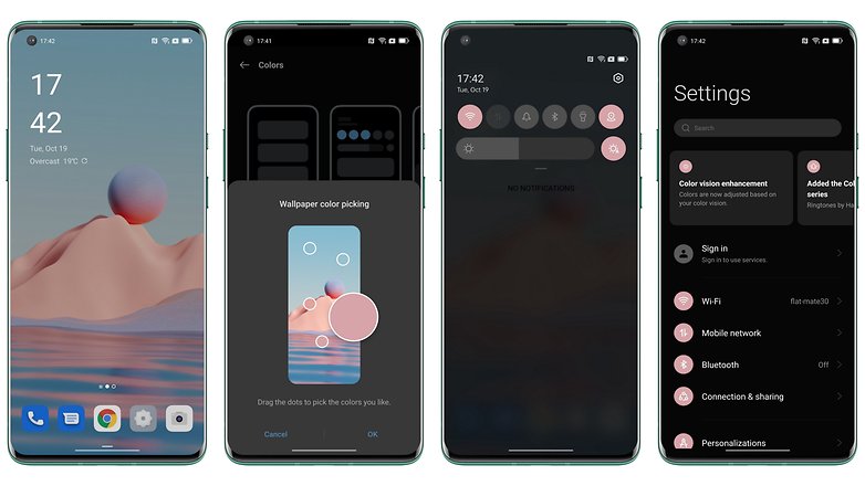
We can take note of the new proprietary icons, reworked animations with a new Quantum Animation Engine 3.0, and Material You. Well, almost Material You, but not totally quite there yet, and I must say that it's already very good.
Indeed, ColorOS 12 does not use Material You since the manufacturer explained that it has not had access to it for the moment. But Oppo has cobbled together its own in-house alternative to emulate Android 12's Dynamic Theme and adapt the color of your current interface to the dominant color of your wallpaper. Personally, I found the effect to be well executed.
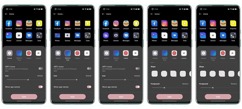
Icons under ColorOS are ultra customizable with several templates at your disposal including the Material Style, which opts for a more realistic look and therefore less "flat" with relief and shades of shadow. The icons react to the pressure of your finger and the opening animations of each app are quite nice.
Revamped animations with a new engine
Let's talk about the animations. Oppo boasts of having completely revamped them using the new Quantum Animation Engine 3.0. This engine intervenes on 3 key elements to make the animations more fluid:
- 3D resistance: Scrolling adapts to your swipe speed, so the faster you swipe, the longer the scrolling. A bit like a spinning wheel, if you ask me.
- Inertia: Elements on the screen have physics, they react when you interact with them. For instance, when you drag a floating window, it will continue to float a bit even after you release it.
- Feedback: The interface reacts and lets you know that your action is performed even if it is not valid. It's silly, but when you swipe in the quick access menu, the interface reacts even if there's no page to swipe to. It's hard to illustrate with words alone. But it makes it feel like the interface reacts to all our actions, not just the ones that are "allowed" or recognized by the system. This ensures that the experience is a more organic one.
New features
Productivity and multitasking
With ColorOS 11, Oppo introduced a new feature known as FlexDrop that allows you to use apps in floating windows. This very practical feature is back in ColorOS 12 under the name Flexible Windows. For the record, it's pretty crazy to see just how fluid and intuitive it is.
You can create a floating window either via the Smart Sidebar menu or by swiping up from an application, hide the window by swiping to the left or right edge of the screen, tap once to minimize it and twice to make it full screen. It simply worked like a charm every single time and is perhaps my favorite feature of ColorOS 12.
Accompanying this new feature, there are also some old ones like the 3-Finger translate which allows you to take a quick screenshot by swiping with 3 fingers and then translating the text into the image via Google Lens and Google Translate.
Oppo has also made a few other additions like PC Connect, an Oppo-style version of Samsung's DeX to facilitate interactions between your Oppo smartphone and your PC (Windows only). But this feature won't be available until February 2022.
Battery Utility and the new Phone Manager
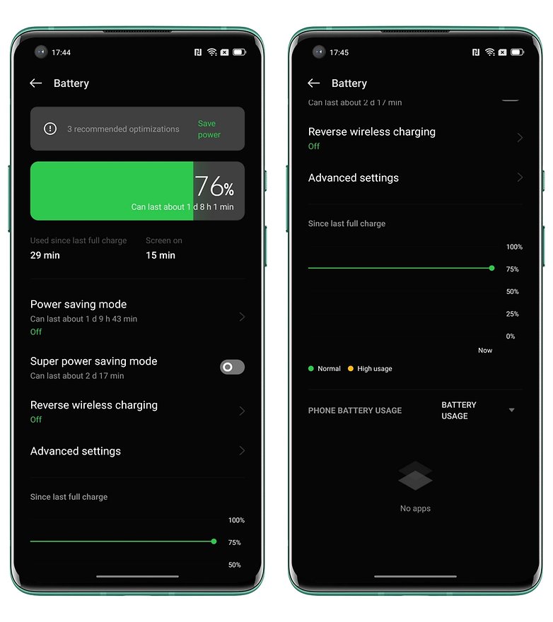
Oppo has also revised its take on the battery utility with this new Android 12 skin. It now allows you to view a fairly accurate infographic that visualizes your screen time and usage.
This is something that should be made a staple in all Android smartphones but unfortunately, that is not the case. Hence, I salute Oppo on this point.
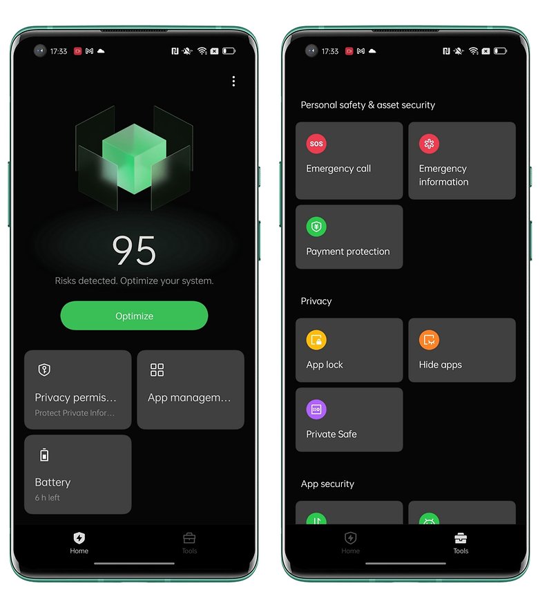
There's also the new Phone Manager app, which is very much inspired by what's done on MIUI. It brings together the main utility menus for battery, apps, and the Privacy Dashboard (the Privacy Panel in Android 12). I'm personally not a big fan of native apps that "optimize" our smartphone since they usually just kill apps that run in the background to free up RAM and lighten the load on the battery.
Adjustable dark mode
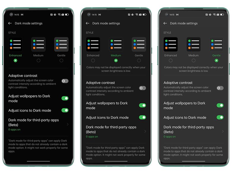
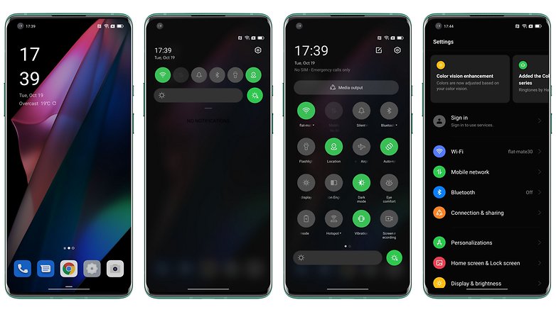
Another new feature of ColorOS 12 is the dark mode which is now adjustable according to 3 different levels of intensity. These modes mainly modify the contrast level and the black intensity. The dark mode can also adjust the contrast of your wallpaper, application icons, etc. Personally, I would not use it so much since the more attenuated intensity modes affect the colorimetry of the screen.
Privacy
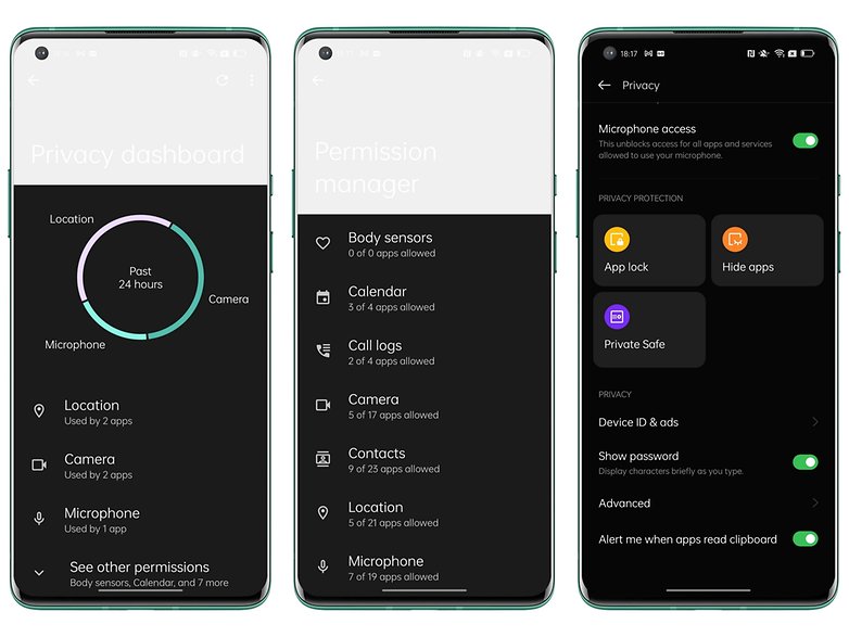
In terms of privacy and data protection, Oppo wants to remain on track and is offering 100% integration of Android 12's privacy features. Users get to access the Privacy Dashboard, approximate location sharing, as well as camera/microphone usage LED indicators.
Oppo also touts a feature known as the Anti-peeping mode that supposedly prevents anyone from spying on your notifications. With a sensor, this mode can detect if someone is looking at your screen at the same time as you, and reduces the level of detail in the notifications that are displayed. Unfortunately, this feature isn't available in the version of ColorOS 12 I tested.
Accessibility
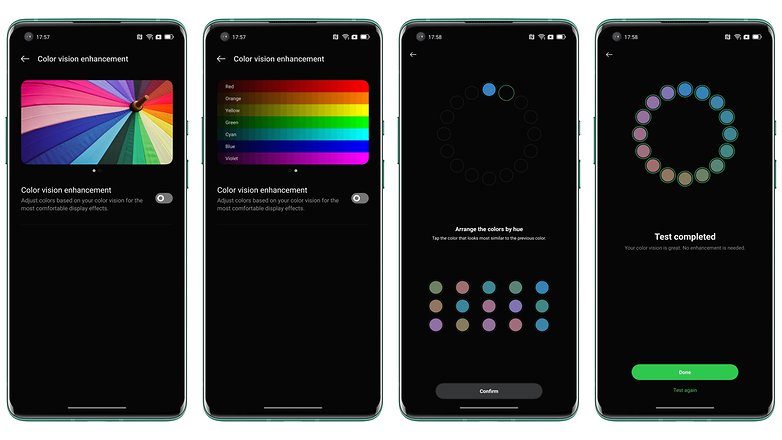
I've already mentioned that Oppo placed a heavy emphasis on inclusivity in ColorOS 12, and that inclusivity includes accessibility. So Oppo has integrated Google's Magnify and TalkBack features by default for the visually impaired. The former allows you to enlarge the items displayed on the screen while the second allows you to read aloud what you touch on the screen.
There are also high-contrast colors, and a new feature called Color Vision Enhancement that adjusts the colorimetry of the screen based on your vision. The vision test is quite fun, and for people with low vision or dyschromatopsia, it can be useful (although I haven't checked with a person who is visually impaired. Feel free to share your thoughts about this in the comments if you know someone who found this to be handy.
Conclusion
The version of ColorOS 12 I tested here is only an Alpha build. Oppo has launched a public beta but it is not yet available in Europe. Hence, I cannot give any definitive opinion on ColorOS 12. This is especially so when some features such as anti-peeping mode, Omojis, or PC Connect are not available in my version.
However, as my first opinion, which is a temporary one at best, remains a rather positive affair. The ex-OnePlus fanboy that I am wouldn't even be offended to find this overlay on the future OnePlus 10, for example.
I like the variety of available customization options as well as the fact that they don't go all over the place at the risk of weighing down the interface. I like the floating windows, which are much more intuitive than on OneUI, as Samsung's skin was the reference point in this department.
On the other hand, I find that Oppo has been a bit stingy in terms of new features and innovations this year. The changes compared to ColorOS 11 are anything but drastic. In fact, they are rather muted. Some additions even hail from OxygenOS 11, like the Canva mode for AoD. I'm also keeping my fingers crossed that Dynamic Theme and Material You will be better implemented, although I doubt that this will happen.
But I'm definitely more optimistic about the manufacturer's philosophy for the future of ColorOS. It's refreshing to see a Chinese Android skin becoming more streamlined instead of bloated and making more of an effort to stick with Android 12 while still having its own "personality" and identity, if only visually.
What do you think of ColorOS 12? What are the areas where you think Oppo should improve upon? What are the successes of this Android 12 skin? What else would you like to read about in this review when future releases arrive?






Recommended editorial content
With your consent, external content is loaded here.
By clicking on the button above, you agree that external content may be displayed to you. Personal data may be transmitted to third-party providers in the process. You can find more information about this in our Privacy Policy.