One UI 4.0 review: Undecidedly original
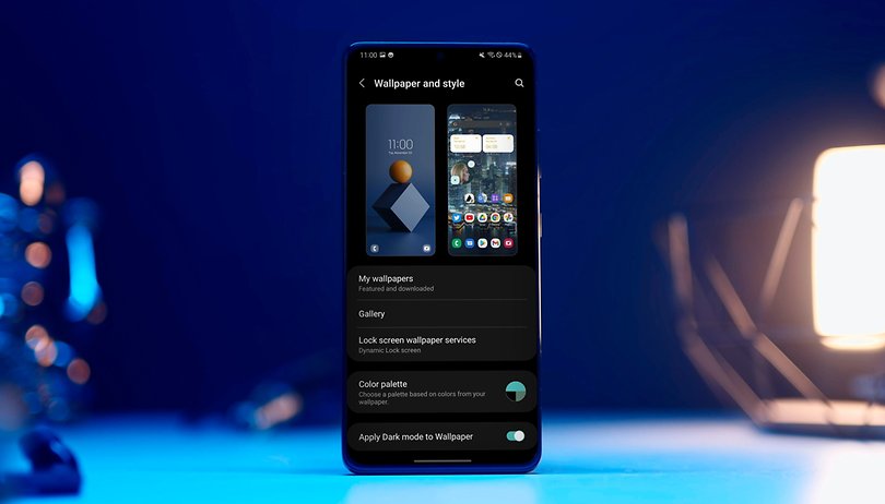

After optimizing its software update policies, building new bridges with Google, and placing foldable smartphones on the map for good, Samsung ends the year by shipping the One UI 4.0 update for its major 2021 smartphone releases.
This is quite an achievement for a company that until recently, was considered one of the laggards when it comes to rolling out Android OS updates. However, this should not be seen as a merit for Samsung, but more as a duty, given that it is the manufacturer who has the lion's share of sales in the smartphone market.
However, getting your house in order comes at a price. One UI 4.0 doesn't bring new features with it, but rather, adaptations to the Android 12 operating system that is more often not, not fully implemented. This leads to the question: is that be a positive or negative thing?
Partial Material You integration
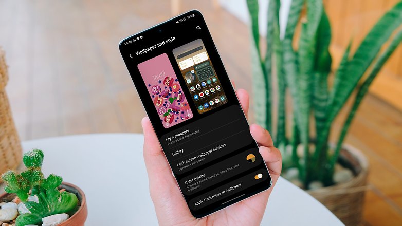
Since the beta version, I've been testing the new One UI 4.0 on the Samsung Galaxy S21+, but my primary handset is the Google Pixel 6 Pro. Hence, it's hard not to compare interfaces and user experiences every time I switch from one model to another. It is through this sense that I can say that the Material You concept has been truly embraced by Samsung.
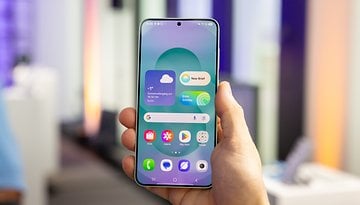
Android 12's dynamic theme works similarly in One UI, where it will take note of your smartphone's wallpaper colors and pepper them across different elements of the operating system and apps. As with the Pixel devices, the Galaxy S21+ also offers a variety of color palettes, but does not, however, allow you to choose between basic colors.
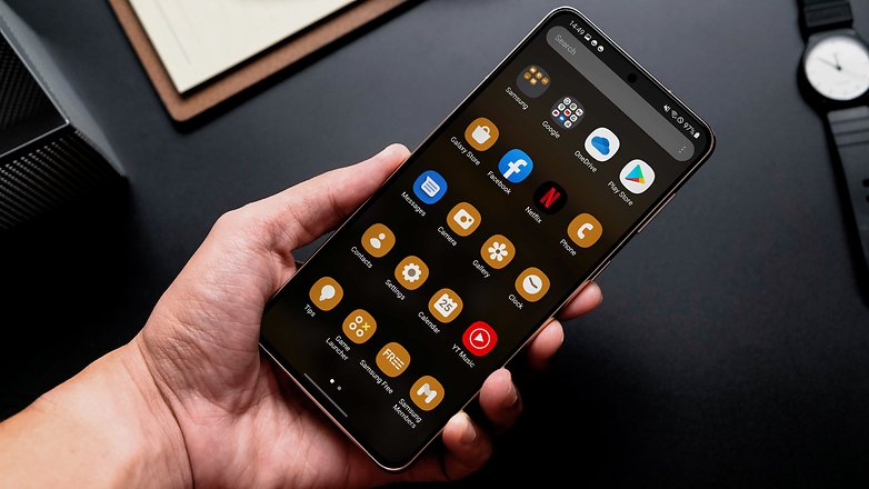
Another difference is how the customization of app icons is applied only to Samsung apps. This way, Google or third-party services, even those that are eligible to be adapted to Material You, will not be modified. This makes the One UI experience an inconsistent one. What happens here, however, is that Samsung had to create its own dynamic theme mechanism, given that Google did not share the "Monet" system with its partner manufacturers.
The new Android 12 design guideline is also characterized by shapes. In this sense, One UI retains its essence. The notification bar, the quick shortcut icons, and the settings screen have not changed much at all. Despite the integration with the color theme, they still follow the previous pattern, with tiny icons while offering as much information on the screen as possible.
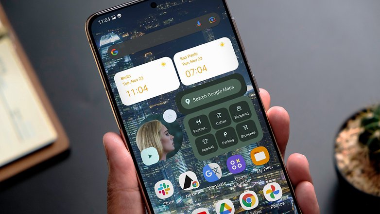
Samsung's widgets haven't changed much either. Of course, Google services like YouTube Music or Google Keep can be used on the Galaxy with Material You's rounded shapes, but Samsung's Clock widget doesn't follow the pattern that comes with the Google Pixel. Personally, I see this as a positive point as it offers a semblance of originality with One UI.
Overall, Samsung's interface shares a resemblance based on the partnership with Google. In other words, One UI 4.0 is compromised somewhat when it comes to Android 12 in order to maintain the health of the relationship.
New and welcome privacy features
When it comes to the privacy features that are heavily explored in Android 12, Samsung has adopted the same degree of clarity and transparency we've seen Google embark upon. The privacy panel has been moved to the privacy menu, sensor usage alerts work in a timely and reliable manner, and you can choose whether or not to give access to your precise location.
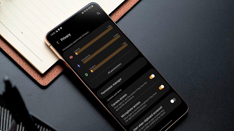
The "Android Private Compute Core" technology that performs the processing of personal information in Android 12 on the smartphone itself is also available on Galaxy devices, but it is now known as Android System Intelligence, similar to what you will find on the Pixel range of devices. This means the data processing of features that rely on AI and ML remain private.
Somehow, OneUI 4.0 still loses out...
On the one hand, we had gains in apps like the camera which now shows the zoom level in a numerical manner, or Samsung Health, which is more inclusive by offering additional gender options. On the other hand, Samsung has embarked upon some questionable decisions, such as hijacking up to 4 GB of the phone's internal storage for virtual memory usage.
This is because the RAM Plus feature that is enabled by default in One UI 4.0 cannot be disabled on Galaxy devices that run the new OS – so far, that is. This may not be a really serious problem when it comes to the manufacturer's top models, but it's been getting a lot of criticism for not offering a choice to device owners.
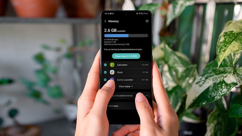
Also, OS updates on selected devices didn't happen smoothly, with bugs related to the screen's adaptive refresh rate and sudden performance drops.
On the Galaxy S21+ that I'm using, I only experienced issues with the adaptive refresh which switched from 120 Hz to 60 Hz whenever I took my finger off the screen. However, this didn't affect my experience with the system overall, and Samsung has already sent an update to correct both bugs.
Conclusion
One UI 4.0 clearly shows how Samsung is torn between retaining the interface features of its own software while submitting it to Google's decisions. This has always been the case but in a veiled manner. However, with Material You, we do notice the tentacles of the search giant expand, somewhat making themselves more present.
Also read: Why Android 12 has everything I expect from an operating system
Would that be positive or negative thing? It depends! On the one hand, Samsung has accelerated the update process for its smartphones, releasing Android 12 for 2021 flagships just a month after Google released the update to Pixel smartphones. That should be celebrated. By the end of the year, the list of Galaxy smartphones that run One UI 4.0 should be the longest that we have ever seen so far from a single manufacturer.
Personally, when it comes to interfaces for Android smartphones, I would normally stick to Google and Samsung. However, the two in one place doesn't really appeal to me. What I feel about One UI 4.0 is that Samsung has partially adapted some of Android 12's landmark features to its interface and hasn't had time to work on flagship features for the Galaxy ecosystem itself.
Ultimately, One UI 4.0 will please those who are already used to the Samsung experience, as well as those who want to have a customizable smartphone that is on par with Google's Android experience. However, I missed at least one major feature that Samsung normally offers. Therefore, my rapt expectation turns all the way to One UI 4.1!
What about you? What do you think of Samsung's new interface that is based on Android 12? Do you own a Galaxy smartphone that has already received the update? I'm curious to know what your impressions are!





This is meaningless overhead masked as branding and loyalty. Make it a bundled launcher we can uninstall and delete. It's always more complicated than stock Android leading to obfuscation of settings, tasks and controls at a wasted price of engineering, testing and user time.
Can we just be done with required skins already?