ColorOS 12: Here's what your Oppo (and OnePlus) smartphone will look like on Android 12

Read in other languages:
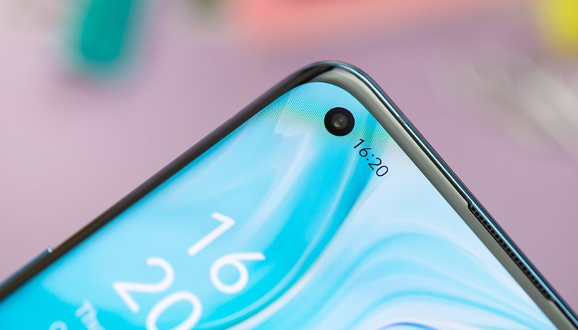
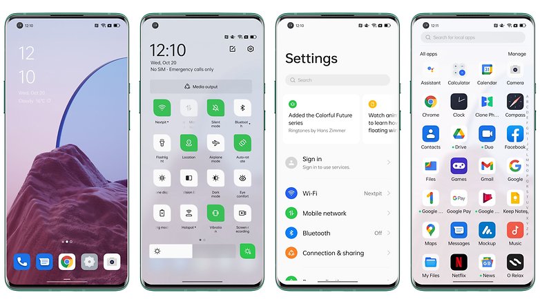
Come and see what the fuss is all about in ColorOS 12, the Android 12 skin for Oppo smartphones. We were able to test Oppo's OS and we offer you the very same chance to discover the "inclusive" design of ColorOS 12 in selected screenshots.
I'll work on a full review ColorOS 12 very soon (really!). However, in the meantime, I was able to test out a build provided by Oppo on an Oppo Find X3 Pro.
And since Android 12 is about to roll out in stable form on the Pixel since the launch of the Pixel 6 and Pixel 6 Pro, Oppo wants to be among the first manufacturers to update its smartphones to Android 12. Come on, let's begin!
*The images below are clickable.
The keyword for the new ColorOS 12 design is 'inclusiveness'. Oppo has really insisted on this notion in its marketing and seems to want to underline how hard its team has worked tirelessly to internationalize the Android overlay. Basically, to make it more visually pleasing and more accessible to the Western audience, or at least those who live outside of China.
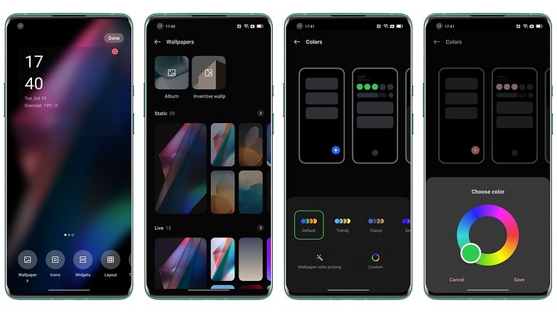
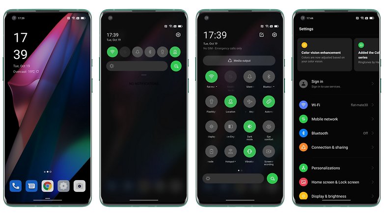
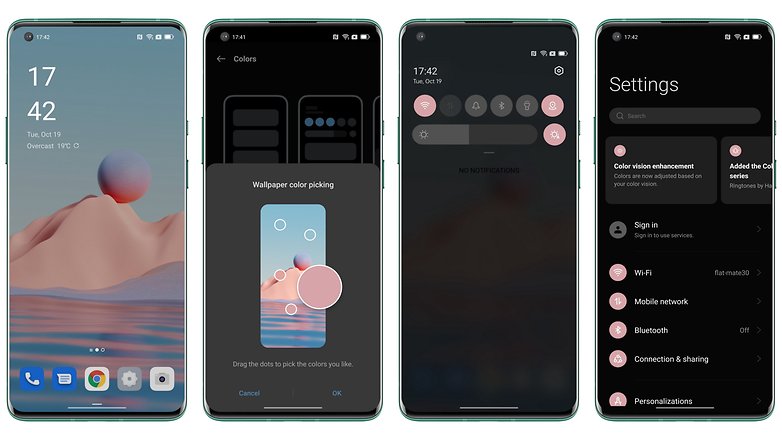
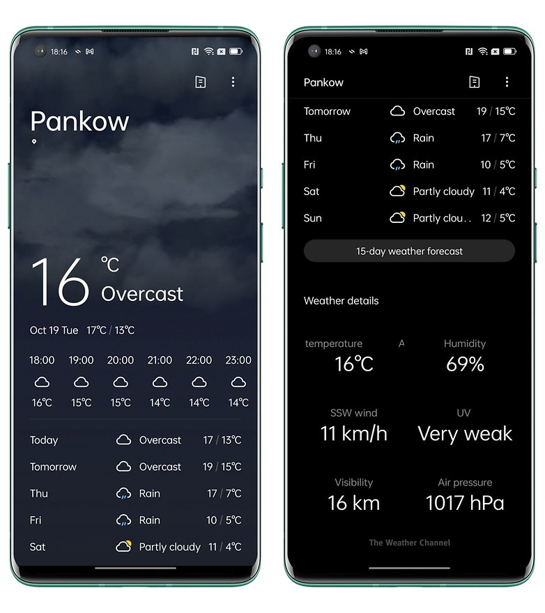
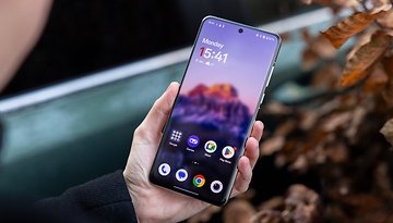
The idea is to have a lighter design, a less cluttered interface, and a better hierarchy of information on the screen. Visually, we do find that there is still some remnant of Xiaomi in ColorOS, albeit with a wide range of customization options. Material You and the Dynamic Theme seem to still remain exclusive to Pixel devices but ColorOS 122 attempts to offer theme creation that has been adapted according to the colors of your wallpaper.
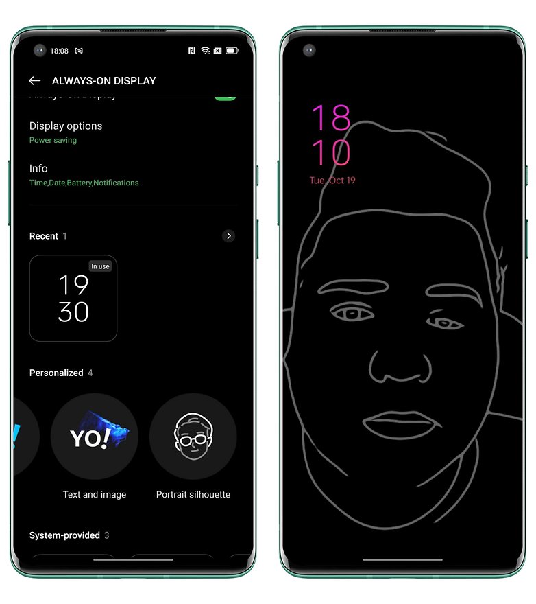
For the Always on Display, Oppo has integrated OnePlus' Canva mode on OxygenOS 11 which allows you to create sketches on a black background of a photo in your gallery.
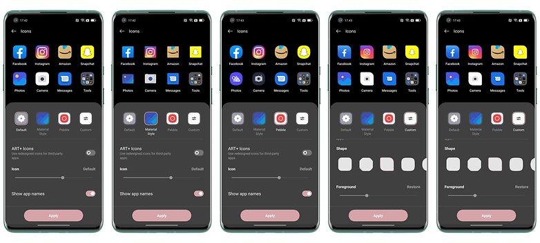
ColorOS 12's icons are also extremely customizable and Oppo will offer its own proprietary icons this year. These icons animate when an app is launched and closed, much like the ones found in MIUI. Almost every element of the user interface now behaves like objects in the physical world. For example, when you tap on an icon, it will be pressed as though you were clicking an actual button.
Another visual change is the animation. The interface elements will move according to the speed with which you interact with them.
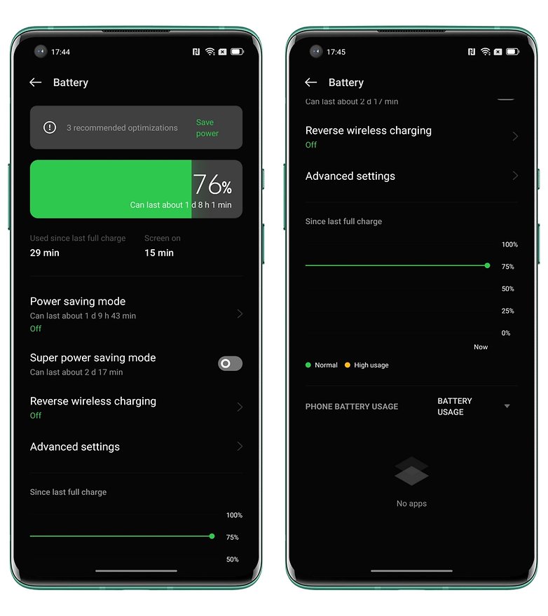
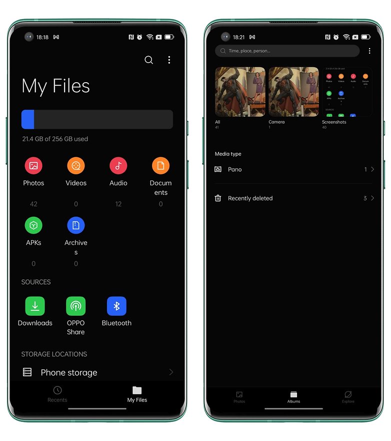
Oppo has further reworked several of its utility menus like for the battery, which allows you to better visualize your screen time and usage. This is something that too few manufacturers offer, unfortunately. For the photo gallery, I found the interface to be abnormally small, I don't know if it's a bug or an accidental setting on my part.
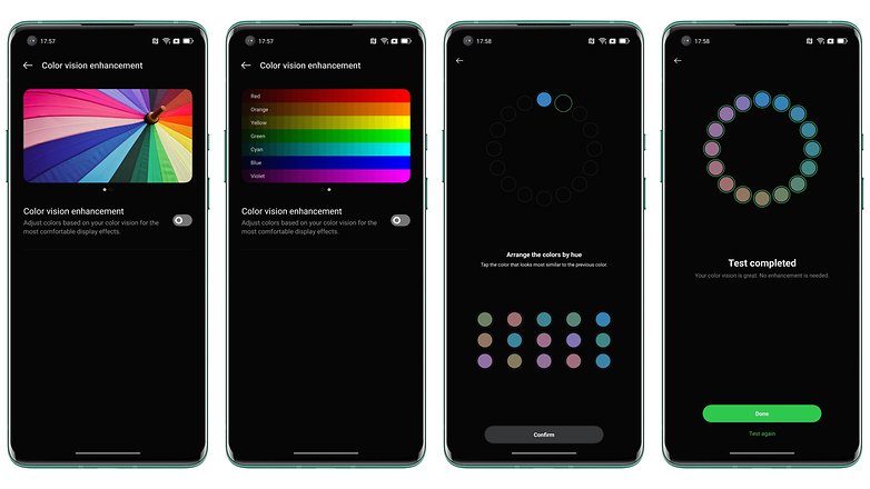
There is also the Color Vision AI Enhancement function that adapts the colorimetry to your sight and your own perception of colors. This test of vision is unique to say the least, and can prove useful for those who with partial sight (although I did not verify with a person who is not blind, nor did I didn't check with anyone who was. Feel free to keep me posted in the comments if you know of someone who has taken advantage of the Color Vision AI Enhancement function).
Overall, there are no major changes to take note of visually compared to ColorOS 11. I understood the concept of inclusivity but I didn't expect Oppo to pull it off well. The intentions are laudable, but it doesn't go much beyond the stage of brand marketing.
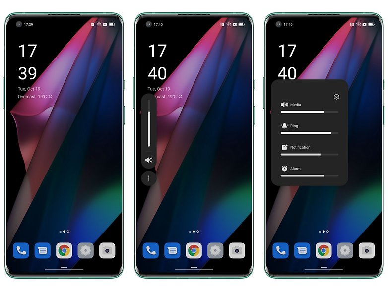
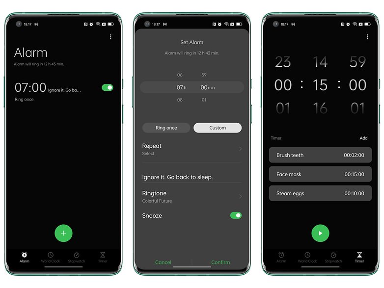
In some native apps, I feel like Oppo has moved some elements down the screen to make it easier to use with one hand while making the font larger. One-handed operation while enlarging the font and "essential" elements on the screen that have been relegated to the upper part of the screen will be part of ColorOS 12. This is a stylistic doctrine that was initiated by most manufacturers last year to address UI issues related to the ever-growing form factor of modern smartphones.
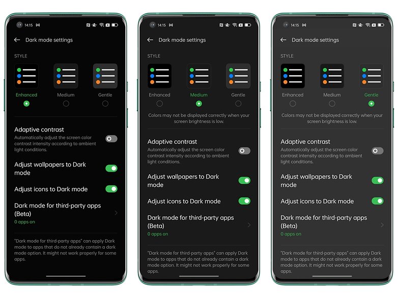
Finally, ColorOS 12 offers an adaptive Dark Mode that you can change the intensity according to 3 levels with the possibility to adapt the icons, wallpaper, and contrast of the screen.
That's all for now in this quick tour of the ColorOS 12 design. What do you think of Oppo's interface? Do you have any questions regarding my ColorOS 12 review? Let me know in the comments!







Wasted overhead. Eliminate cruft, not generate more.