Google brings Material Design to Gmail

Google is finally updating its email client interface on mobile devices. The new UI will use the new Material Theme that is slowly spreading on all services - both desktop and mobile, of the Mountain View company.
If you use Gmail on your desktop browser, you may have noticed some major changes that have occurred recently. The interface has been redesigned to be consistent with the new design guidelines also adopted by all other Google services such as Calendar or Drive.
As part of this general redesign, Google has announced the launch of the new Gmail UI also on mobile devices, so expect an update coming to the Google Play Store or the App Store in the coming days.
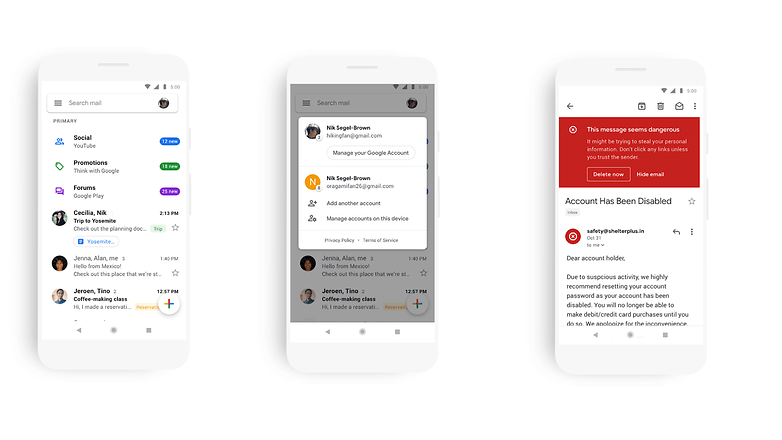
The dominant color is obviously white, with buttons with rounded shapes and icons defined only by a colored outline. It is likely that the update was presented in anticipation of the launch of the new Android version (currently only know by the code name Q), which should support a system-wide Dark Mode. With this new design it will be easier for the search giant to implement changes and the dark version of the interface in time.
What do you think about the changes made by Google? Do you prefer the new interface or the current one? Let us know in the comments.
Source: Google
